Form holds concept,
concept
breaks form.
Hi! Our Seoul-based independent Special creative design studio provides brand direction, digital, space design, and print solutions.
Our Studio is to approach and express various social issues and messages through design. We are an experimental studio designed to explore the essence of design through a continuous process of modification and adaptation.
Latest Projects.
Our crew is a dynamic,multi-skilled team and we can handle visual design challenges our way.
(2012 — 2025) Projects.
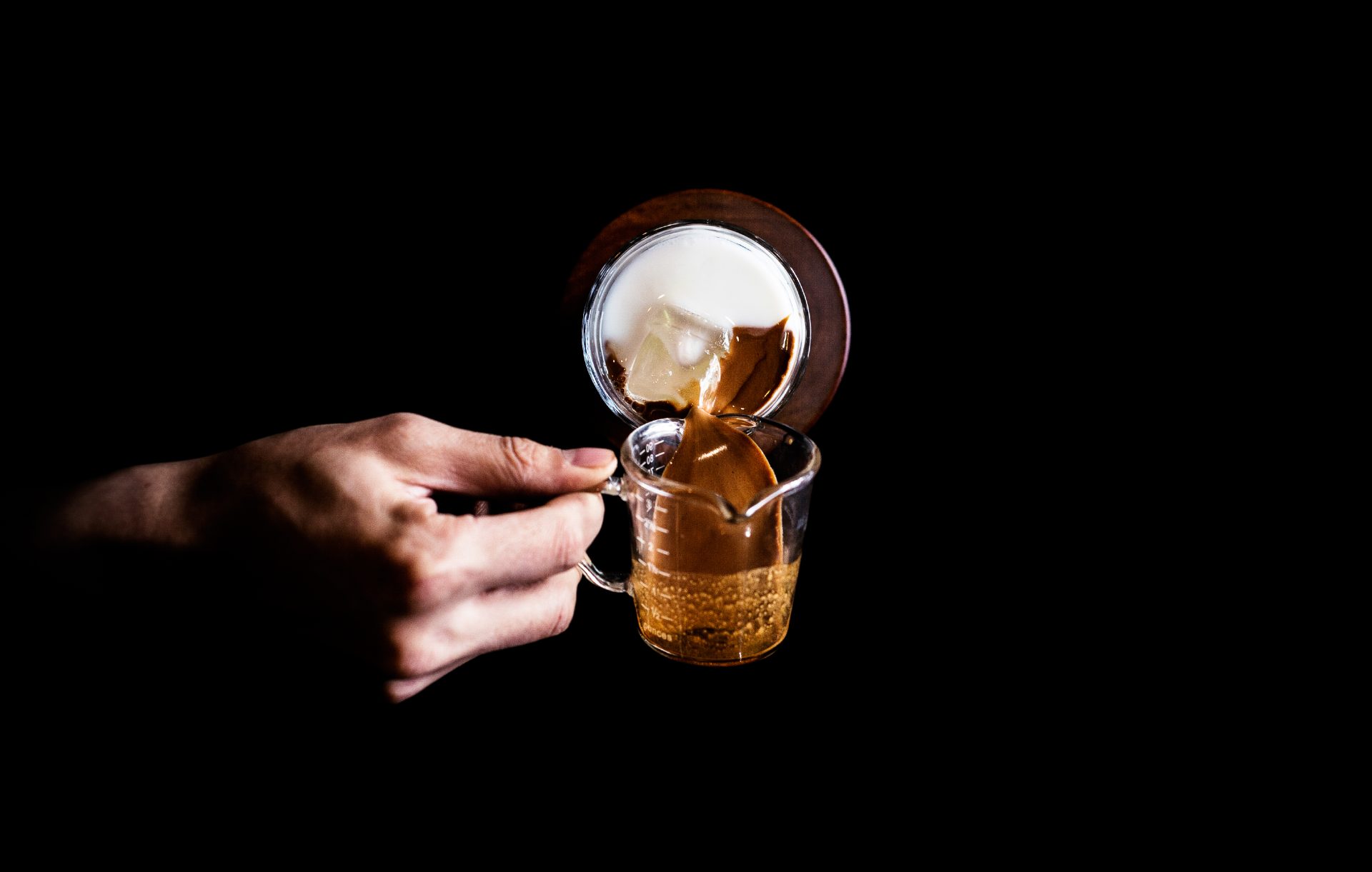
10th Anniversary Rebranding : Champ Coffee Roasters
A rebranding project celebrating ten years of Champ Coffee Roasters. The concept draws on the bond of three brothers and their shared roots in Muju,…
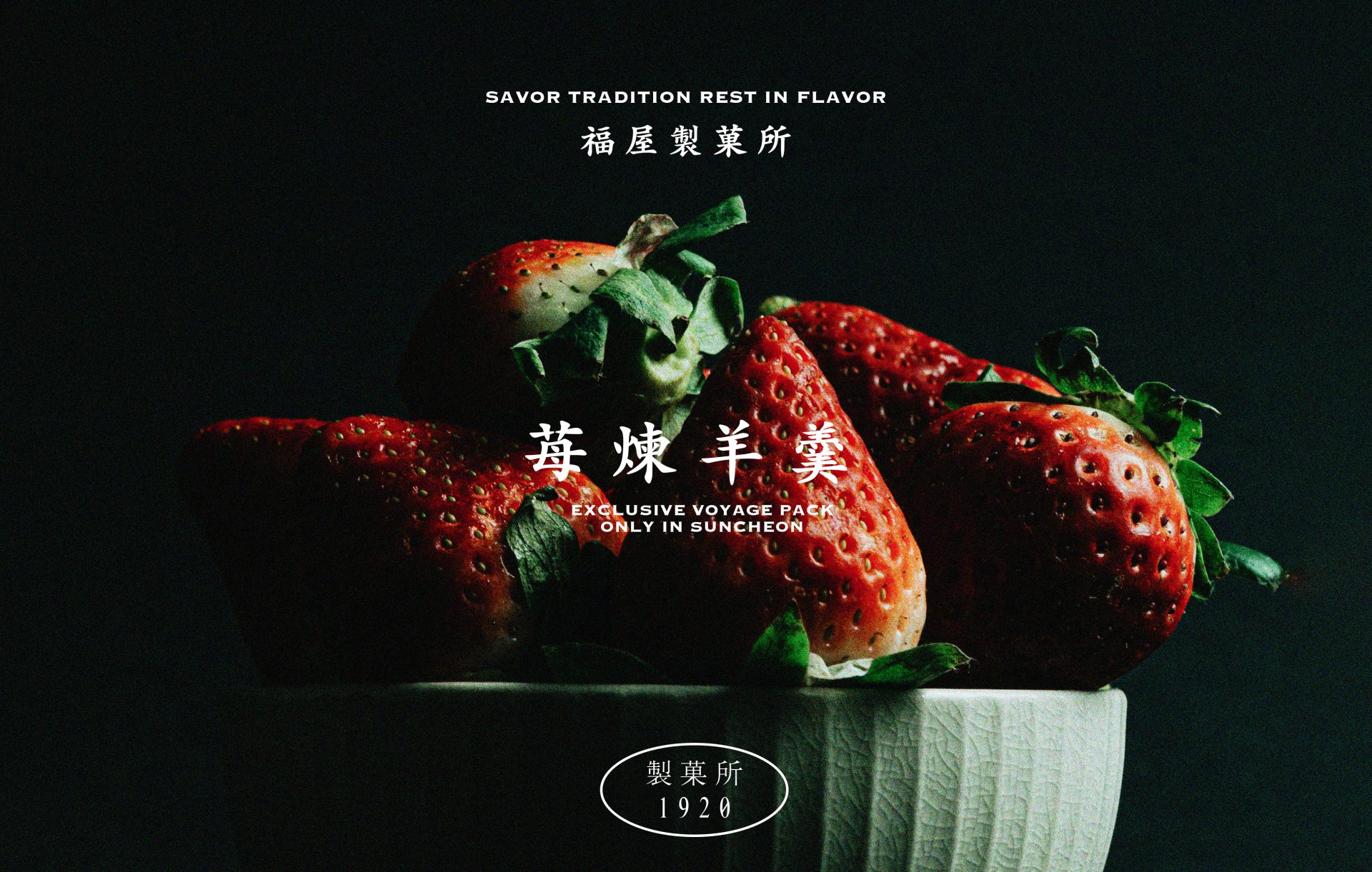
Savor Tradition Rest in Flavor
A playful yet nostalgic brand identity system for a dessert café inspired by Korean retro-modern aesthetics. From custom typography to symbolic illustrations, Bokok’s design reflects…
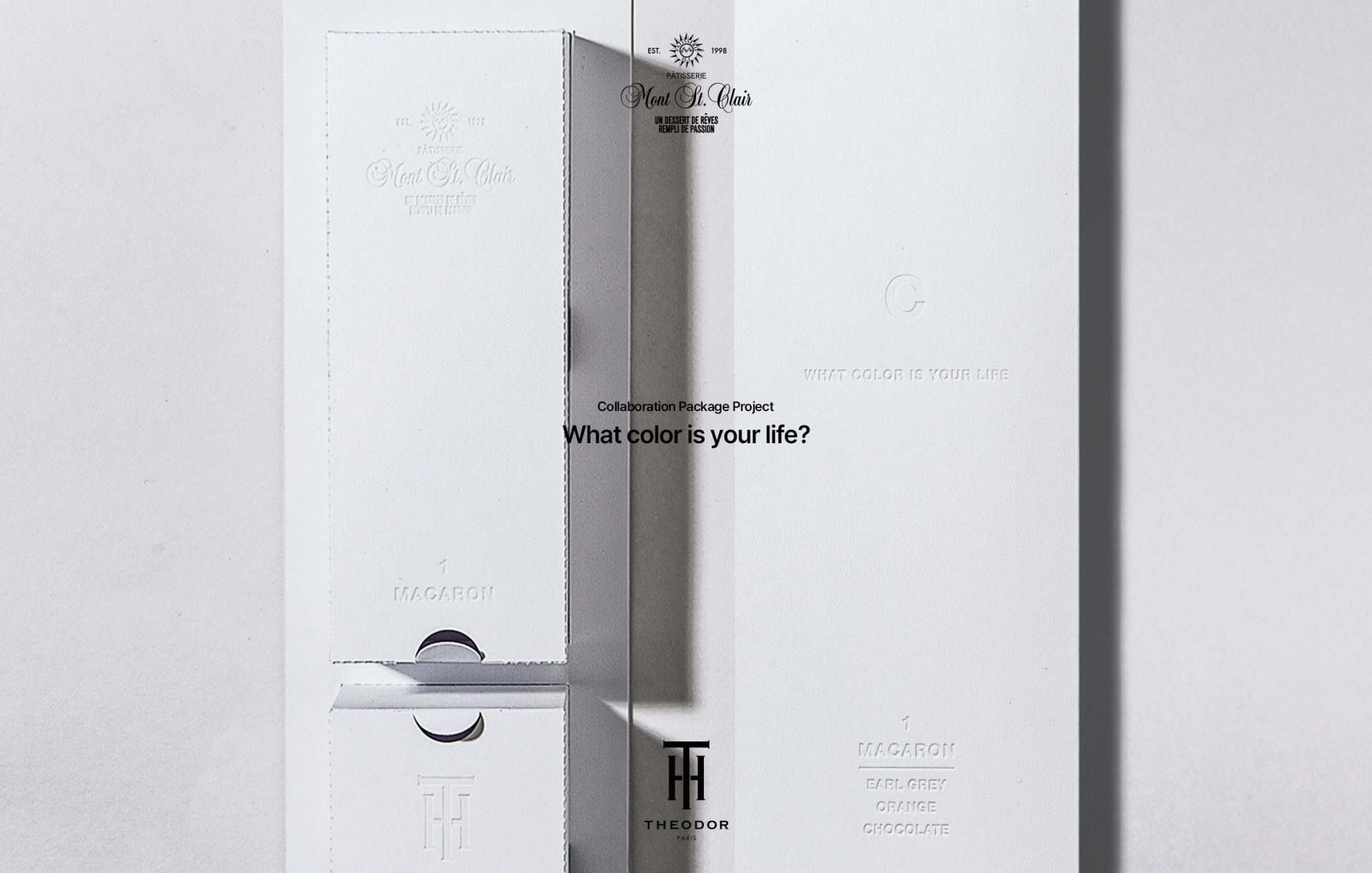
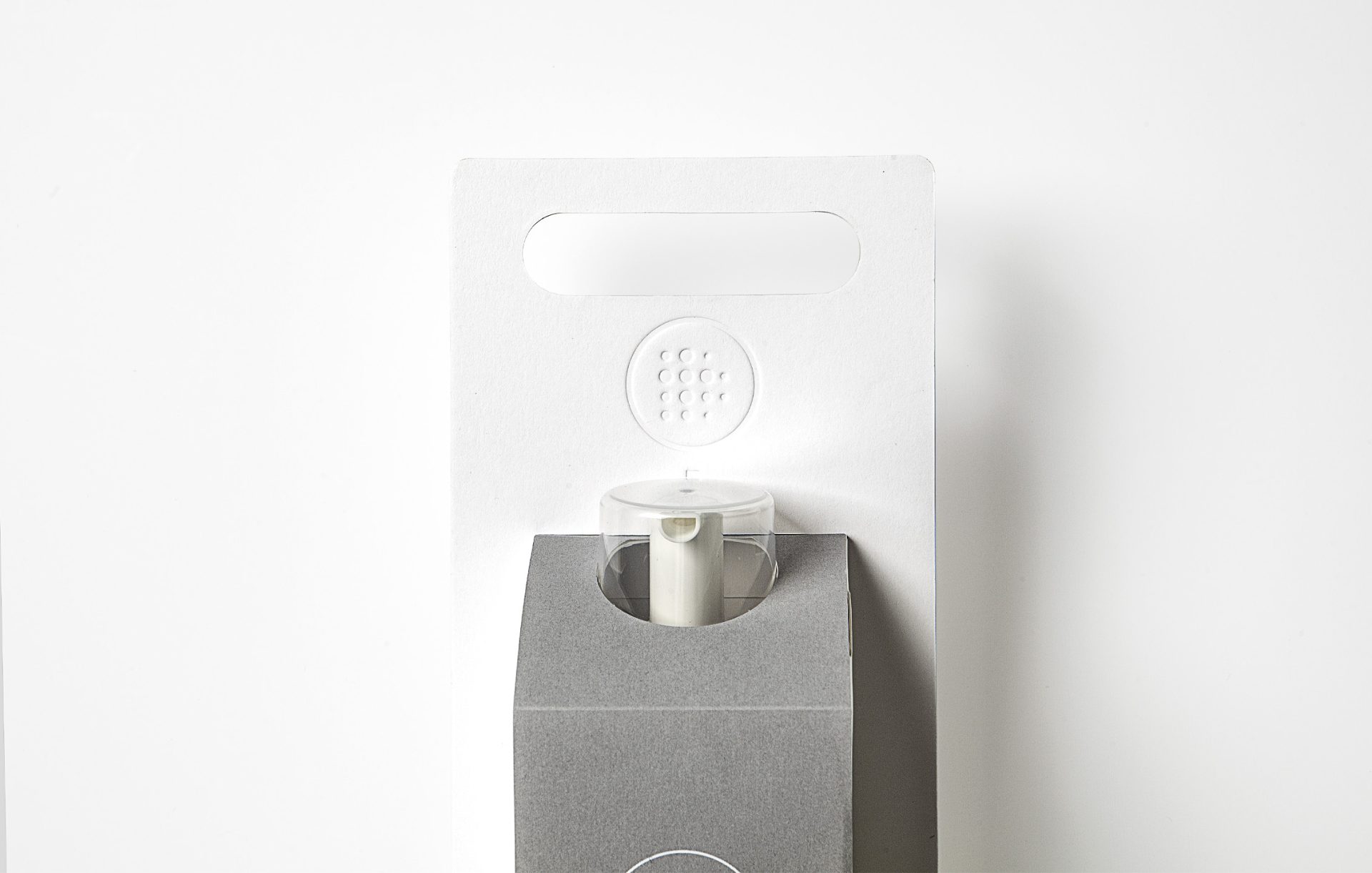
Launching Party Gift : Collaboration Package
A gift package design that conveys brand and product information using embossing only. White paper was used to highlight each brand’s color identity, capturing the…
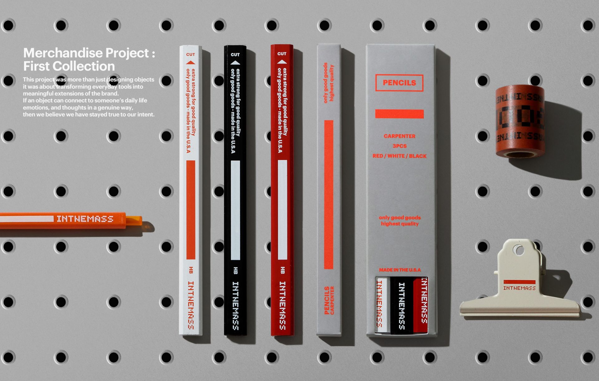
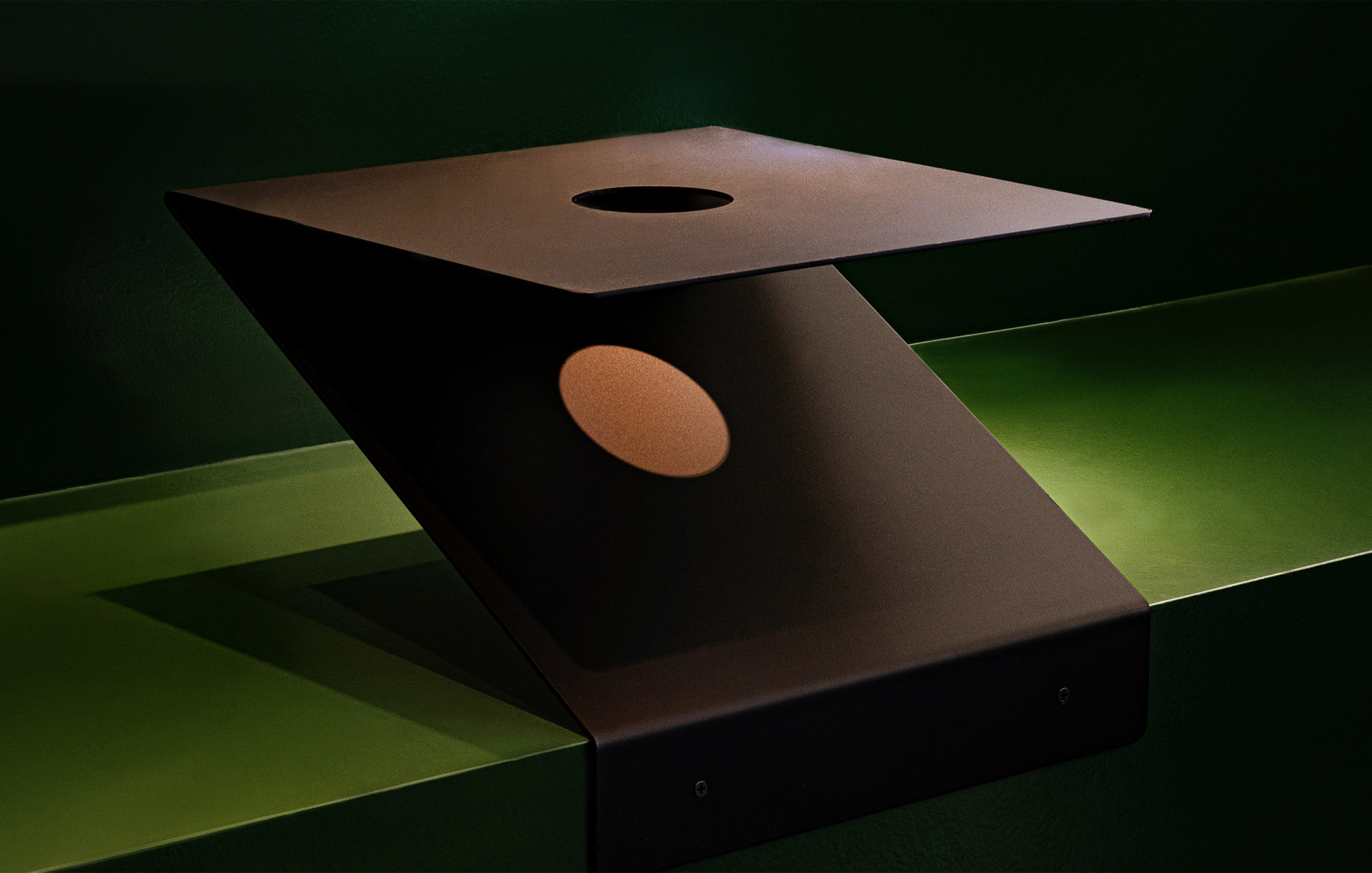
Branded Utility-Merchandise Project
This merchandise design & production project was a collaboration with INTHEMASS, aiming to encapsulate the brand’s philosophy and everyday rituals into tangible objects. INTHEMASS is…
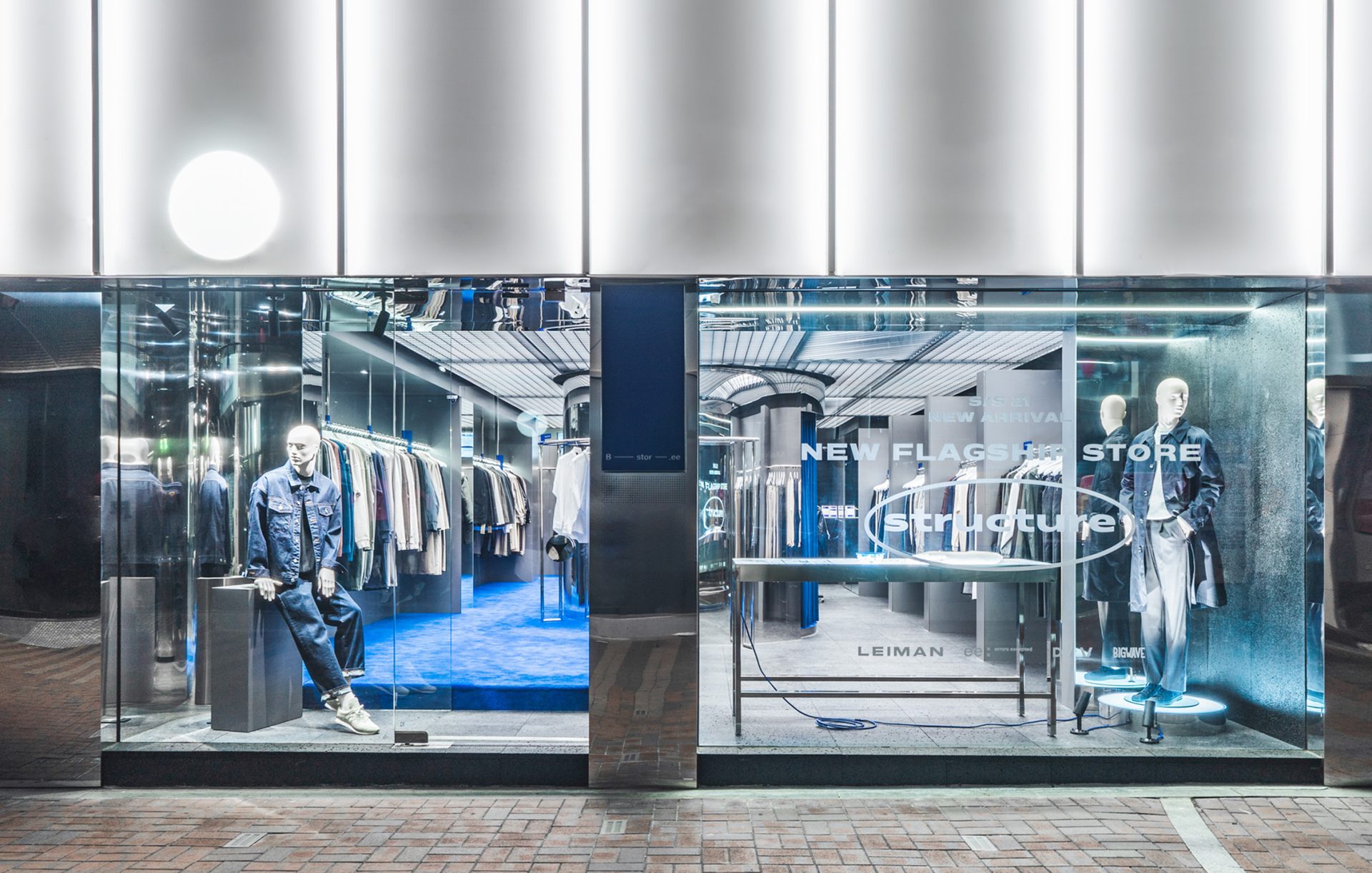
Duality of Light and Material
A flagship space where light, metal, and textures intersect to build a unique brand narrative.Lighting and structural rhythms elevate the retail experience.
Seogyo Cafe Interior Design Inspired by a Forest Lake
A quiet retreat in the city,inspired by the stillness of a forest lake.Elevated structures and layered greensshape a space where light and calm settle.
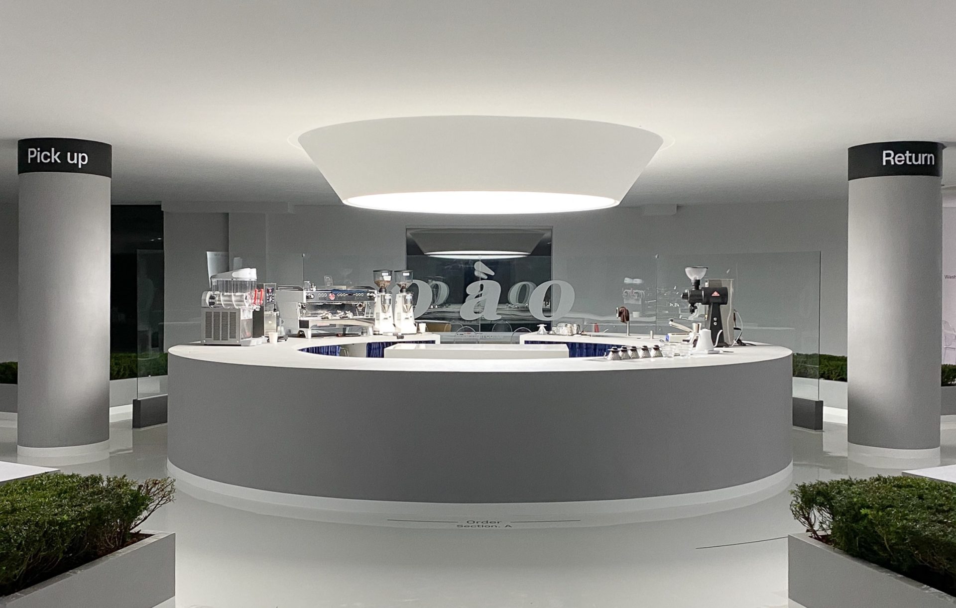
A creative café where raw concrete meets modern light
A café space that takes inspiration from the bold sliced form of a mountain, where the raw beauty of exposed materials meets the flowing harmony…
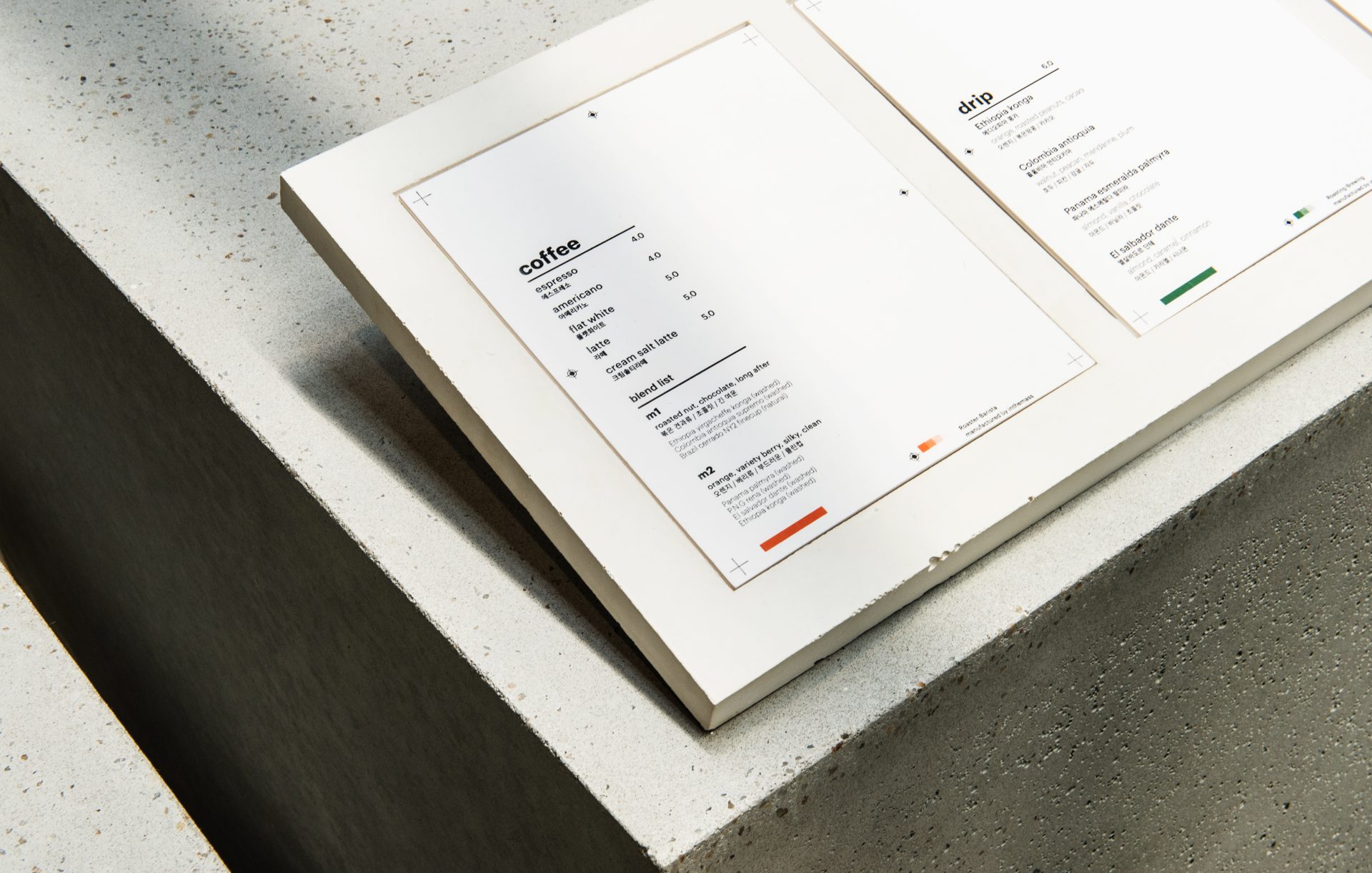
Defining a New Identity for Inthemass
A new high-end identity shaped from the foundation of MASS.Its visual language is structured and deliberate,dense with meaning and driven by a spirit of experimentation.
The Ground of the Stadium
A public pavilion created in an unfamiliar setting.A fortress-like space where sound, sight, and people flow together.
Nathing – Thoughtful & Sustainable
A packaging system rooted in quiet intention. This design expresses the brand’s values through form, texture, and structure.
Visual Rhythm in Coffee Packaging
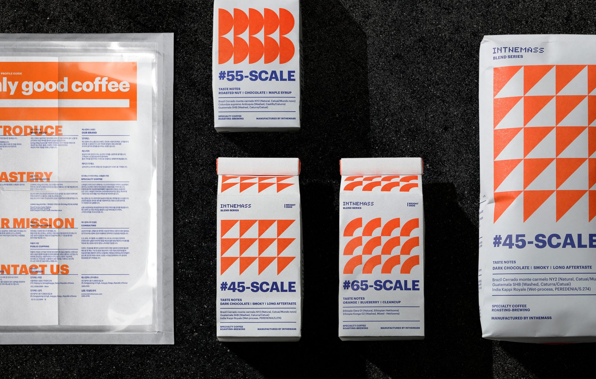
INTHEMASS packaging visualizes roast levels through structured rhythm and color. A modular system bridges product clarity and brand identity across all formats.
SAKURA – Seasonal Limited Edition Dessert Branding
Mont St. Clair’s Sakura Edition blends tradition with a refined sense of seasonality. Origami-inspired packaging and gentle tones capture spring in its most poetic form.
A Singular Myth in Urban Silence
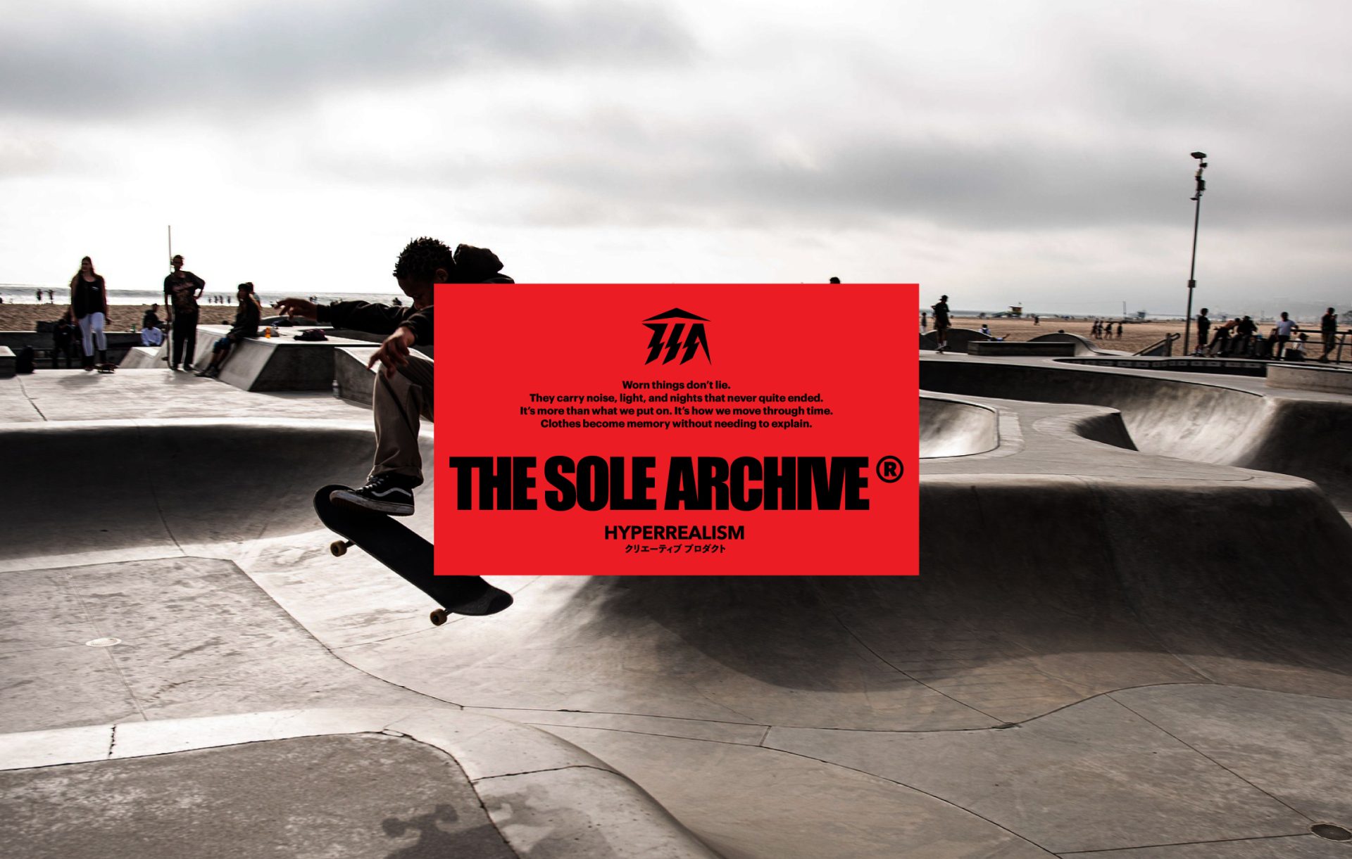
A logo born from Greek myth, shaped like lightning and temple. The Sole Archive channels street and extreme culture through minimalist outdoorwear.
Garment for the City in Motion
A system forged in utility, shaped by the city. CDM blends discipline and street energy into a functional identity, where every detail serves a purpose.…
Intersecting Lines and Contrast Like a Scene from a Film
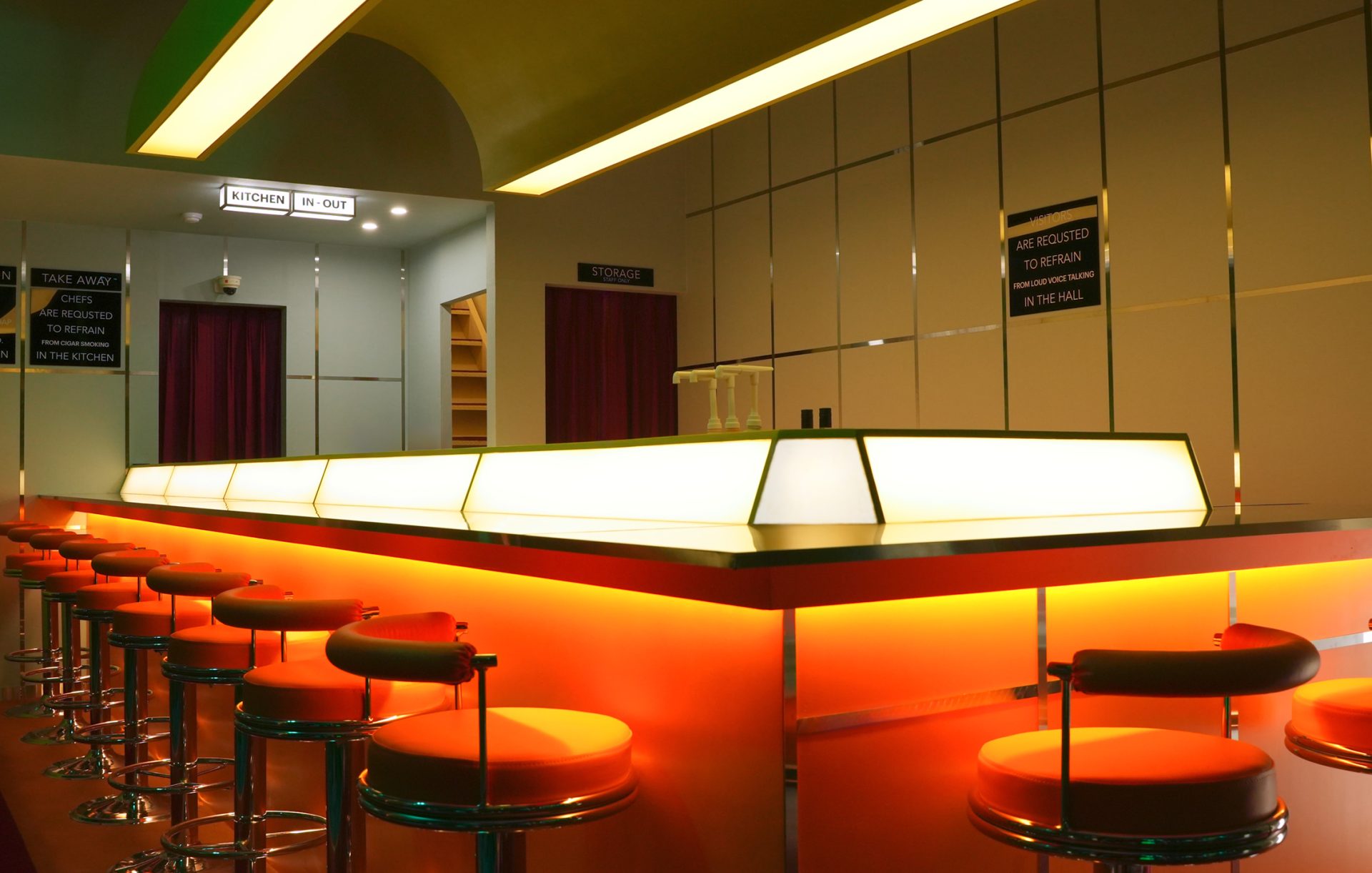
A cinematic, warm F&B brand space for KASKI.Defined by bold lines, color, and rhythm, the design creates a distinctive experience.
Messages from Light:Exhibition Visual Artwork
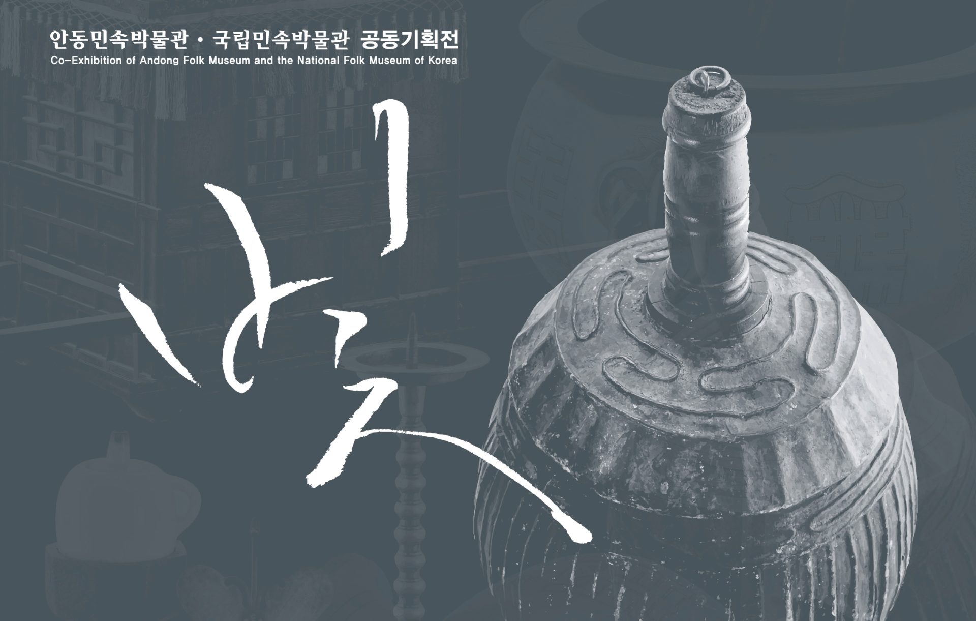
Exploring how light carries meaning. A visual interpretation of Joseon-era lighting objects reimagined for a modern exhibition.
Absolute standard – Editorial Concept & Photoshoot
An editorial capturing high-end style at an abandoned ski resortBlending runway and dance to express the shift of an era
A Quiet Tension Between Space and Self
A soft tension between body and space. Captured in quiet postures and still light. Leiman’s Wolgot collection unfolds slowly, like a breath held in visual…
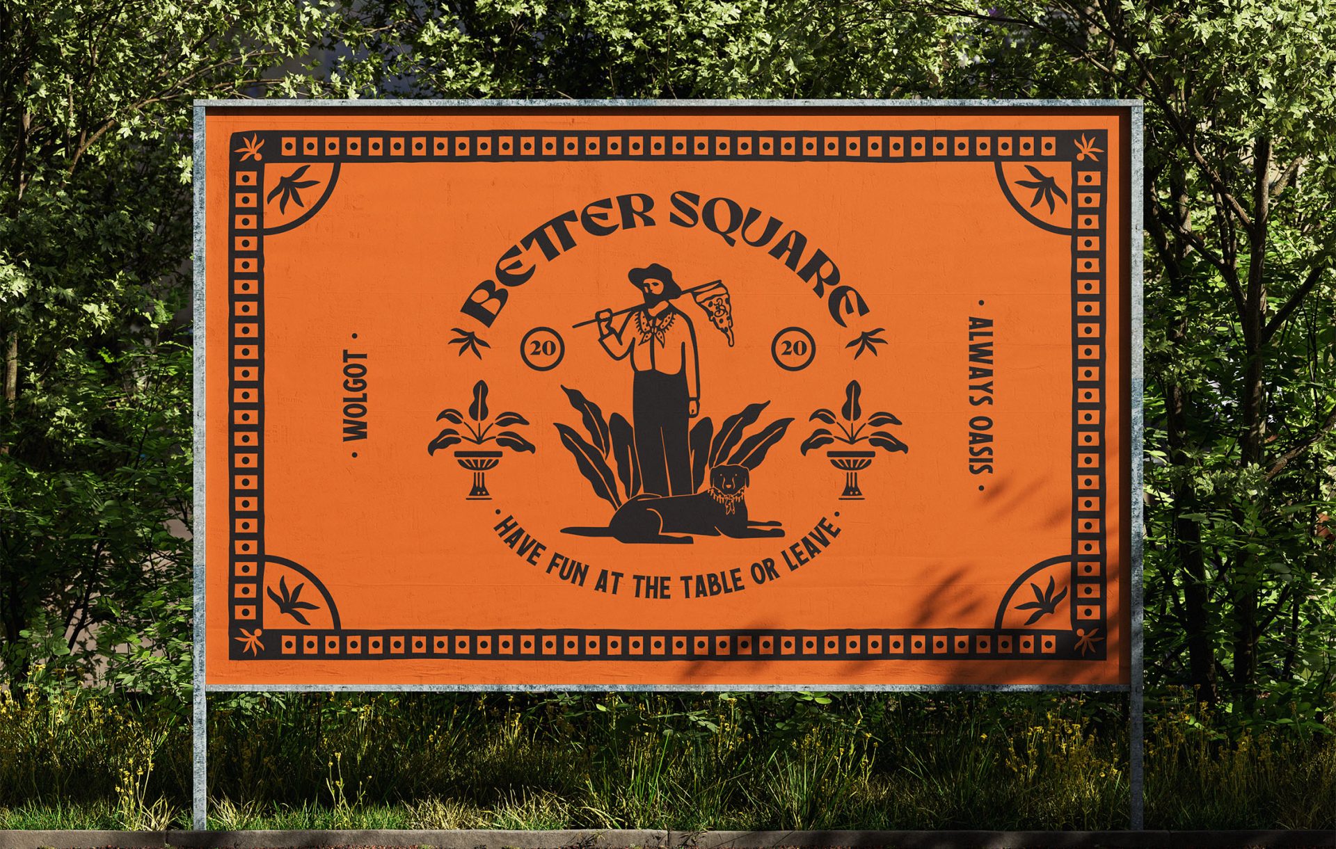
Oasis Within the Woods
This is the Season 2 BI renewal for BETTER SQUARE, themed around an oasis where nature and people coexist. The visual system combines a hand-drawn…
Between Stillness and Ascent:Visual Artwork
A sage dwells in the gap where space and time unfold. A contemporary graphic study reimagining rest through deconstructed Korean landscape art.
Hong Kong Movie-Inspired Restaurant Branding and Design
A branding and logo system crafted like a frame from a slow-burning film. Drawing from the moody lighting, spatial stillness, and visual tension of the…
The Essence of Nothing
NAHTHING PROJECT captures the essence of purity through structural design. Nothing unnecessary, everything intentional.
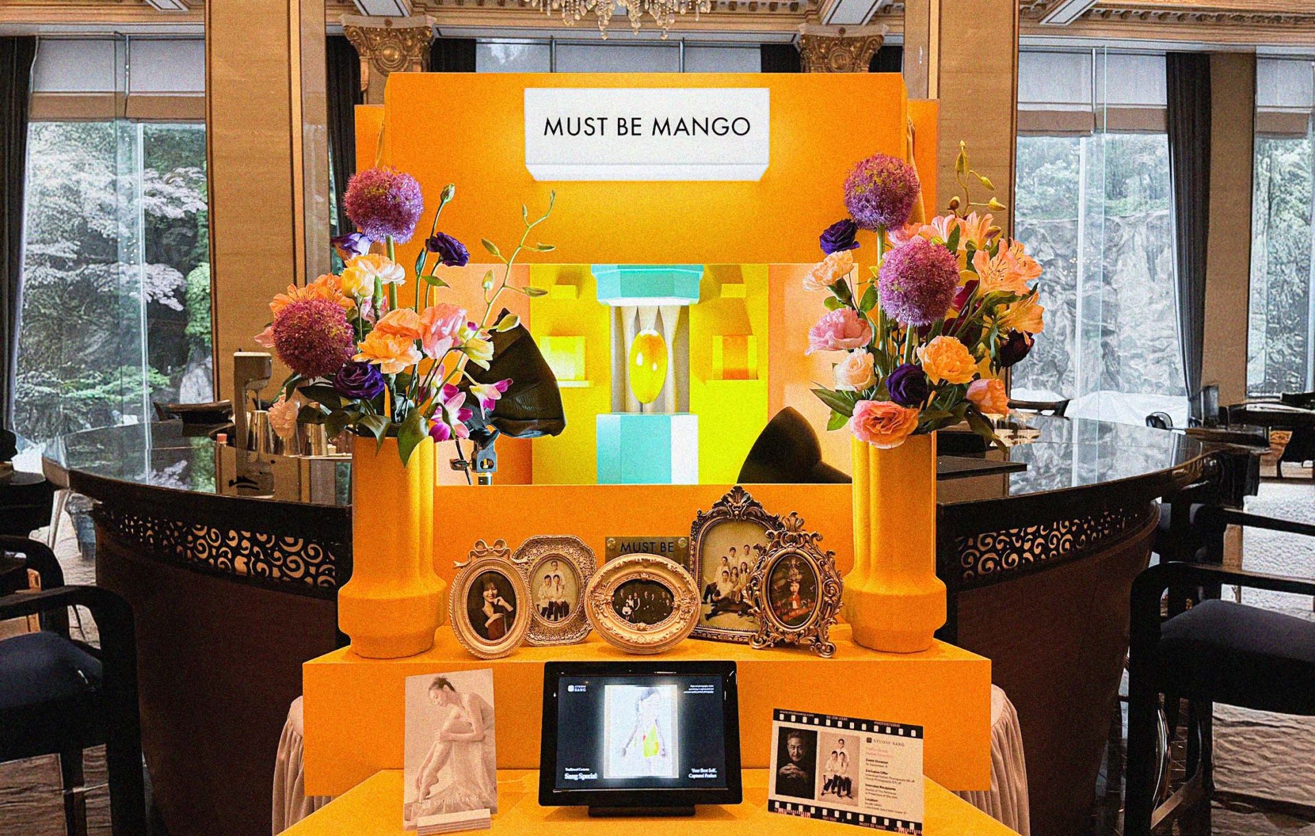
A Mango Journey, with Eyes Closed
To celebrate Mango Season at Lotte Hotel Seoul, we collaborated with Studio Sang to create a miniature display inspired by a fictional journey. The scene…
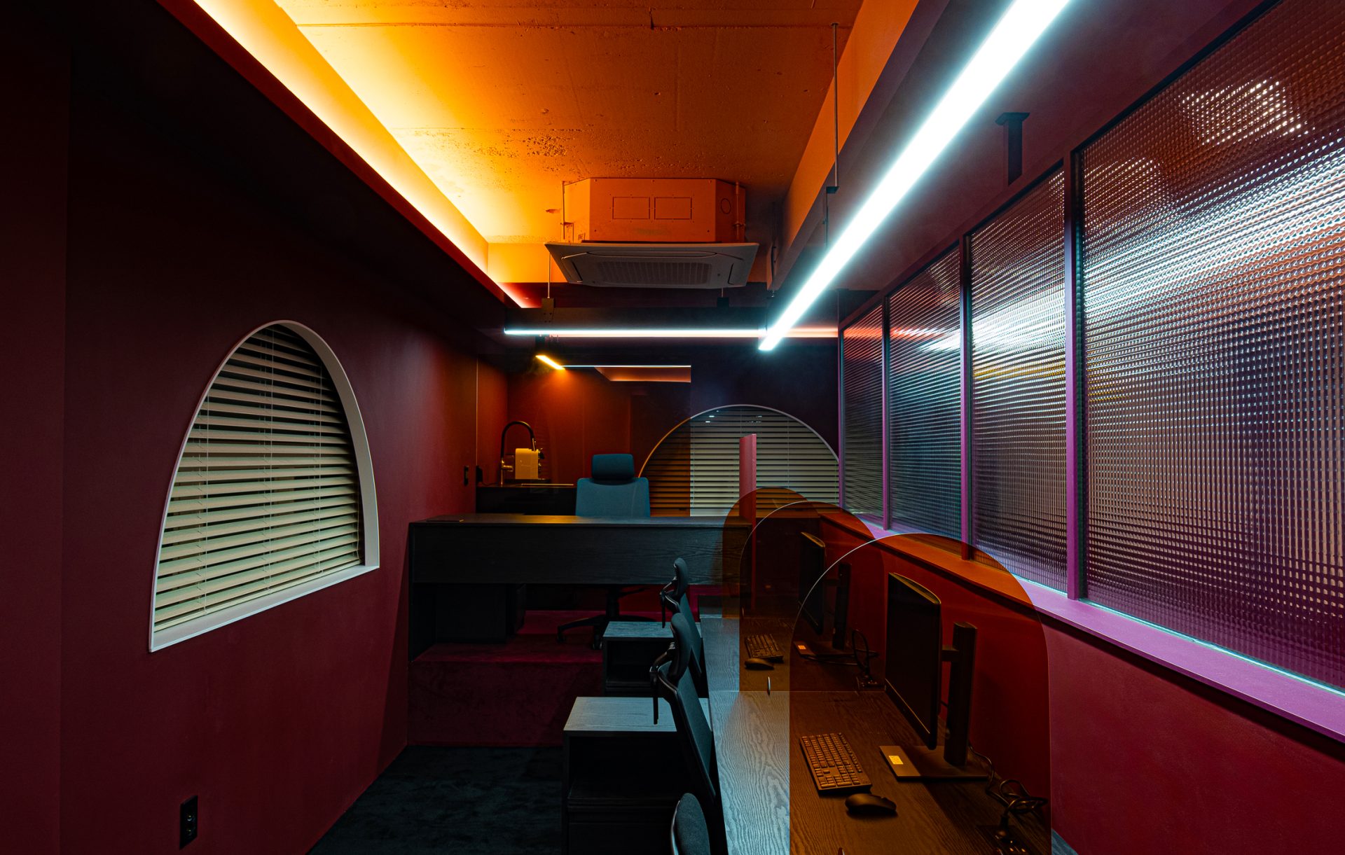
Design office isn’t just a workspace
An accessory design office shaped by color, material, and light.A space where creativity and trust come together.
A Structure for Visibility
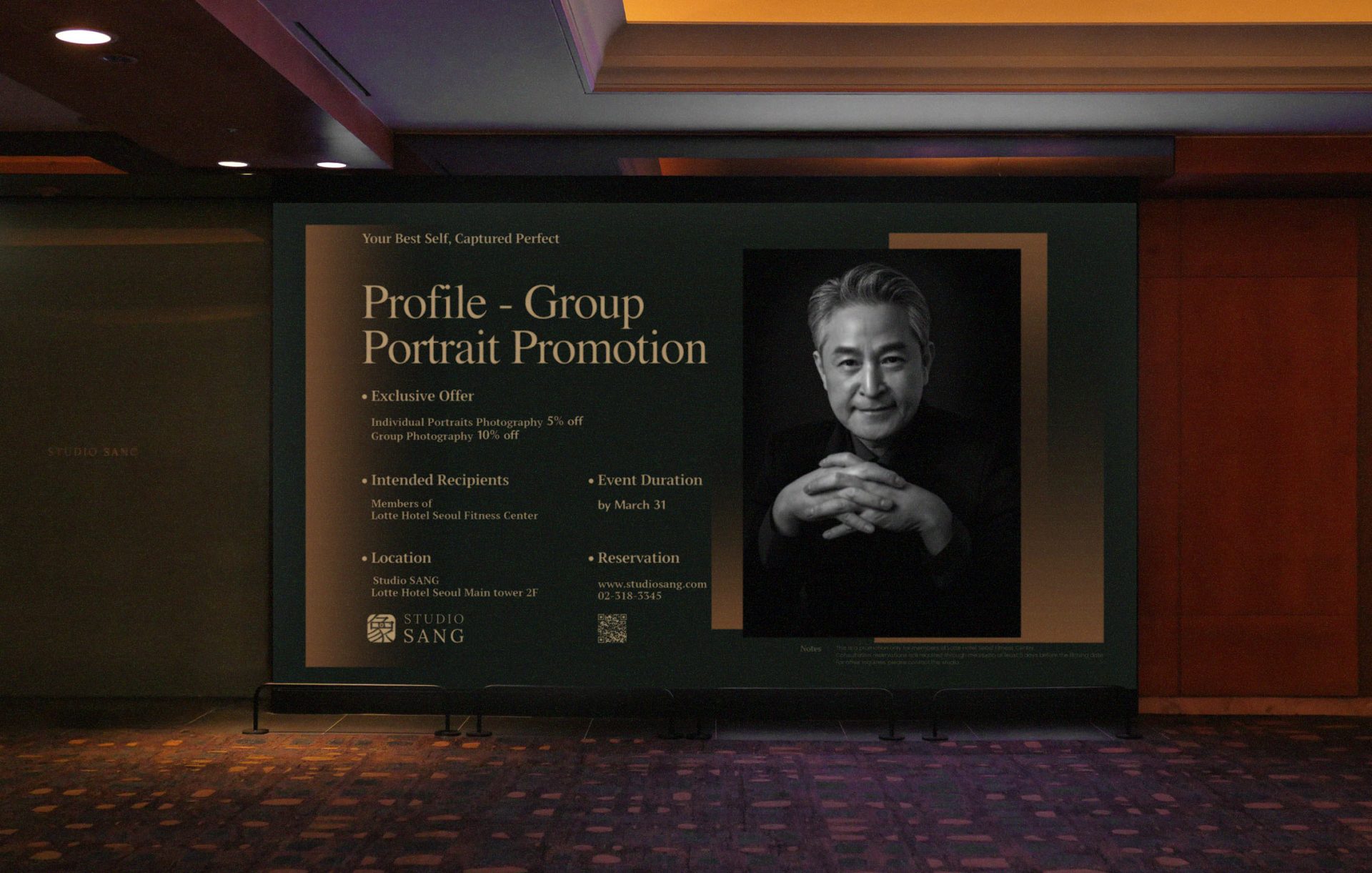
A visual rhythm of typography and light guides the viewer through Studio Sang’s promotional DID display. The design reflects the brand’s composed and refined character.
Marc-André Leclerc Inspired Design:The Pursuit Beyond Limits
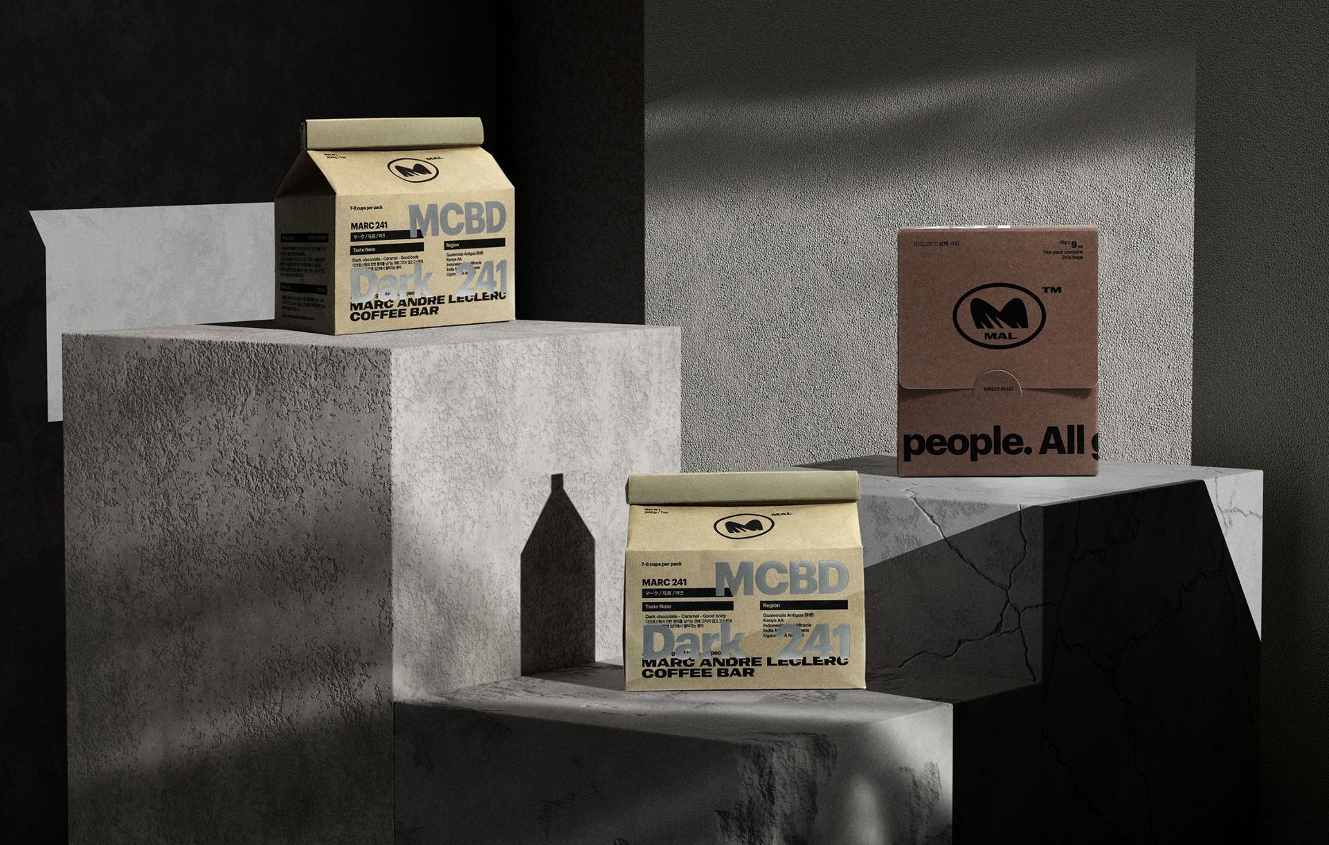
MAL COFFEE BAR visualizes challenge through vast desert dunes. Inspired by climber Leclerc, the brand blends narrative and form into one coherent identity.
Visual Variations in Motion
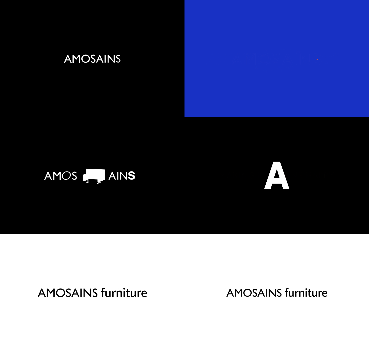
A spatial motion graphic that visualizes the brand’s design language through movement. AMOSAINS unfolds in visual rhythm and quiet transformation.
Speak Share Save – Package Merchandise
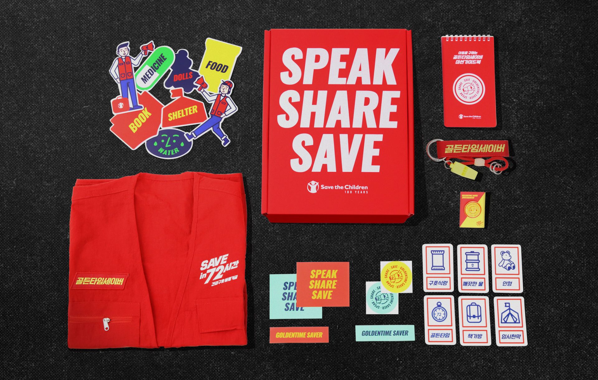
Sound Box reimagines emergency relief through the metaphor of sound. Donors become the source, and each item amplifies the message of rescue.
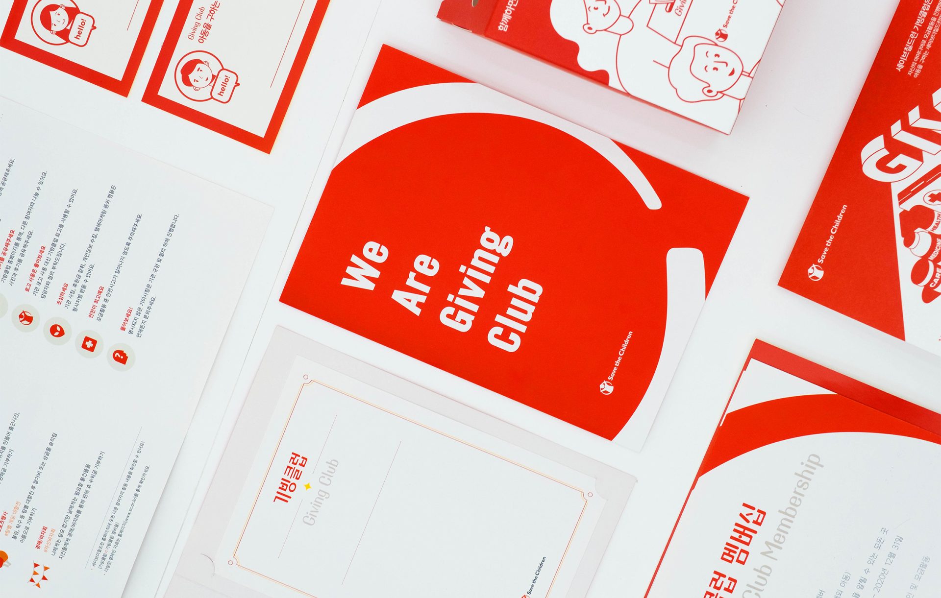
Giving Begins here
Giving Club redefines the act of giving through approachable and engaging design. The visual system encourages participation with clarity, warmth, and ease of use.
What makes you smile? – Editorial Concept & Photoshoot
Two rockstars meet in a sacred space, their emotions clashing like feedback in an echo chamber. Filtered through stained glass, the light reveals the raw…

