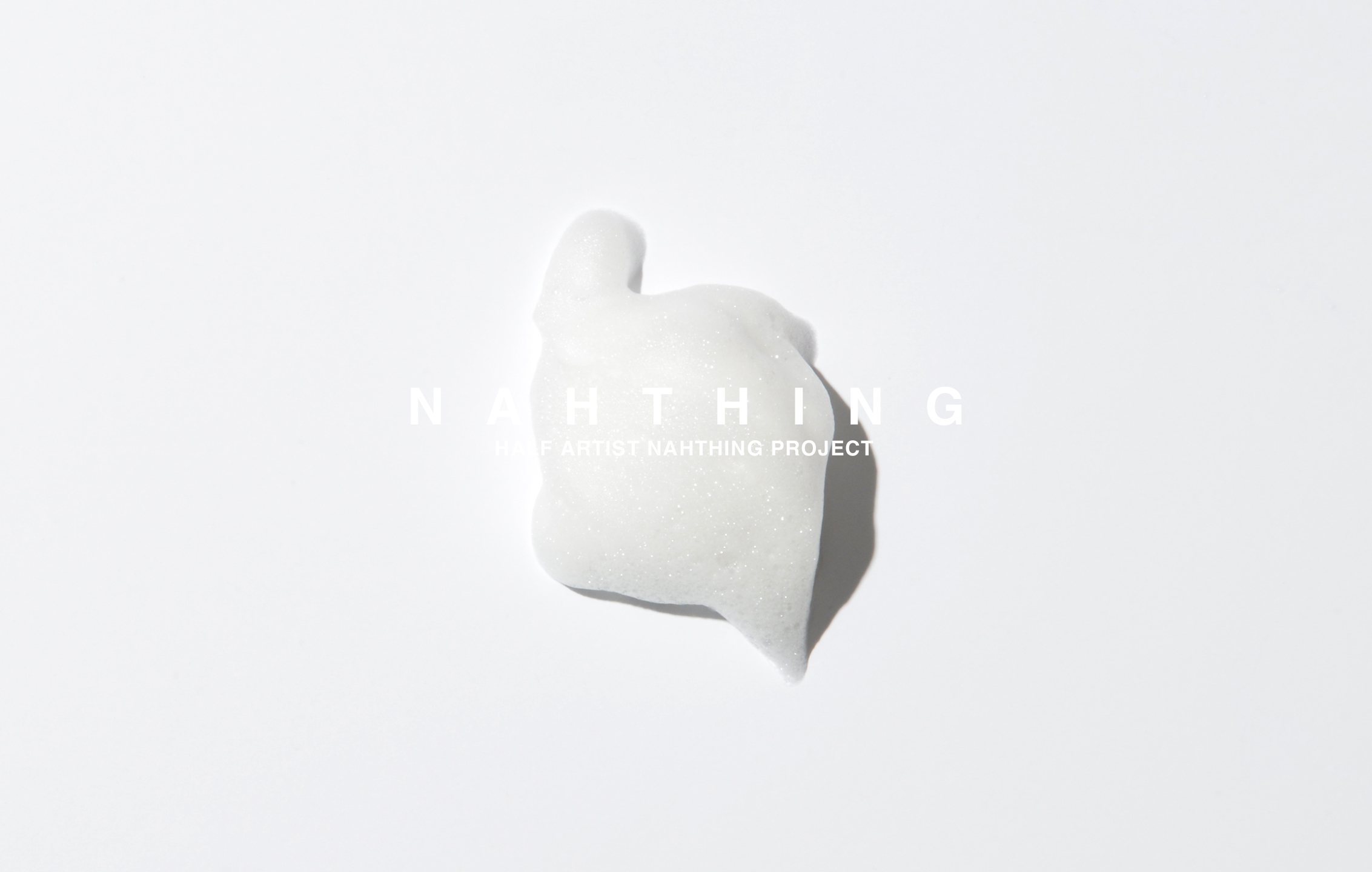
Nathing – Thoughtful & Sustainable

A packaging system rooted in quiet intention. This design expresses the brand’s values through form, texture, and structure.
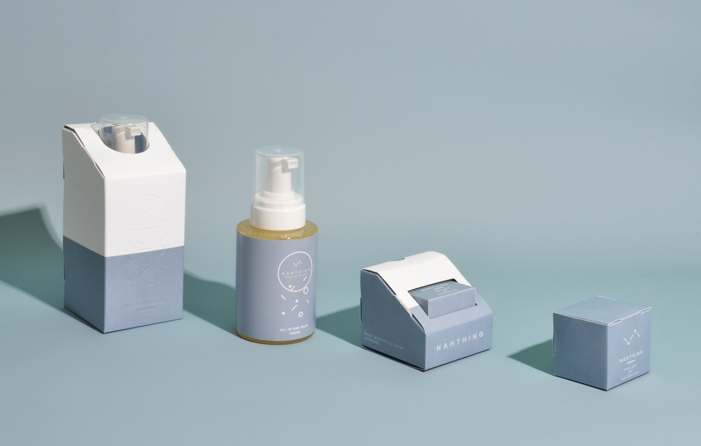
Task

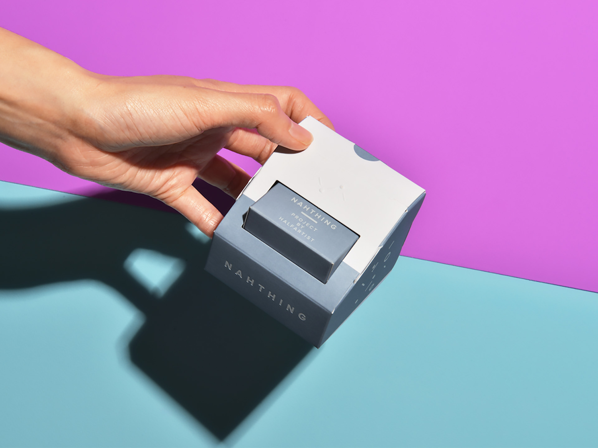
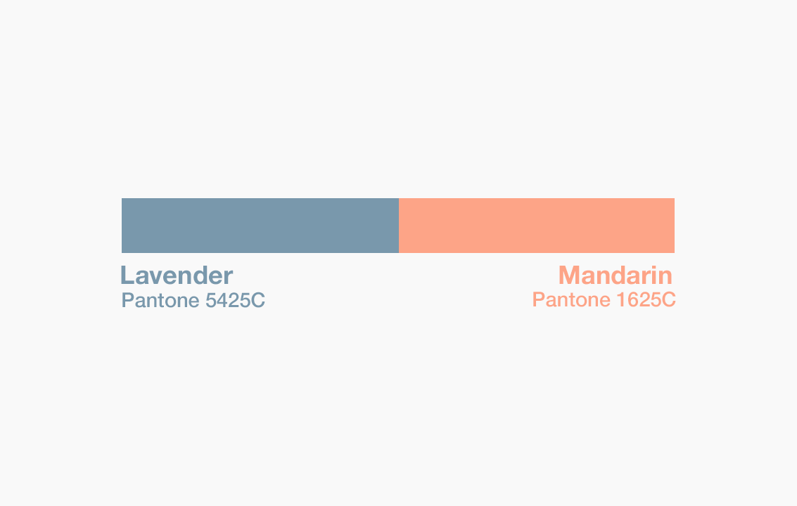
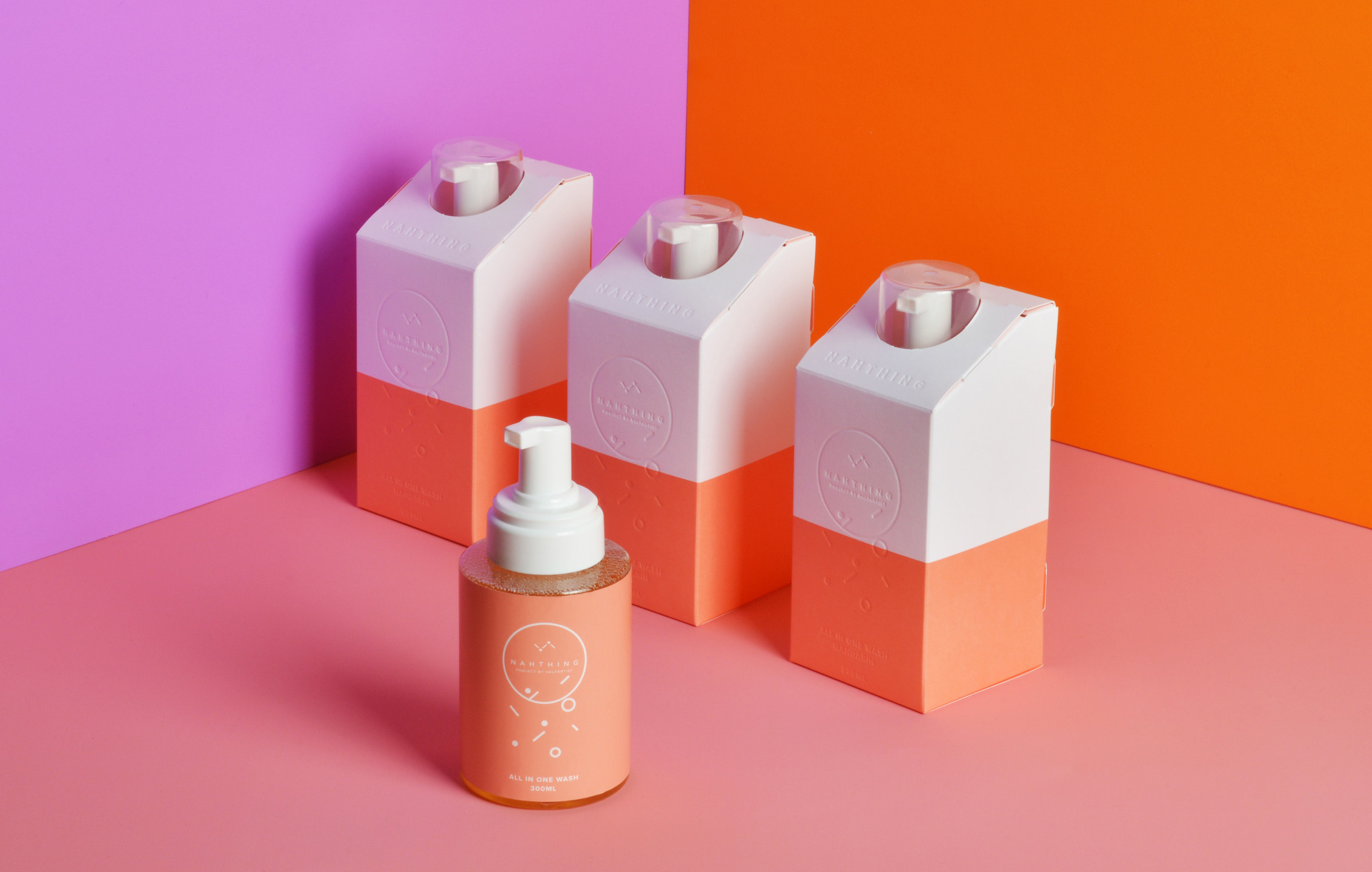
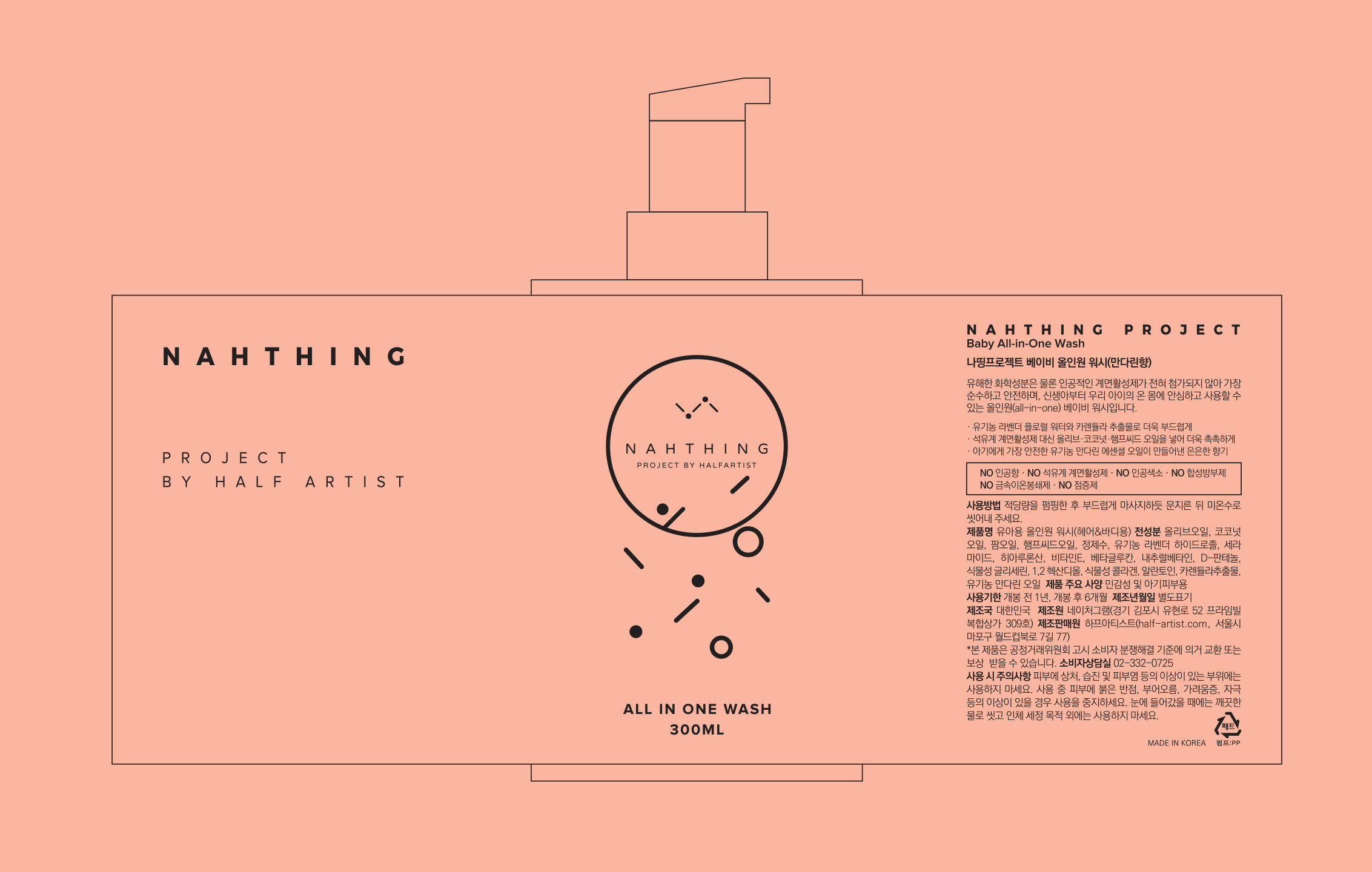
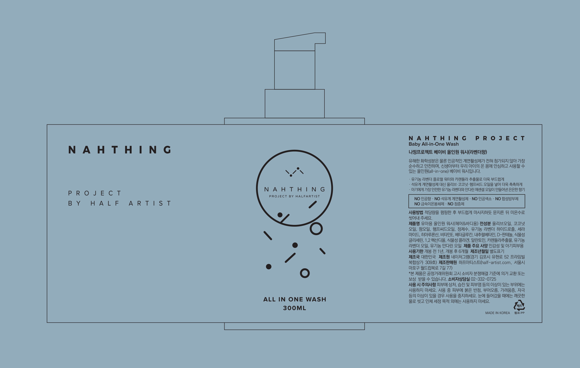
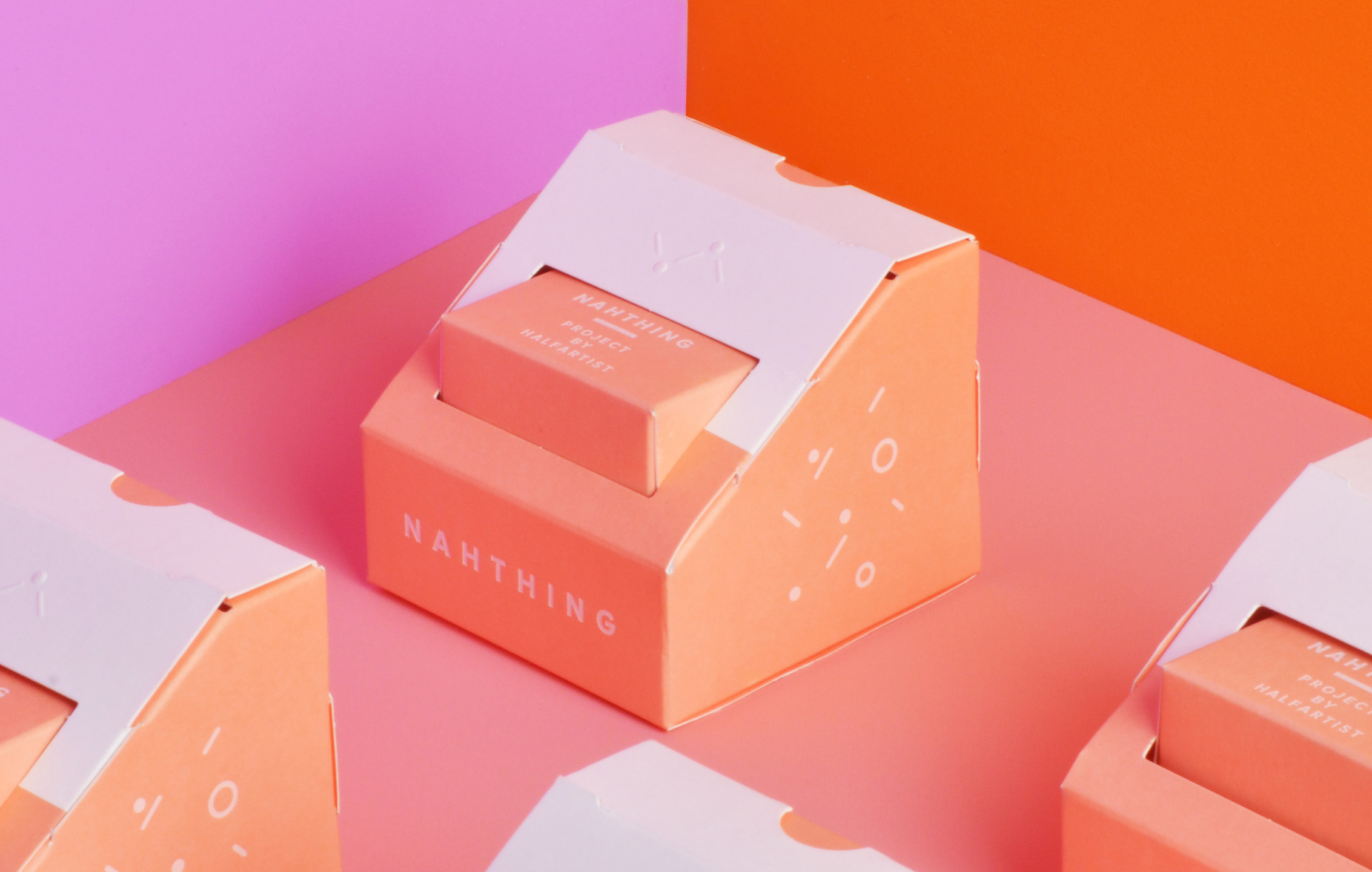
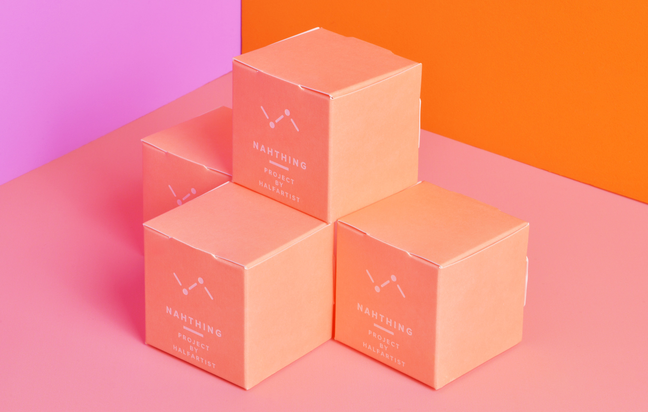
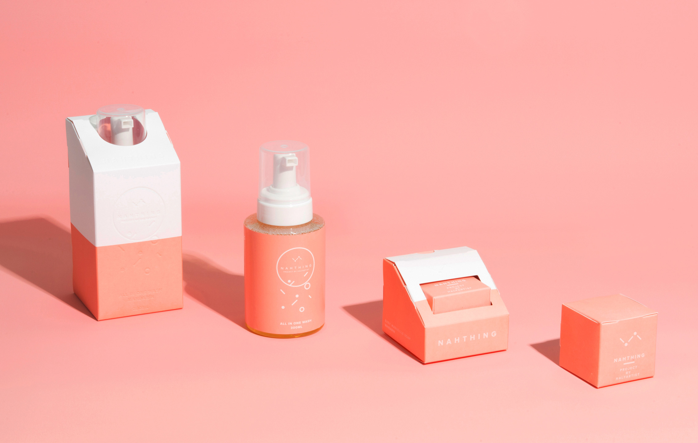
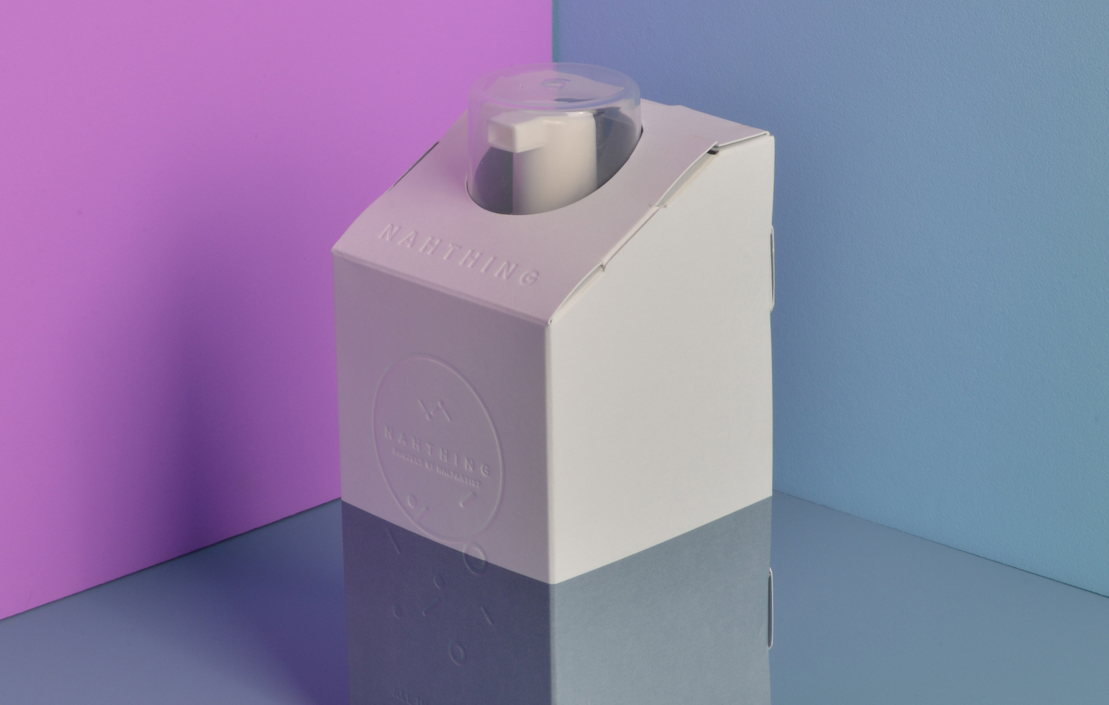
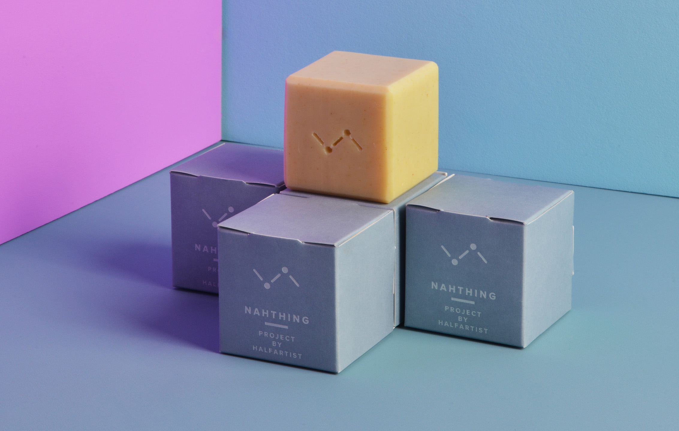
We translated the brand’s philosophy into a refined structural and material design system. We used FSC-certified paper, stone-powder white foil, and embossed details to express sustainability and texture. A glue-free origami-style package encouraged user participation through self-assembly. We applied a consistent structural language across the WASH and SOAP lines, including a signature diagonal top cut for subtle product visibility. Distinct color palettes lavender and mandarin were assigned to each variant and extended across product types to create a unified visual identity.

01. Information - Concept & package

This project was not just a packaging redesign. It was a process of translating brand philosophy into a tangible and structured design experience. Our goal was to balance functionality with refinement, using design as a quiet yet deliberate form of communication. We selected FSC-certified paper, stone-powder white foil, and embossed details to highlight both sustainability and tactility. 


These choices reflected the brand’s commitment to environmentally conscious design without unnecessary excess. Instead of a conventional box, we introduced a glue-free origami-style structure. This allowed users to assemble the packaging themselves, creating a more personal interaction with the product. A signature diagonal cut at the top revealed a glimpse of the item inside, adding a tactile layer of curiosity. This structural language was applied consistently across both the SOAP and WASH lines to maintain visual unity.


Color was a key part of the identity system. We assigned specific hues lavender and mandarin to differentiate product variations. These palettes were extended to both soap and cleanser formats to establish a seamless and coherent visual language. This project was ultimately about expressing brand values through form and restraint. We aimed to communicate sustainability and care not through ornamentation, but through structure, material, and purposeful design.

이번 프로젝트는 단순한 패키지 리디자인이 아니라, 브랜드 철학을 시각과 구조로 번역하는 작업이었다. 디자인의 출발점은 기능성과 조형성의 균형, 그리고 의도 있는 미니멀리즘이었다. 우리는 FSC 인증 종이와 석분 백색 포일 인쇄, 섬세한 엠보싱 디테일을 활용하여 지속 가능성과 촉각적 경험을 동시에 담아냈다.


이는 브랜드가 추구하는 가치와 환경적 책임을 시각적으로 표현하는 핵심 장치였다. 기존 박스 형태를 지양하고, 비접착 오리가미 구조를 도입함으로써 사용자가 스스로 패키지를 조립하며 브랜드 경험에 능동적으로 참여할 수 있도록 설계했다. 상단에는 대각선 컷 구조를 적용해 제품이 은은하게 보이도록 했으며, 이 구조는 SOAP과 WASH 라인 모두에 동일하게 적용되어 브랜드 일관성을 강화했다.


컬러는 브랜드 정체성에 있어 핵심적 요소였다. 제품별로 라벤더와 만다린 컬러를 지정하고, 해당 색상을 SOAP과 CLEANSER 패키지 모두에 확장 적용해 하나의 시각 언어로 통합된 제품군을 완성했다. 이 프로젝트는 단순한 시각적 재정비를 넘어, 브랜드가 지향하는 삶의 태도와 환경에 대한 메시지를 조용하지만 명확한 디자인 언어로 전달하는 시도였다.

Let's get in touch,
we respond fast.

Ready to work together?
Back