A Singular Myth in Urban Silence

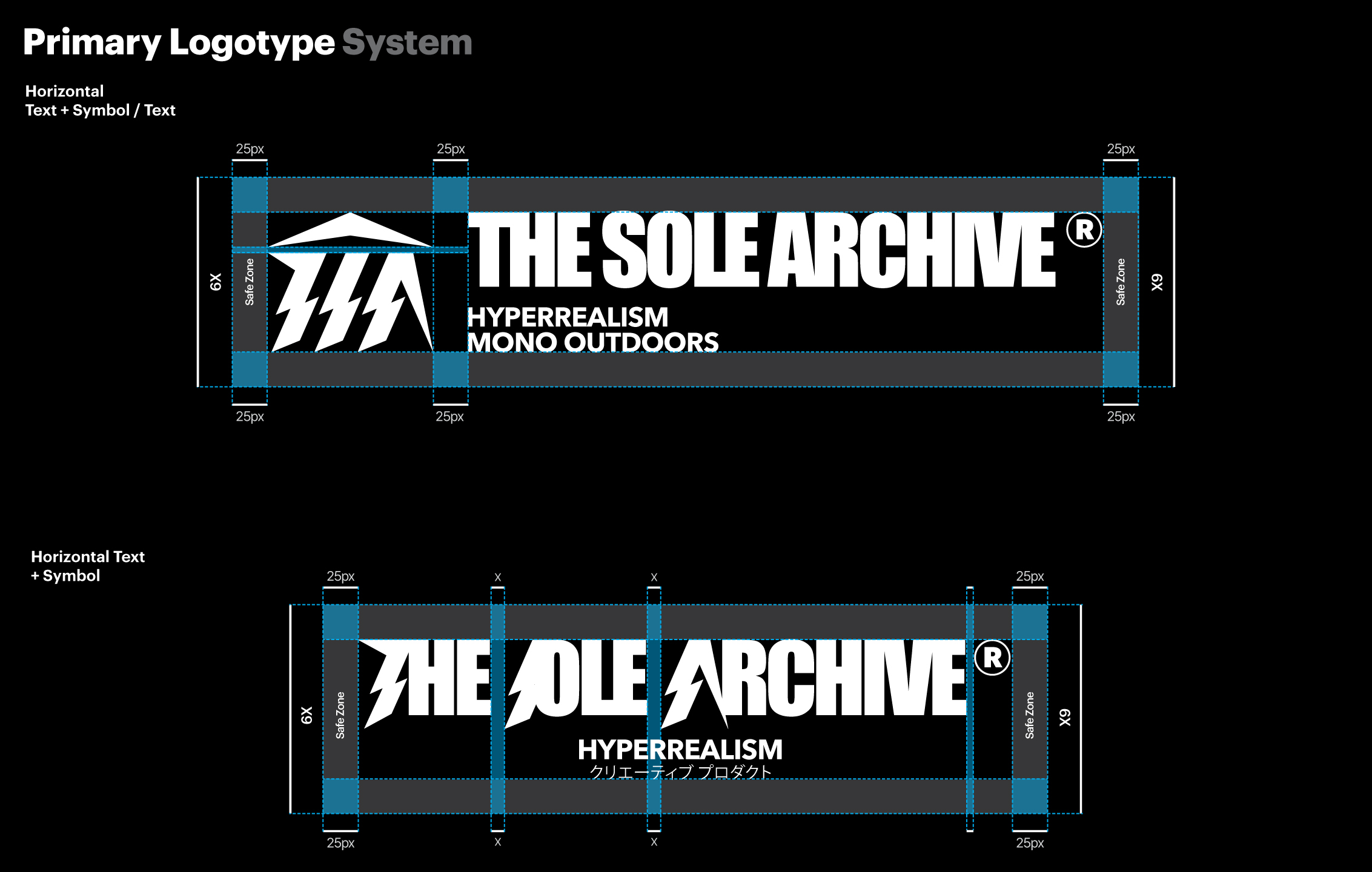
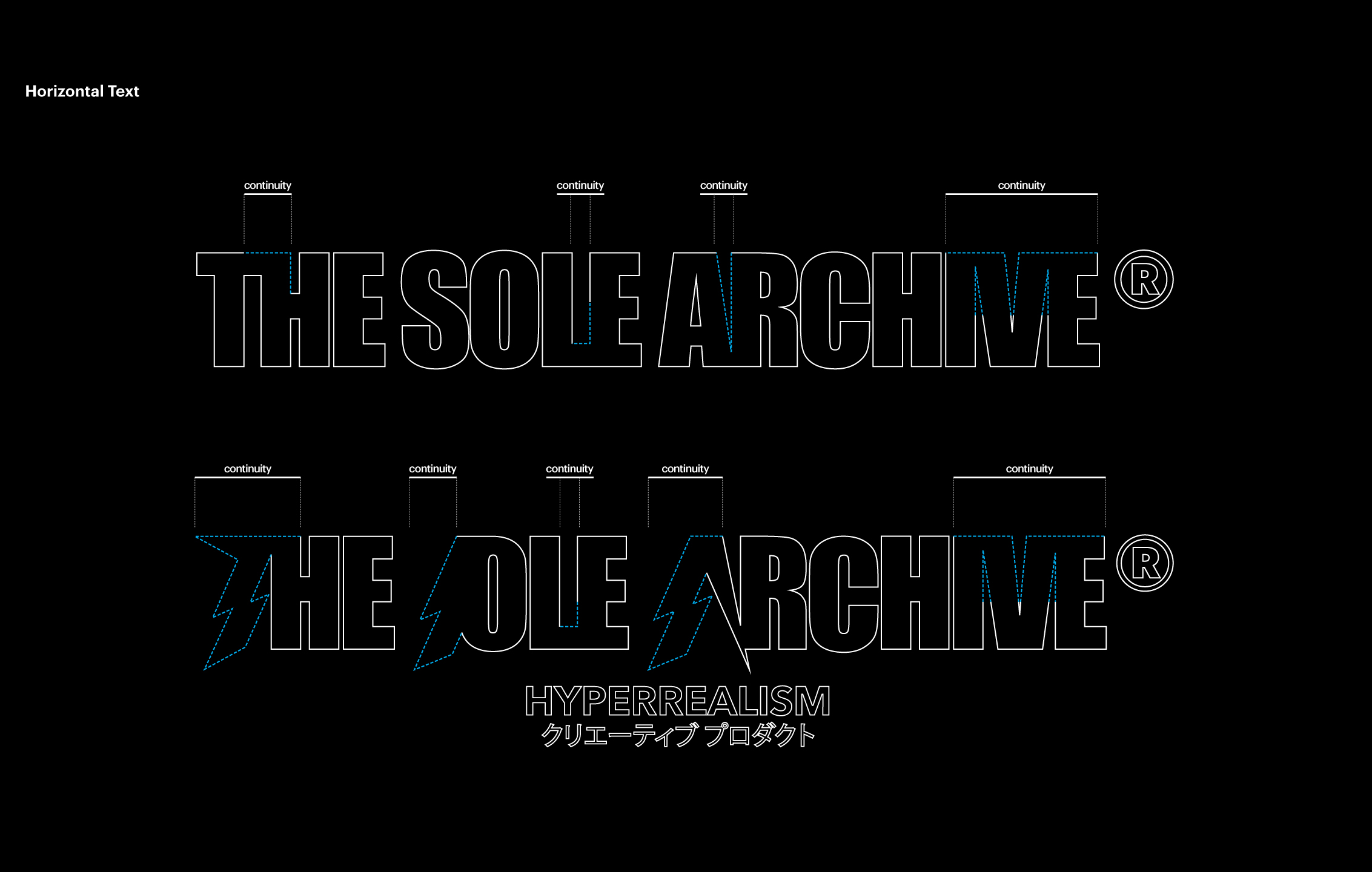
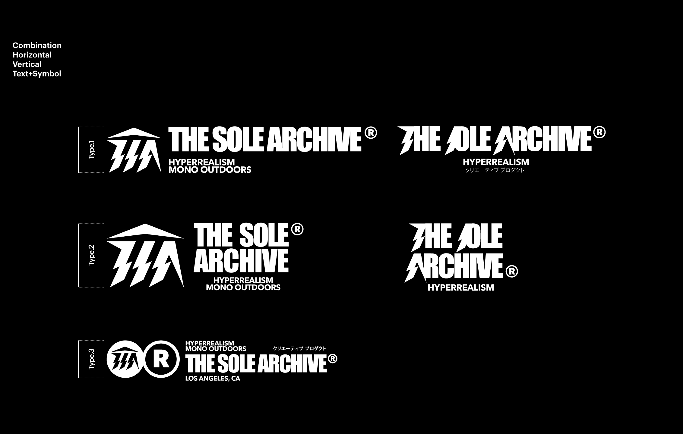
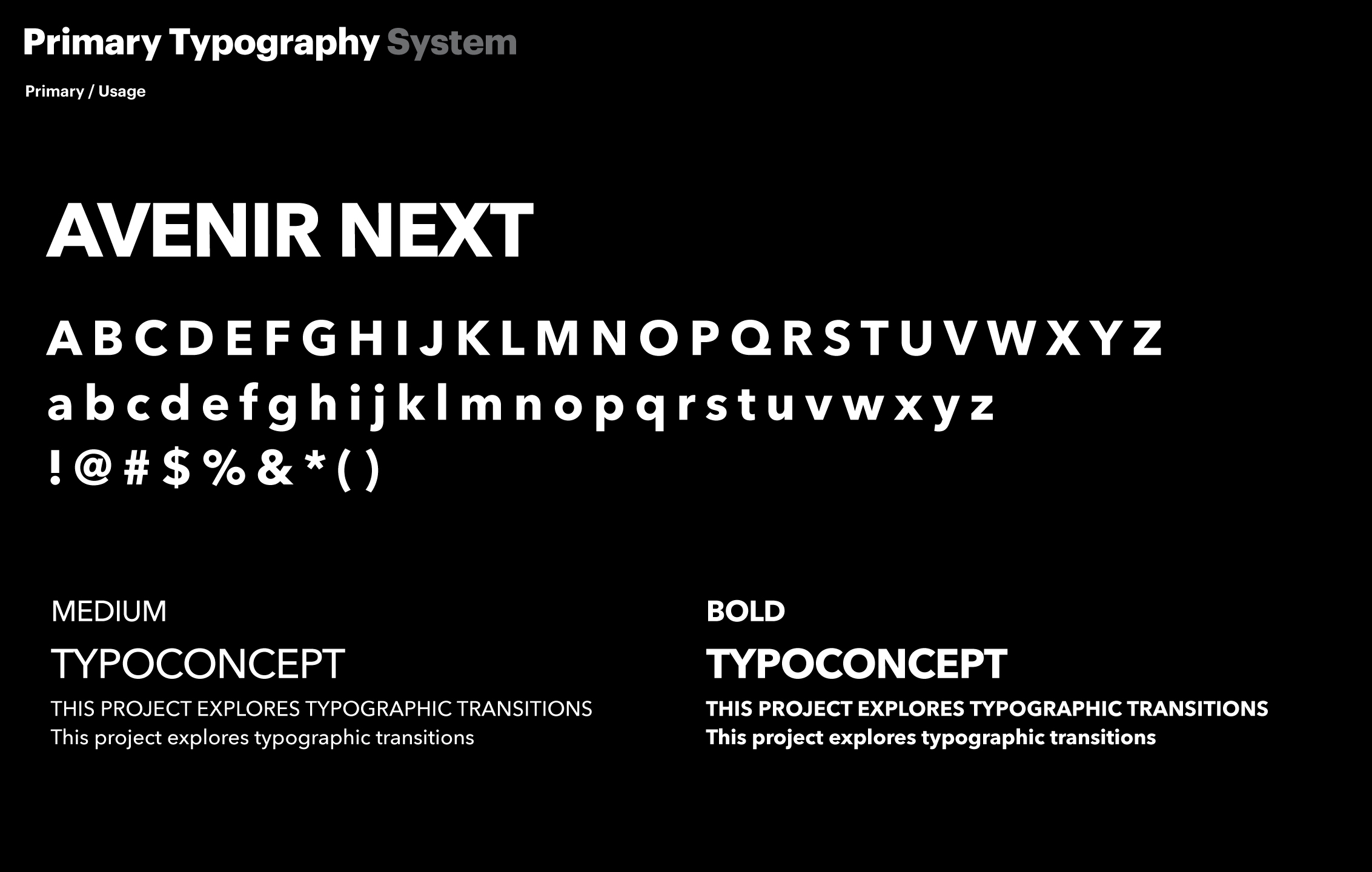
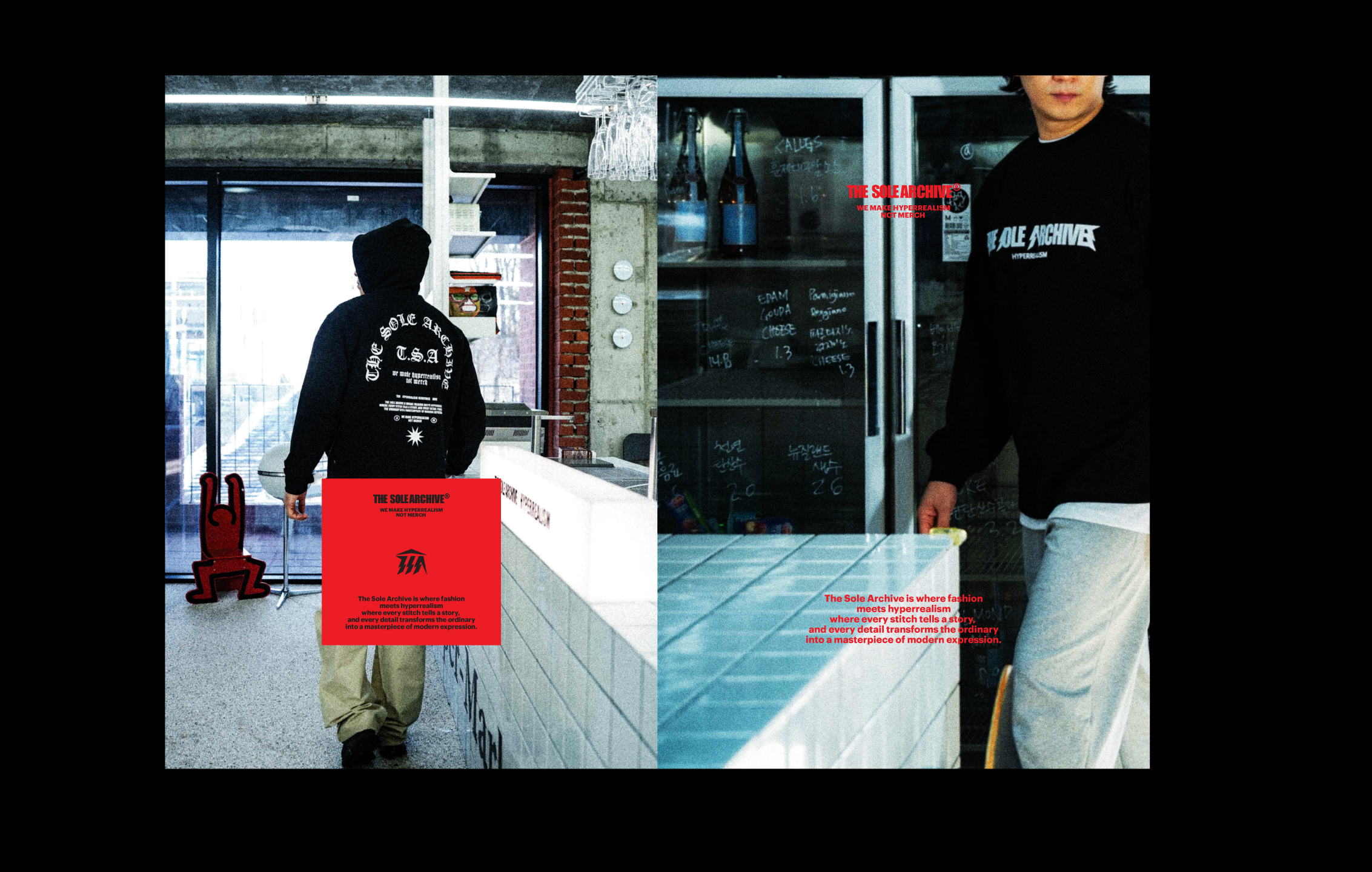
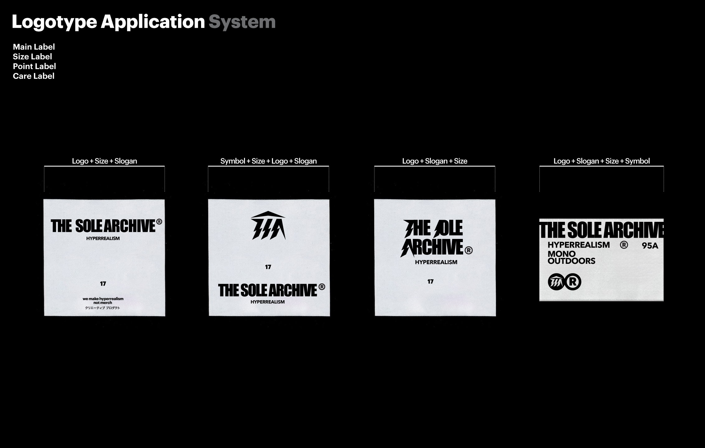
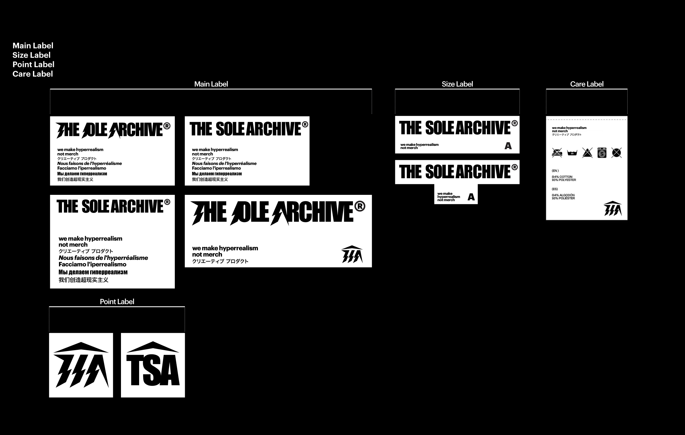
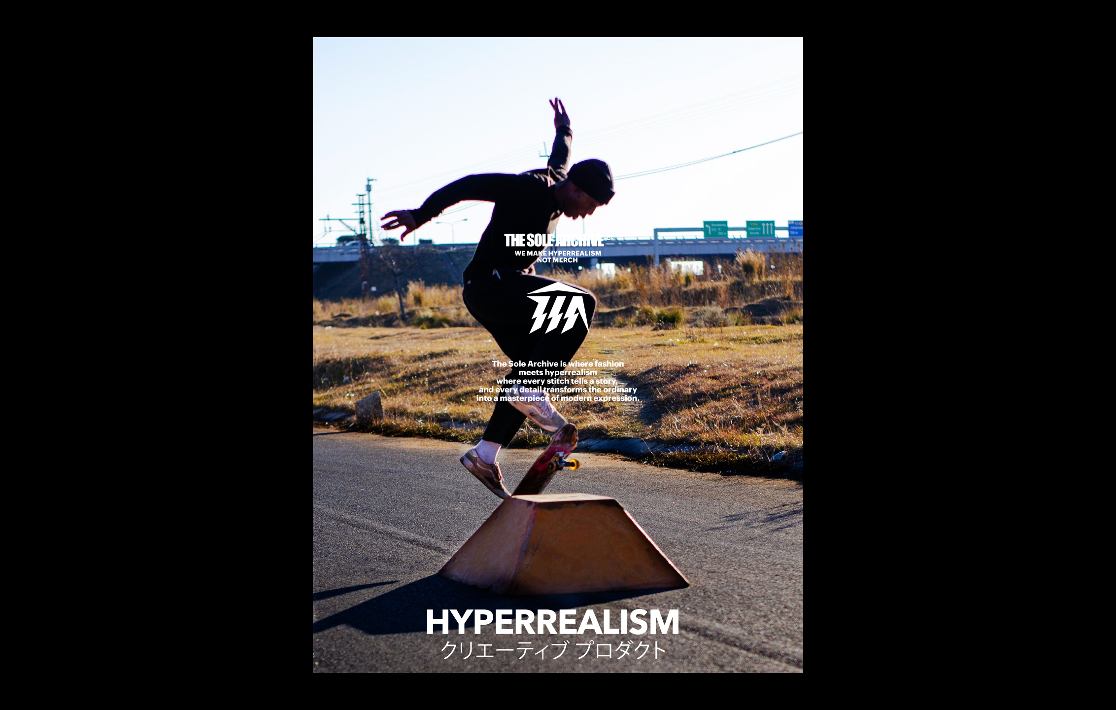
A logo born from Greek myth, shaped like lightning and temple. The Sole Archive channels street and extreme culture through minimalist outdoorwear.

Task

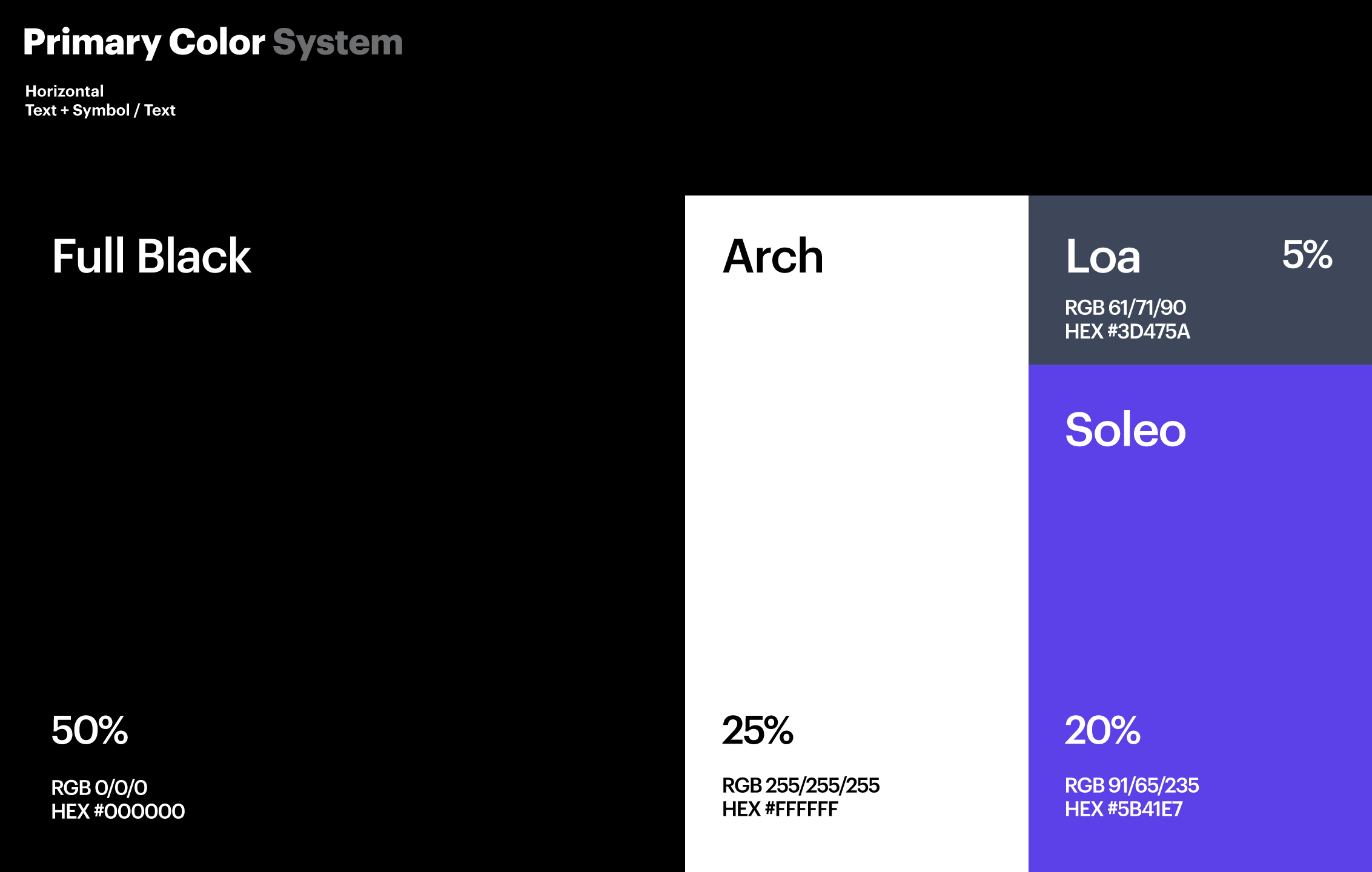
We developed a logo inspired by Greek mythology, combining the form of lightning and a temple to symbolize strength and singularity. This design was applied to The Sole Archive’s minimalist outdoorwear collection, capturing the energy of street and extreme culture through refined graphics.

01. Information - B.I

The Sole Archive reimagines street and extreme sports aesthetics through the lens of minimalist outdoorwear.
With a focus on refined structure and functional design, the brand unfolds under the slogans “Similar Hyperrealism” and “Mono Outdoor”.

At its core lies a singular idea: uniqueness.
The word SOLE represents not just “one and only,” but an elevated, near-divine state. Drawing on Greek mythology, this uniqueness takes the form of Zeus, a figure of absolute presence.
The brand builds upon this mythology, visualizing a temple not as a physical structure, but as a vessel of presence.

The logo centers around TSA, a monogram inspired by the shape of lightning, echoing mythological power.
Its rigid, angled geometry resembles the facade of a temple, a symbol of monumental stillness.
This emblem is not merely a mark, but an archive where the presence of a singular entity is preserved.

The Sole Archive(더솔아카이브)는 도심 속 스트릿 문화와 익스트림 스포츠에서 영감을 받아, 이를 미니멀한 아웃도어웨어로 재해석한 패션 브랜드입니다.
기능성과 구조의 정제된 디자인을 중심으로, 브랜드는 ‘시밀러 하이퍼리얼리즘(Similar Hyperrealism)’과 ‘모노 아웃도어(Mono Outdoor)’라는 슬로건 아래 전개됩니다.

브랜드의 핵심 키워드는 “유일함”입니다.
브랜드명 속 SOLE은 ‘단 하나’ 혹은 ‘신격화된 존재’를 의미하며, 이 상징은 곧 그리스 신화 속 제우스라는 형상으로 치환됩니다.
우리는 이 신화를 브랜드의 철학적 기반으로 삼았고, 신전(Temple)이라는 구조를 통해 ‘존재의 절대성’을 시각화했습니다.

로고는 TSA라는 심볼을 중심으로 구성되며, 이는 신화 속 번개에서 착안된 형태로 디자인되었습니다.
구조적이고 각진 형태의 조합은 마치 신전의 입면(Façade)을 연상케 하며,
이는 단지 로고 이상의 의미,한 명의 신이 머무는 장소이자, 기록이 보존되는 아카이브로 기능합니다.

The logo centers around TSA, a monogram inspired by the shape of lightning, echoing mythological power.
Its rigid, angled geometry resembles the facade of a temple, a symbol of monumental stillness.
This emblem is not merely a mark, but an archive where the presence of a singular entity is preserved.

로고는 TSA라는 심볼을 중심으로 구성되며, 이는 신화 속 번개에서 착안된 형태로 디자인되었습니다.
구조적이고 각진 형태의 조합은 마치 신전의 입면(Façade)을 연상케 하며,
이는 단지 로고 이상의 의미,한 명의 신이 머무는 장소이자, 기록이 보존되는 아카이브로 기능합니다.

02.Infomation - Application

The placement and combination of TSA labels and graphics were carefully organized as part of the brand’s application system.
Every label was positioned with attention to mobility, ensuring it never interferes with how the product is worn or used.
The graphic elements were designed to clearly express the brand’s identity, with thoughtful detail in both form and placement.

TSA의 라벨과 그래픽 요소들은 다양한 위치와 조합으로 정리되었으며,
우리는 이를 Application으로 체계화했다.
라벨의 위치는 사용자의 기동성을 방해하지 않도록 여러 요소를 고려해 설계했으며,
그래픽은 브랜드의 정체성을 직관적으로 전달할 수 있도록 세심하게 작업하였다.

03.Infomation - Work Order

Let's get in touch,
we respond fast.

Ready to work together?
Back