Design office isn’t just a workspace

An accessory design office shaped by color, material, and light.
A space where creativity and trust come together.

Task

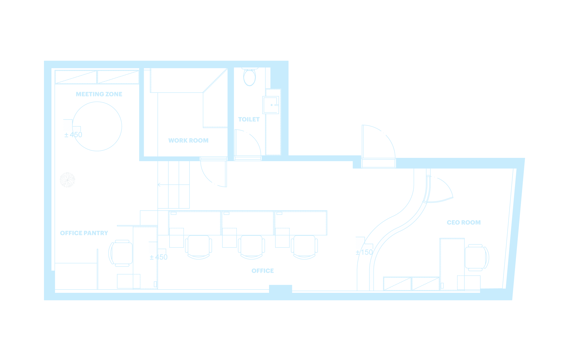
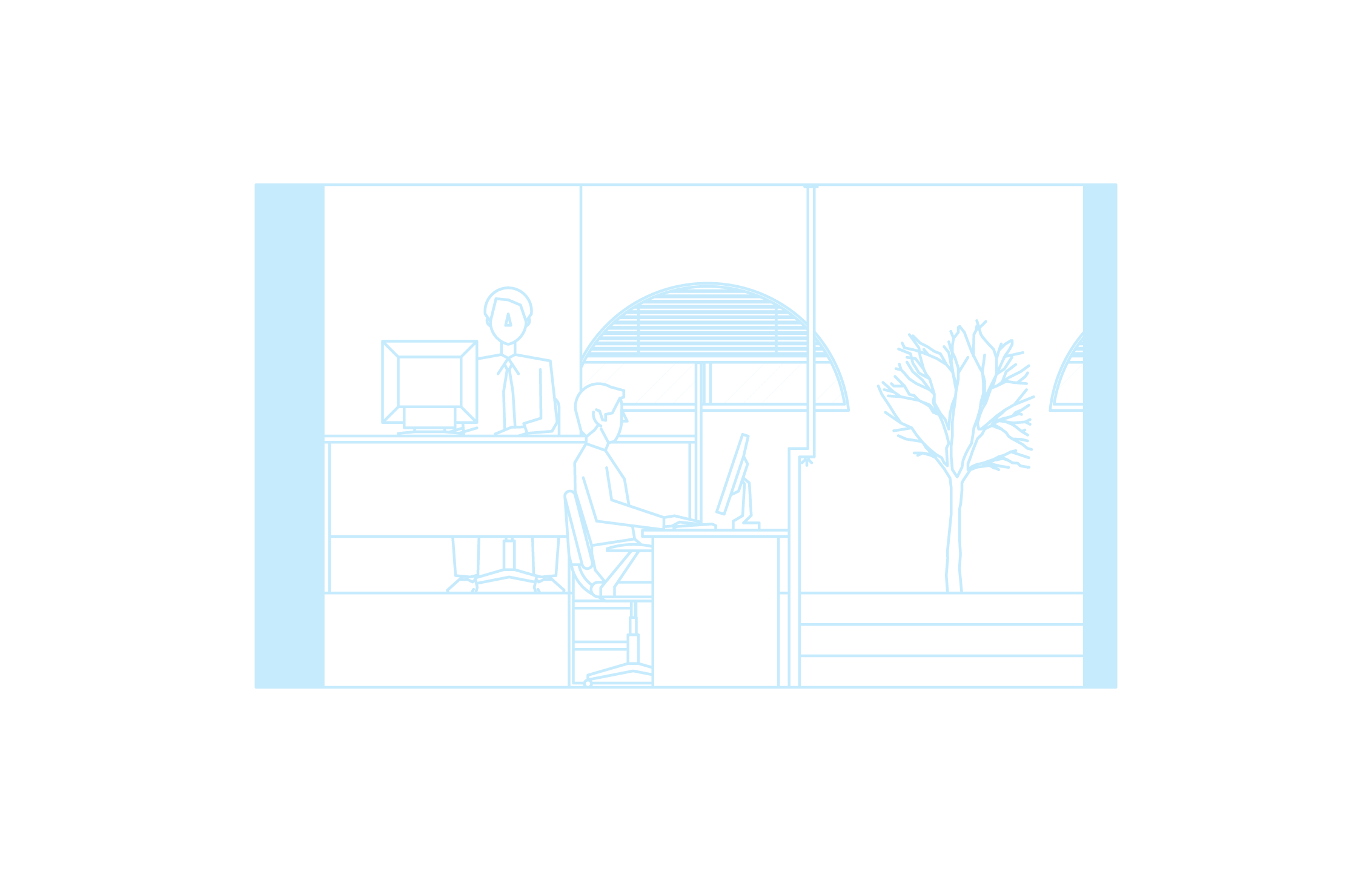
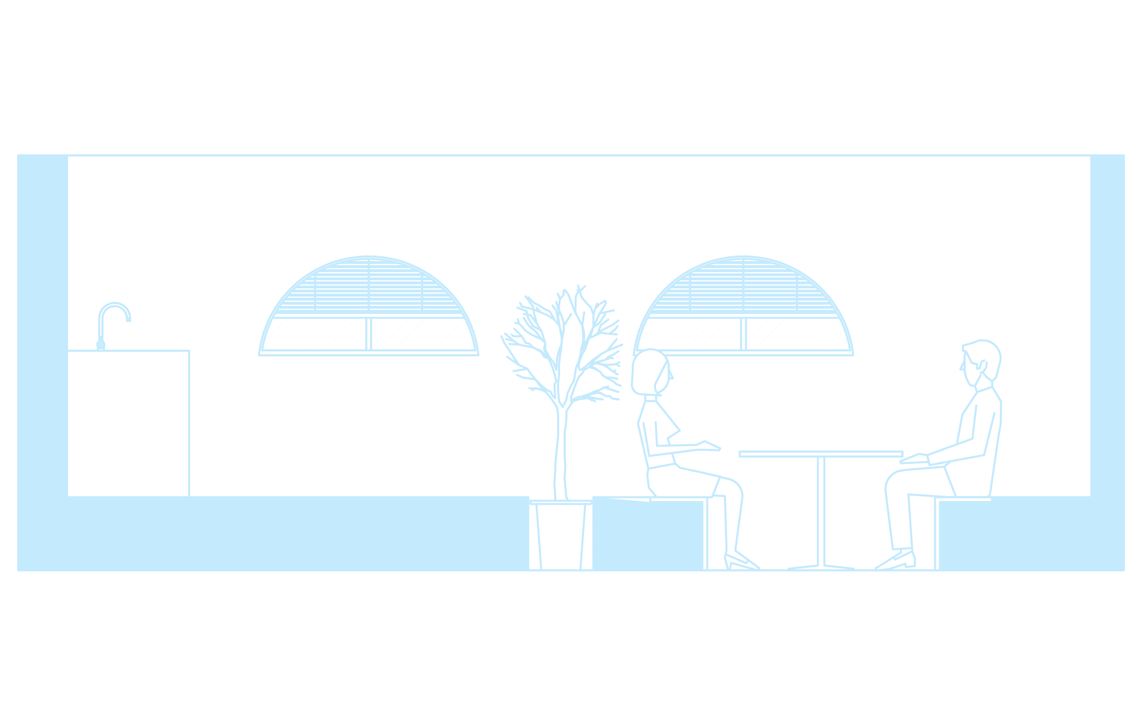
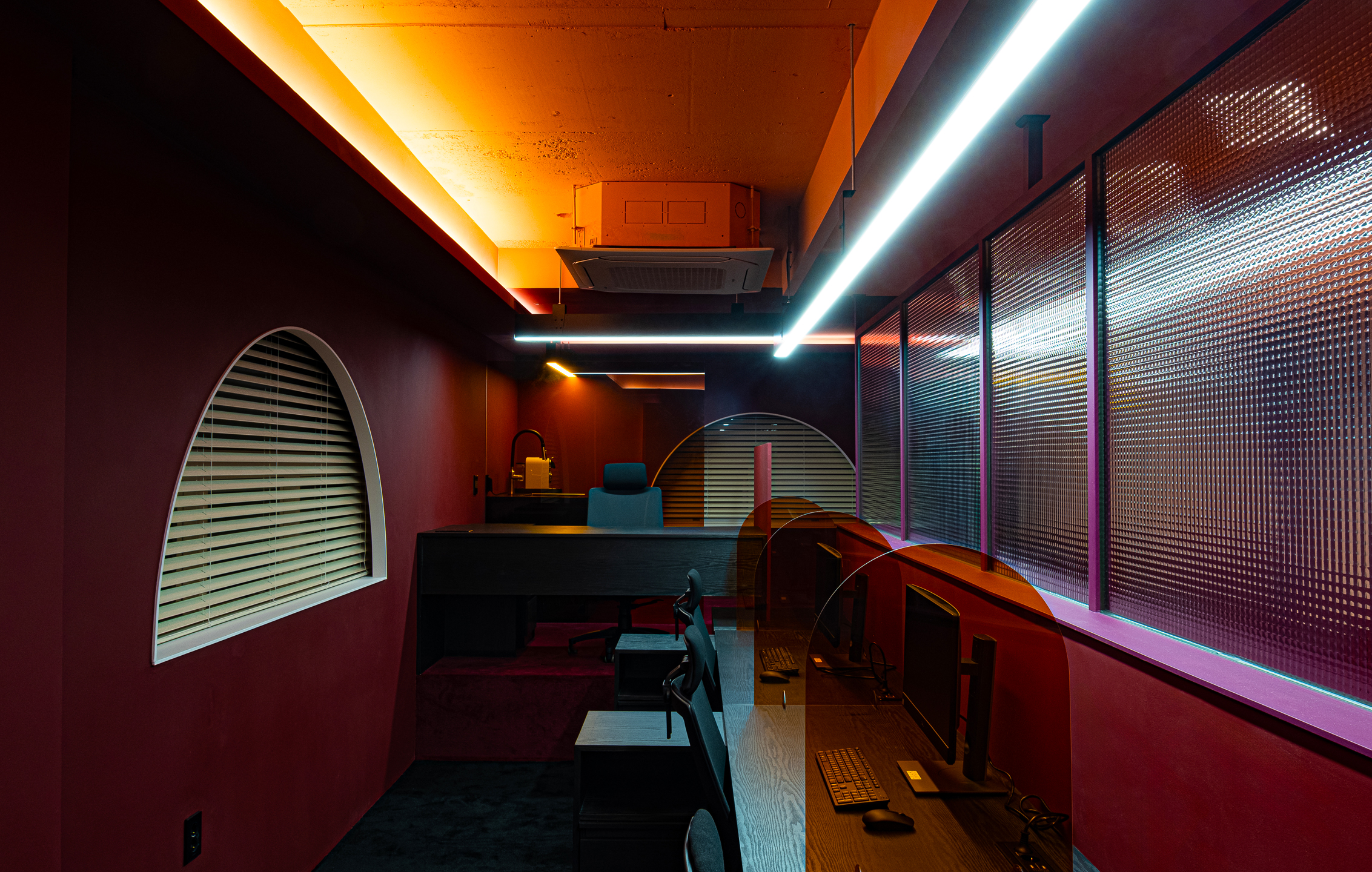
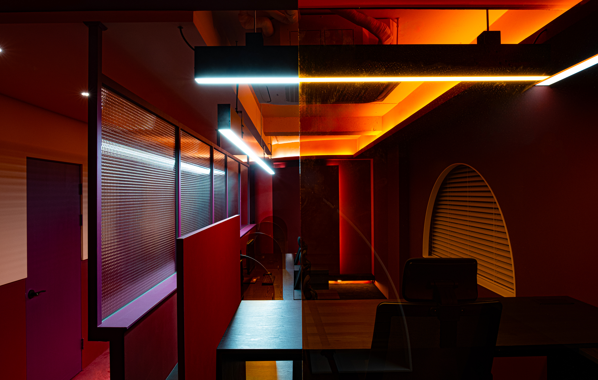
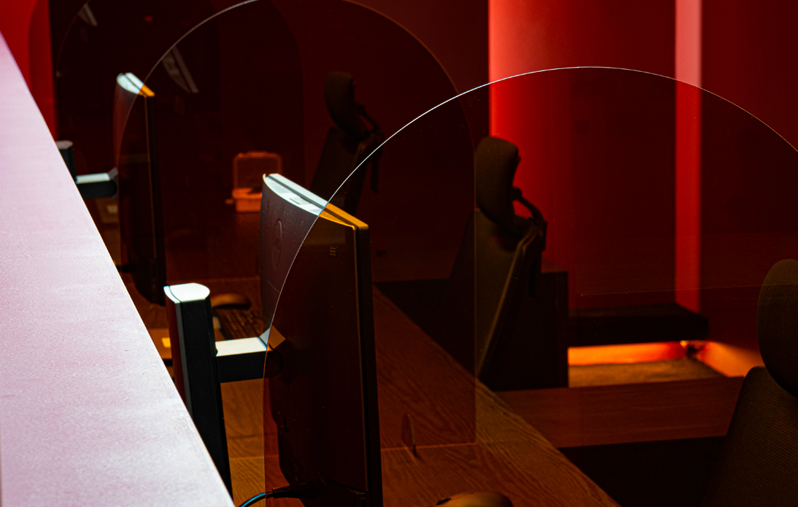
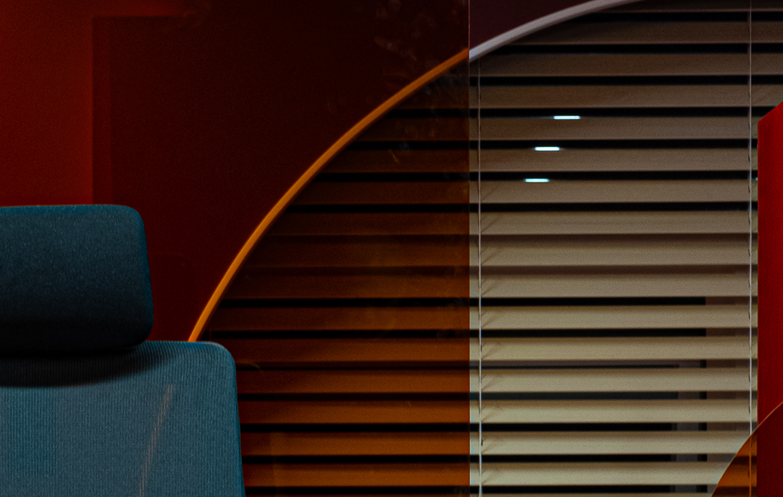
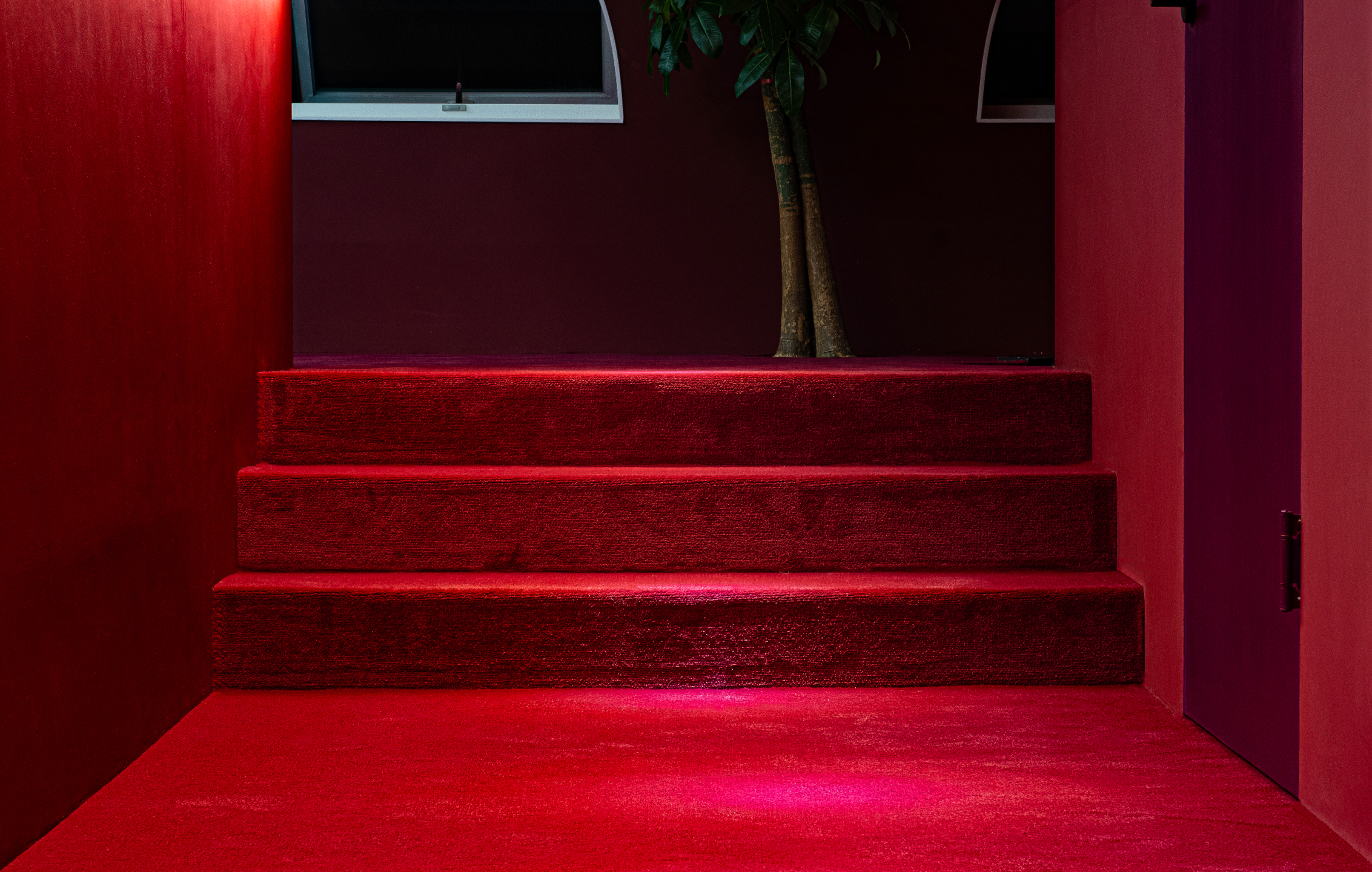
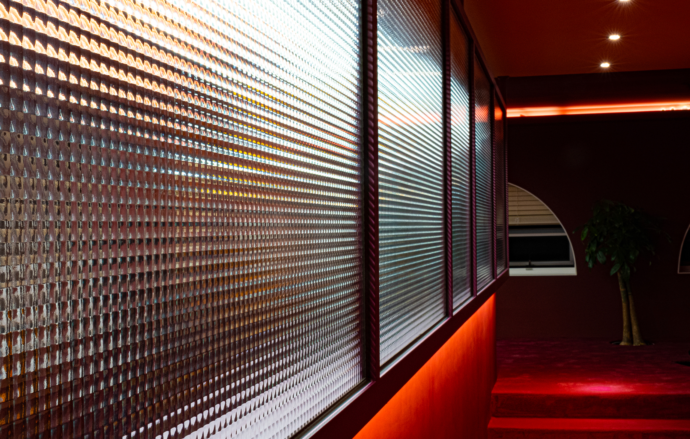
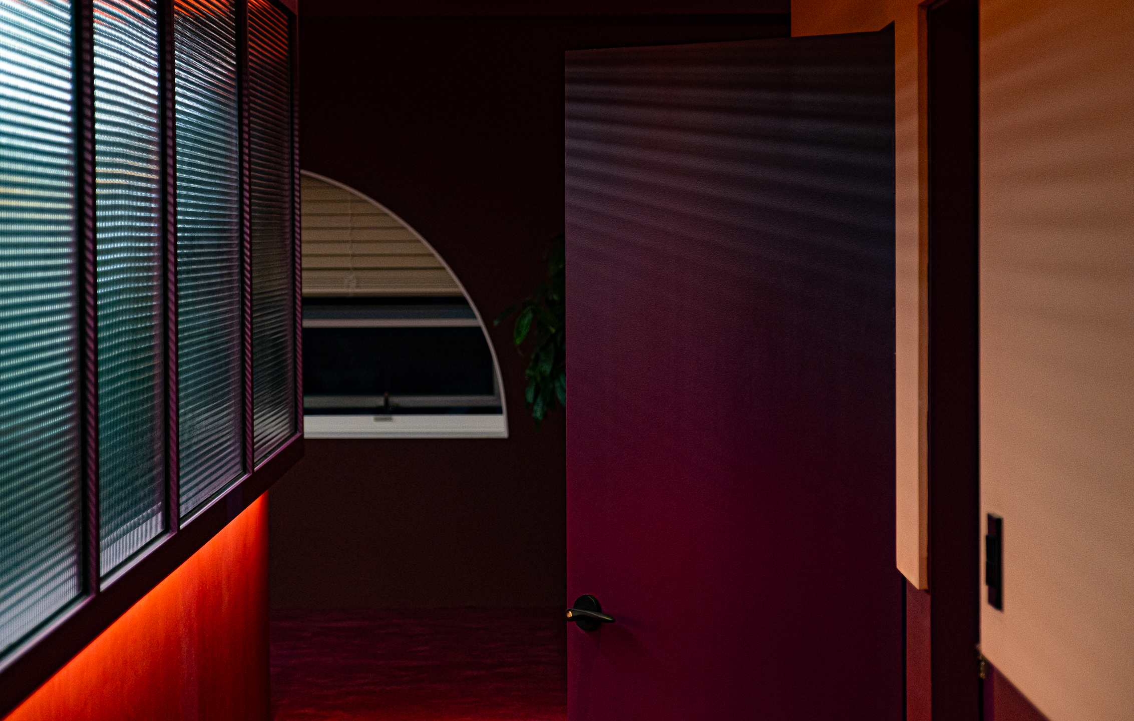
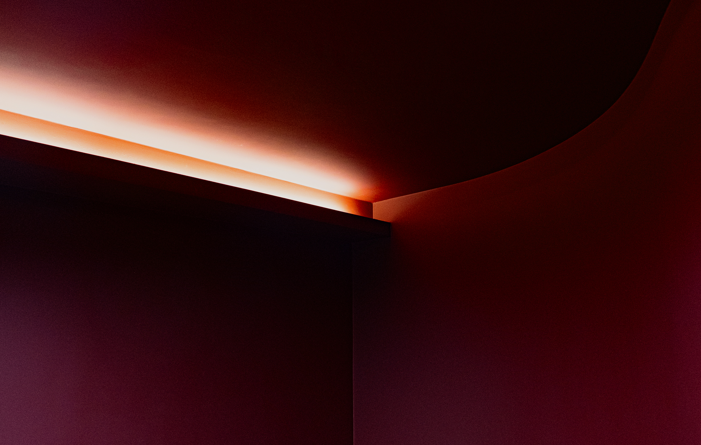
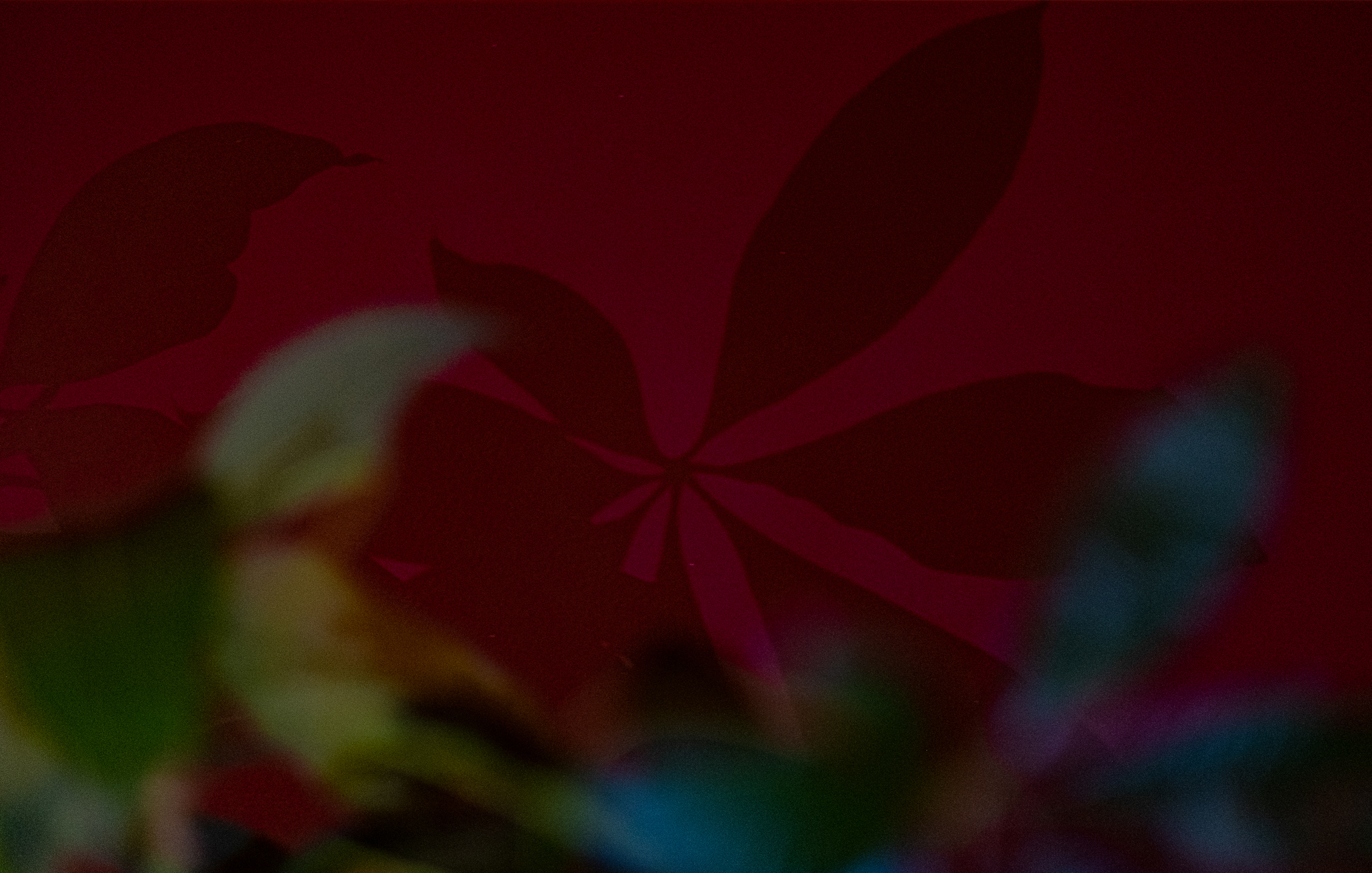
The spatial structure and flow were planned to reflect the accessory design office’s philosophy and creative process, with color, material, and lighting designed in harmony to define the mood and rhythm of each area. Unnecessary decoration was removed, plants were placed thoughtfully to ease fatigue and encourage flexible thinking, and the interaction of light and contrast was carefully considered to create a comfortable visual environment.

01. Purpose Beyond Function: A Space for Creativity and Trust

The KOO accessory design office was designed as more than just a workspace.
It is where ideas take form, creativity flourishes, and brand vision comes to life.
Located in the heart of Jongno, Seoul, the office was planned to inspire designers and provide clarity and trust to clients.
Clear zones for focused work, brand discussions, and relaxation were established to enhance both efficiency and creative energy.

KOO 액세서리 디자인 사무실은 단순한 작업 공간을 넘어, 아이디어가 구체화되고 브랜드의 비전이 살아나는 공간으로 설계되었다.
서울 종로 중심에 자리한 이 사무실은 디자이너에게는 영감을, 방문하는 클라이언트에게는 신뢰와 명확성을 전달하는 장소가 되도록 기획되었다.
이를 위해 집중 업무, 브랜드 토론, 휴식을 위한 구역을 명확히 나누고, 각 공간이 효율성과 창작 에너지를 극대화하도록 구조를 구성하였다.

02. Shaping Atmosphere with Color, Material, and Light

The atmosphere of the office was shaped through thoughtful use of color, material, and lighting.
Black carpeting and burgundy tones subtly distinguished the work areas from corridors without physical barriers,
while black and navy were used on floors and desks to provide a sense of stability.
The overall color identity was anchored by deep burgundy accents.

Lighting was curated not only to illuminate the space but also to add depth and define zones.
Rather than creating stark brightness, the lighting established a warm, immersive atmosphere that remains inviting even during long hours of work.
Unnecessary ornamentation was minimized, with greenery placed throughout to reduce fatigue and encourage fluid thinking.
Every material was carefully chosen for its interaction with light and contrast, ensuring an environment free from visual strain.

사무실의 분위기는 색상, 소재, 조명을 중심으로 완성되었다.
작업 공간과 복도는 검은색 카펫과 부르고뉴 컬러로 물리적 장벽 없이 시각적 구분을 주었고,
바닥과 가구에는 검은색과 네이비 톤을 사용해 안정감을 더했다.
전체 색채 아이덴티티는 깊은 부르고뉴 컬러로 통일감을 주었다.

조명은 단순히 공간을 밝히는 것을 넘어 깊이와 구역의 성격을 드러내도록 계획되었다.
선명한 밝기 대신, 장시간 머물러도 편안하고 따뜻한 몰입감을 주는 분위기로 연출되었다.
불필요한 장식은 최소화하고, 공간 곳곳에 식물을 배치해 피로도를 낮추고 사고의 유연함을 유도하였다.
모든 소재와 마감은 빛과 대비의 상호작용을 고려해 시각적 부담을 줄이는 환경을 만들기 위해 신중히 선택되었다.

Let's get in touch,
we respond fast.

Ready to work together?
Back