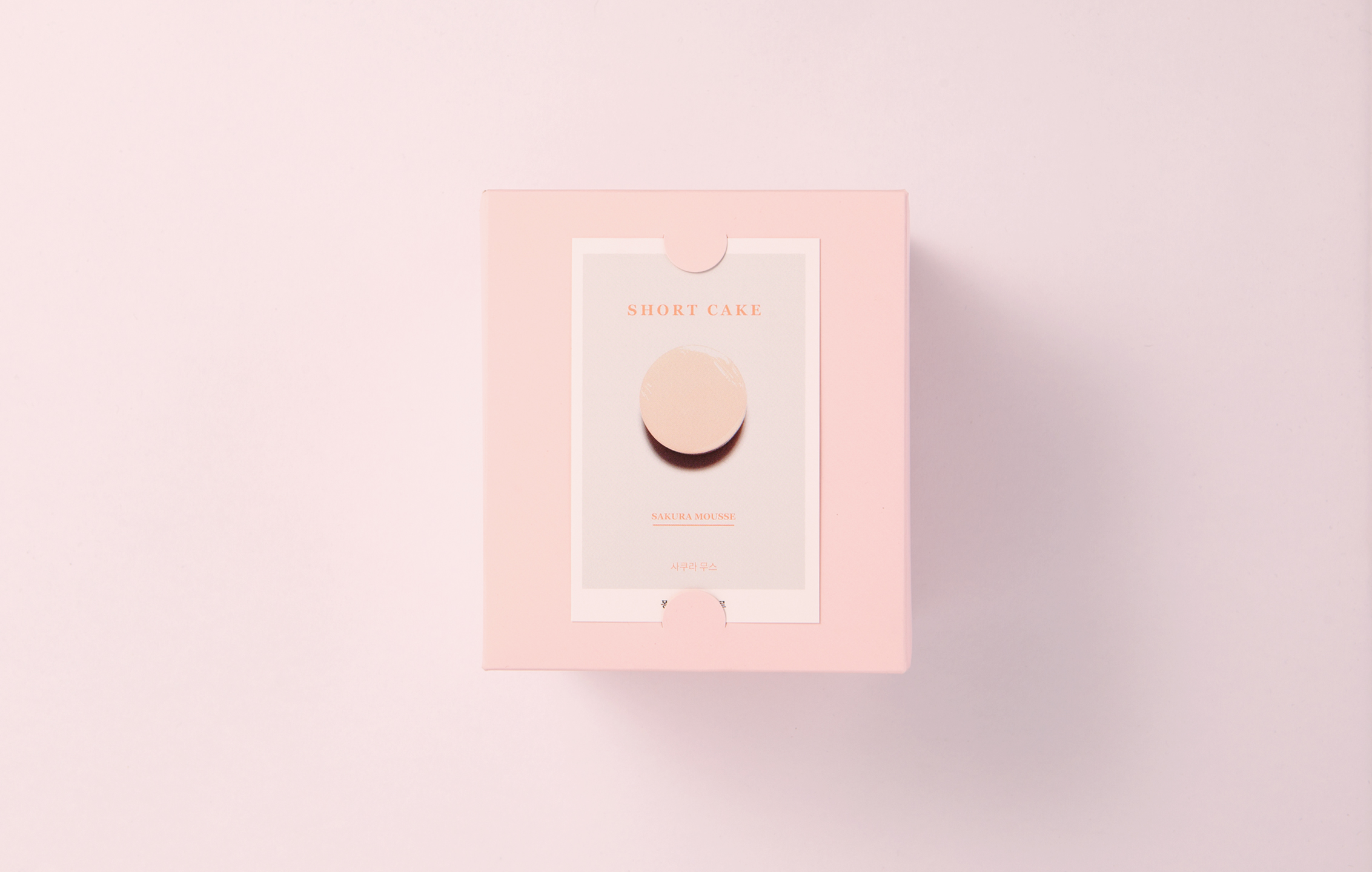
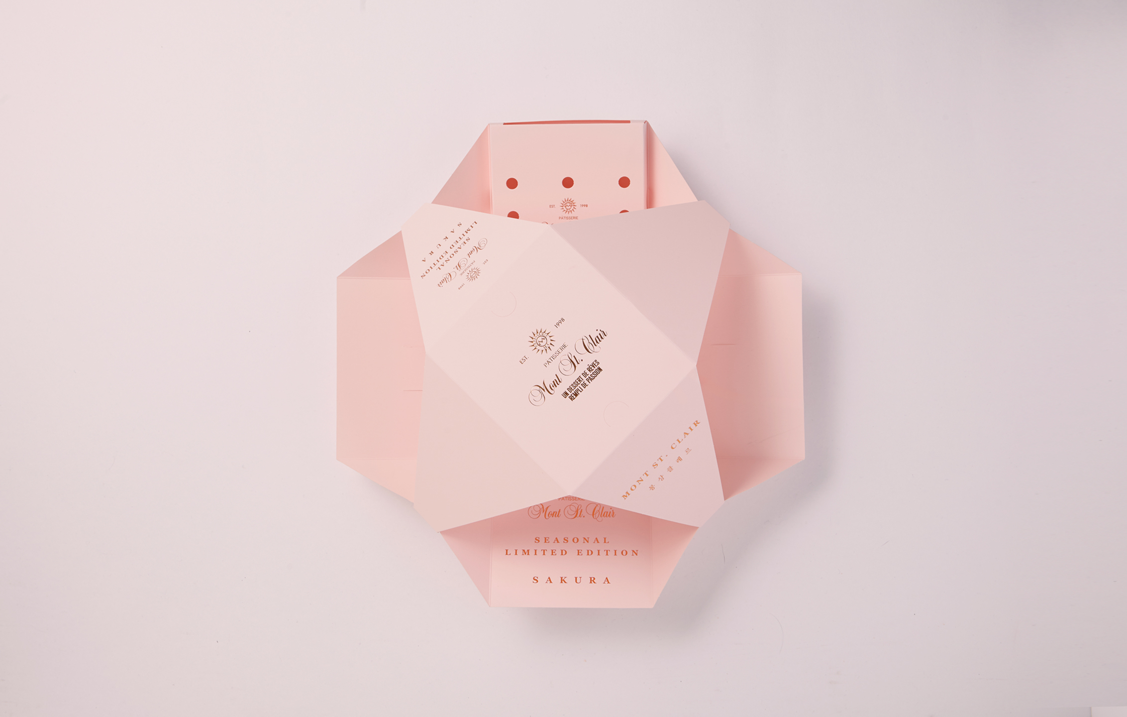
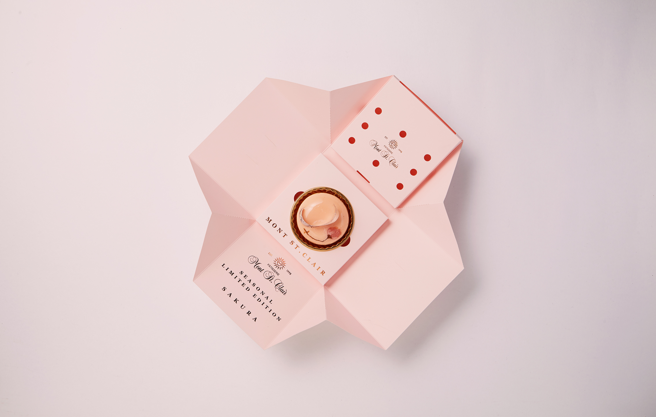
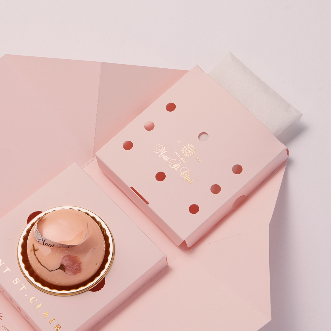
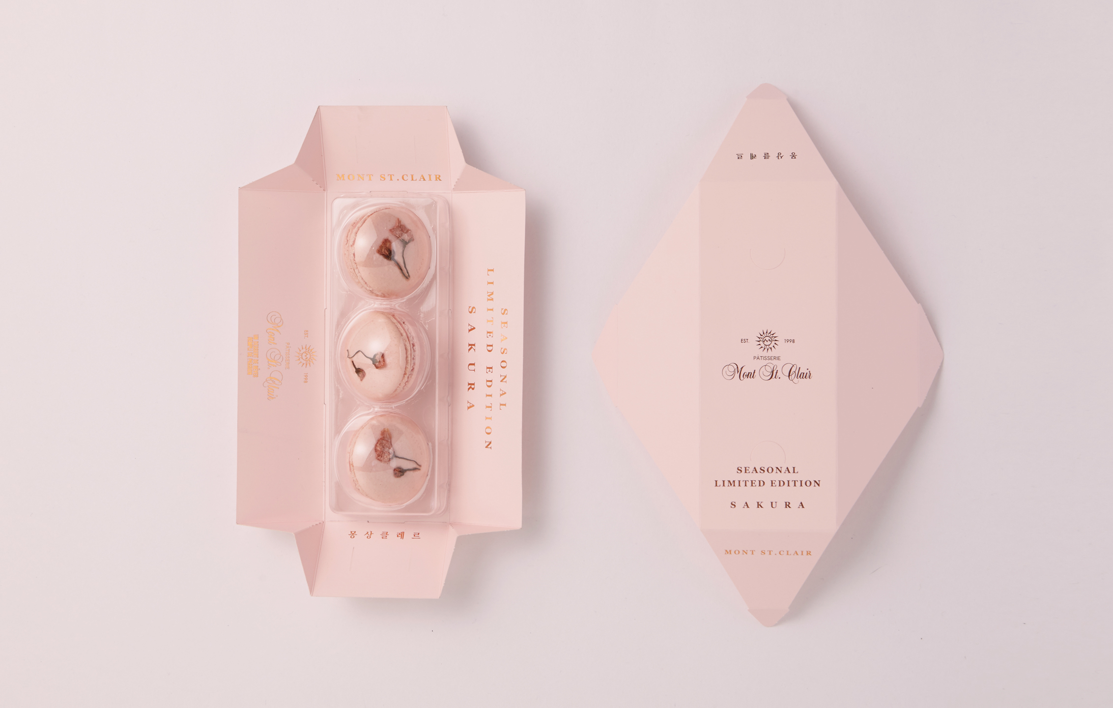
SAKURA – Seasonal Limited Edition Dessert Branding

Mont St. Clair’s Sakura Edition blends tradition with a refined sense of seasonality. Origami-inspired packaging and gentle tones capture spring in its most poetic form.

Task

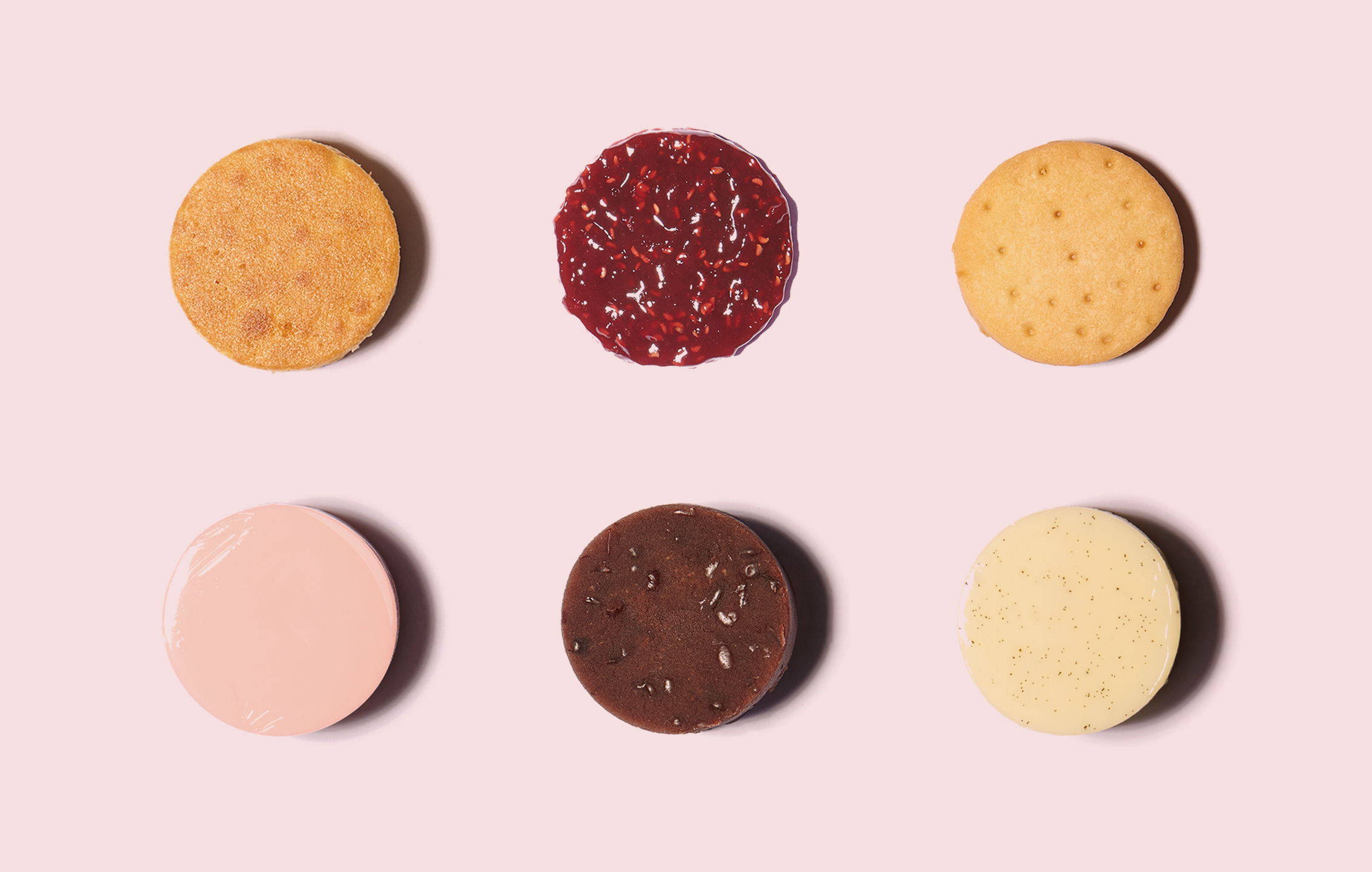
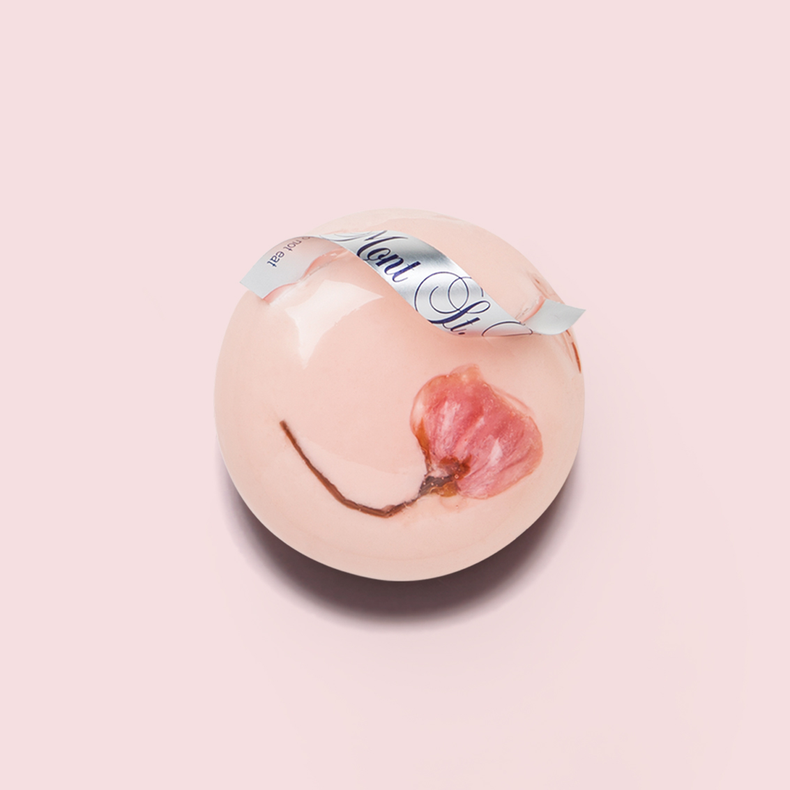
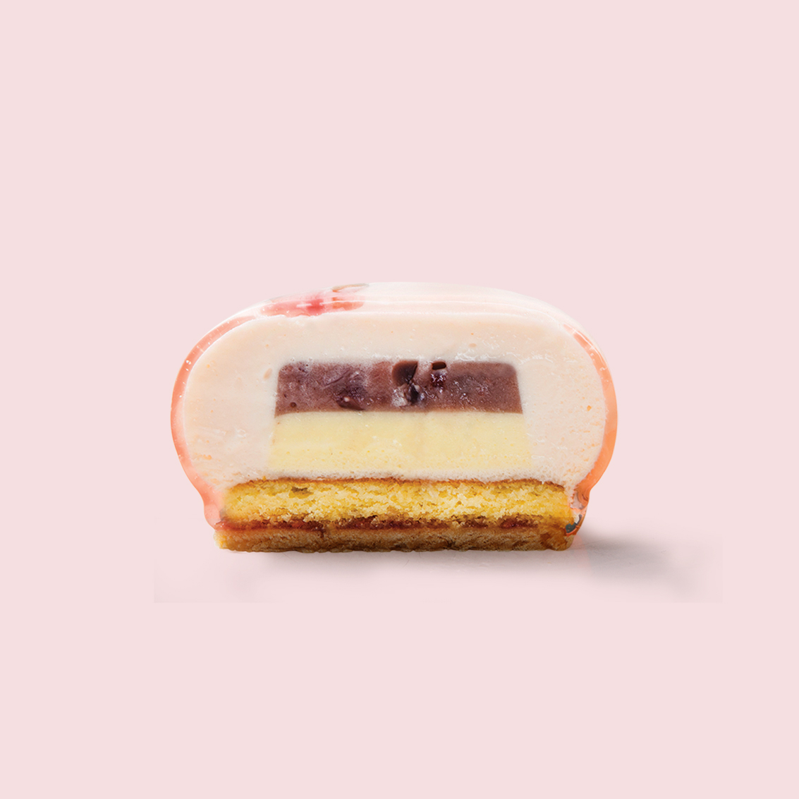
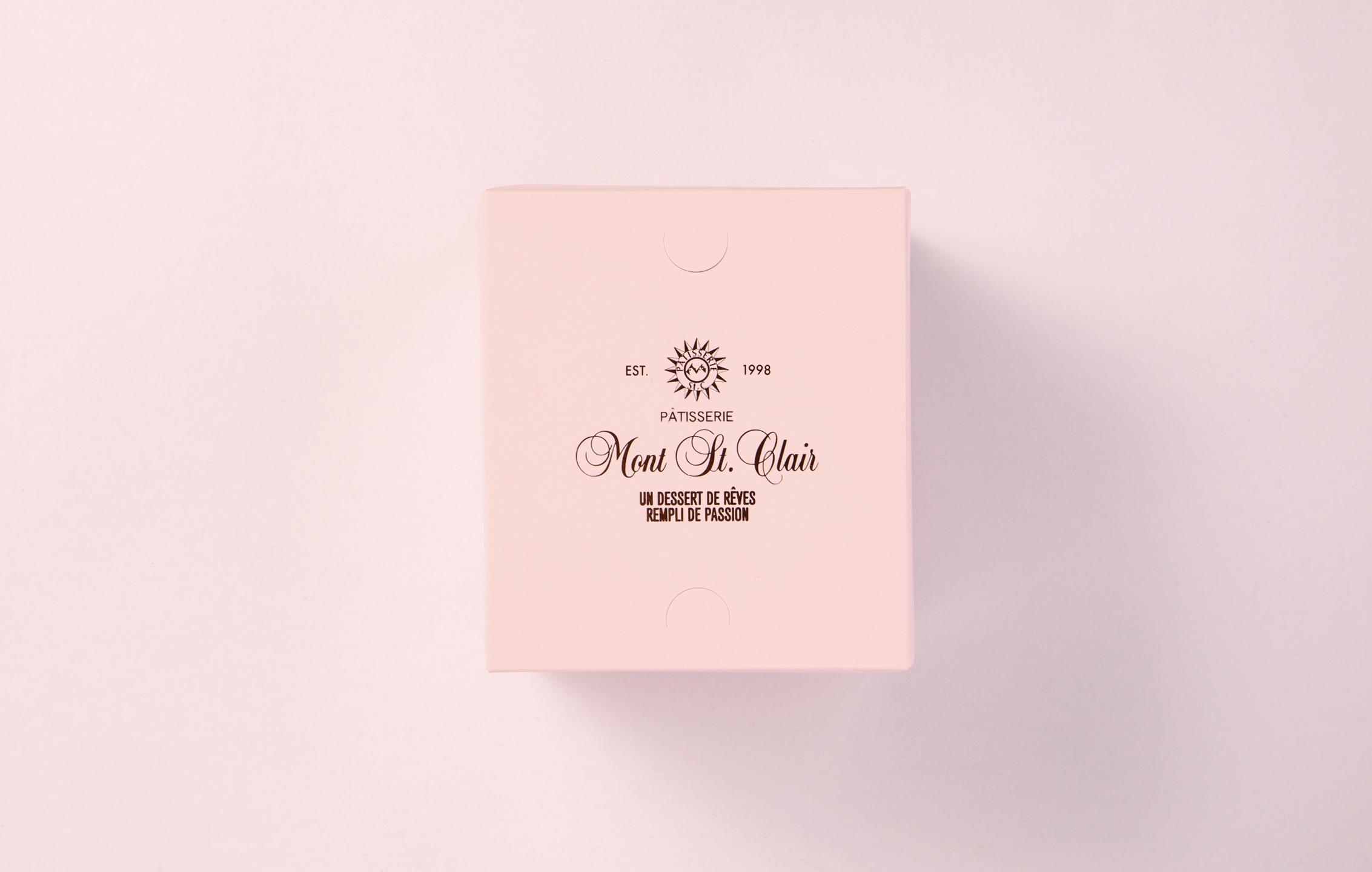
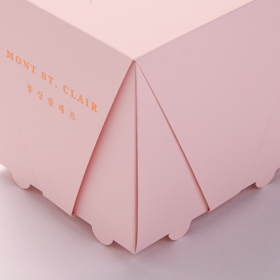
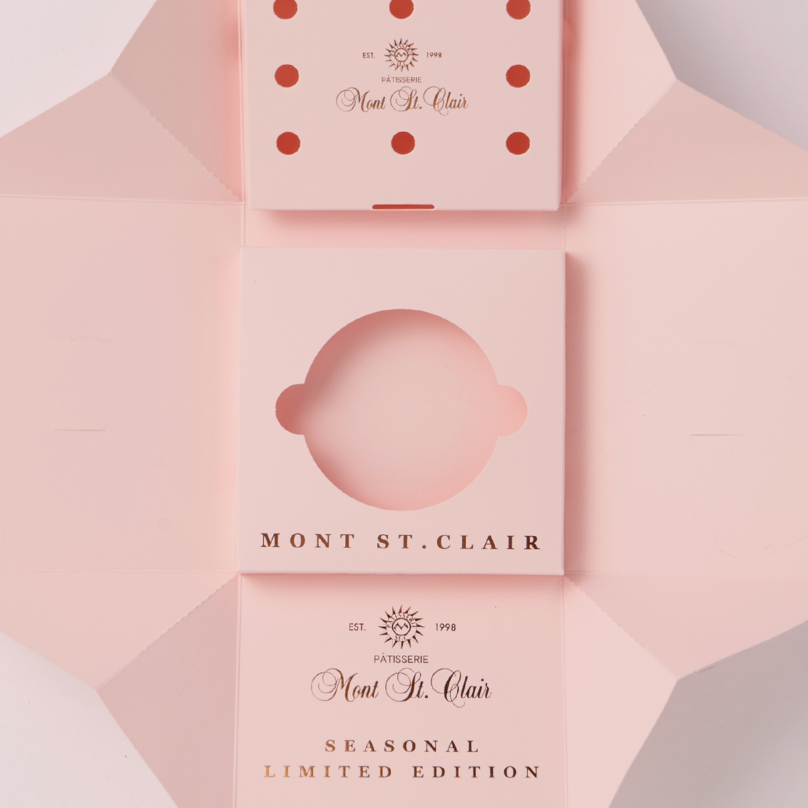
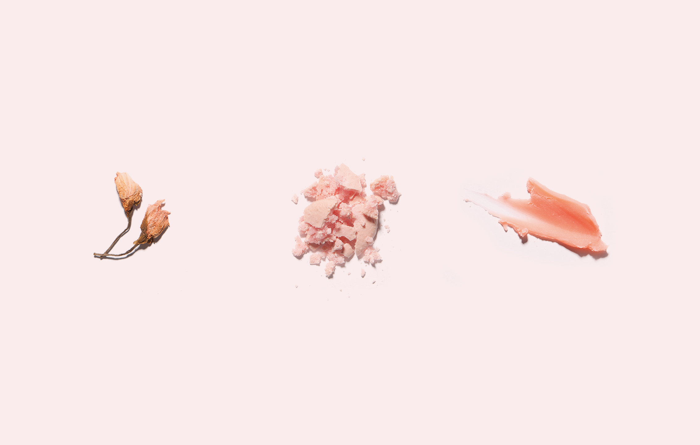
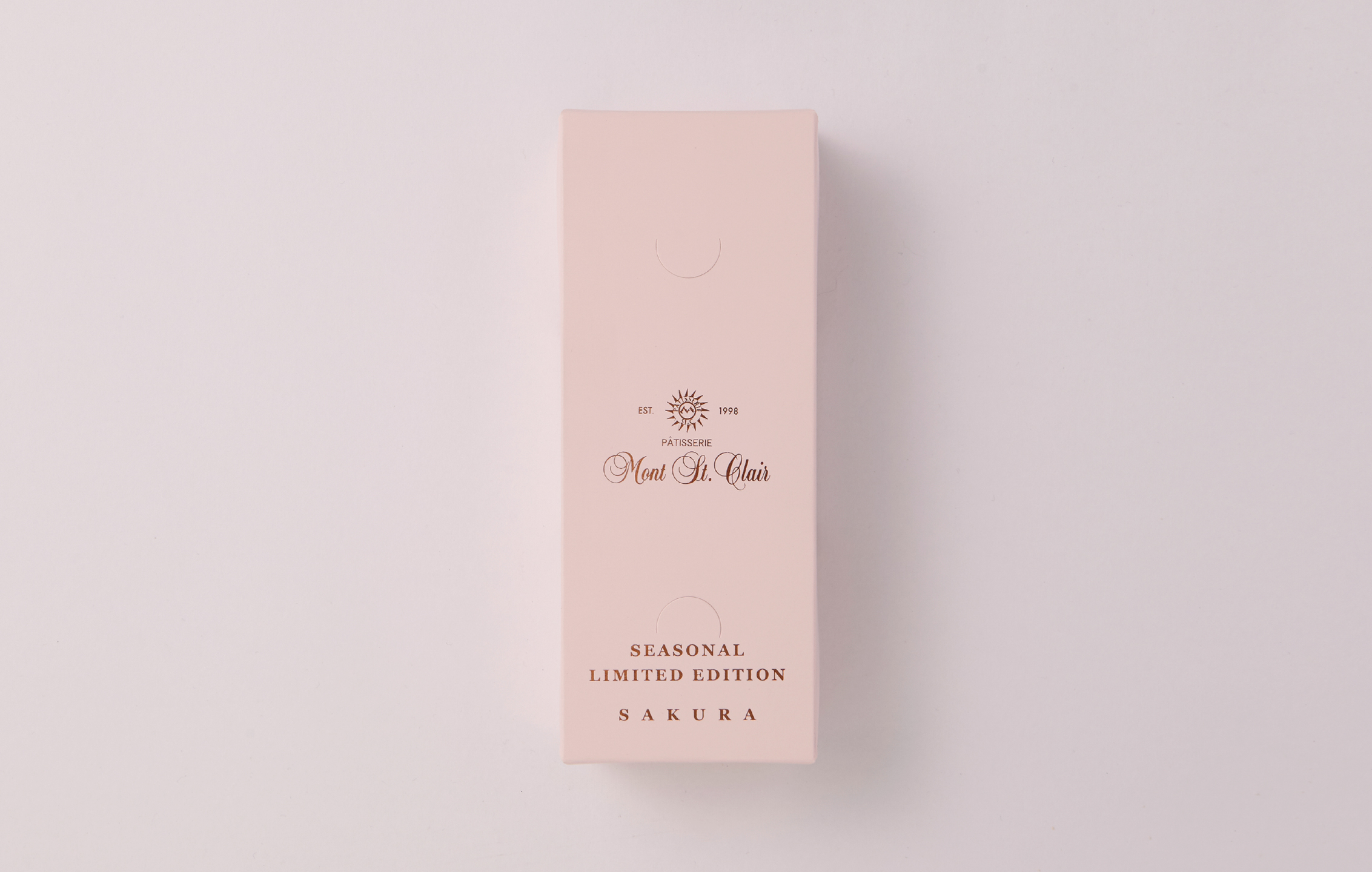
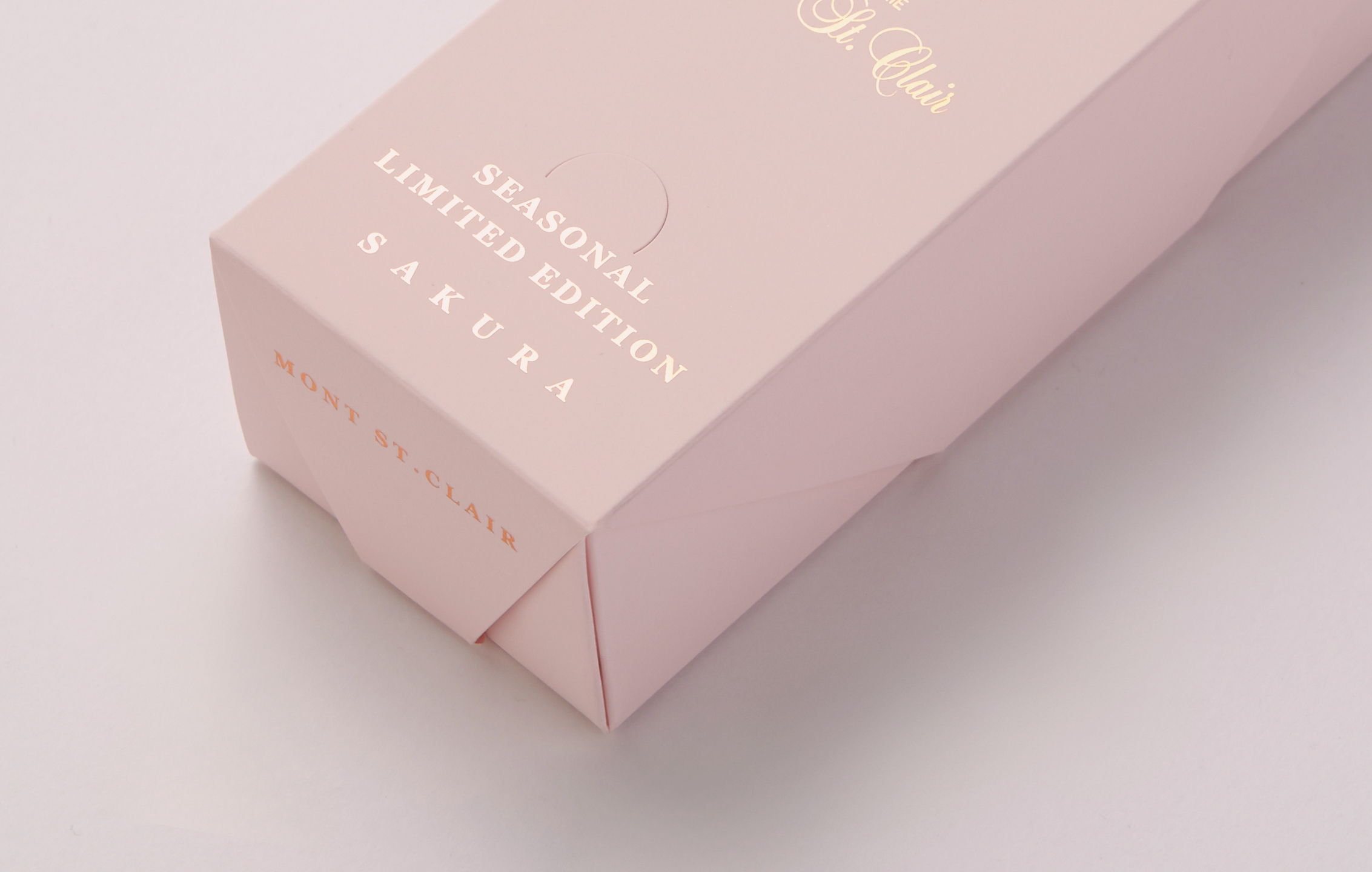
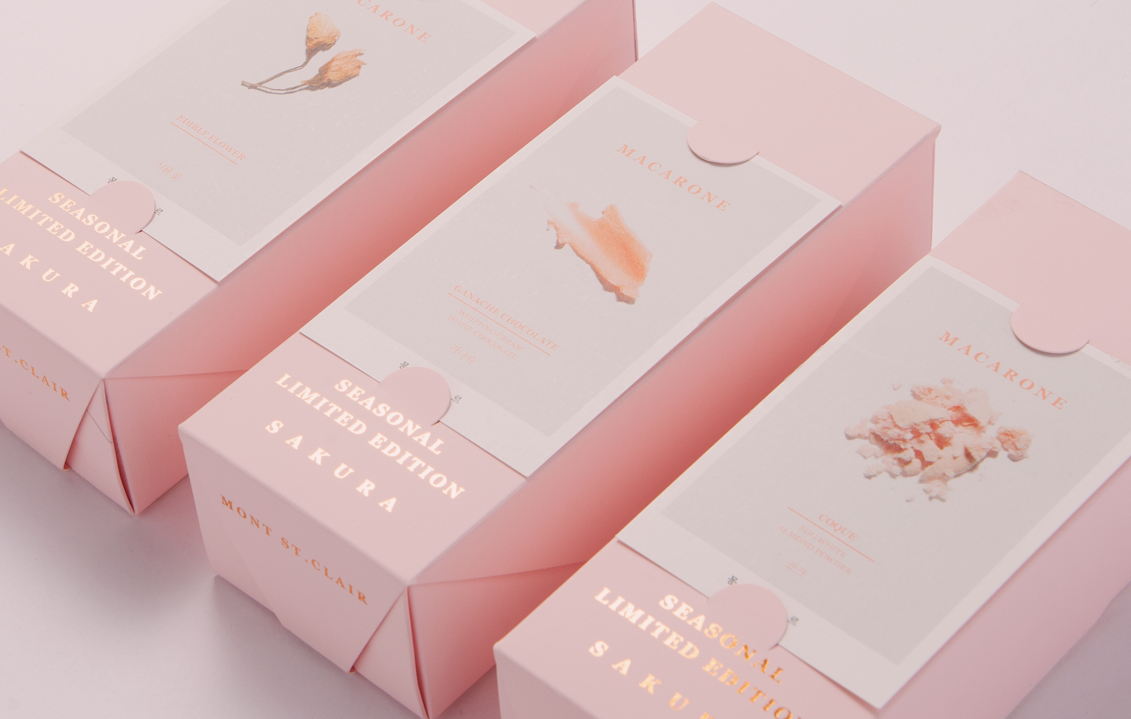
We began by reinterpreting Mont St. Clair’s Sakura tradition while preserving its familiar seasonal elegance. Our visual direction was rooted in the atmosphere of spring and cultural references to Japanese aesthetics. We designed an adhesive-free origami-style package that emphasized both structural integrity and environmental responsibility. The folded form and paper texture became central elements, while gold foil detailing added visual depth. We improved the internal structure to allow cakes and ice packs to be stored together for better usability. In the poster visuals, we deconstructed the desserts to highlight the craftsmanship behind each component.

01. Information - Concept & package

Every spring, Mont St. Clair presents its Sakura Limited Edition as a tribute to the season. This year, we aimed to preserve the brand’s tradition while introducing a refined and fresh perspective. Our process began by exploring the mood of spring and identifying the visual cues that most evoke Japanese culture. The goal was to remain faithful to Mont St. Clair’s annual Sakura theme while enhancing its emotional and aesthetic impact.


We treated packaging not just as a protective shell but as a medium of storytelling. Continuing our pursuit of sustainable design, we used an adhesive-free, origami-style folding structure. This allowed the natural texture of the paper to stand out while reinforcing the structural integrity of the package. It also served as a visual and environmental statement. To reflect the fleeting beauty of cherry blossoms, we used a palette of soft pink and white balanced by subtle branch tones. The folded structure was designed to evoke the moment a petal lands on the ground. 


Gold foil detailing highlighted the organic silhouette of branches holding their final blossoms, creating a layered interplay of light and shadow. The unboxing experience was equally important. The internal layout was designed to let the cake appear luminous when opened, enhancing the emotional impact of the moment. Functionally, we improved the structure by integrating compartments for both cake and ice packs, providing a more cohesive solution. 


The project’s visual storytelling continued through poster design. Rather than simply displaying the desserts, we deconstructed the shortcake and macaron into their essential parts, emphasizing the craftsmanship behind each element. This was not just a seasonal branding exercise, but a cinematic experience—a quiet moment captured in form and material.

Mont St. Clair의 봄 한정 사쿠라 에디션은 매년 브랜드의 철학과 계절감을 담아내는 대표 컬렉션이다. 올해 프로젝트의 목표는 이 전통을 존중하되, 새로운 시선으로 봄의 순간을 해석하는 것이었다. 우리는 먼저 봄이라는 계절이 시각적으로 어떻게 인식되는지를 탐색했고, 그 안에서 일본적인 정서와 시적인 장면을 불러일으킬 수 있는 요소들을 선별했다. 이를 기반으로 Mont St. Clair의 사쿠라 테마를 유지하면서도, 감정적 깊이와 시각적 완성도를 더했다. 패키지는 단순히 제품을 보호하는 역할을 넘어, 브랜드의 서사를 전달하는 매체로 작동해야 한다.


우리는 수년간 비접착식 구조를 연구해왔고, 이번 프로젝트에서도 접착제를 사용하지 않는 오리가미 구조를 채택했다. 이 구조는 환경적 메시지를 담는 동시에, 종이 고유의 질감을 디자인의 핵심 요소로 끌어올렸다. 색채는 사쿠라의 덧없고 맑은 분위기를 표현하기 위해 연한 핑크와 화이트, 그리고 은은한 브랜치 컬러를 선택했다. 패키지 구조는 꽃잎이 떨어져 바닥에 안착하는 순간을 닮은 유기적이면서도 정제된 접힘 구조로 설계했다.


여기에 골드 포일을 더해, 가지 위 마지막 꽃잎이 남긴 빛과 그림자의 결을 표현했다. 또한 언박싱 경험 역시 핵심 요소로 다뤘다. 박스를 열었을 때 케이크가 빛을 머금은 듯한 시각적 효과를 연출하도록 구조를 설계했으며, 기존에는 분리 포장되었던 케이크와 아이스팩을 하나의 수납 구조 안에 통합해, 사용성과 밀도 모두를 개선했다.


포스터 디자인은 이 철학을 확장하는 작업이었다. 단순히 디저트를 소개하는 것이 아니라, 쇼트케이크와 마카롱을 요소별로 해체해 그 안에 담긴 장인의 손길을 드러냈다. 이 프로젝트는 단순한 시즌 브랜딩이 아닌, 디저트를 들고 있는 그 순간이 마치 벚꽃이 흩날리는 한 장면처럼 느껴지도록 구성된 서사적 경험이다.

Let's get in touch,
we respond fast.

Ready to work together?
Back