Speak Share Save – Package Merchandise

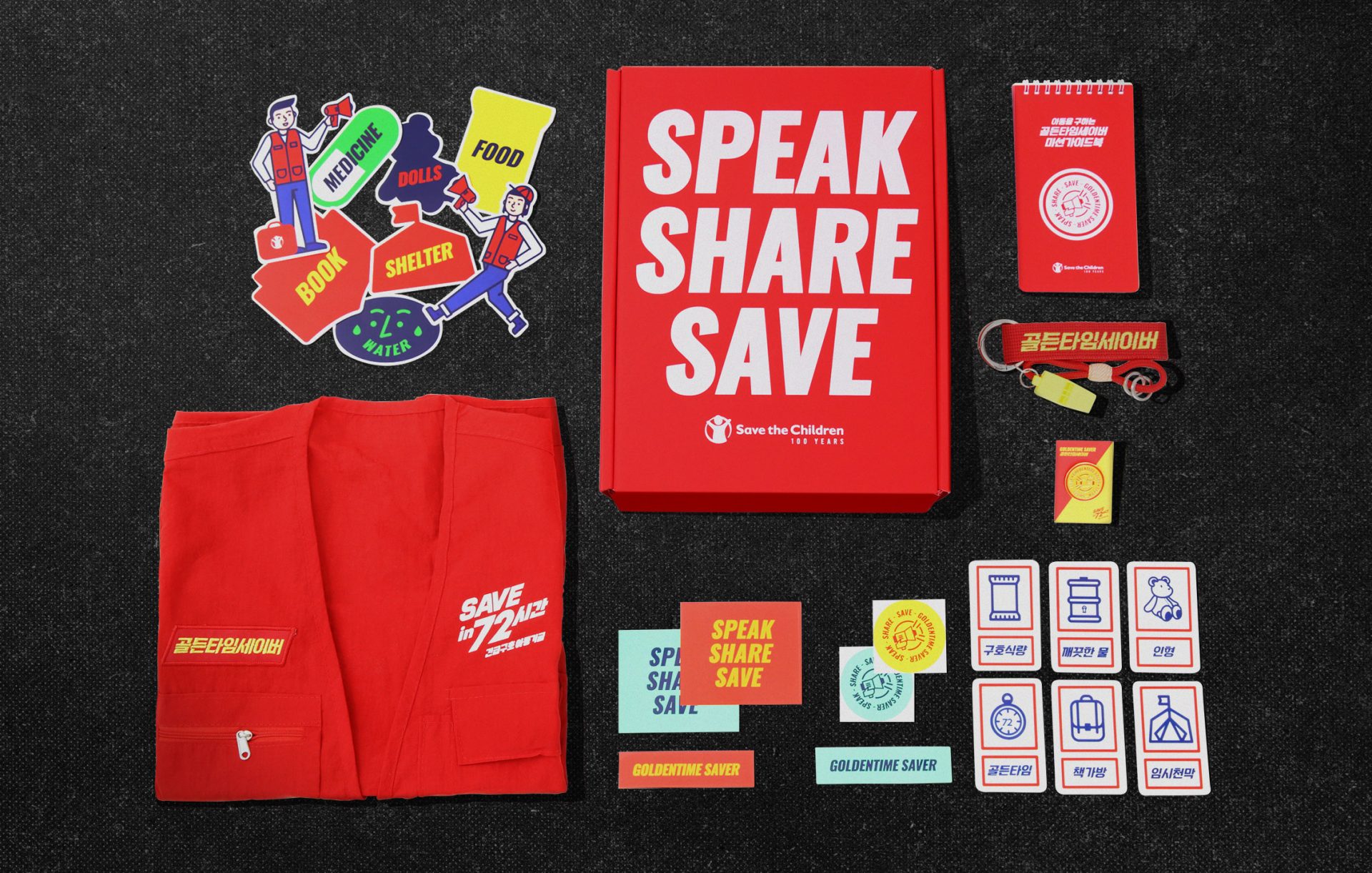
Sound Box reimagines emergency relief through the metaphor of sound. Donors become the source, and each item amplifies the message of rescue.

Task

We partnered with Save the Children to design a donor kit that raises awareness for the Emergency Relief Fund for Children. The project centered around the metaphor of sound, using it as a symbol for how rescue messages spread from one person to another. We developed the name and structure of the “Sound Box,” positioning the donor as the origin of the signal. The visual system was organized into three key stages: SPEAK, SHARE, and SAVE. Each element in the kit such as the whistle keyring, vest, mission card, booklet, tumbler, and stickers was designed to communicate urgency and resonance through bold colors, wave-like graphics, and expressive typography.

  • Design

    Package Design

  • Client

    Save the Children

01. Information - Season collection concept

This project with Save the Children was designed to raise awareness for the Emergency Relief Fund for Children. The objective was to activate donors not just as contributors, but as media advocates individuals who carry and amplify messages of rescue through their own platforms. 


The concept of sound was used as the core metaphor. Just as sound waves move through vibration and medium, the idea of rescue spreads through people. Based on this idea, the donor welcome kit was named the Sound Box, positioning the donor as the source of resonance and action.

이번 프로젝트는 세이브더칠드런의 프로젝트로 진행되었으며, 아동 긴급구호 기금에 대한 인식을 확대하고 기부자를 자발적인 확산자로 전환하는 것을 목표로 했다. 기부자가 단순한 후원자가 아니라, 자신의 채널을 통해 구조 메시지를 전파하는 ‘미디어 행위자’로 작동하는 구조를 설계했다.


프로젝트의 중심에는 ‘소리’라는 메타포가 있다. 소리가 진동과 매체를 통해 퍼지듯, 구조 요청의 메시지도 사람을 통해 전파된다. 이 개념을 바탕으로 기부자 웰컴 키트는 Sound Box라는 이름으로 명명되었고, 기부자가 그 진동의 시작점임을 상징적으로 드러내도록 구성되었다.

The package system was structured around three stages of message flow: SPEAK, SHARE, and SAVE. At its center is a bold red box containing a whistle keyring, rescue vest, mission card, welcome booklet, stickers, and a branded tumbler.

Each component was designed to visually represent sound waves and urgency through expressive typography, wave-inspired graphics, and high-contrast color codes like red, yellow, and mint. The entire experience was created not just to deliver functional materials, but to turn the package itself into a communication tool. With every unboxing, the message of emergency relief continues to spread clear, emotional, and ready to act.

패키지 디자인은 SPEAK / SHARE / SAVE라는 세 단계의 메시지 흐름을 시각화하는 구조로 설계되었다. 붉은색의 구조적 박스를 중심으로, 휘슬 키링, 구조 조끼, 미션 카드, 웰컴 북클릿, 스티커, 브랜디드 텀블러 등이 포함되었다.

각 구성물은 소리의 파동, 긴급함, 전달의 리듬을 시각 언어로 구현했다. 레드, 옐로우, 민트 등 고대비 컬러 조합과 단순하면서도 전달력 있는 일러스트레이션은, 패키지를 단순한 물리적 수단이 아닌 메시지를 담는 하나의 미디어로 변환시킨다. 결과적으로 Sound Box의 언박싱 경험은 구조 메시지의 일부가 되는 행위로 설계되었다.

Let's get in touch,
we respond fast.

Ready to work together?
Back