Visual Rhythm in Coffee Packaging

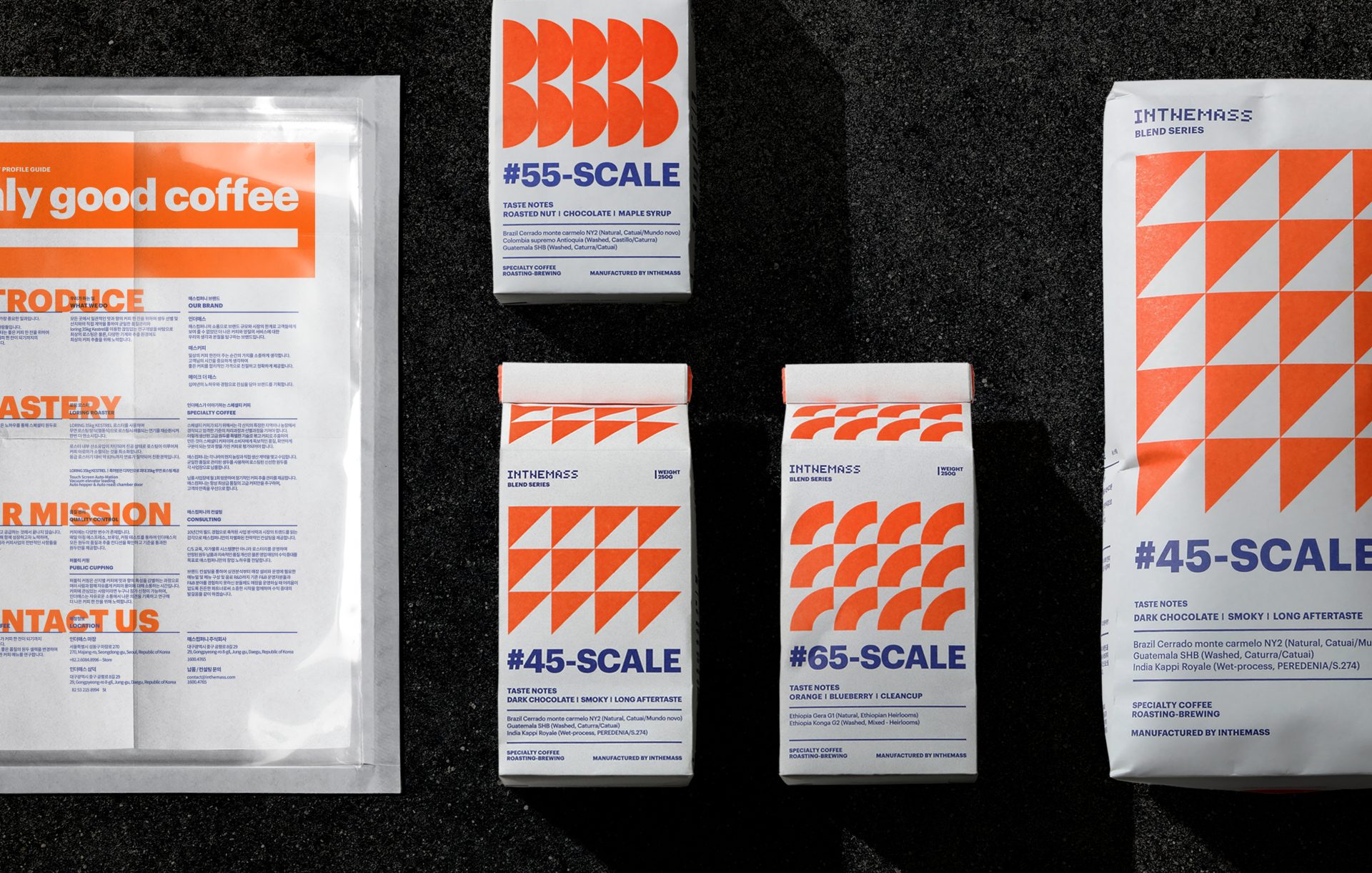
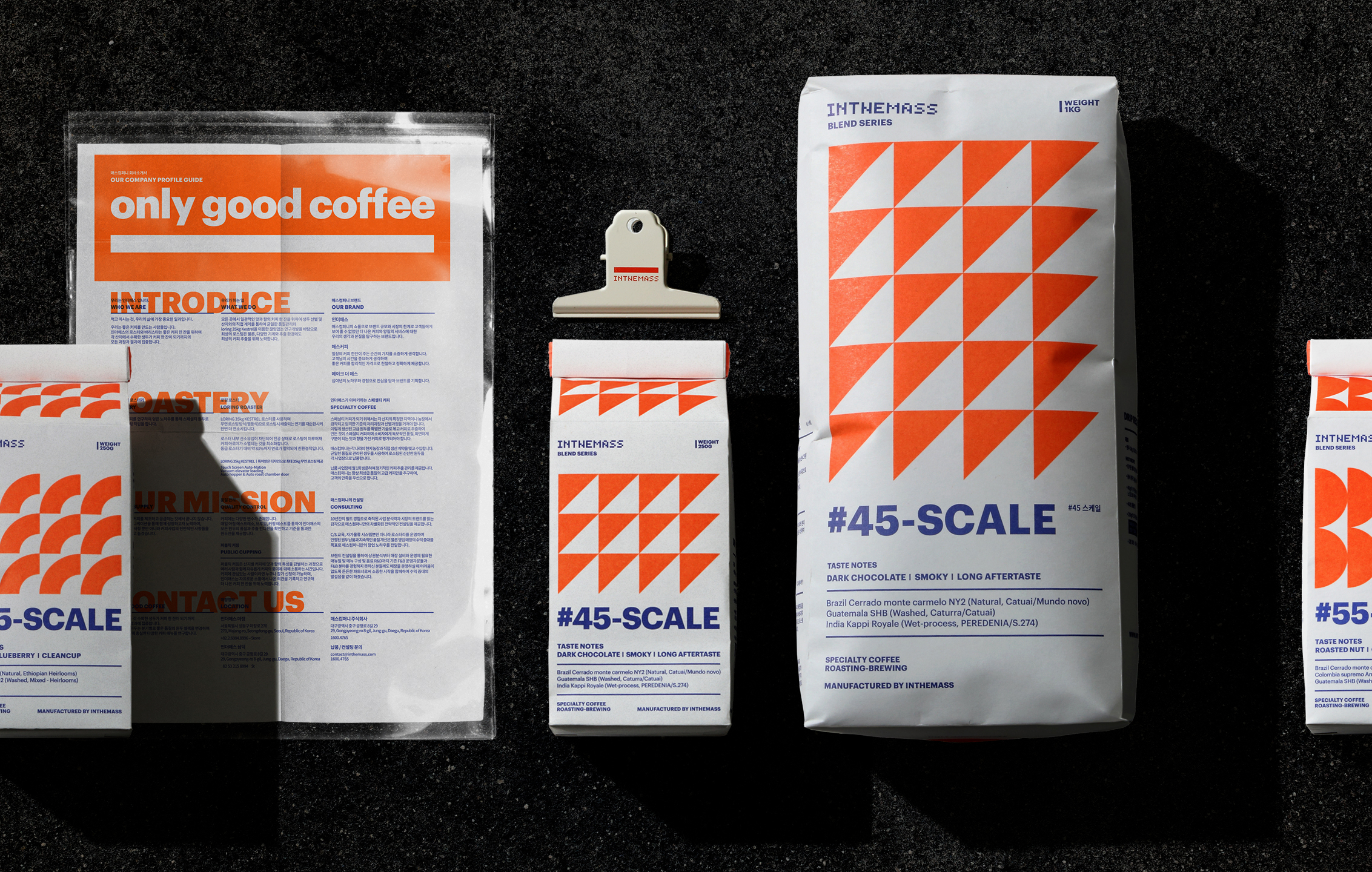
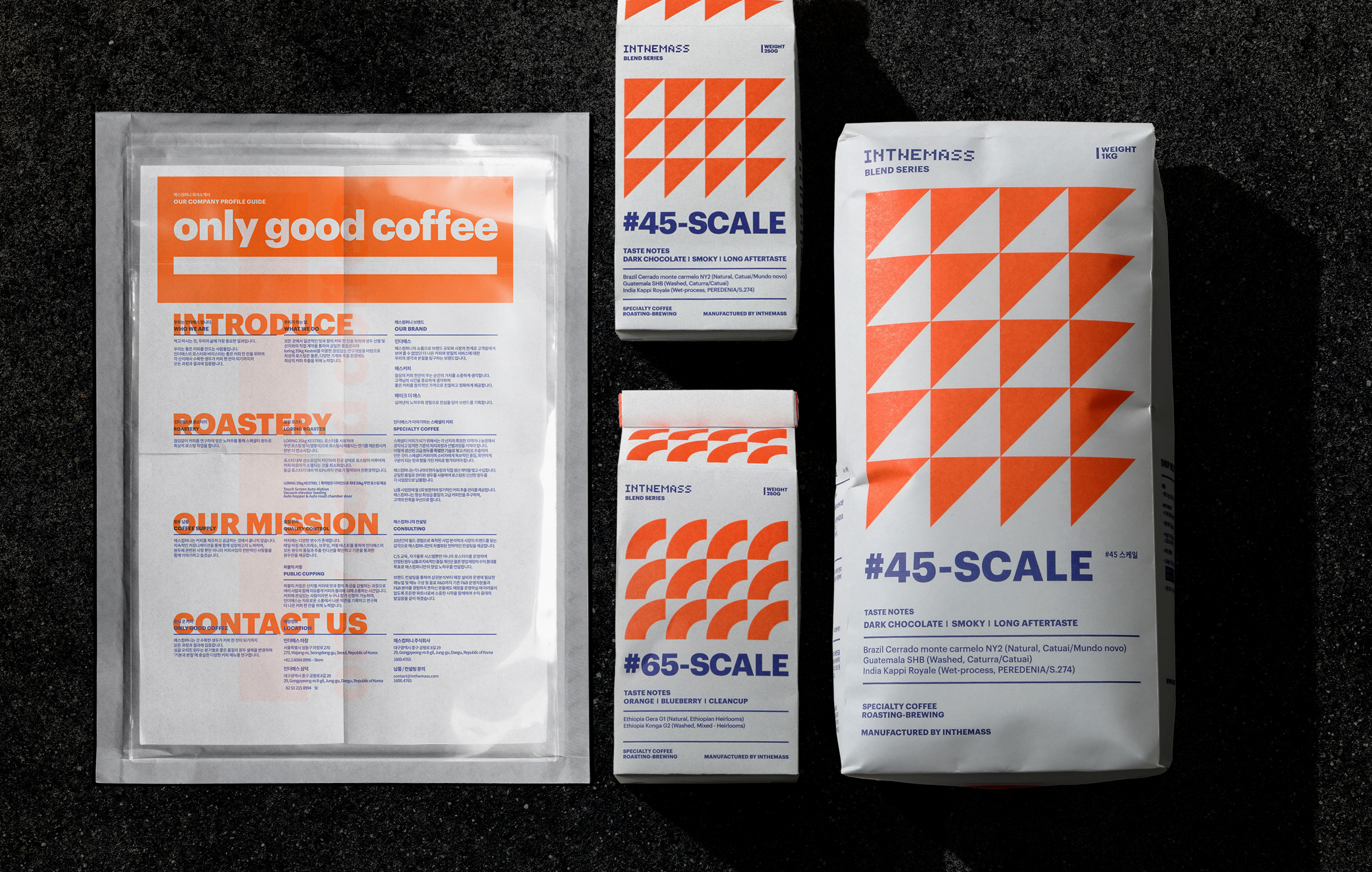
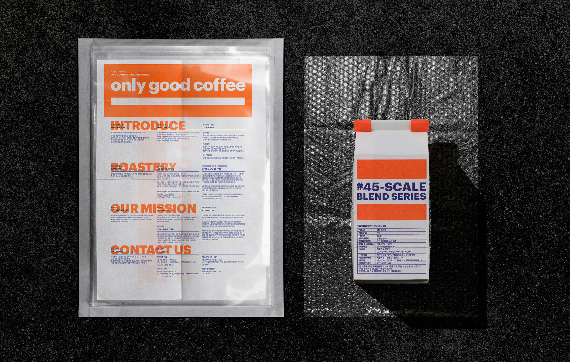
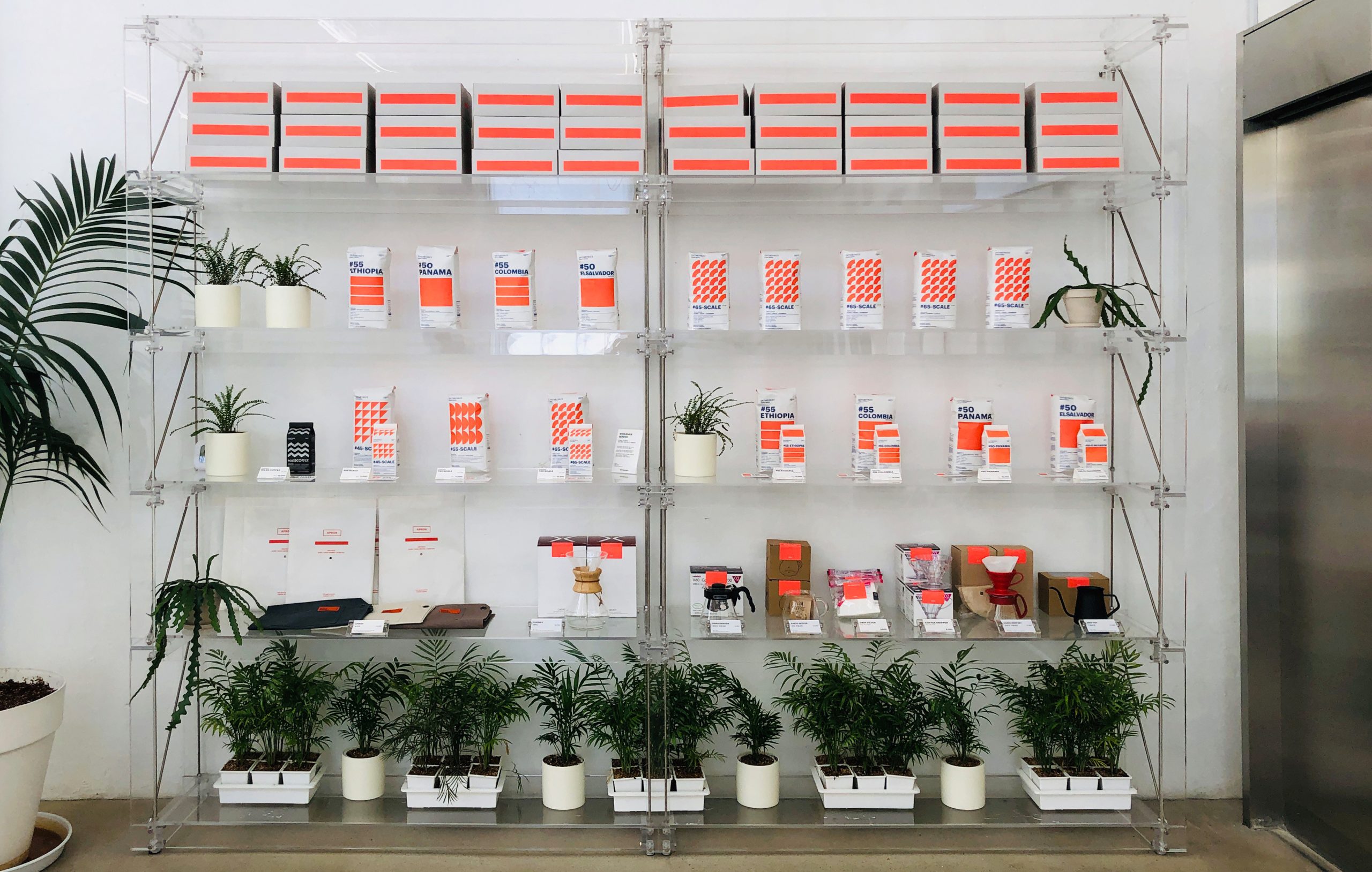
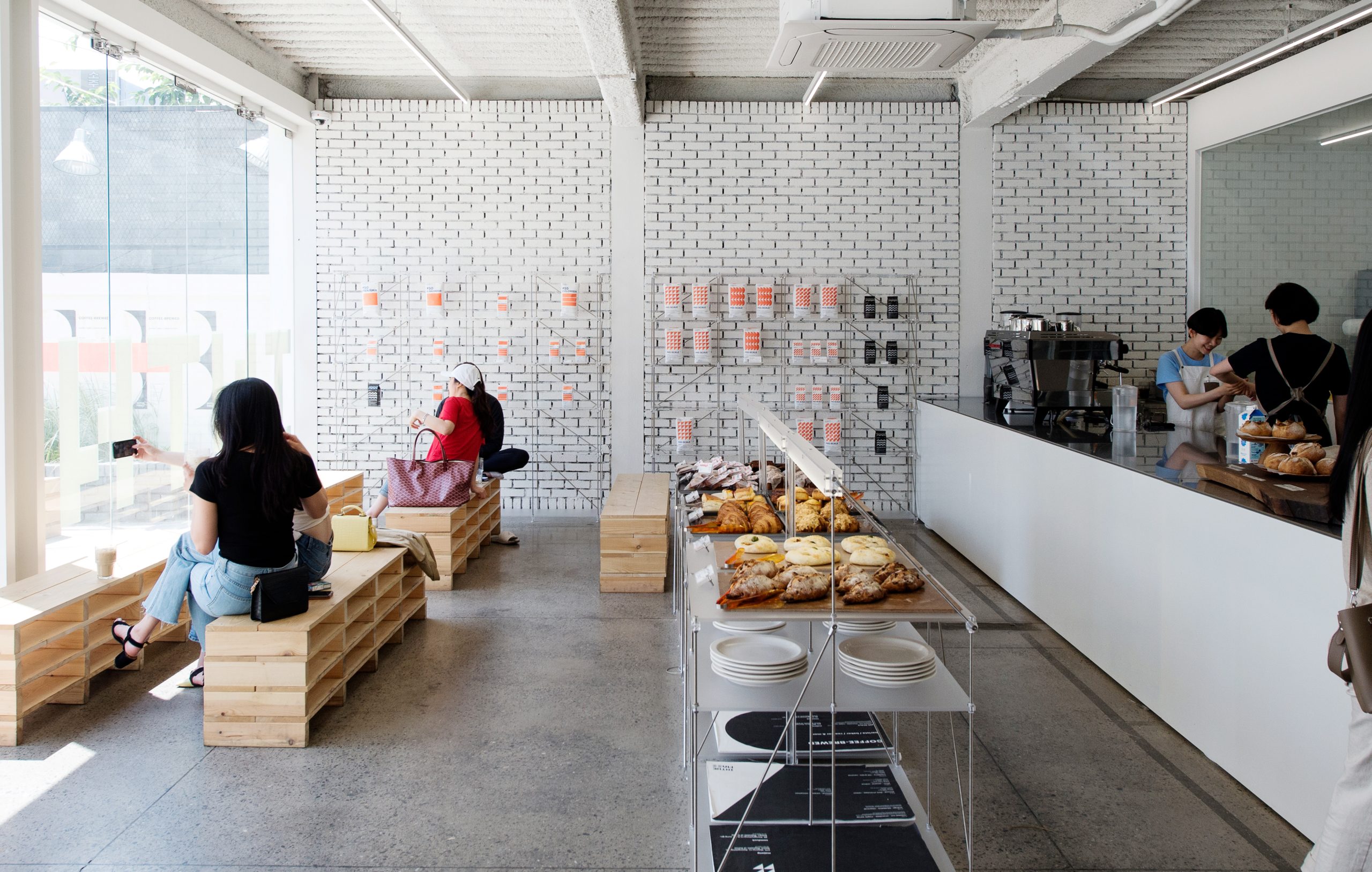
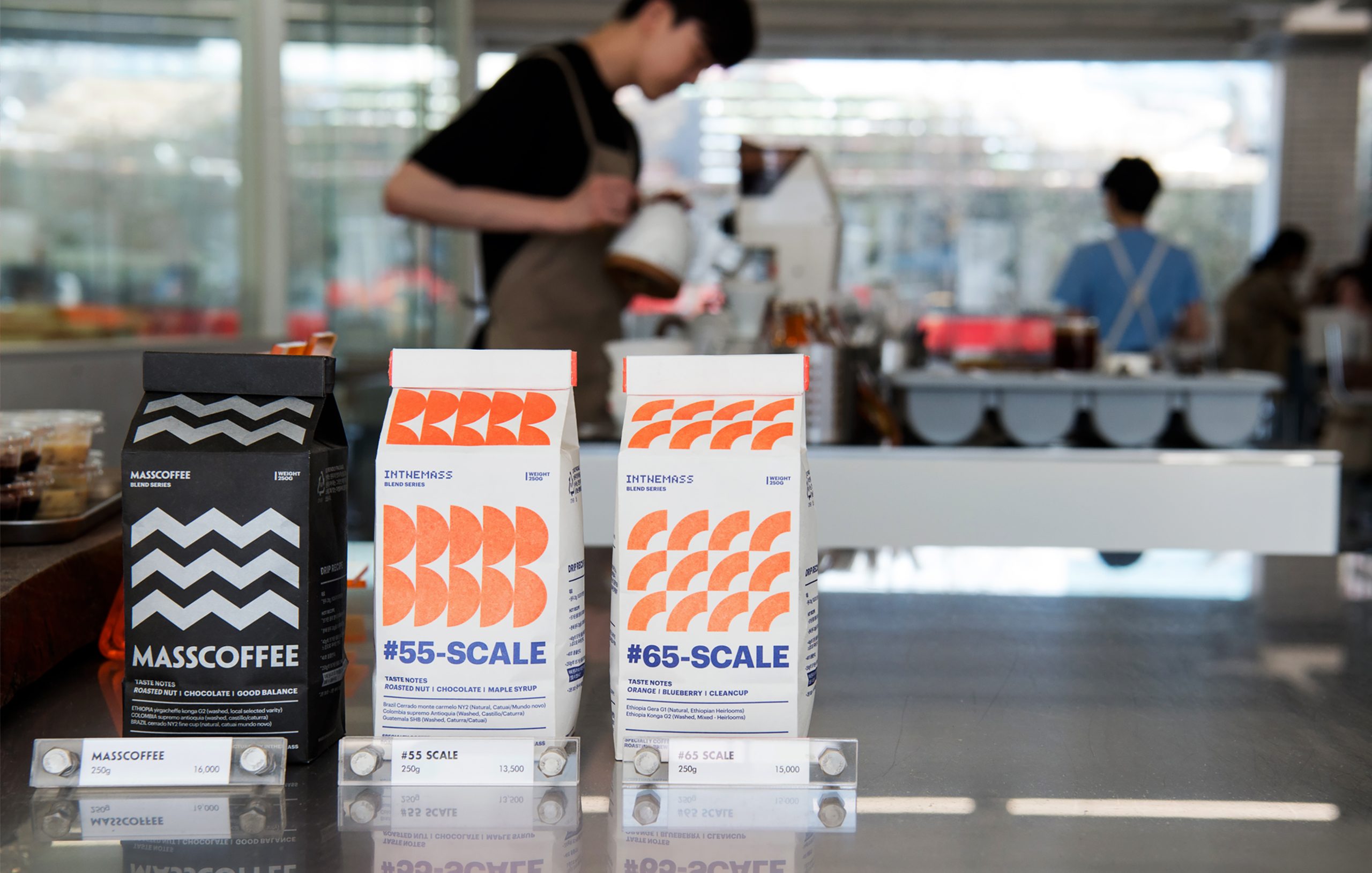
INTHEMASS packaging visualizes roast levels through structured rhythm and color. A modular system bridges product clarity and brand identity across all formats.

Task

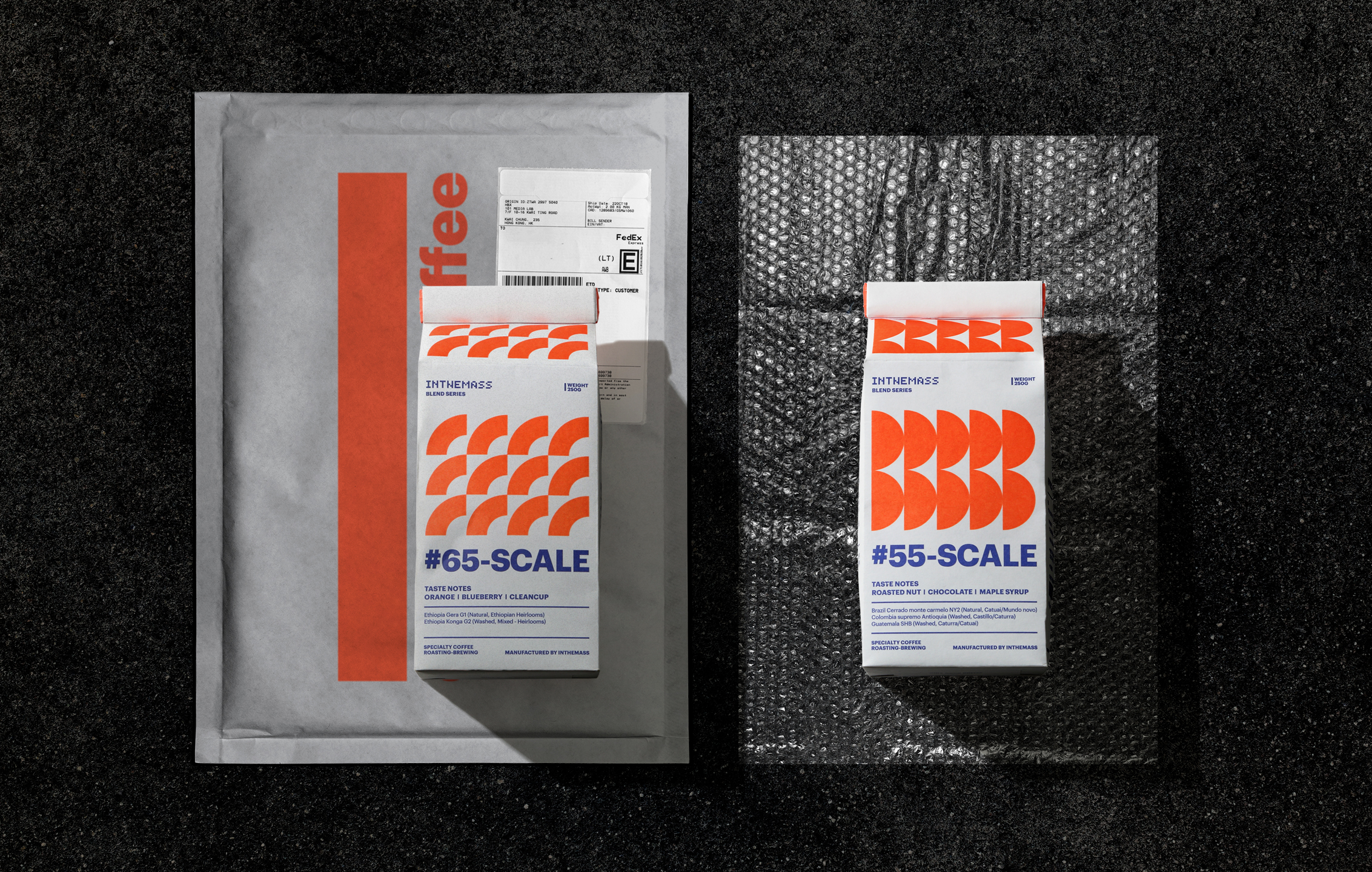
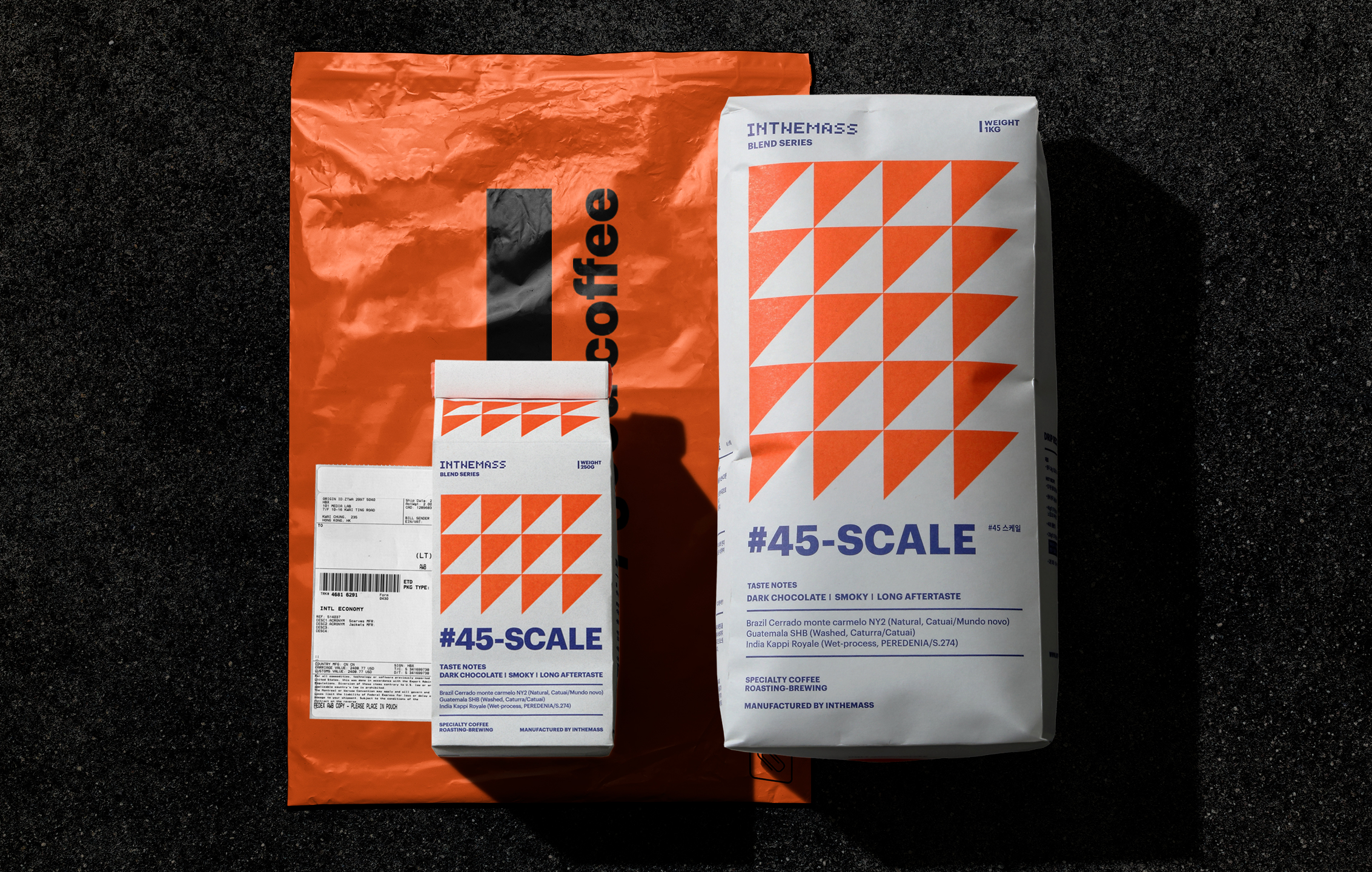
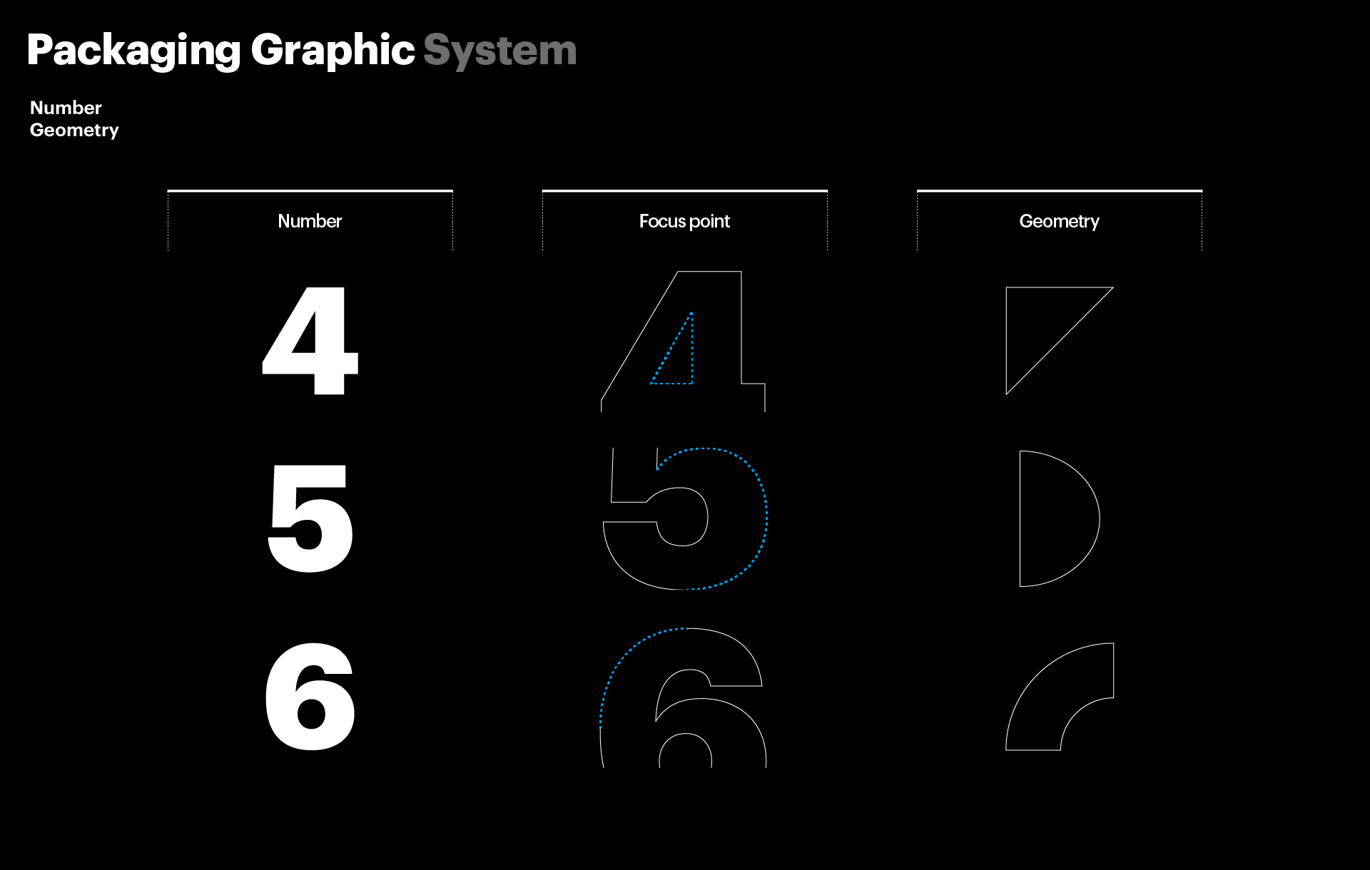
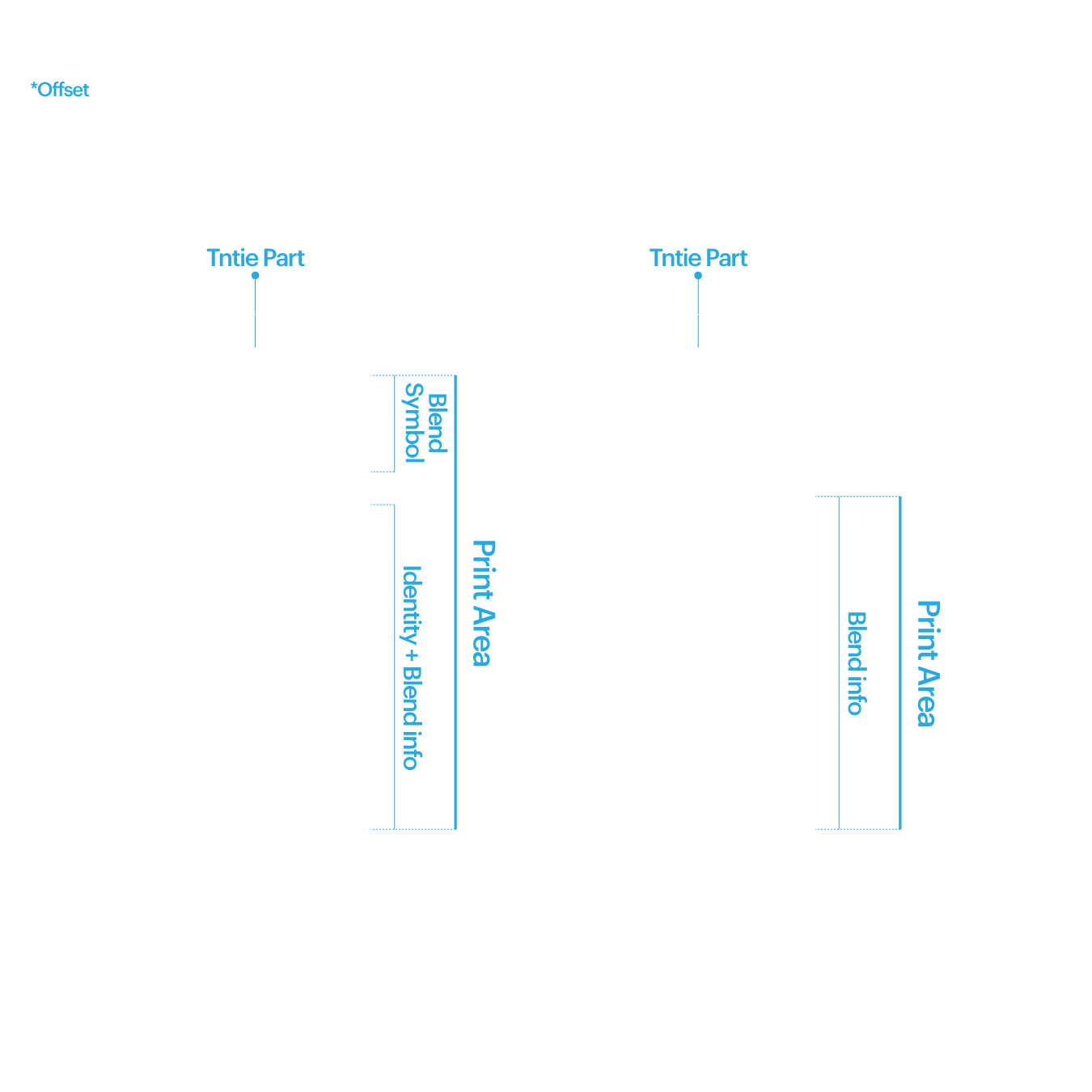
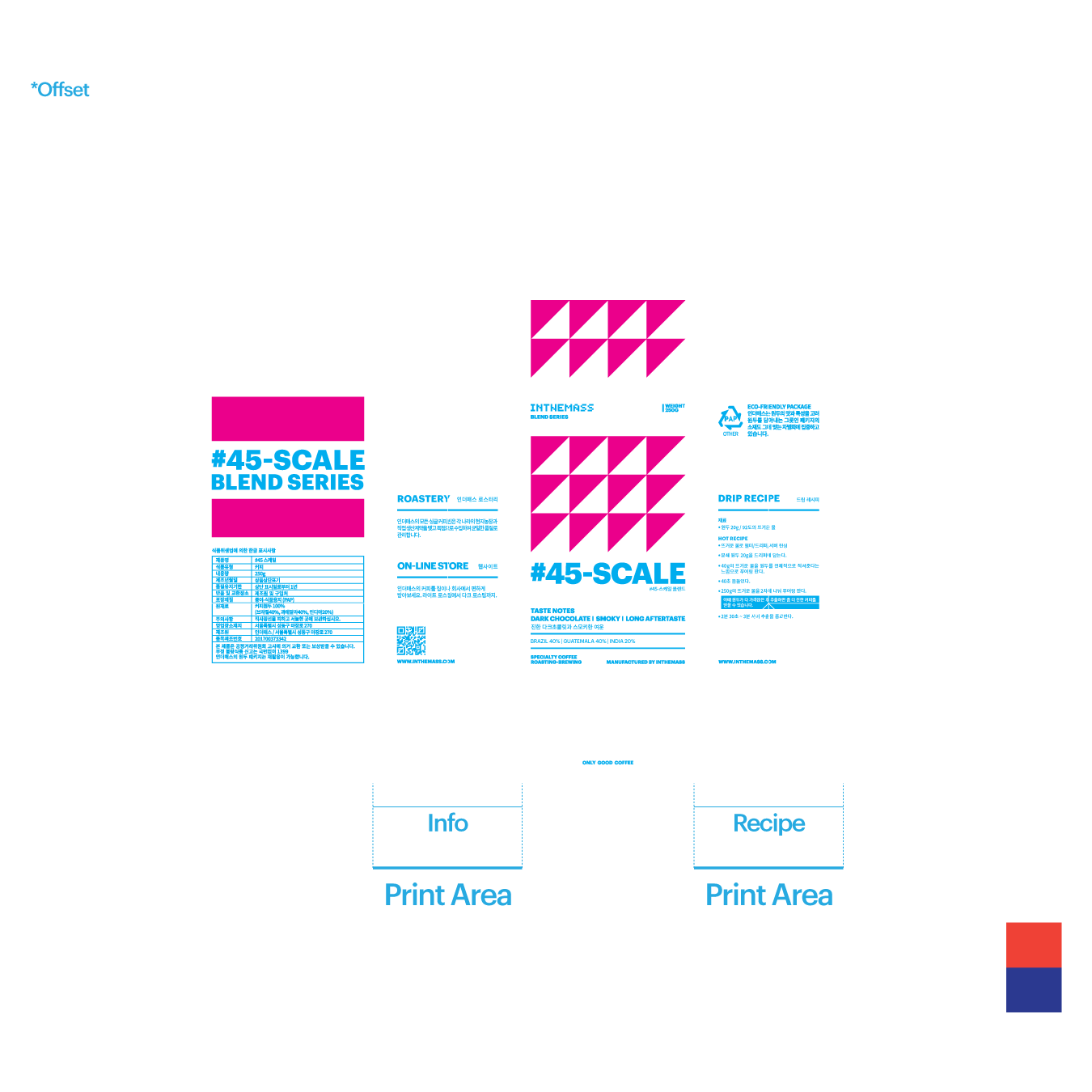
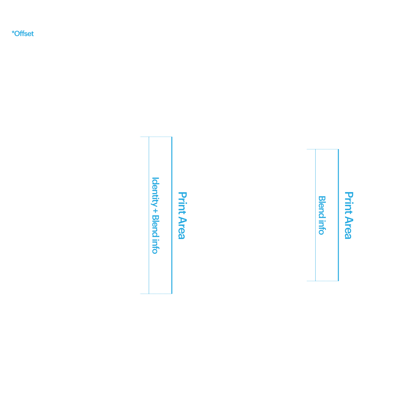
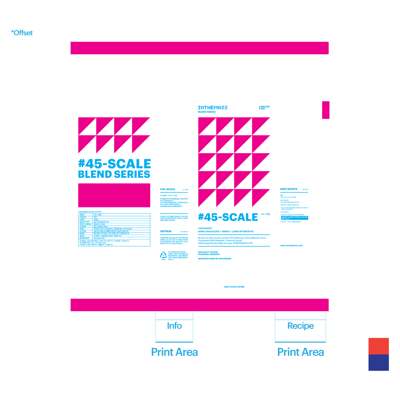
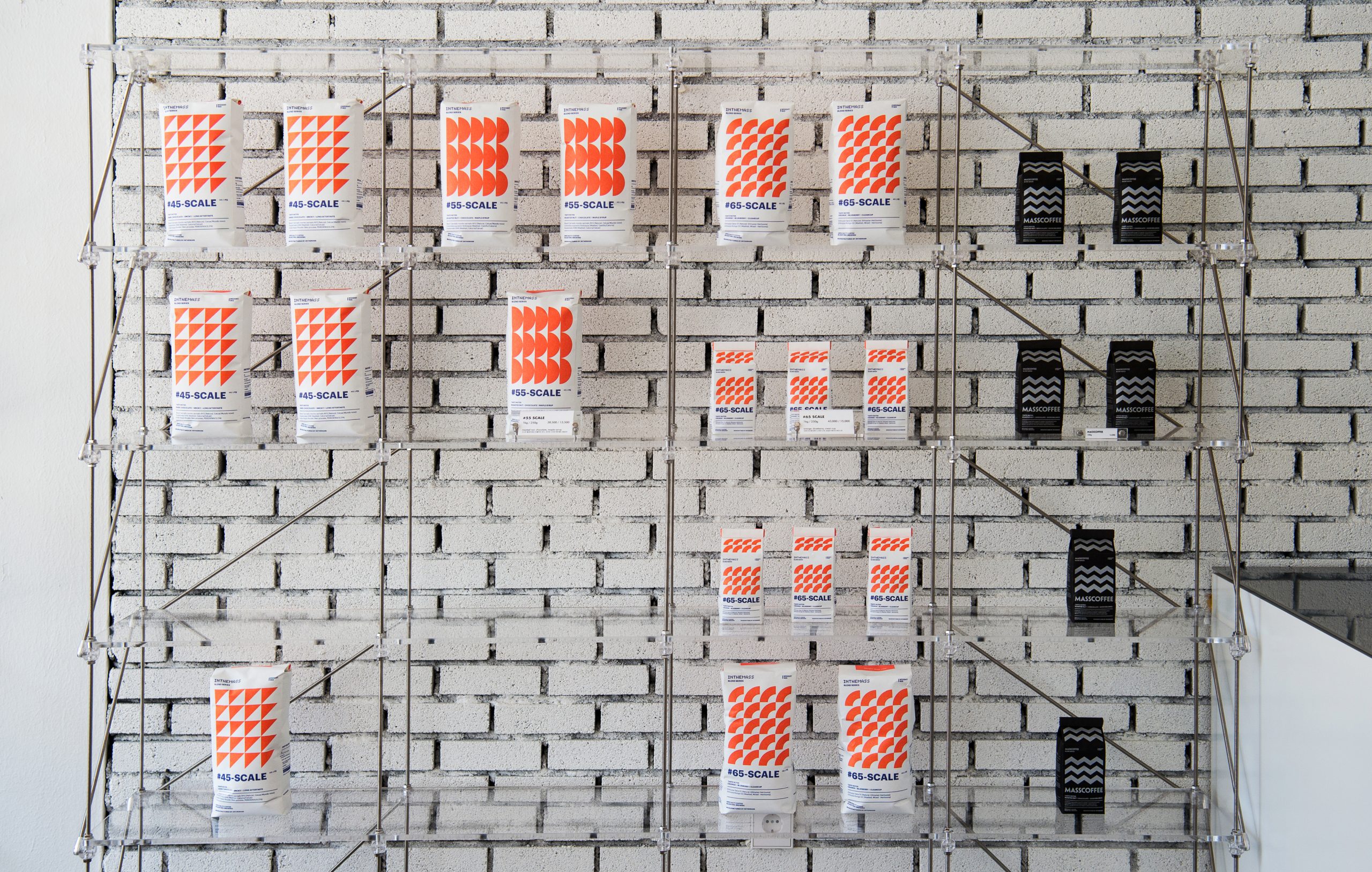
We began by researching coffee product categories and brand positioning. Agtron roast levels were translated into geometric patterns, each assigned to a specific product series. These patterns were then integrated with a pixel-inspired logotype to create a cohesive graphic system. We applied this structure across whole bean bags, drip bag boxes, and tintie labels, ensuring consistency and clarity. Each layout was designed to be minimal yet informative, emphasizing the roasting character and brand voice.

  • Design

    Package Design

  • Client

    Inthemass

01. Information - Package Graphic

This packaging design for INTHEMASS explores how roast data can be transformed into visual rhythm to express both brand identity and product clarity. At the heart of the system is the use of Agtron-inspired patterns numeric values representing roast levels—deconstructed into geometric forms and assigned to specific coffee series.


These patterns are applied across multiple product formats, including whole bean bags, drip bag boxes, and tintie stickers. Each series is visually differentiated through color accents, structured layouts, and rhythmical geometry, creating intuitive cues for both flavor profile and product type. The brand’s pixel-style logotype integrates seamlessly into this system, forming a direct link between the identity and its packaging expression.


By emphasizing form, material, and structured rhythm, the system translates technical roast information into a cohesive and expressive visual language.

INTHEMASS 커피 패키지 디자인은 로스팅 정보와 브랜드 아이덴티티를 시각적 리듬으로 연결하는 것을 목표로 한다. Agtron 수치(로스팅 정도를 나타내는 국제 표준값)를 기반으로, 숫자를 분해해 기하학적 패턴으로 재구성하고, 시리즈마다 다른 리듬으로 표현하였다.


이러한 모듈형 시스템은 원두, 드립백, 틴타이 스티커 등 다양한 패키지 유형에 일관되게 적용되며, 제품 분류, 맛의 성향, 브랜드의 감각적 언어를 동시에 전달한다. 브랜드 로고는 픽셀 형태의 타이포그래피로 제작되었으며, 이는 패턴의 조형성과 연결되어 브랜드 마크와 시각 시스템 사이의 통일성을 만들어낸다.


형태, 소재, 구조 중심의 디자인 접근을 통해, 단순한 로고 중심의 브랜딩을 넘어, 제품 전체가 브랜드를 말하는 구조를 완성했다.

02.Infomation - Print system

Let's get in touch,
we respond fast.

Ready to work together?
Back