Giving Begins here

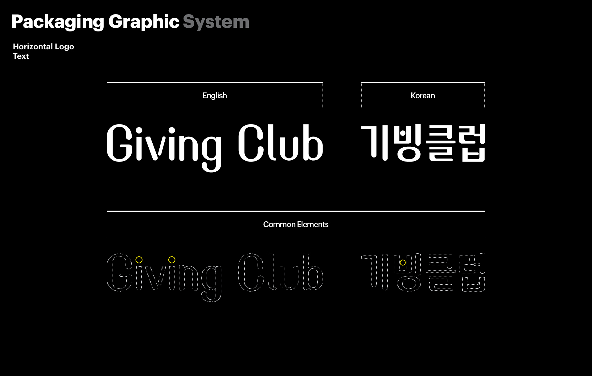
Giving Club redefines the act of giving through approachable and engaging design. The visual system encourages participation with clarity, warmth, and ease of use.

Task

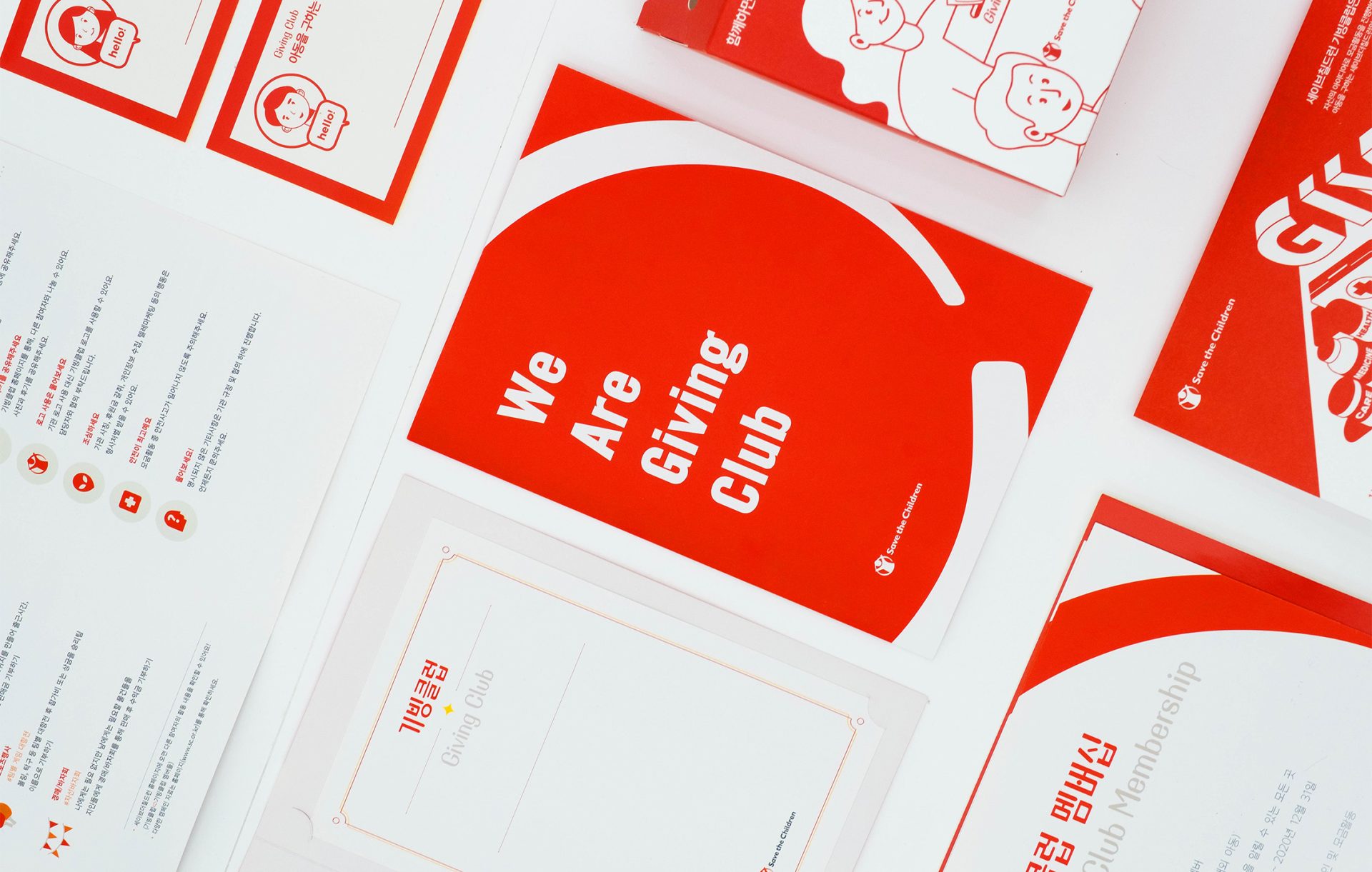
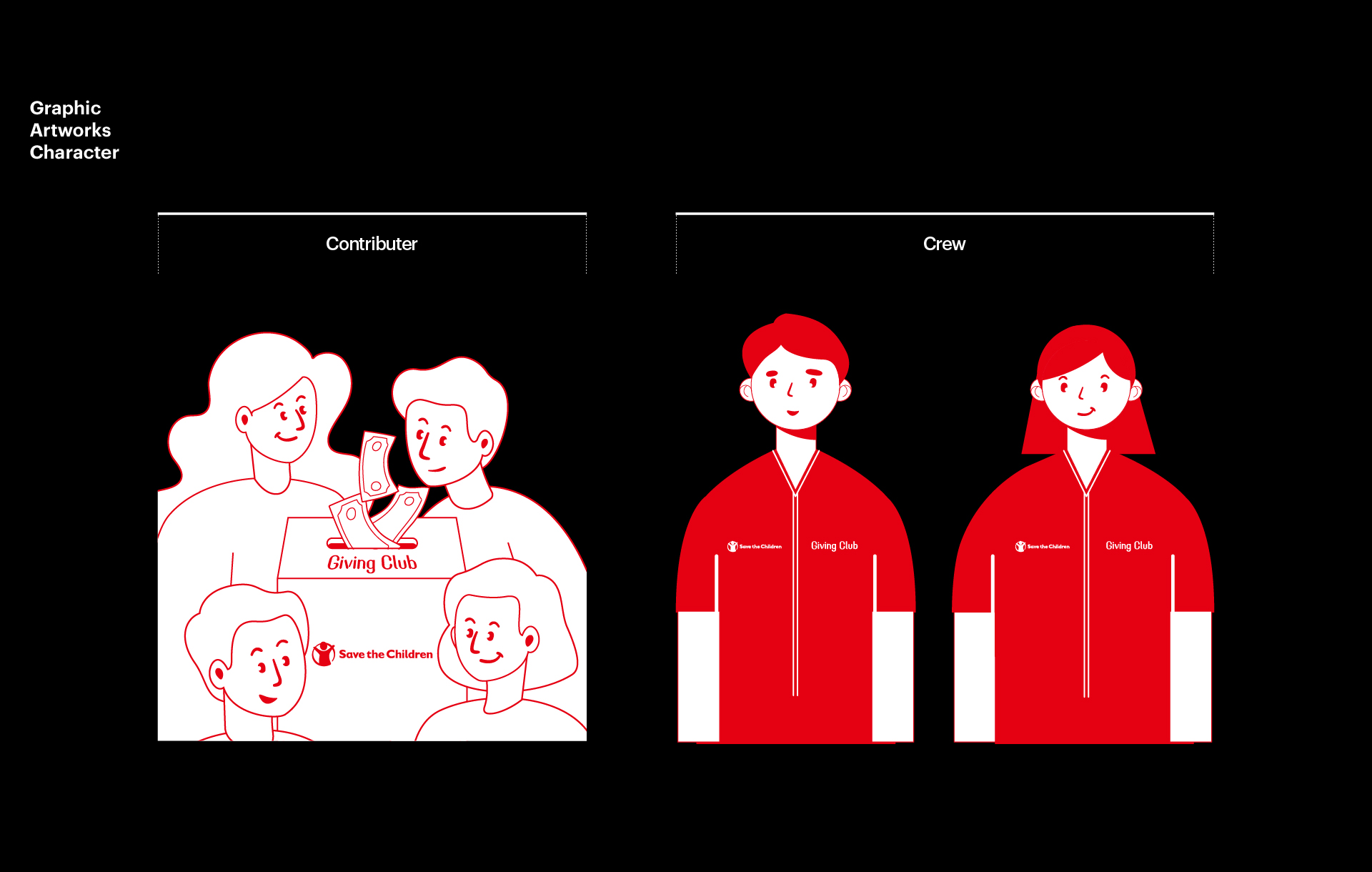
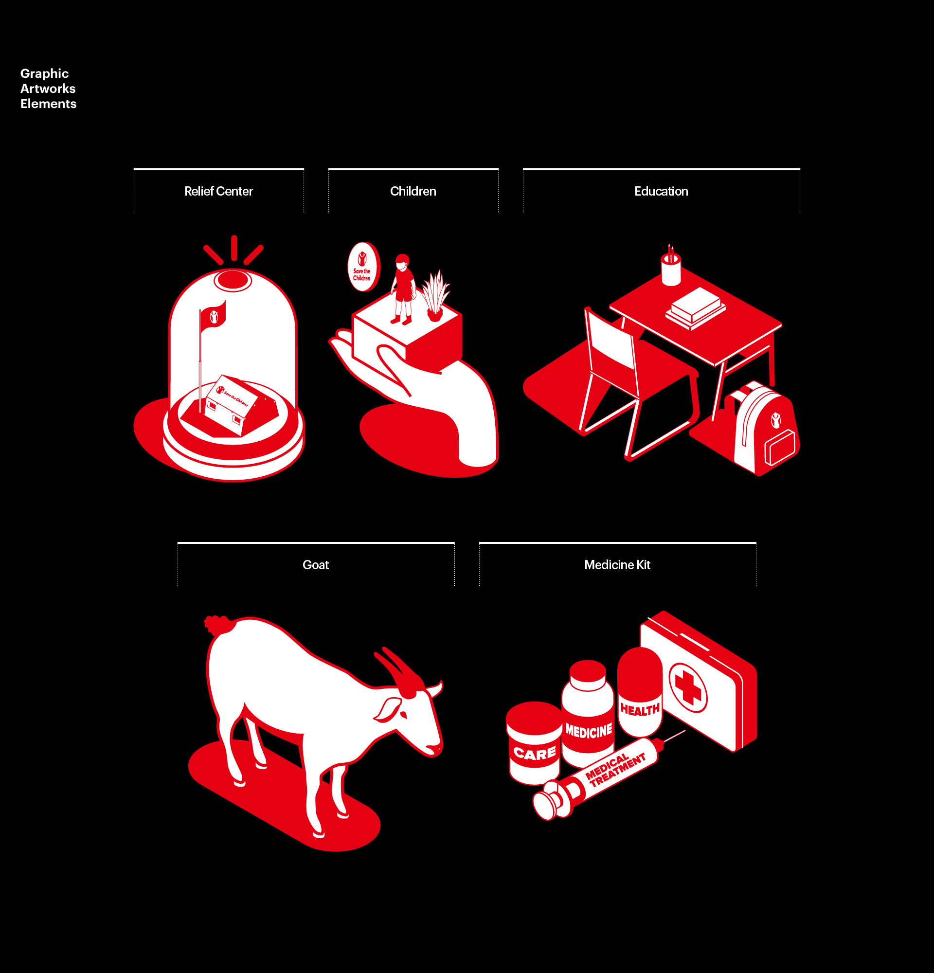
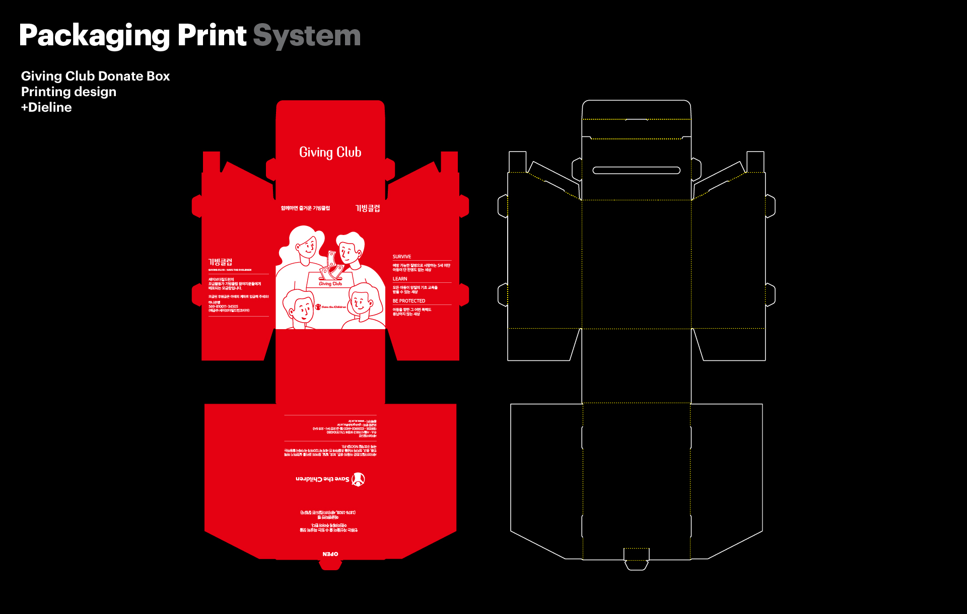
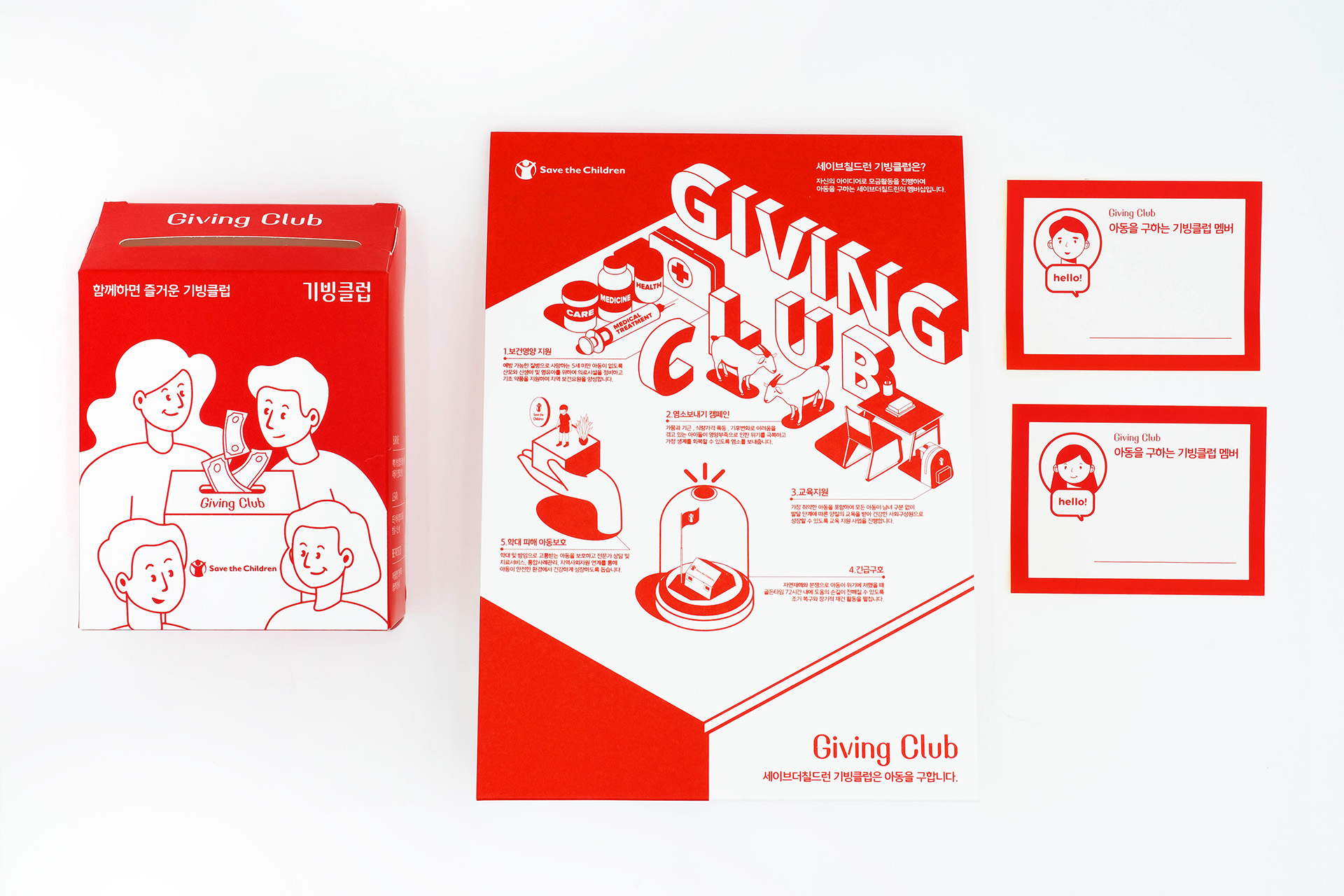
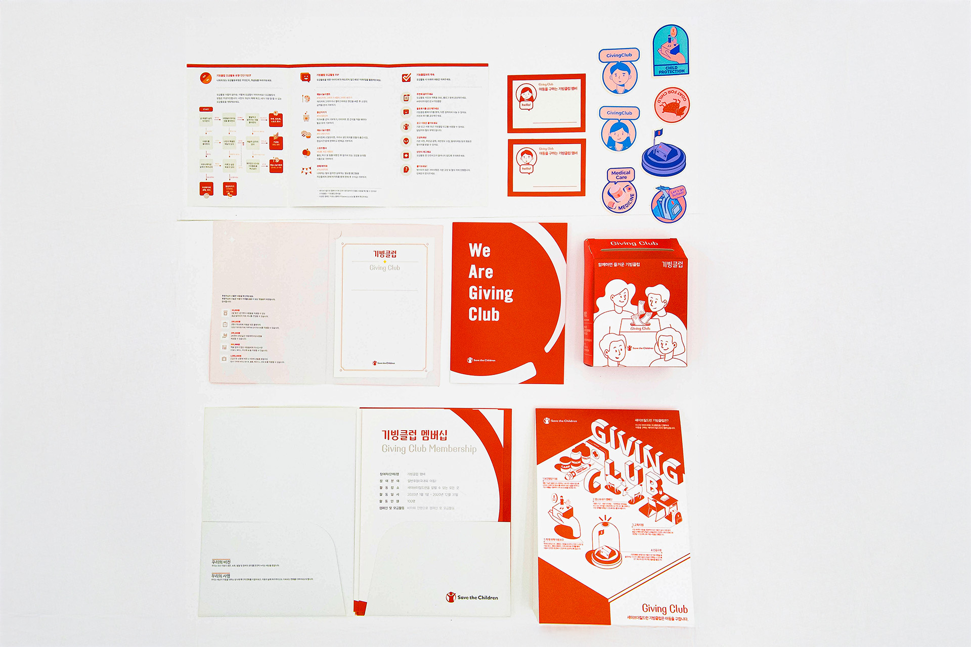
We conducted research into the emotional barriers that often surround donation campaigns. The design approach focused on creating a friendly and accessible experience that aligns with Save the Children’s brand values. We developed a flat-pack donation box that is easy to produce, assemble, and distribute. A cohesive set of characters and icons was designed to represent key giving areas such as education, healthcare, and emergency relief. Supporting materials like brochures, stickers, name cards, and information sheets were created to ensure consistency and usability across all touchpoints.

  • Design

    Package Design

  • Client

    Save the Children

01. Information - Season collection concept

Giving Club is a donation program operated by Save the Children. This packaging design project focused on reshaping the donation experience by removing the formality and hesitation often associated with giving. The goal was to build a system that feels warm, accessible, and easy to engage with, encouraging more people to participate. 


The visual strategy was grounded in Save the Children’s brand identity. We used the official red as a base and paired it with soft illustrations and clean layouts to build trust and openness. Rather than relying on abstract messaging, the design highlights tangible causes through characters and icons. Each symbol represents a key area of impact such as education, medical aid, and emergency response. 


At the core of the system is a flat-pack donation box that is efficient to print, assemble, and distribute. The design combines expressive illustrations with clear typography to achieve both emotional connection and functional clarity.

Giving Club은 세이브더칠드런이 운영하는 공식 기부 프로그램이다. 이번 패키지 디자인 프로젝트는 기부라는 행위를 더 쉽게 접근할 수 있도록 재구성하는 것을 목표로 했다. 전통적인 기부 캠페인에서 나타나는 형식적인 분위기나 심리적 부담을 덜어내고, 누구나 따뜻하게 참여할 수 있는 시각 언어를 구축하는 데 중점을 두었다.


브랜드의 시각 전략은 세이브더칠드런의 공식 레드 컬러를 중심에 두고, 단순한 레이아웃과 친근한 일러스트를 활용해 신뢰감과 개방성을 동시에 전달하도록 설계되었다. 기부자와 수혜자의 관계는 캐릭터와 아이콘으로 시각화되었으며, 교육, 의료, 긴급구호와 같은 핵심 기부 분야를 직관적으로 보여준다.


패키지의 중심에는 평면으로 납품이 가능한 플랫팩 기부 상자가 있다. 이 상자는 인쇄 효율, 조립 용이성, 운송 편의성까지 고려하여 설계되었다. 명확한 타이포그래피와 감정에 호소하는 그래픽이 결합되어, 정보 전달과 감성적 연결을 동시에 가능하게 한다.

Additional items like brochures, stickers, name cards, and guide sheets were created with the same visual tone to maintain consistency.


This approach transforms giving into a visually intuitive and emotionally engaging experience. Every detail, from layout to color to message, was crafted to reduce hesitation and invite action. Rather than speaking through slogans alone, the brand communicates through thoughtful design and structure.

브로셔, 스티커, 네임카드, 안내지 등 다양한 보조 구성물은 전체 브랜드 시스템 안에서 시각적 일관성과 사용 편의성을 고려해 디자인되었다.


Giving Club의 디자인은 단순한 시각 요소를 넘어, 기부라는 행동에 자연스럽게 참여할 수 있는 경험을 제공한다. 형태와 색상, 메시지 모두가 참여를 유도하고 망설임을 줄이기 위해 설계되었으며, 브랜드는 말이 아닌 구조와 감성으로 그 철학을 전달한다.

Let's get in touch,
we respond fast.

Ready to work together?
Back