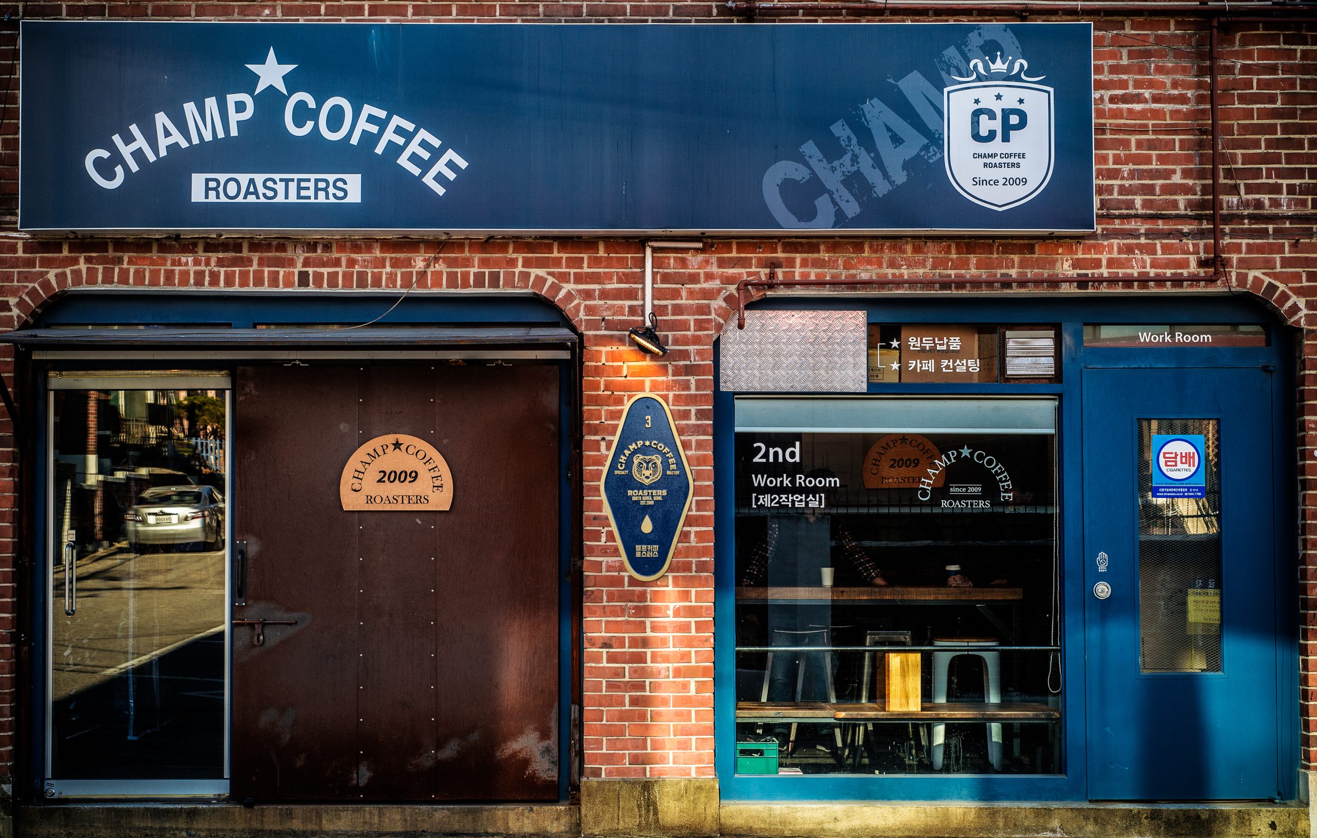
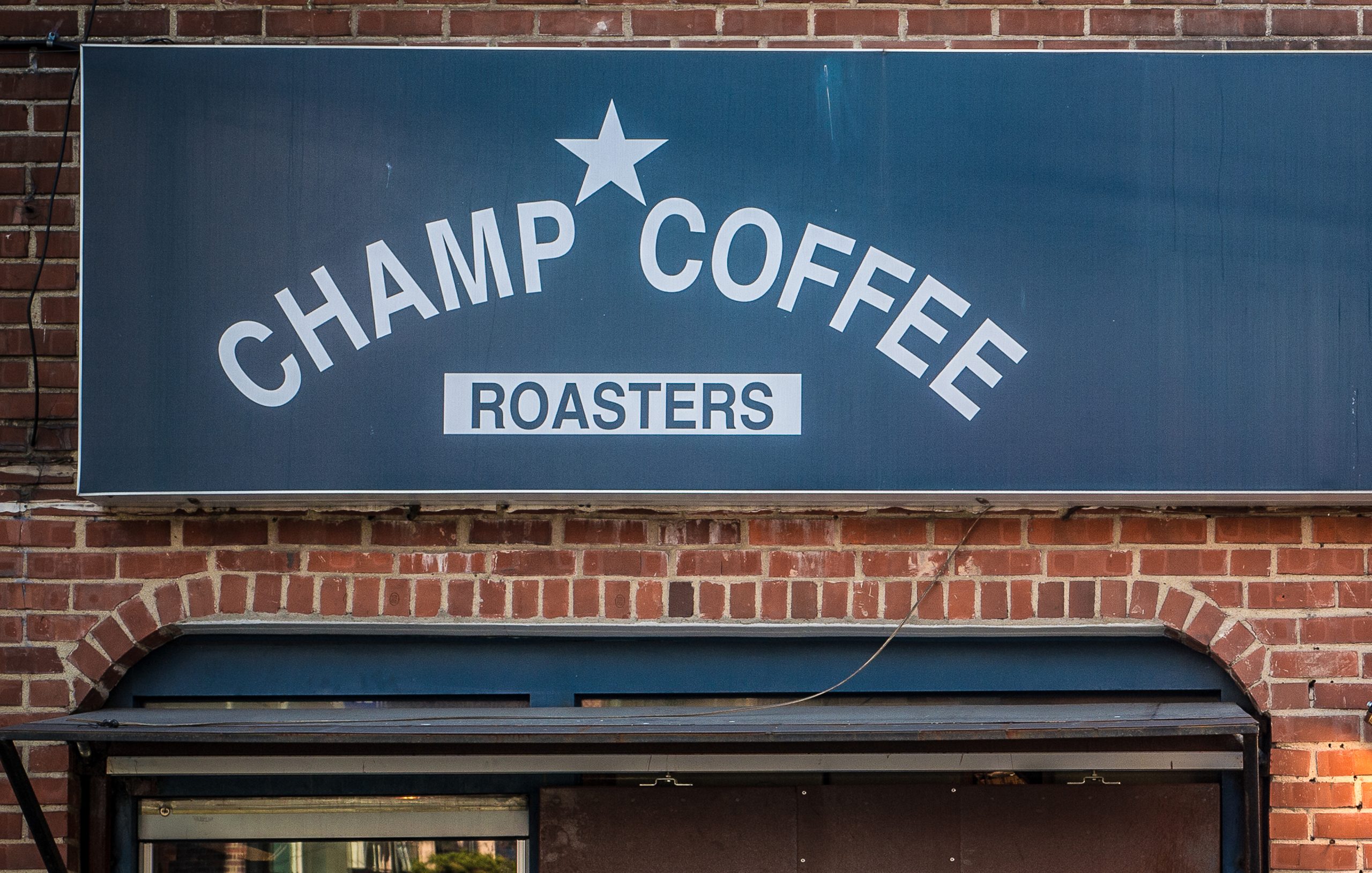
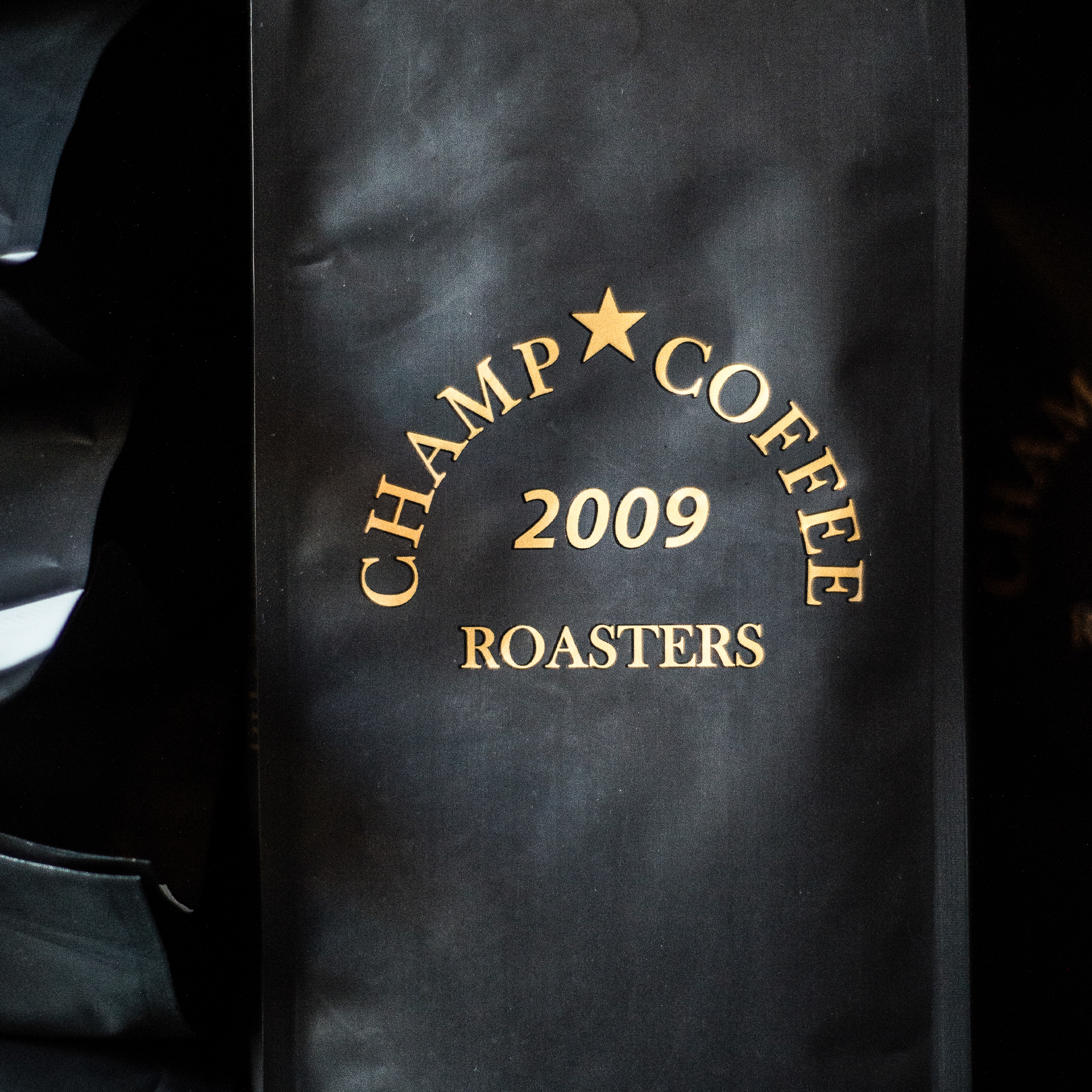
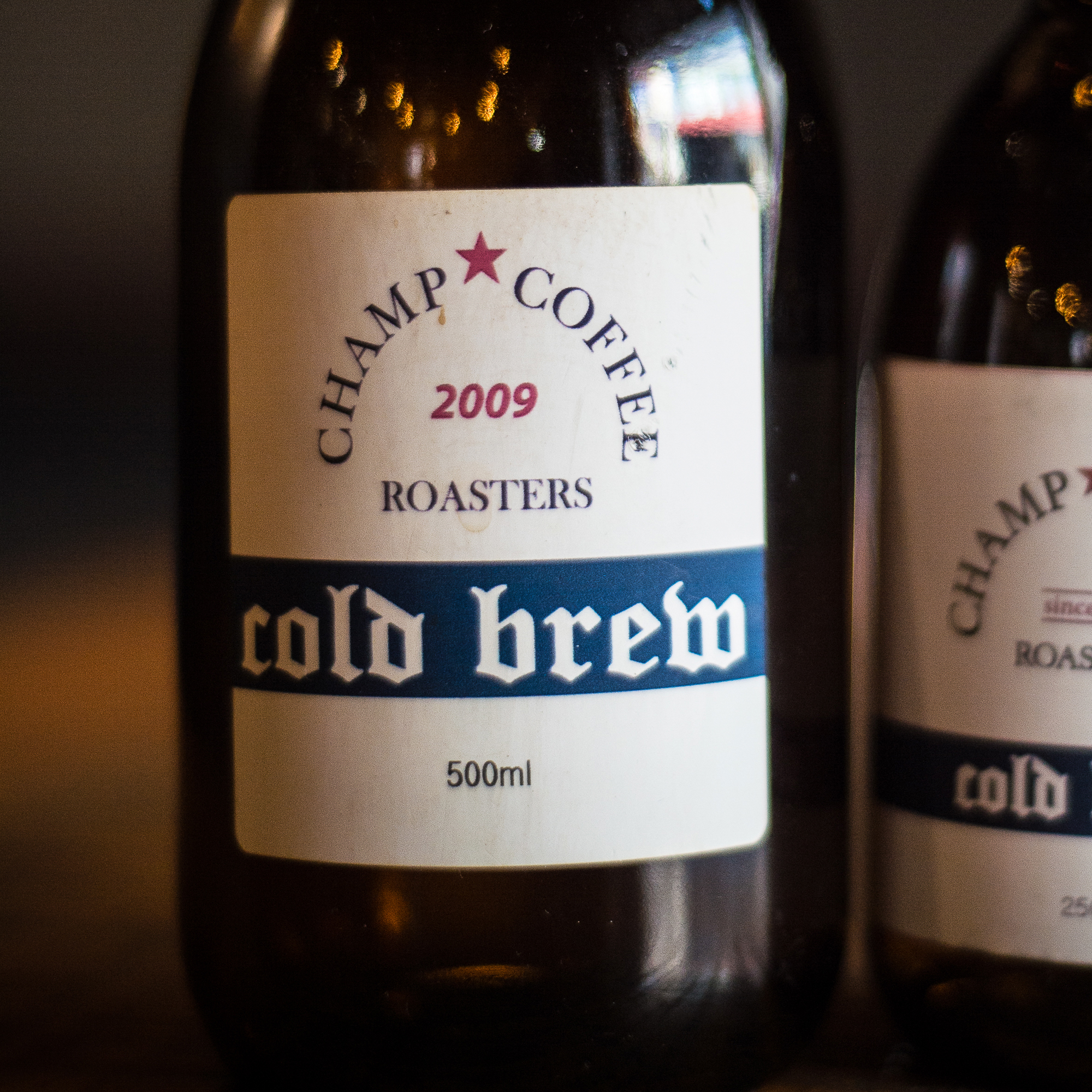
10th Anniversary Rebranding : Champ Coffee Roasters

A rebranding project celebrating ten years of Champ Coffee Roasters.
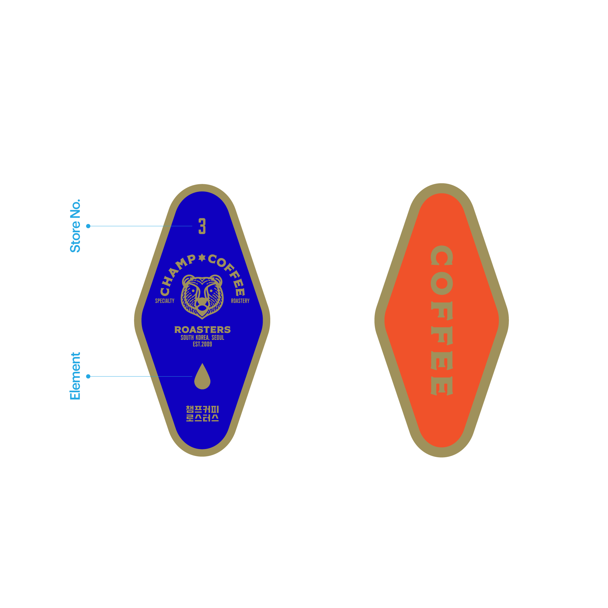
The concept draws on the bond of three brothers and their shared roots in Muju, brought to life through character design and storytelling.

Task

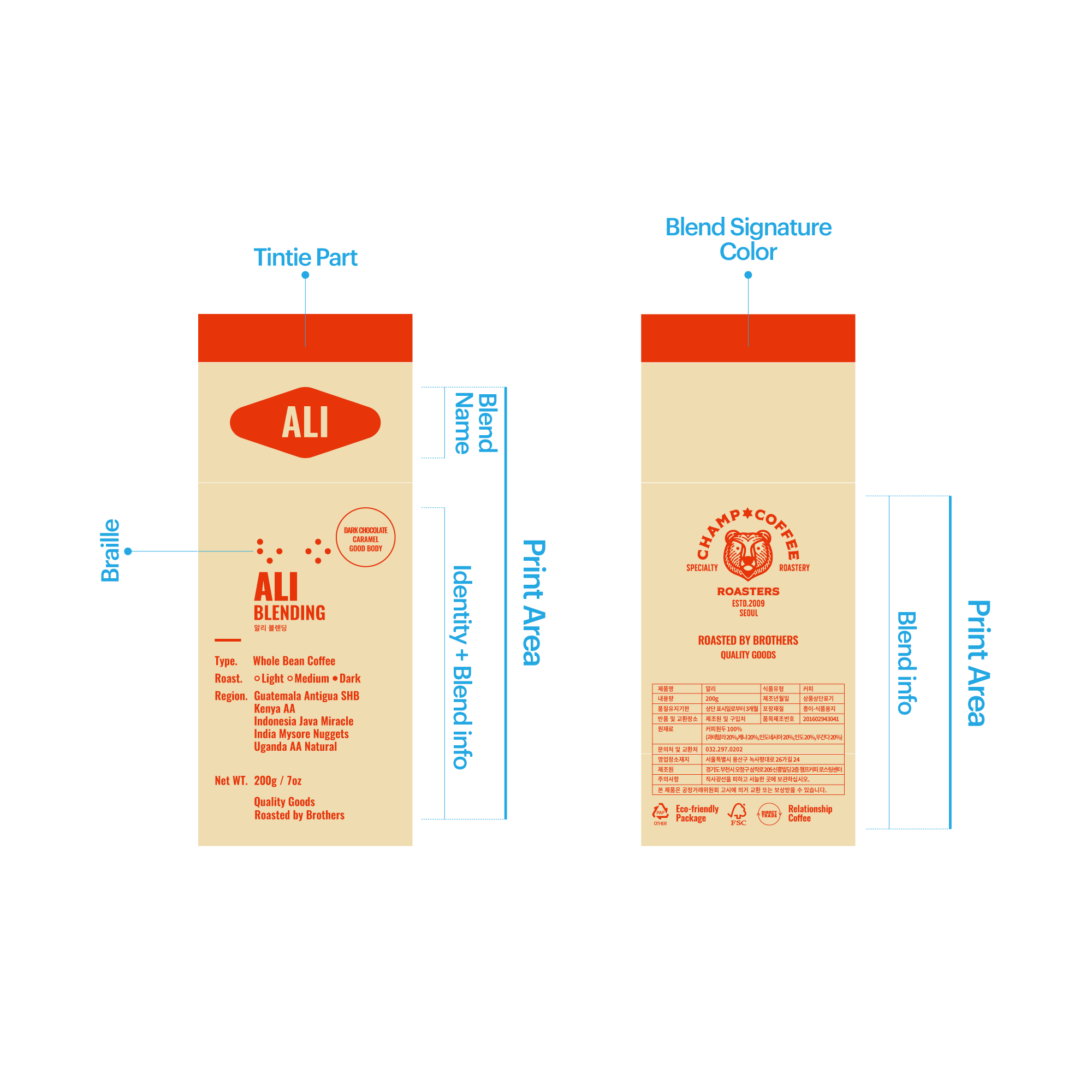
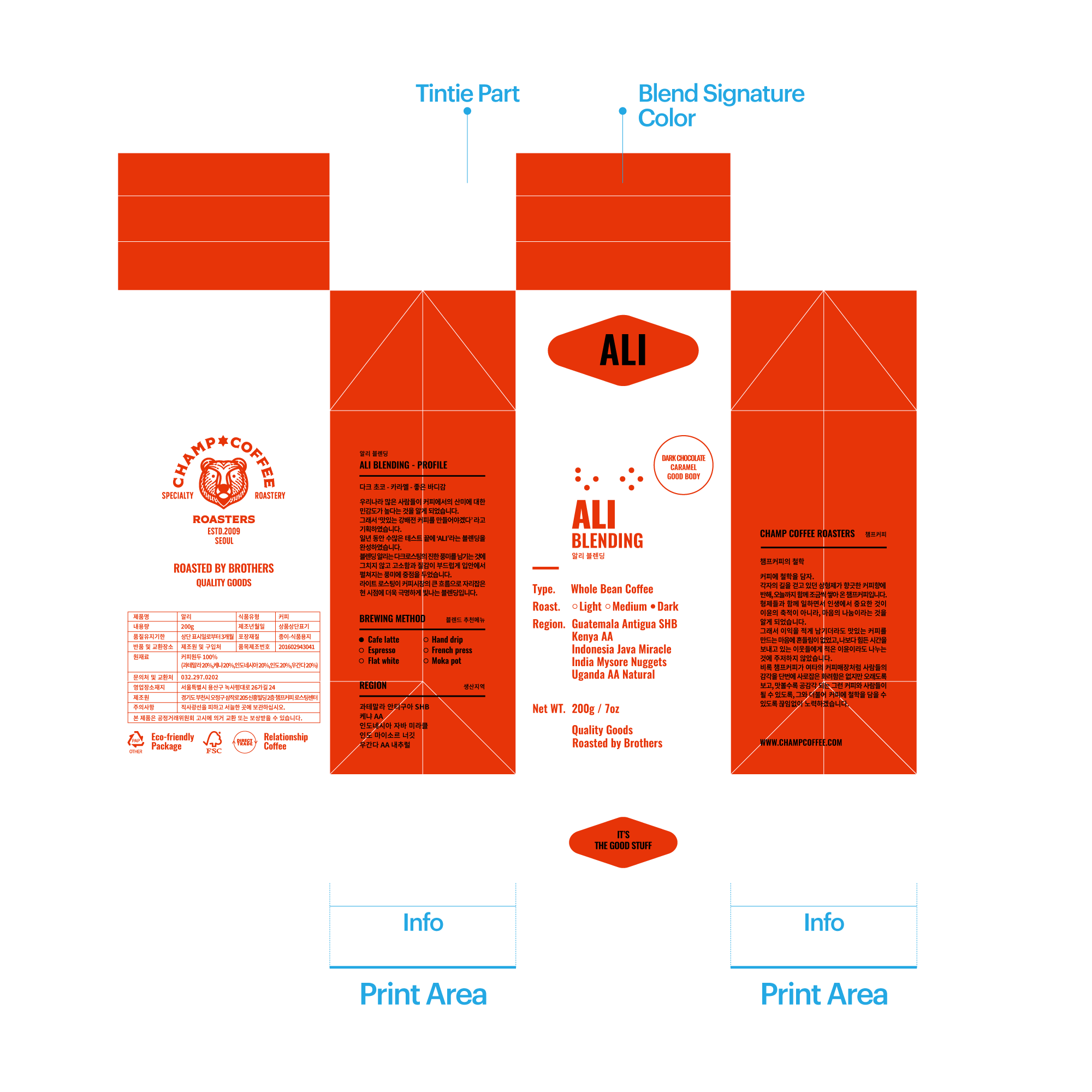
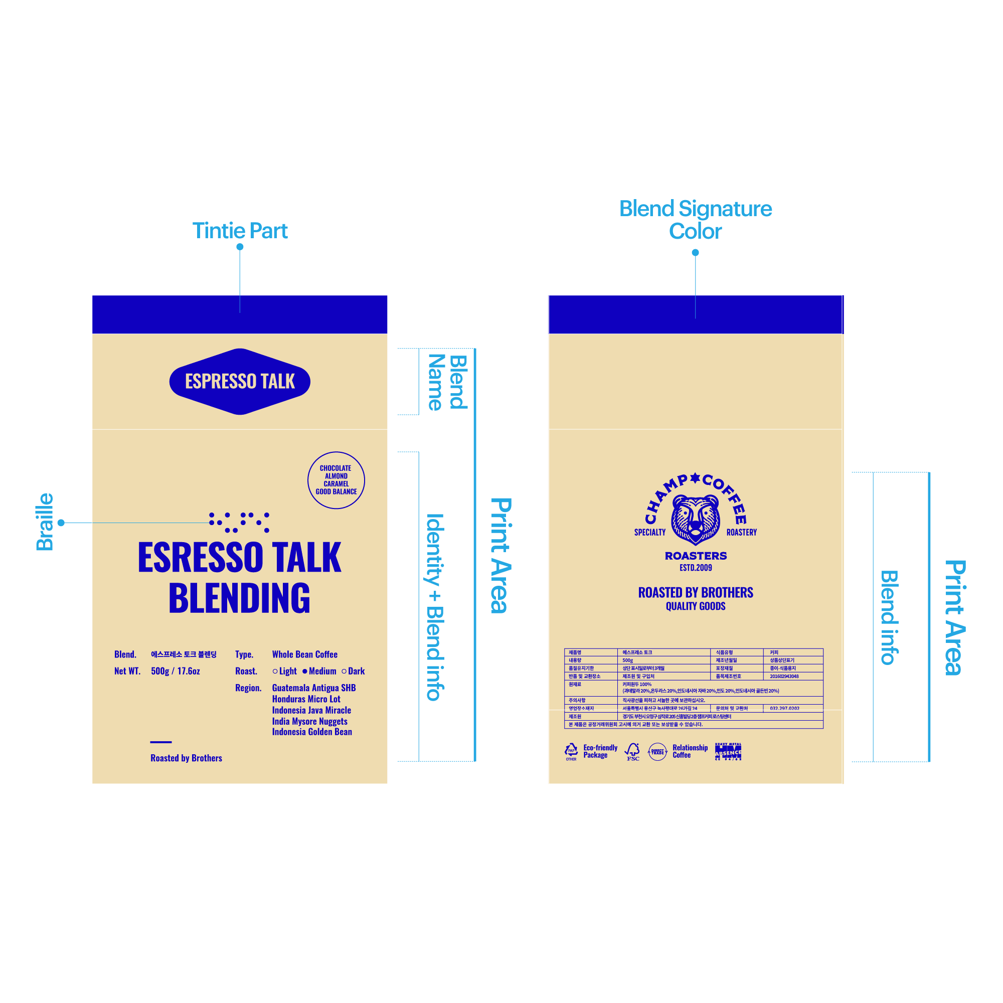
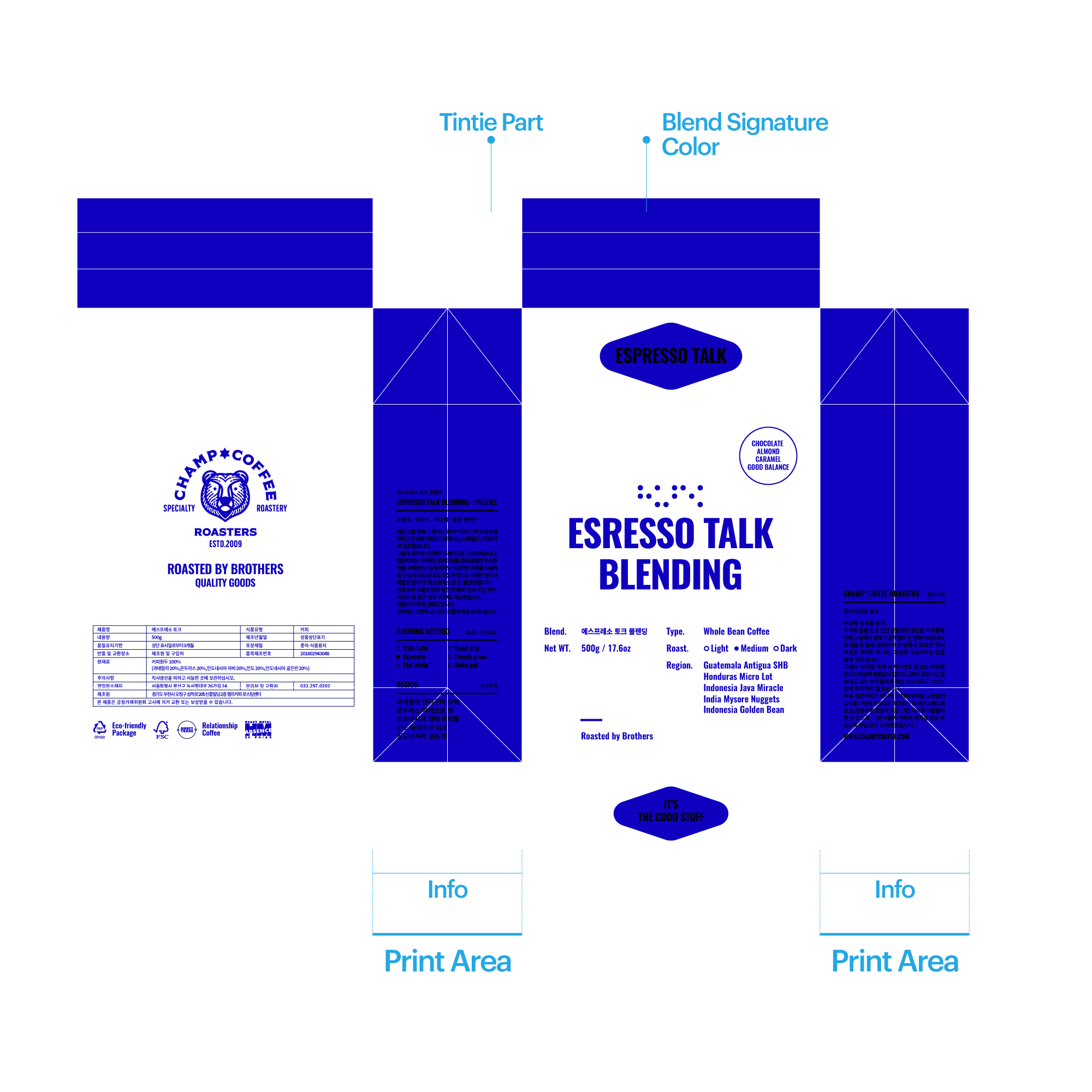
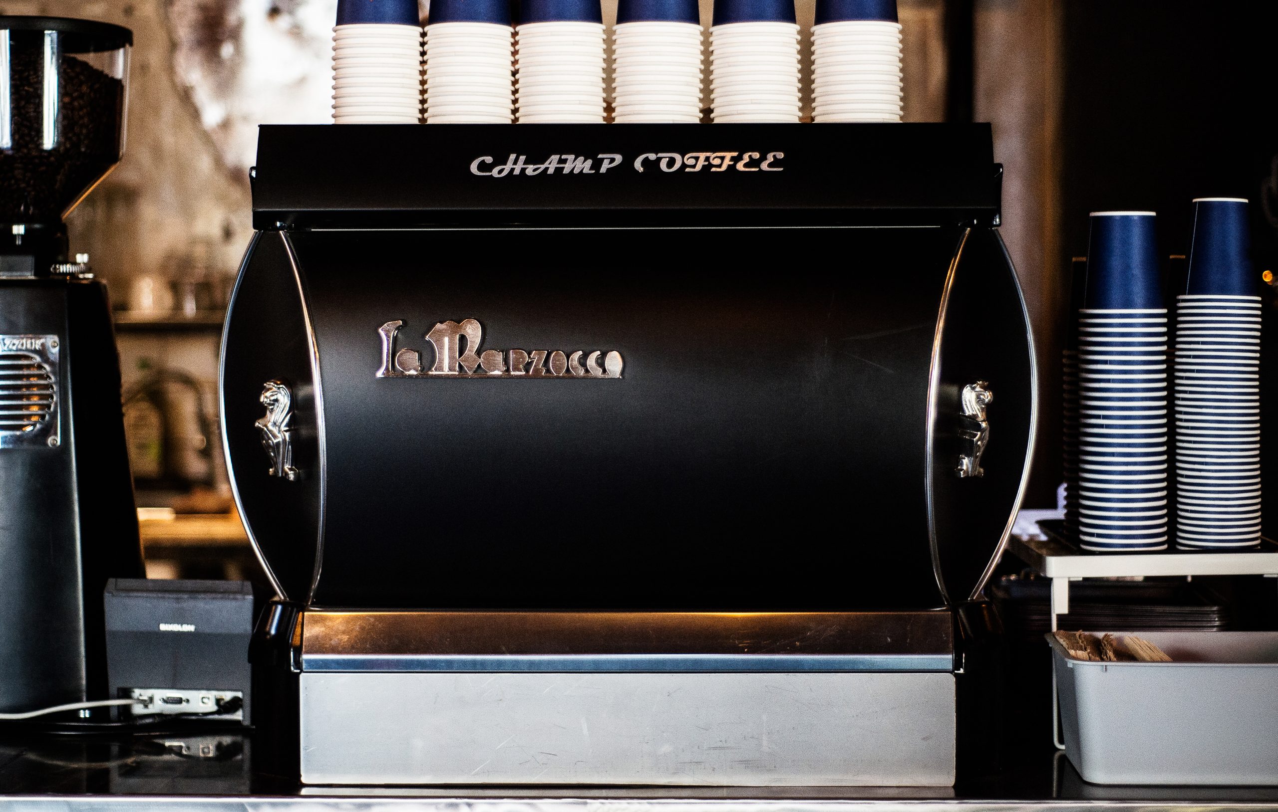
The project began by defining the rebranding concept around the brand’s philosophy and origin. We shaped character designs inspired by Muju and the moon bear legend, focusing on the theme of brotherhood. The work included creating a unified system across the logo, character visuals, and packaging, ensuring a consistent tone and message.

  • Design

    Rebranding

  • Client

    Champ Coffee Roasters

01.Project intro

Champ Coffee Roasters spent ten years quietly becoming a favorite among coffee lovers who valued authenticity over trends. Known for its integrity and character, the brand chose its 10th anniversary as the perfect moment to reflect on its roots and look ahead with a new vision. This rebranding wasn’t about changing for the sake of change. It was about deepening the story and offering a refreshed identity that honored its past while setting the stage for what’s next.

챔프커피 로스터스는 10년 동안 조용히, 그러나 단단하게 커피 애호가들의 마음을 사로잡아온 브랜드였다. 메인스트림보다는 언더그라운드에서 개성과 진정성을 인정받으며 자리 잡은 이 브랜드는 10주년을 계기로 새로운 변화를 고민했다. 리브랜딩은 단순히 시각을 새롭게 하는 작업이 아니었다. 그동안의 시간과 철학을 담아, 앞으로의 방향성을 제안하는 깊이 있는 프로젝트였다.

02.Project concept

The concept development began with a deep dive into the brand’s roots and philosophy.
Through interviews and workshops with the founders, we identified three core values that define CHAMP COFFEE: brotherhood, hometown, and sharing.
The story of the three brothers who started the brand became the foundation of its identity, while their hometown, Muju, provided a rich backdrop for the narrative.

During our research, we came across the tale of a moon bear that had crossed from Mount Jiri to Muju. This story offered a powerful symbol for brotherhood and home, and it became a central motif that shaped the rebranding’s visual and narrative direction.

리브랜딩의 시작은 브랜드의 뿌리와 철학을 다시 들여다보는 데서 출발했다.
창립자들과의 인터뷰와 워크숍을 통해 브랜드의 핵심 가치를 정리하는 과정을 거쳤으며, 그 결과 ‘삼형제’, ‘고향’, ‘나눔’이라는 세 가지 키워드가 중심 개념으로 선정되었다.
챔프커피를 세운 삼형제의 이야기는 브랜드 정체성의 출발점이었고, 그들의 고향인 무주라는 지역은 스토리텔링의 중요한 배경이 되었다.

무주에 대한 자료 조사 과정에서 지리산에서 건너온 반달곰 이야기가 발견되었고, 이는 형제애와 고향을 상징적으로 표현할 수 있는 모티브로 발전되었다. 이 이야기는 브랜드 철학과 깊게 연결되며 리브랜딩의 중심 내러티브로 자리 잡았다.

03.Limitations of the Original Logo

The original logo hinted at CHAMP COFFEE’s potential and character but reflected a brand identity that was still in progress.
It fell short of capturing the depth of the brand’s philosophy and the founding brothers’ story, and it lacked the clarity to visually express the true values and narrative CHAMP COFFEE aimed to share.

기존의 로고는 챔프커피가 지닌 잠재력과 개성을 일부 드러내고 있었지만, 아직 브랜드의 정체성이 완성되지 않았음을 보여주었다.
로고는 챔프커피가 쌓아온 깊이 있는 철학과 삼형제의 이야기를 충분히 담아내지 못했으며, 브랜드가 전달하고자 하는 본질적 가치와 스토리를 시각적으로 표현하기에는 한계가 있었다.

04.New design system

At the heart of the rebranding was the creation of three bear symbols, each representing one of the founding brothers.
These weren’t just animal icons—they carried the personality and spirit of each brother, turning into meaningful emblems for the brand.
The new logo and symbol preserved CHAMP COFFEE’s original rugged warmth, while introducing refined details that reflected the significance of the 10-year milestone.
The packaging and merchandise designs were built around this new identity, forming a system that could adapt across different applications while maintaining a cohesive look.

리브랜딩의 핵심은 삼형제를 상징하는 세 마리 곰의 이미지를 개발하는 데 있었다.
이 곰들은 단순한 동물 캐릭터가 아니라, 형제 각각의 성격과 정신을 담은 상징물로 디자인되었다.
심볼과 로고는 챔프커피가 가지고 있던 거친 듯하지만 따뜻한 감성을 유지하면서도, 10주년을 기념하는 세련되고 정돈된 형태로 완성되었다.
패키지와 굿즈는 이 새로운 심볼을 중심으로 통일성을 가지되, 다양한 형태로 확장 가능하도록 디자인 시스템을 구축했다.

The original identity, made up of plain text and literal symbols, was transformed into a cohesive system centered on an illustrated bear that reflected the brand’s story.
This new symbol, paired with typography that matched its tone, was refined within a clear set of design rules, creating a strong and unified foundation for the brand.

기존에는 단순한 텍스트와 직접적인 심볼로 구성되었던 브랜드 아이덴티티를, 브랜드 스토리와 철학에 맞춘 곰의 일러스트와 그 흐름을 함께하는 새로운 타이포그래피로 재구성했다.
이 요소들은 새로운 디자인 규칙에 따라 체계적으로 정리되었으며, 이를 통해 브랜드의 기본 틀과 일관된 비주얼 시스템을 완성했다.

We designed a custom Korean font that had never existed within the brand before, creating a fresh layer of identity.
The font was intuitive and clear in form, yet carried a subtle retro character that echoed the brand’s tone and story.
This made typography another key element that visually tied back to the brand’s unique narrative.

기존에는 없던 한글 전용 폰트를 새롭게 개발하여 브랜드 아이덴티티에 적용했다.
이 폰트는 직관적이고 명료한 형태를 유지하면서도, 브랜드의 스토리와 톤에 맞게 레트로한 감성을 더해 디자인되었다.
이를 통해 타이포그래피 또한 브랜드의 고유한 이야기와 연결되는 또 하나의 중요한 시각 요소가 되었다.

The new design principles influenced not only the typography but also the way various symbols and elements were arranged.
This brought all visual components of the brand into a unified system, creating a stronger and more consistent identity.

새롭게 세운 디자인 규칙은 타이포그래피뿐 아니라 다양한 심볼을 포함한 요소들의 구성 방식에도 반영되었다.
이로써 브랜드를 이루는 모든 시각적 요소가 하나의 흐름과 원칙 아래 정리되었고, 브랜드 아이덴티티는 보다 단단하고 일관된 시스템으로 완성되었다.

05.Redefining the Packaging and Graphic System

We created a new set of design principles that guided the packaging and overall graphics across the brand.
Standard off-the-shelf packaging was replaced with eco-friendly materials that aligned with the brand’s values, and both the communication of coffee bean details and the visual identity of different blend series were redesigned to fit the updated identity.
This system extended beyond the coffee packaging itself, consistently applied to signage across workspaces as well as cups and merchandise.

패키지와 그래픽 전반에 걸쳐 새로운 디자인 규칙을 정립하고 이를 체계적으로 적용했다.
기존에 기성품 형태로 사용되던 패키지는 브랜드 철학과 맞닿은 친환경 소재로 변경하였으며, 원두의 정보 전달 방식과 다양한 블렌드 시리즈의 표현도 새롭게 구축된 아이덴티티에 맞춰 재설계했다.
이 시스템은 단순히 원두 패키지에만 그치지 않고, 여러 작업실의 사이니지와 컵, 굿즈 등 다양한 접점에서도 일관되게 적용되었다.

Let's get in touch,
we respond fast.

Ready to work together?
Back