A Structure for Visibility

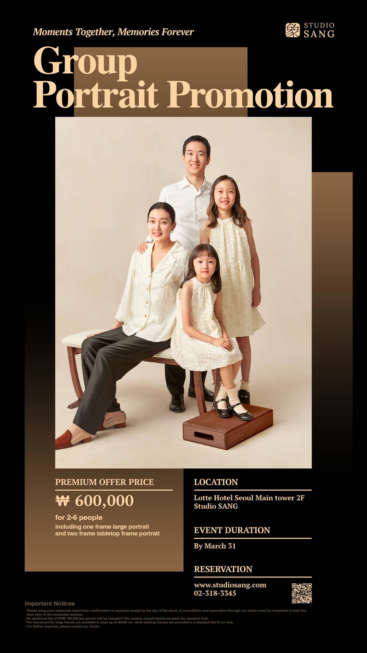
A visual rhythm of typography and light guides the viewer through Studio Sang’s promotional DID display. The design reflects the brand’s composed and refined character.

Task

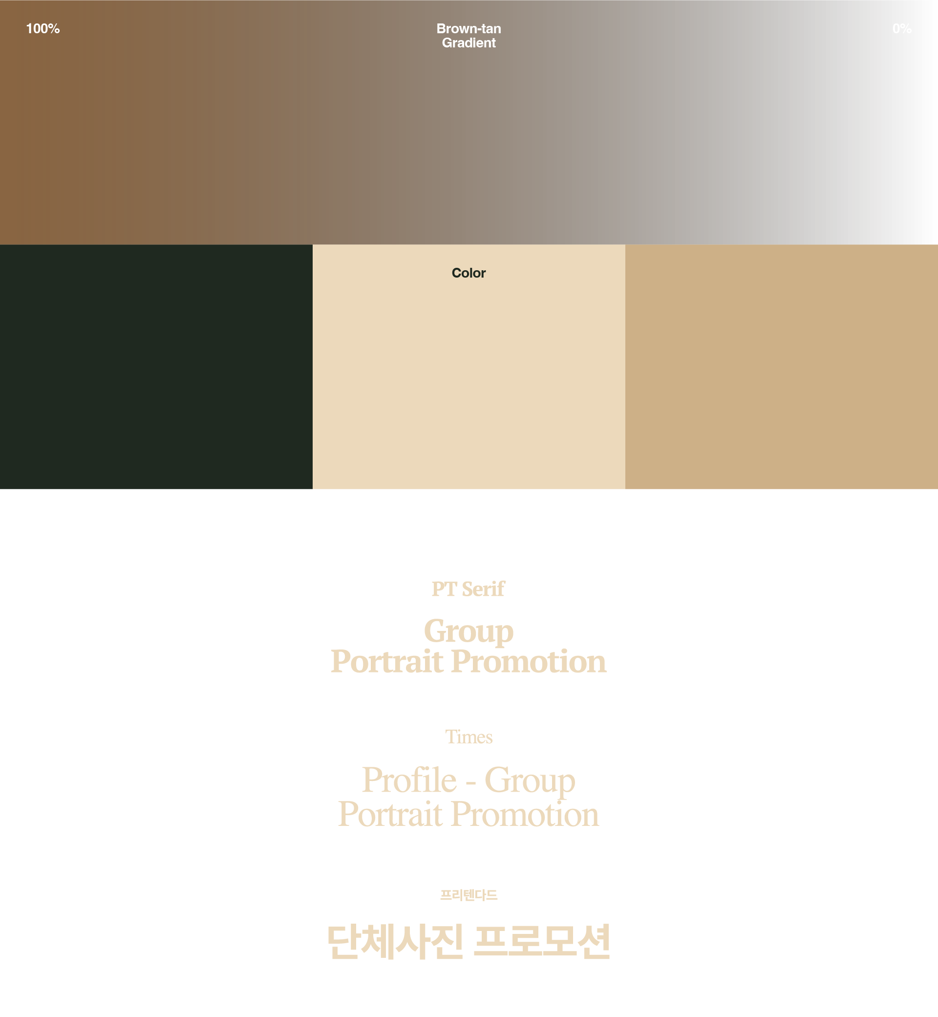
Led the planning and visual direction, designed the display structure, and developed typography and layout systems based on the brand tone.
  • Design

    Promotion Design

  • Client

    FUJI FILM KOREA

01. Information - Promotion Design
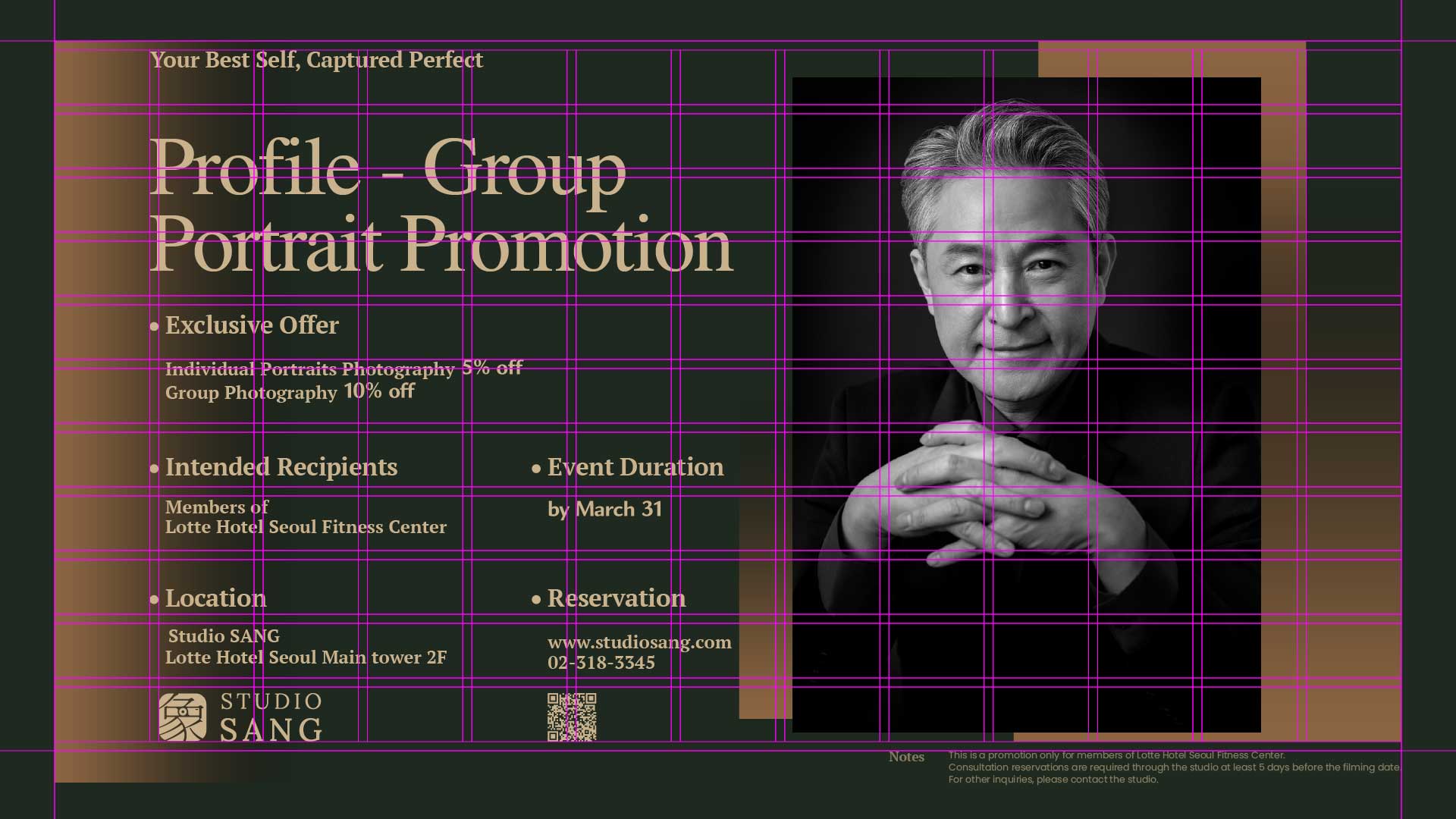
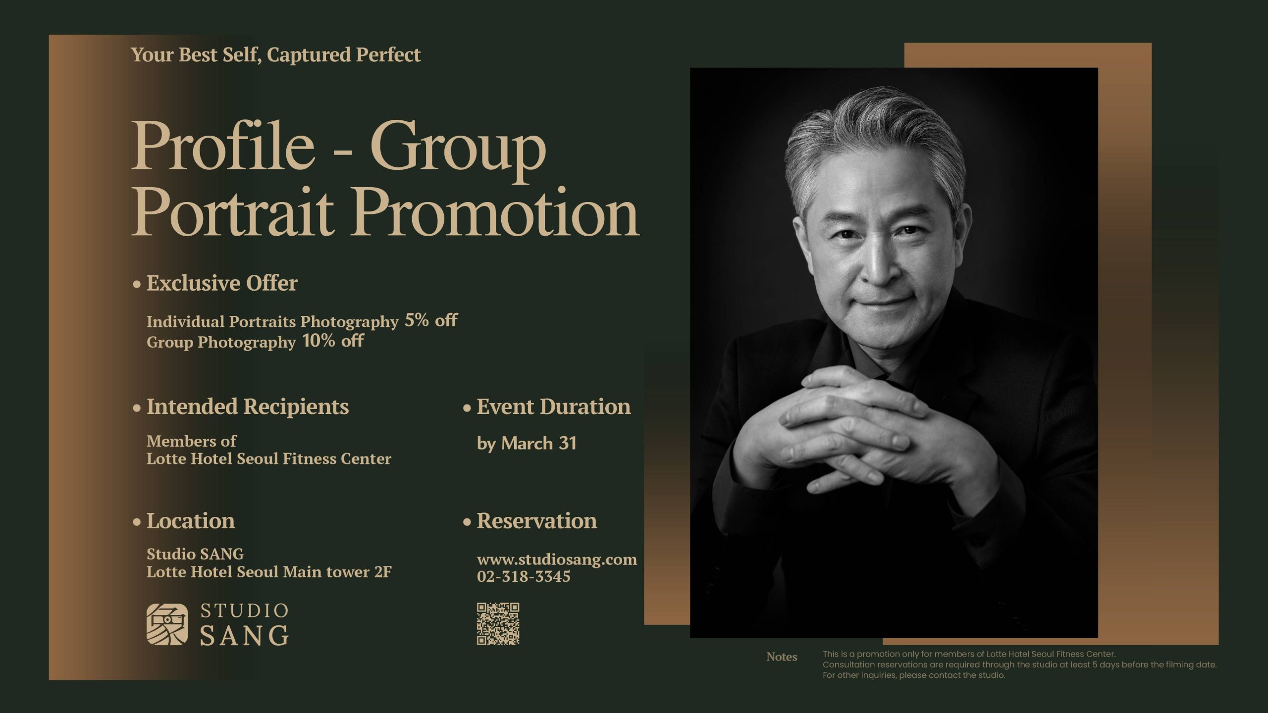
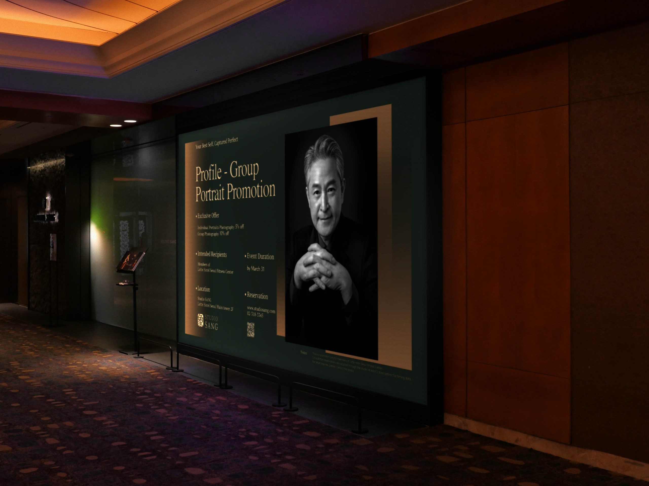
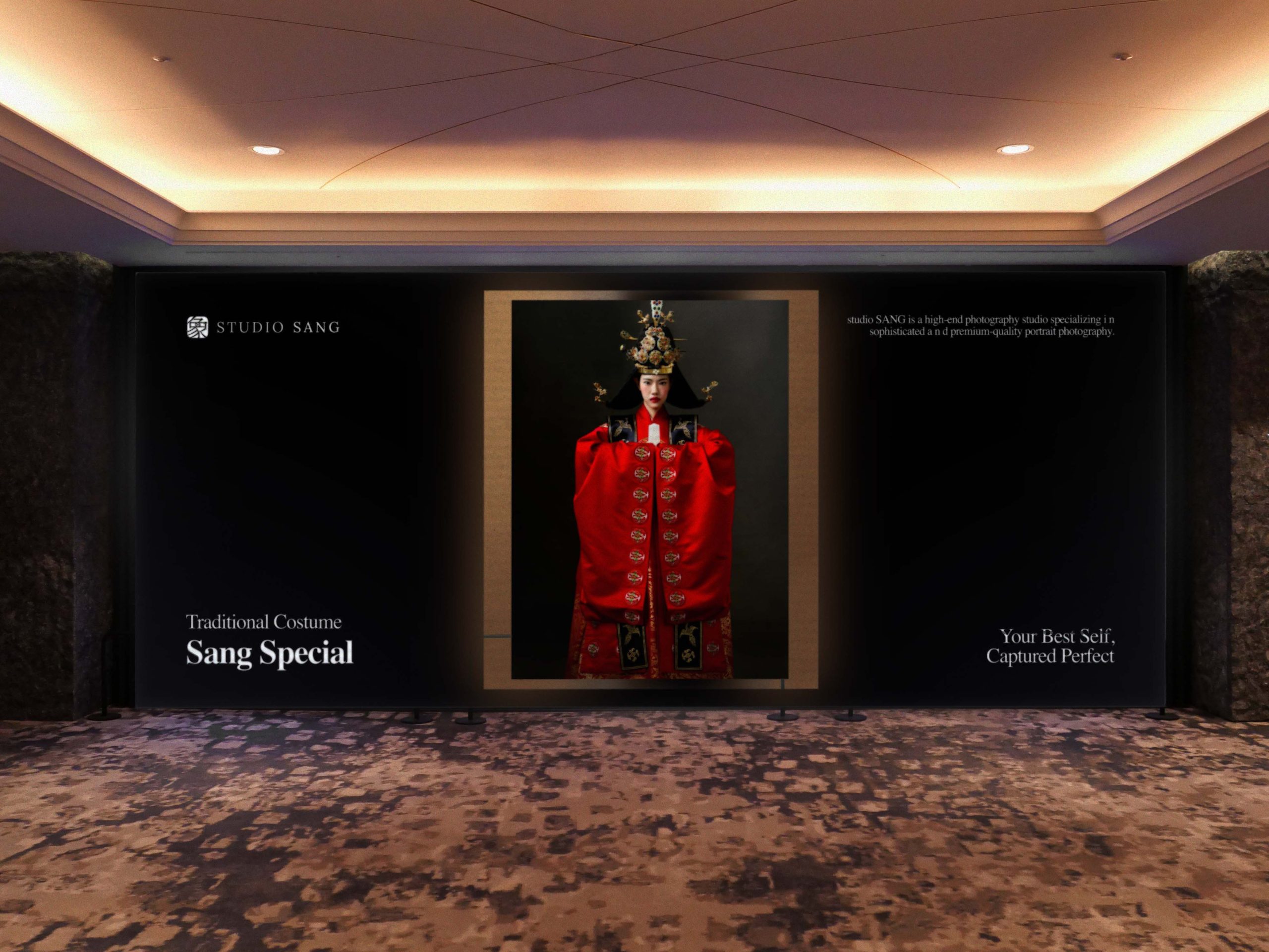
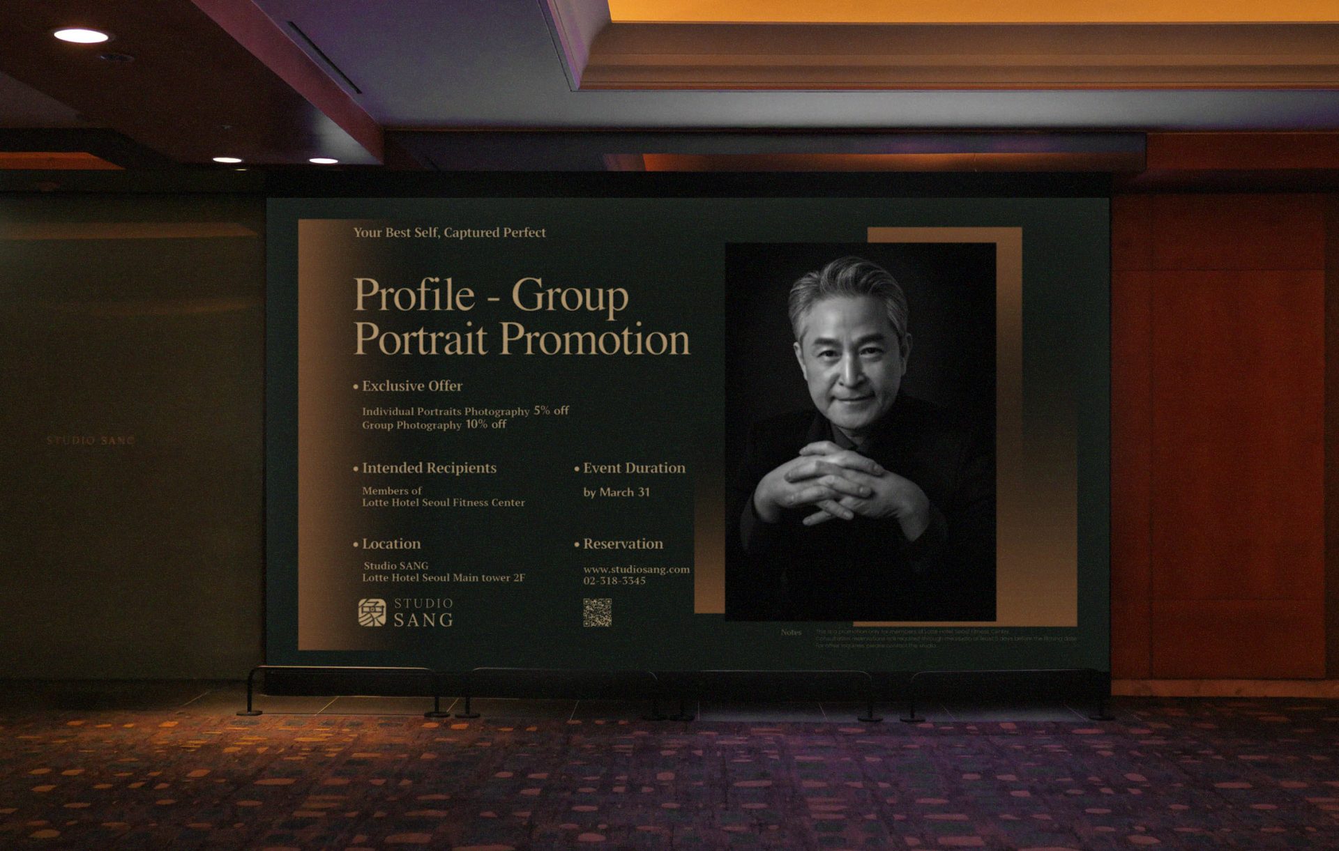
We designed a promotional display for Studio Sang, a high-end portrait brand operated by Fujifilm Korea. Displayed through the DID system at Lotte Hotel Seoul, this work was not created as a decorative element, but as a spatial device for clarity and intentional framing.
 
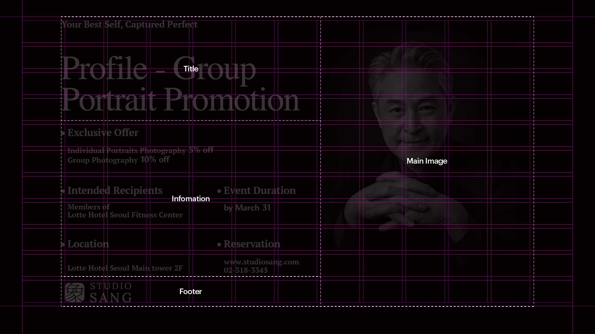
Rather than sequencing information, the design follows the viewer’s gaze, directing perception through spatial rhythm, balanced spacing, and tonal contrasts. Typography is not fixed to a rigid grid, but arranged through atmosphere and light, responding to distance and the brand’s emotional tone.

스튜디오상은 후지필름 코리아에서 운영하는 하이엔드 포트레이트 브랜드로, 롯데호텔 서울 DID 시스템을 통해 전개된 이번 프로모션은 단순한 그래픽이 아닌 구조적인 시선 유도 장치로 기획되었다.


정보를 나열하는 대신, 보는 이의 시선을 중심으로 구성 흐름을 설계하였으며, 공간적 리듬과 여백, 명도 대비 등을 통해 직관적인 전달을 유도하였다. 타이포그래피는 격자 위에만 놓인 것이 아니라, 빛과 거리, 감정의 흐름에 따라 배치되었고, 정형화된 구도보다는 움직임과 침묵에 반응하는 구조를 지향하였다.

02. Information - Display image

Instead of favoring symmetry, the layout embraces motion and quiet, forming a structure that mirrors the way attention shifts and rests. Soft gradients and gentle contrasts create visual depth and a subtle sense of tension.


This is not simply a display. It is a framing device that holds Studio Sang’s identity still within the field of vision. It is a portrait not of a person, but of how visual attention can be guided with care and intention.

부드러운 그래디언트와 섬세한 대비는 깊이감과 긴장감을 동시에 부여하며, 브랜드의 차분하고 절제된 성격을 시각적으로 고정시킨다. 이 디스플레이는 단순한 안내물이 아니라, 브랜드 정체성을 담아내는 하나의 액자와도 같은 역할을 하며, 시선이라는 매개를 통해 ‘정제된 주의’ 자체를 초상화로 구성하고자 하였다.

Let's get in touch,
we respond fast.

Ready to work together?
Back