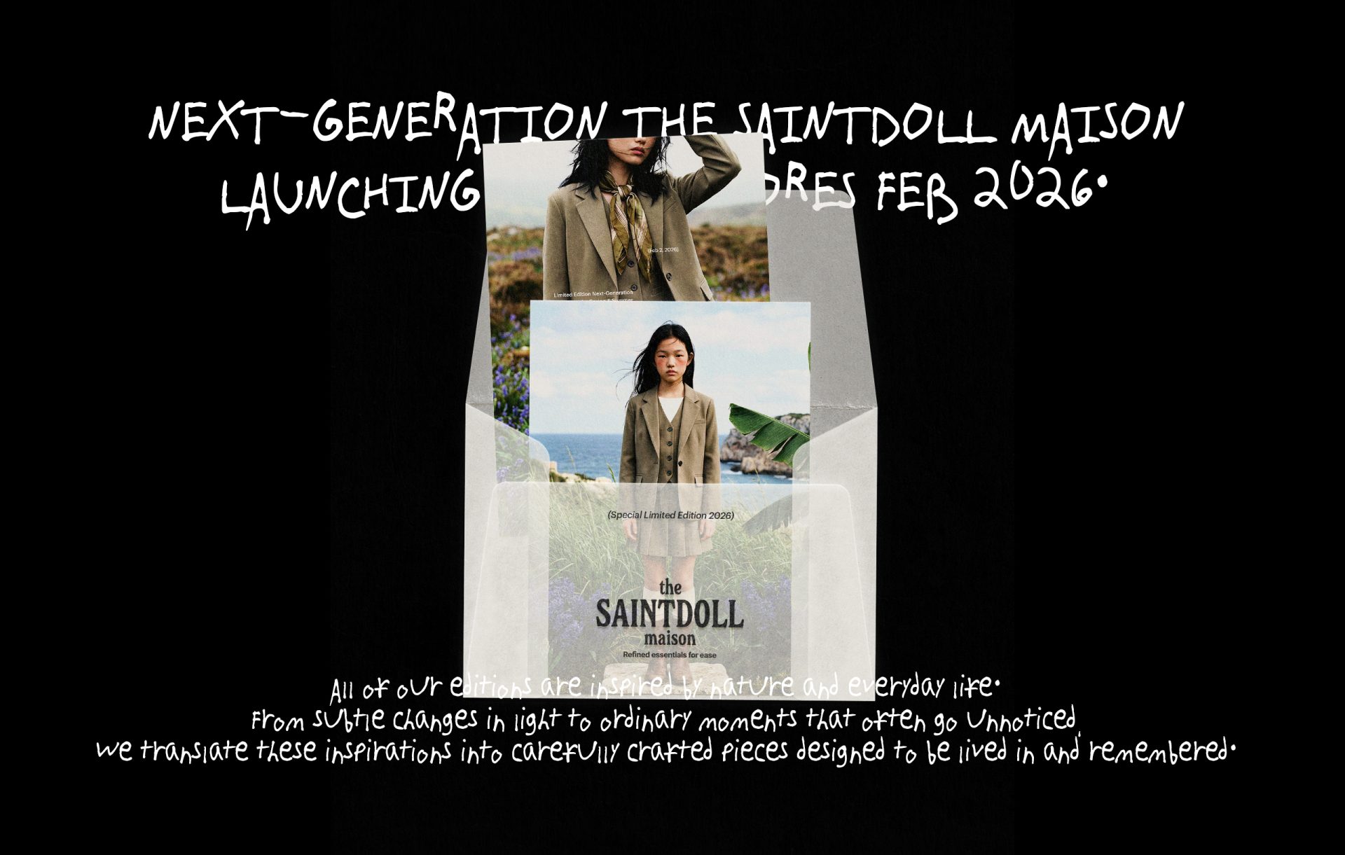
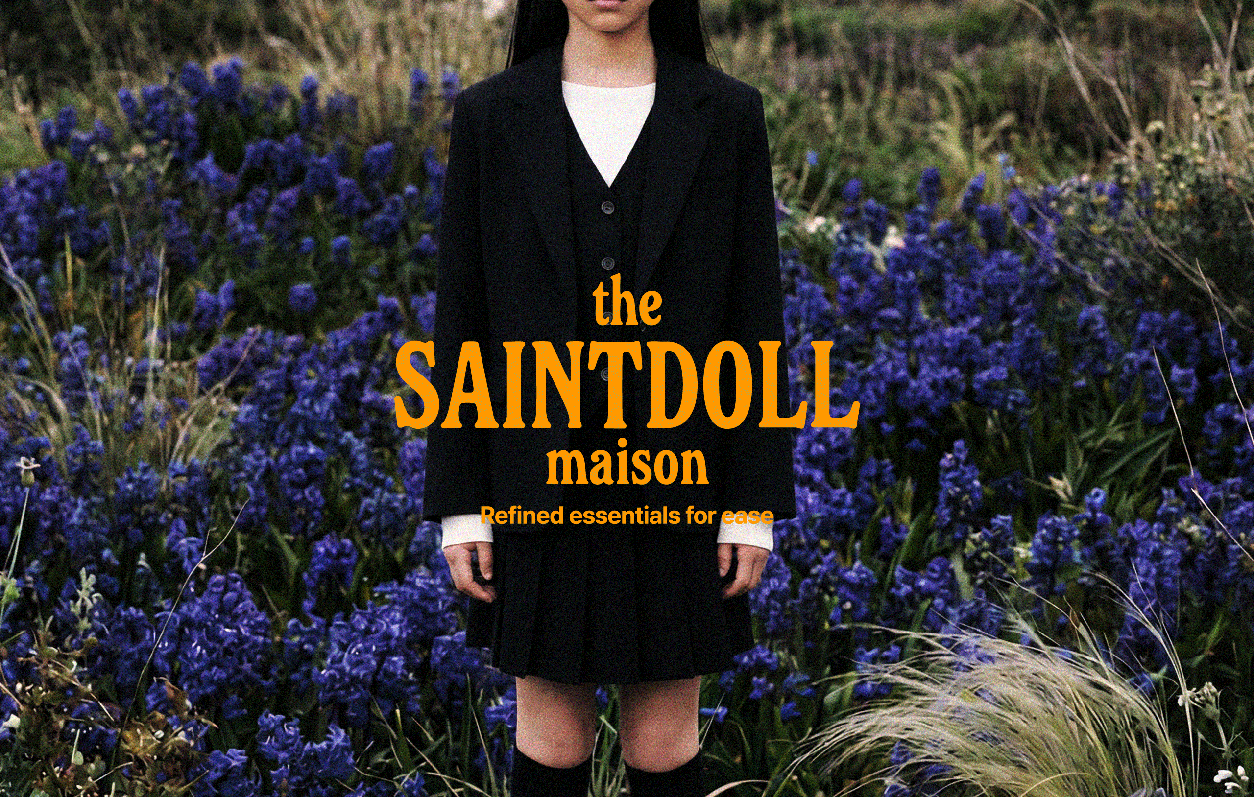
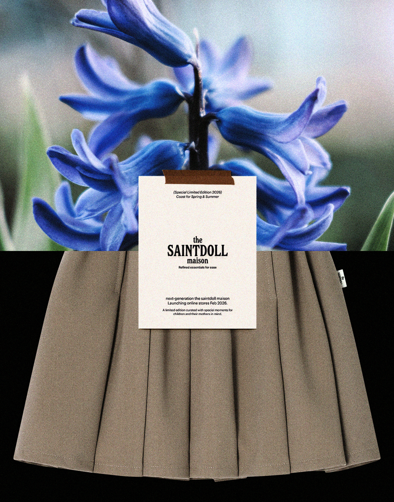
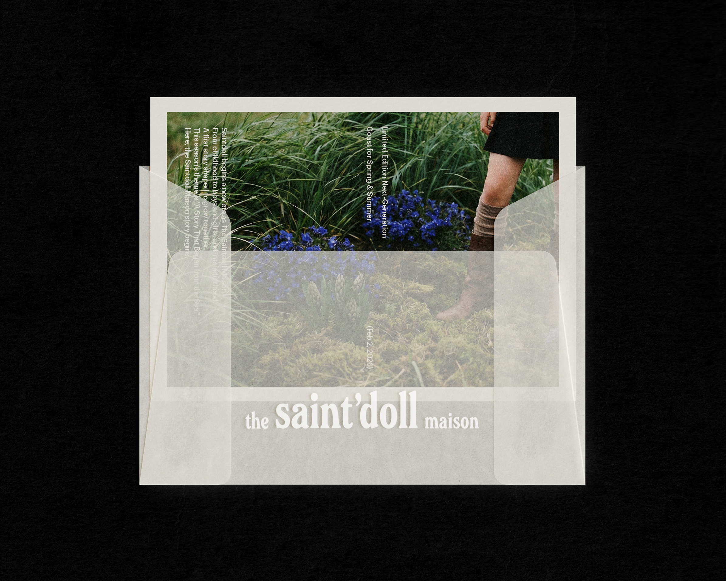
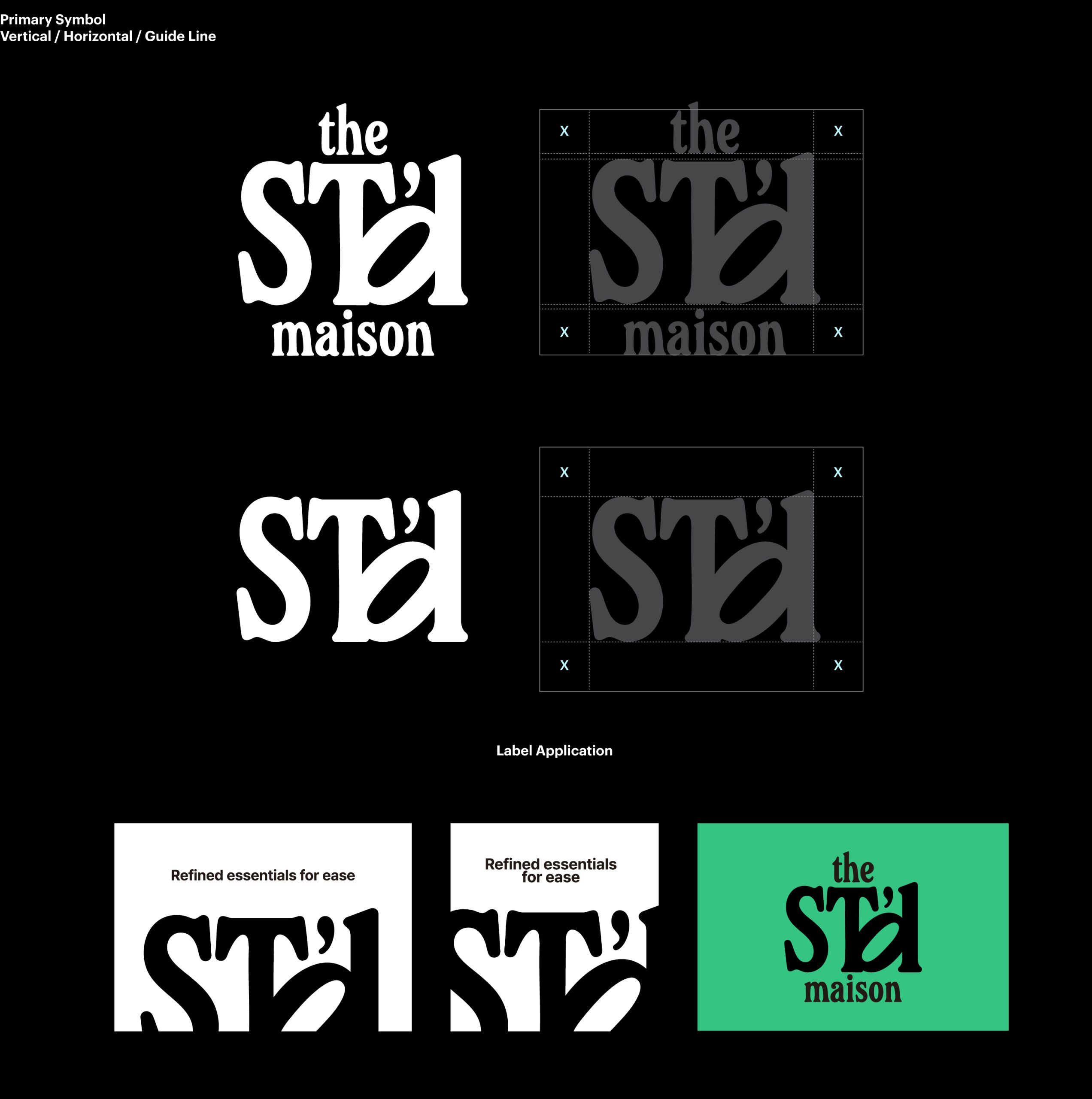
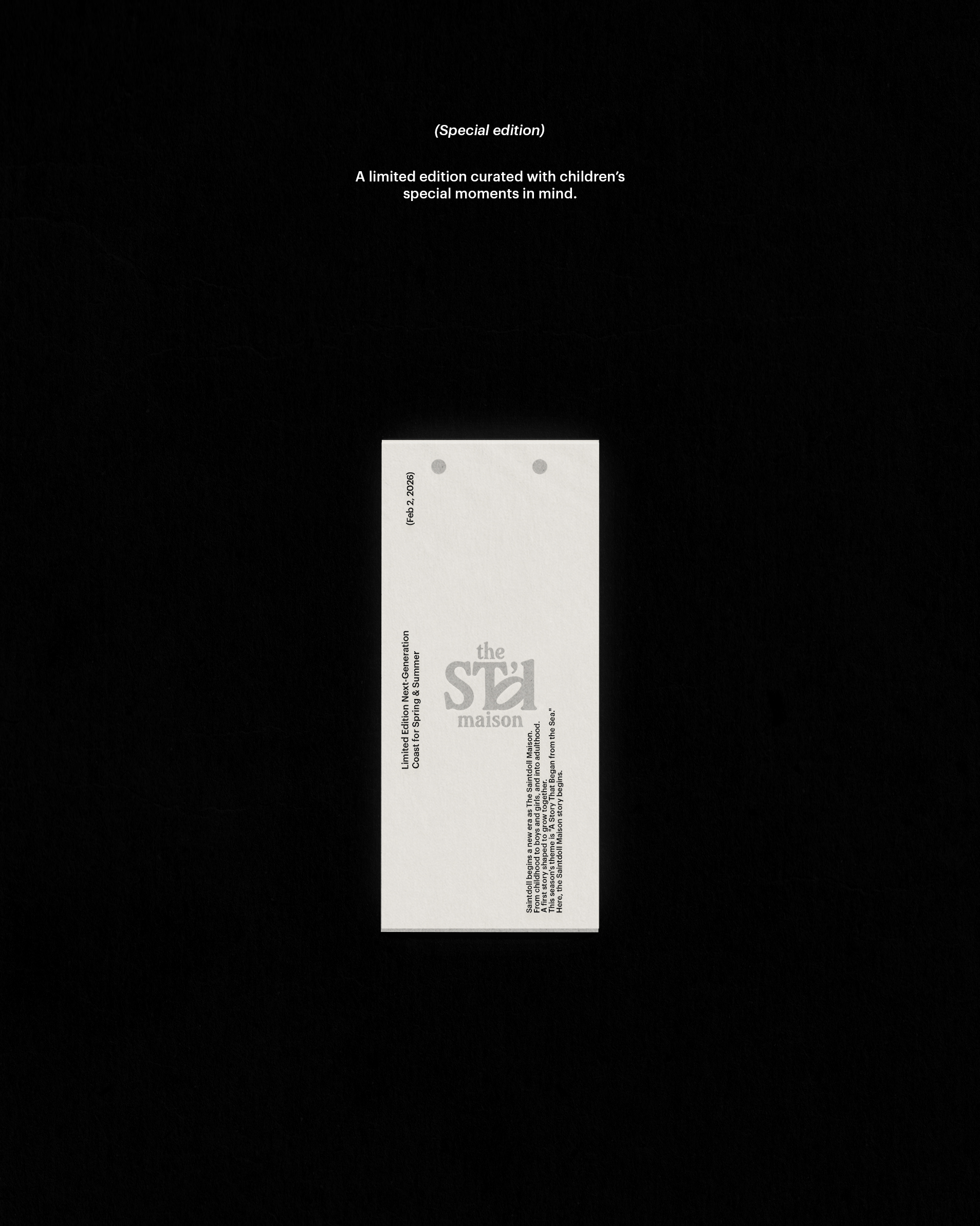
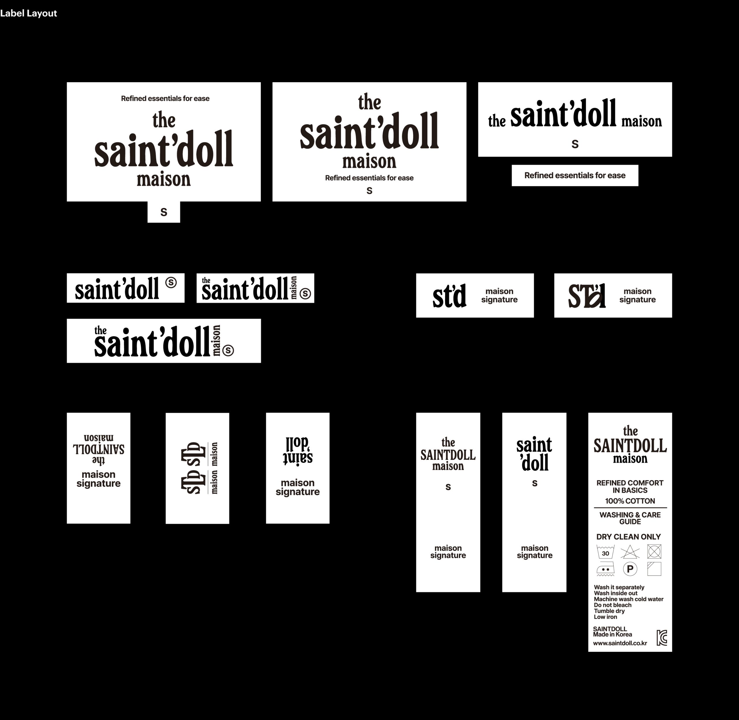
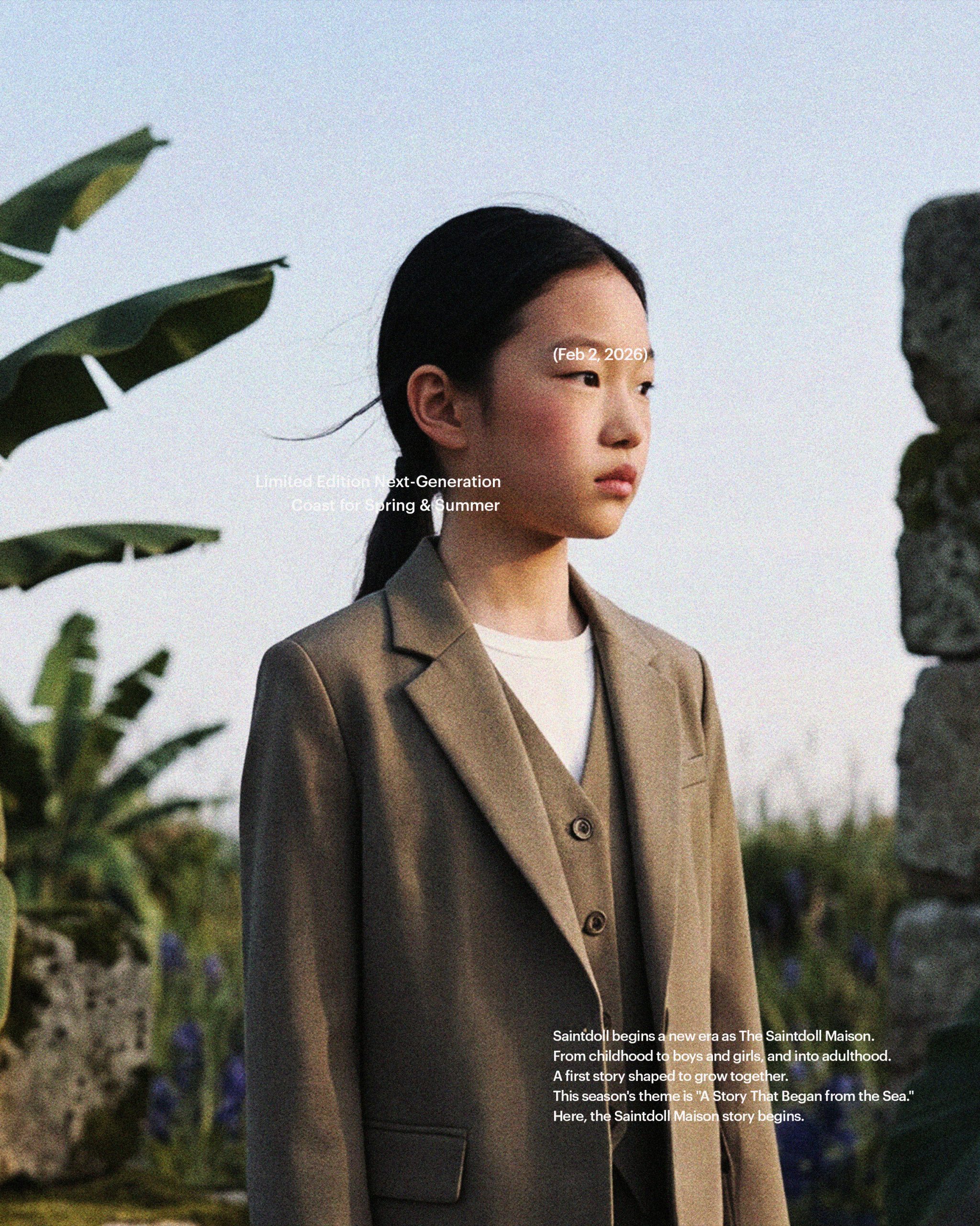
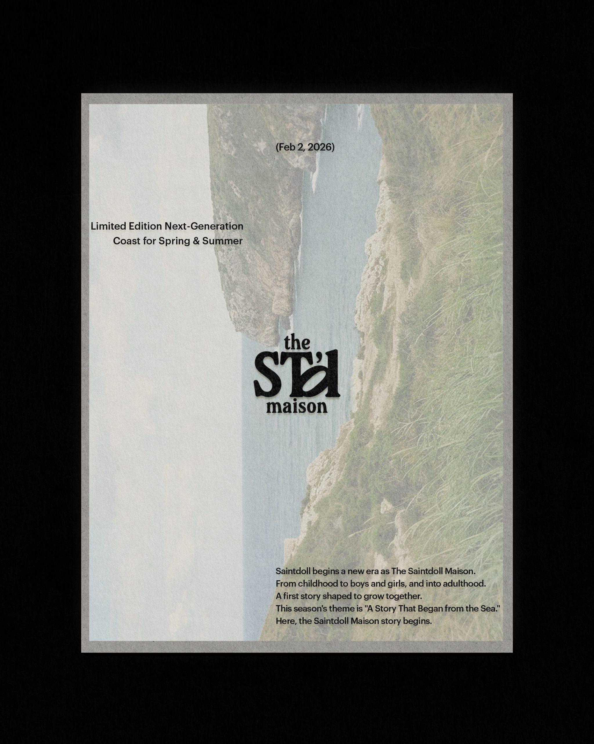
The Saintdoll Maison Rebranding

A complete redefinition of Saintdoll into The Saintdoll Maison, a timeless lifewear brand.
The project dissolves age boundaries and builds a quiet, enduring visual identity for global continuity.
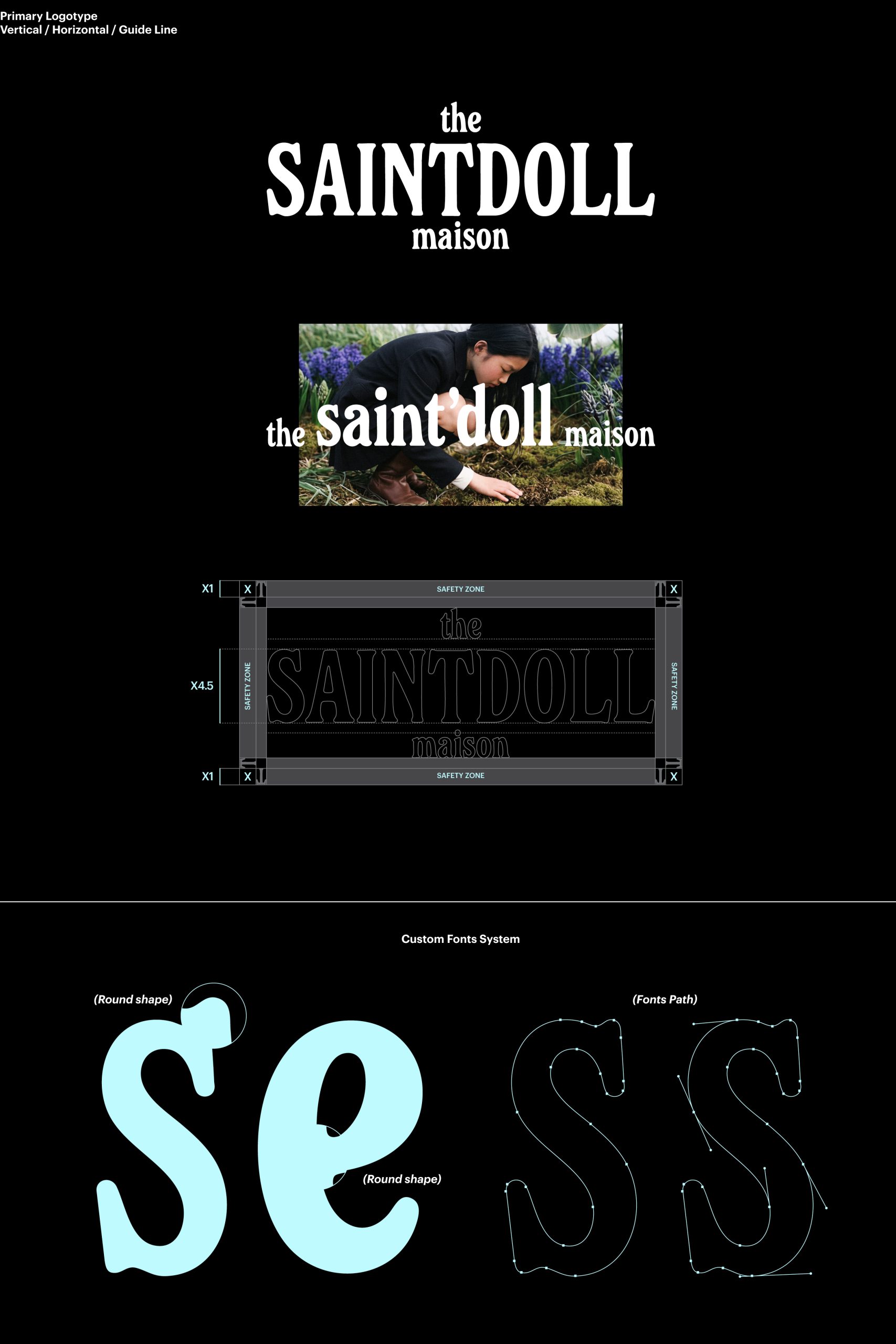
Task

Logotype and symbol system development Design of the overall visual language, including layout structures, labels, and packaging components.
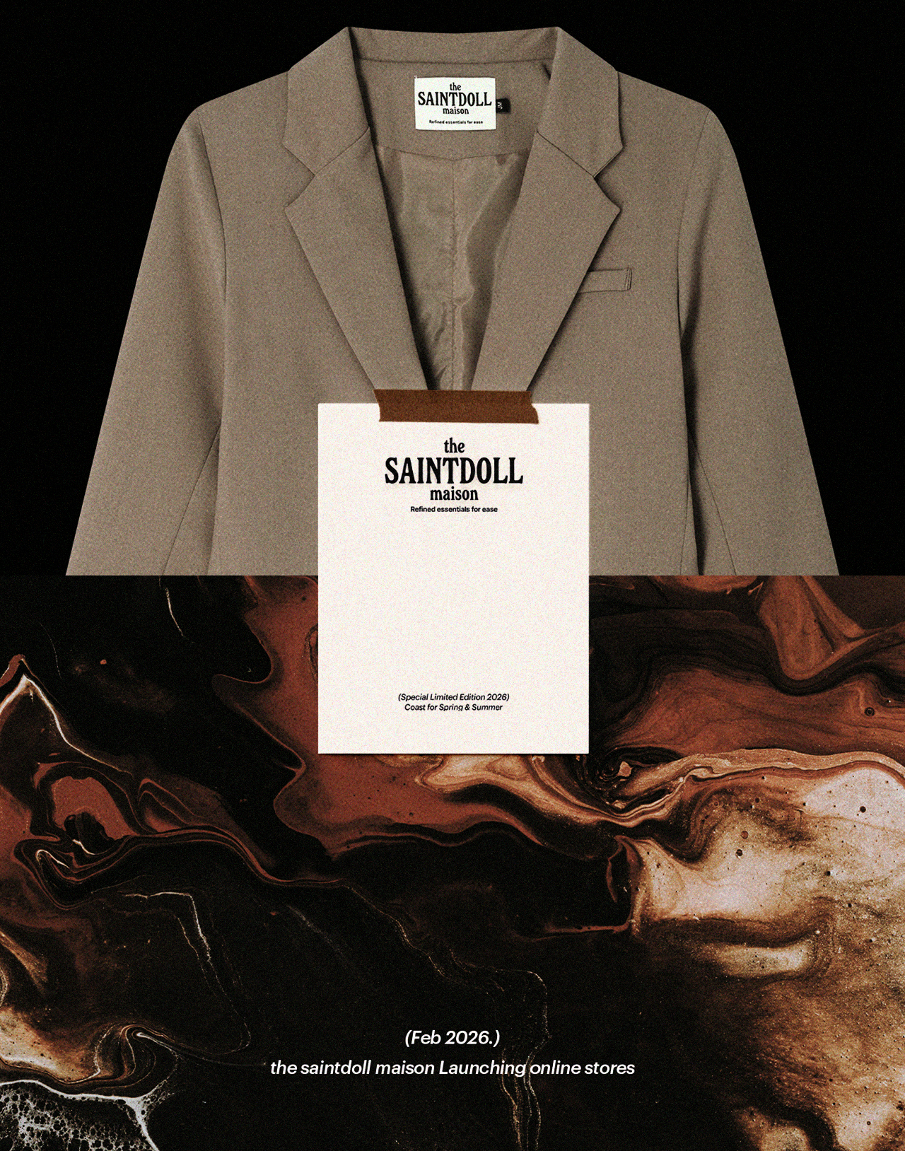
  • Design

    Brand Identity

  • Client

    SAINTDOLL

01.Project Info-Concept

The rebranding of The Saintdoll Maison begins with a shift beyond the singular category of childrenswear toward a lifewear structure designed to endure over time.

By softening age boundaries and building a continuous emotional tone from childhood into adulthood,
the brand is positioned not within a moment but along an expanding timeline.

Grounded in restrained elegance, quiet balance, and long-term sustainability, the project redefines both the visual language and the experiential framework of the brand.

더세인트돌메종 리브랜딩은 키즈웨어라는 단일한 범주를 넘어, 시간의 흐름 속에서 지속될 수 있는 하나의 라이프웨어 구조를 설계하는 데에서 출발하였다.연령의 경계를 흐리고 어린 시절부터 성인까지 이어지는 감도의 연속성을 구축함으로써, 브랜드가 특정 시기에 머무르지 않고 시간과 함께 확장되는 정체성을 갖도록 하였다.절제된 우아함, 과장되지 않은 균형, 그리고 장기적인 지속 가능성을 중심에 두고 브랜드의 시각 언어와 경험 구조 전반을 재정의하였다.

02.Project Info-B.I
The logotype draws from a serif foundation while intentionally avoiding an overly classical impression. Soft, rounded stroke movements are maintained throughout, and sharp terminal tension is reduced to create a calmer visual balance that can coexist naturally with a wide range of garment moods and shifting trends over time. Rather than belonging to a specific era, this approach establishes a typographic system designed to support the brand’s continuity and long-term evolution.
로고타이프는 기본적으로 세리프 구조를 차용하되, 과도하게 고전적인 인상은 지양하고자 하였다. 전체적인 획의 흐름은 부드럽고 둥근 인상을 유지하면서도 글자 말단의 날카로운 긴장감은 최소화하여 다양한 의류의 무드와 변화하는 트렌드 속에서도 자연스럽게 공존할 수 있는 균형을 설계하였다.이는 특정 시대성에 고정되지 않고, 브랜드의 시간적 확장성을 담아내기 위한 타이포그래피 시스템의 기반이 된다.
The visual system of The Saintdoll Maison is designed not as a fixed form
but as a flexible structure capable of adapting across diverse environments and media. The logotype and symbol are organized into multiple proportional and compositional variations,
allowing consistent order to be maintained through labels, packaging, print, and digital applications
while enabling context-specific expansion. The layout system avoids excessive decoration or complexity, focusing instead on balance through spacing, alignment, and proportion. This approach ensures that the brand’s restrained elegance and time-independent stability are experienced consistently at every touchpoint.
더세인트돌메종의 시각 시스템은 단일한 고정 형태가 아닌, 다양한 환경과 매체 속에서 유연하게 작동할 수 있도록 설계하였다. 로고타이프와 심볼은 비율, 조합, 배치 방식에 따라 여러 단계의 베리에이션 구조를 갖도록 구성하였으며,
이는 라벨, 패키지, 인쇄물, 디지털 매체 전반에 일관된 질서를 유지하면서도 상황에 맞는 확장을 가능하게 한다. 레이아웃 시스템 또한 과도한 장식이나 복잡한 구조를 지양하고, 여백과 정렬, 비례의 균형을 중심으로 설계하였다. 이를 통해 브랜드의 절제된 우아함과 시간에 구애받지 않는 안정된 인상을 모든 접점에서 동일하게 경험하도록 하였다.

A gourd-shaped graphic element, inspired by traditional “horibyeong” flasks, was transformed into a core pattern. This motif depicts fortune spilling outward and evolving into a repeating visual theme across packaging, labels and printed materials.

호리병을 본뜬 그래픽 패턴은 내부에 담긴 ‘복’이 점차 퍼져나간다는 내러티브를 형상화한 것으로, 브랜드 시그니처 패턴으로 활용되었다. 이 패턴은 포장 패키지뿐 아니라 테이블웨어, 제품 라벨 등에 반복적으로 적용되며 브랜드의 일관성과 확장성을 함께 구축하였다.

Back