Hong Kong Movie-Inspired Restaurant Branding and Design
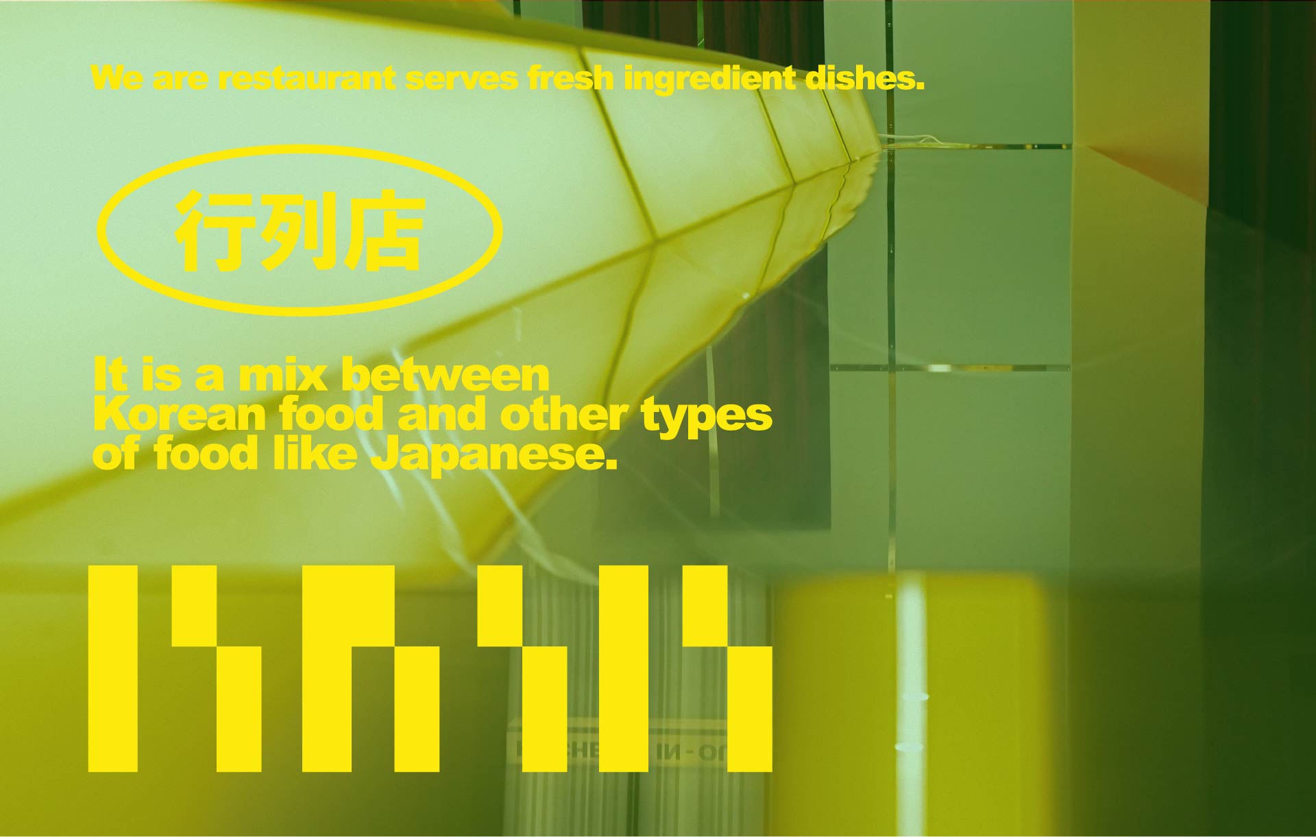
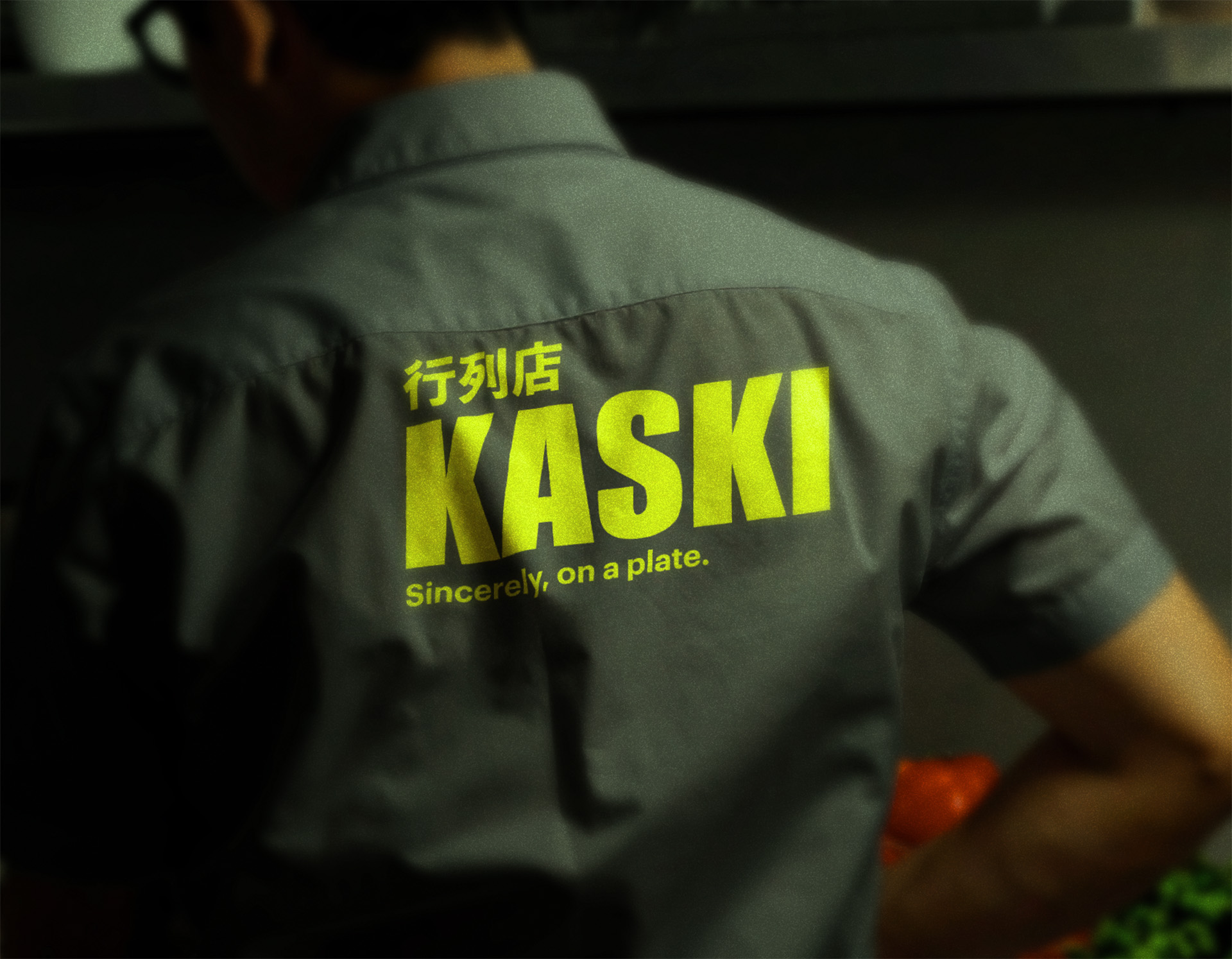
A branding and logo system crafted like a frame from a slow-burning film. Drawing from the moody lighting, spatial stillness, and visual tension of the interior, we shaped an identity that resonates with cinematic emotion where each graphic detail becomes part of a larger narrative atmosphere.
Task
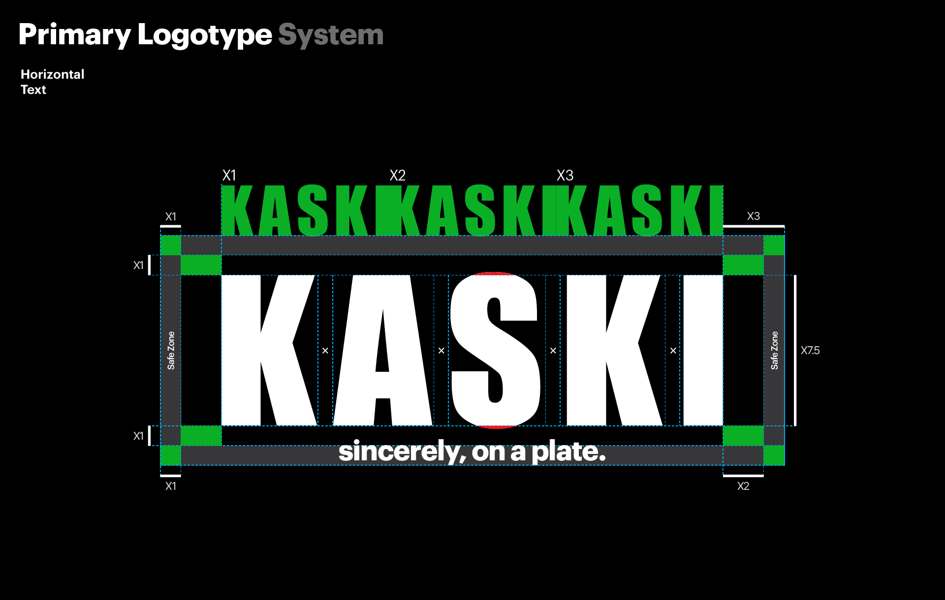
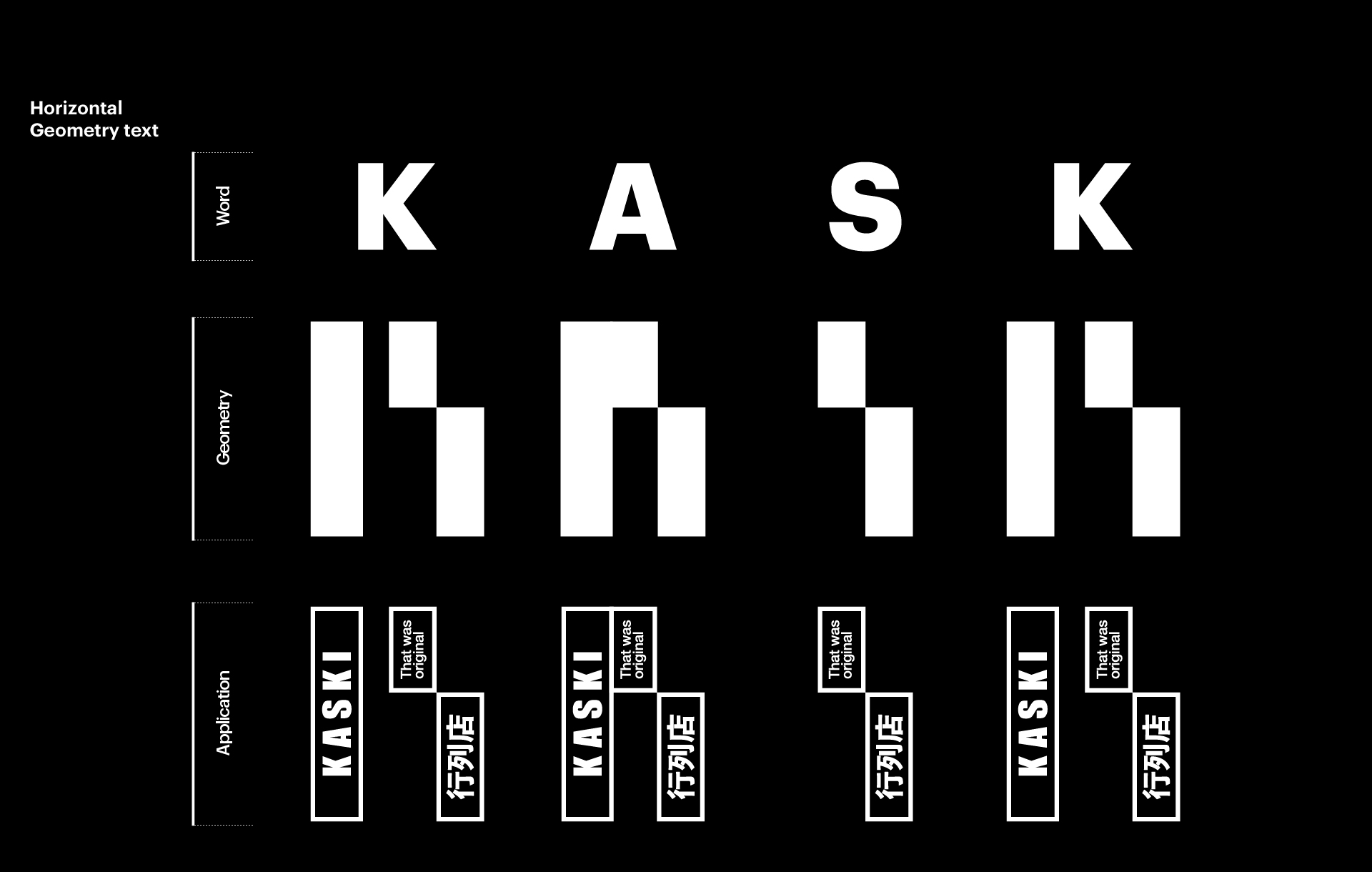
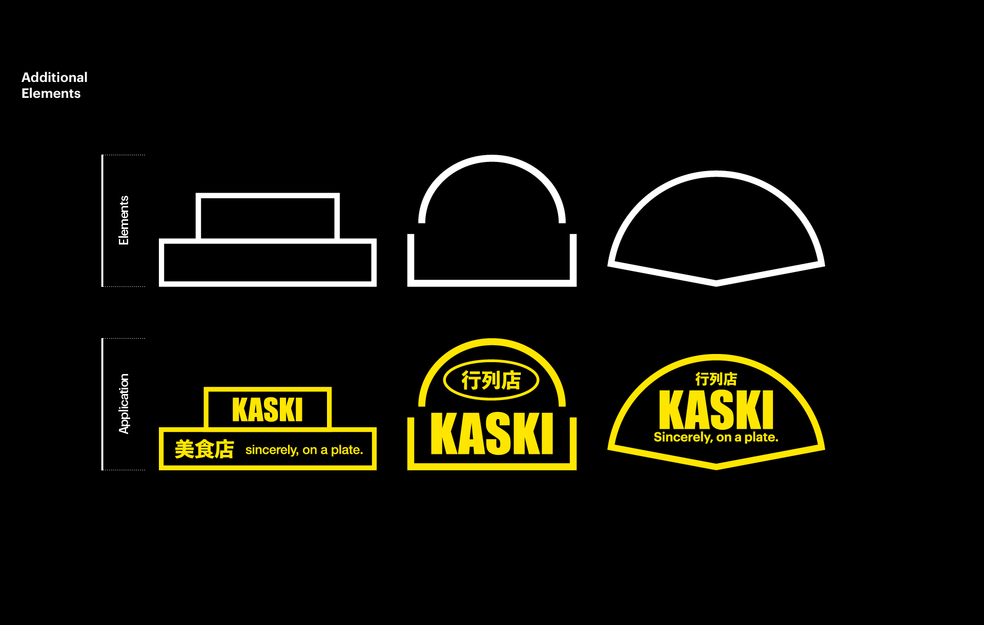
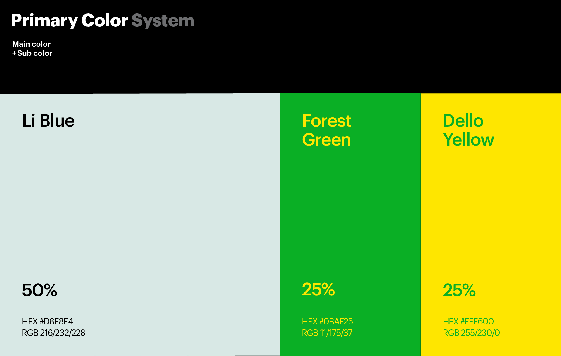
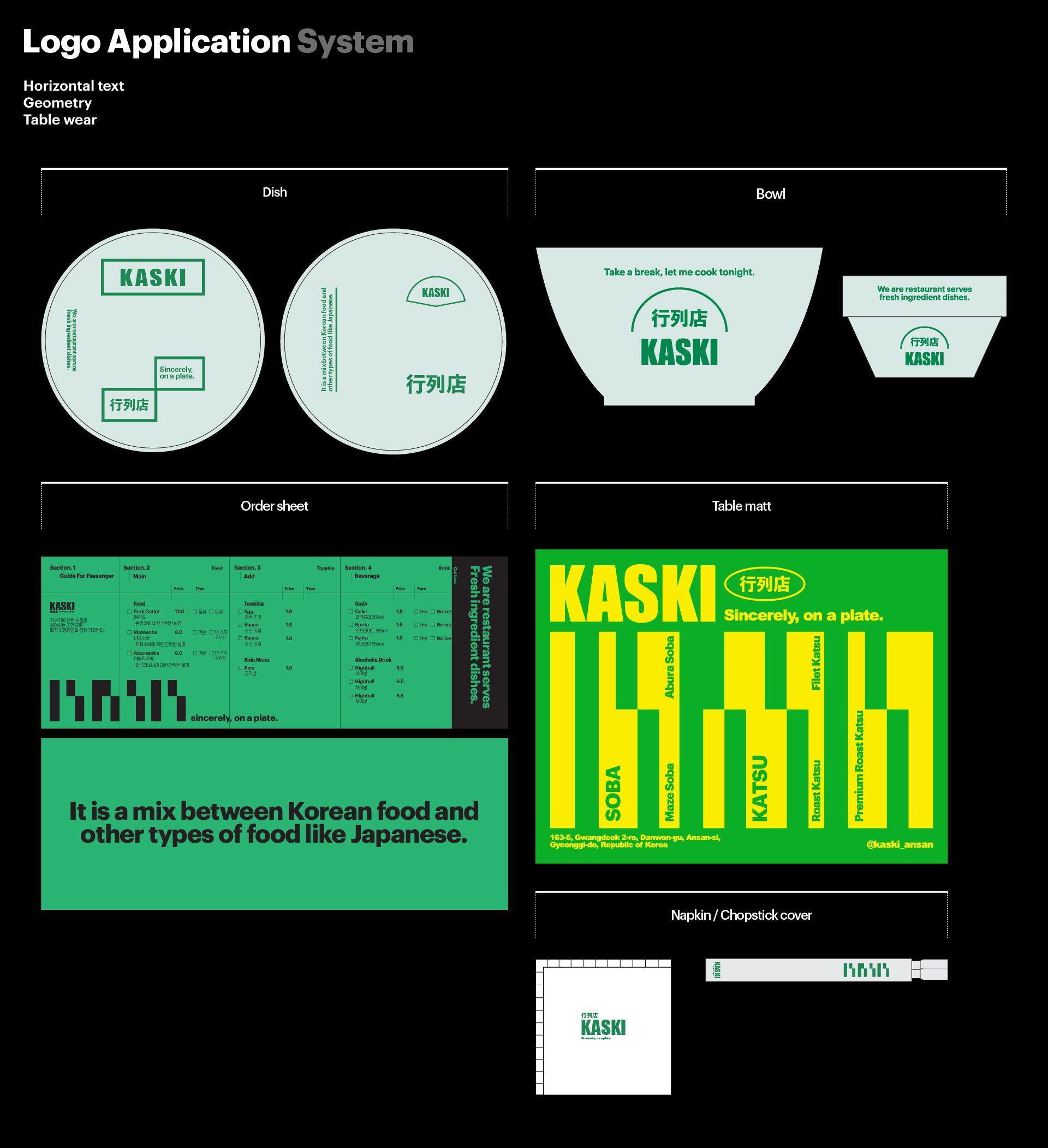
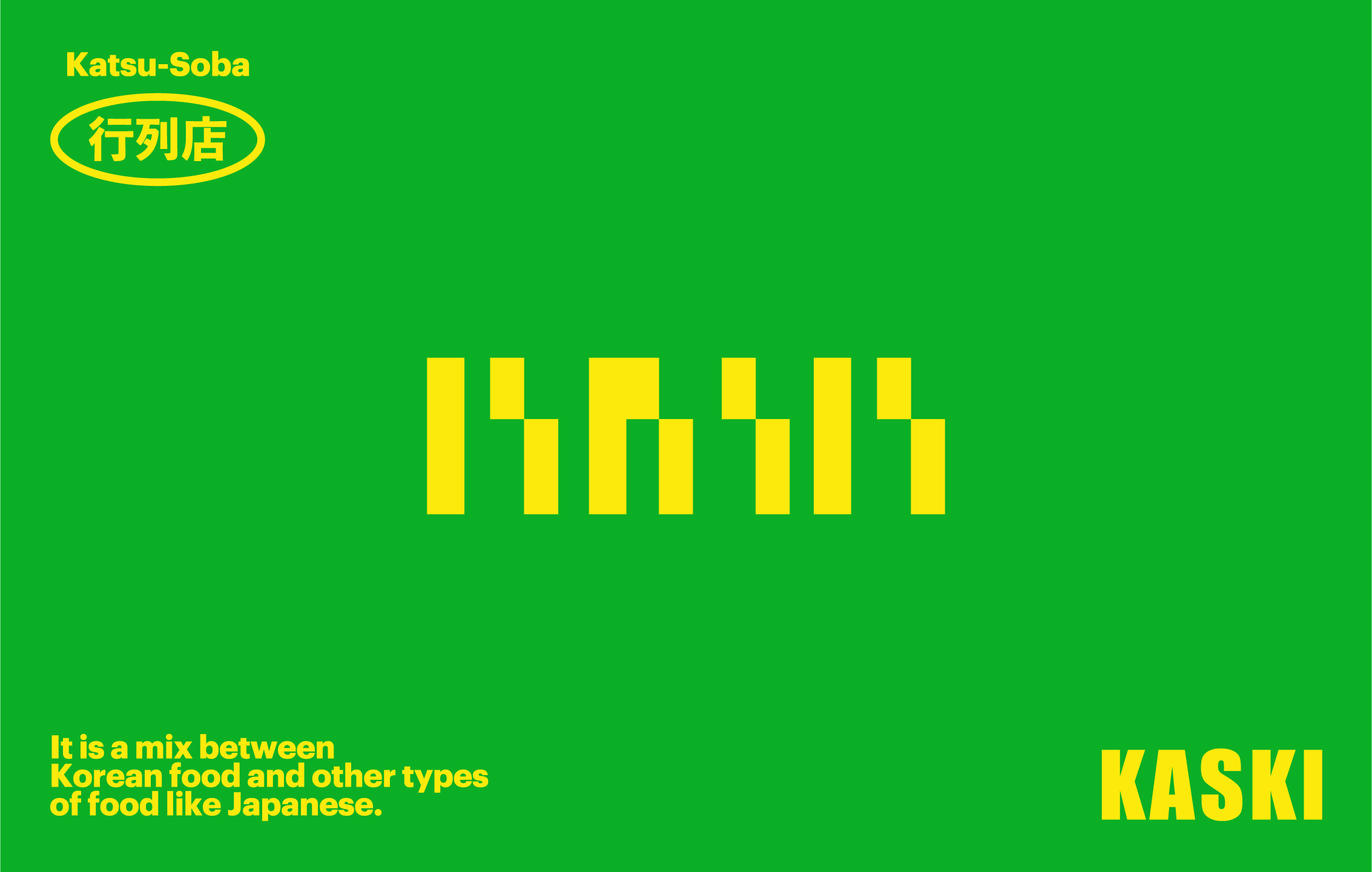
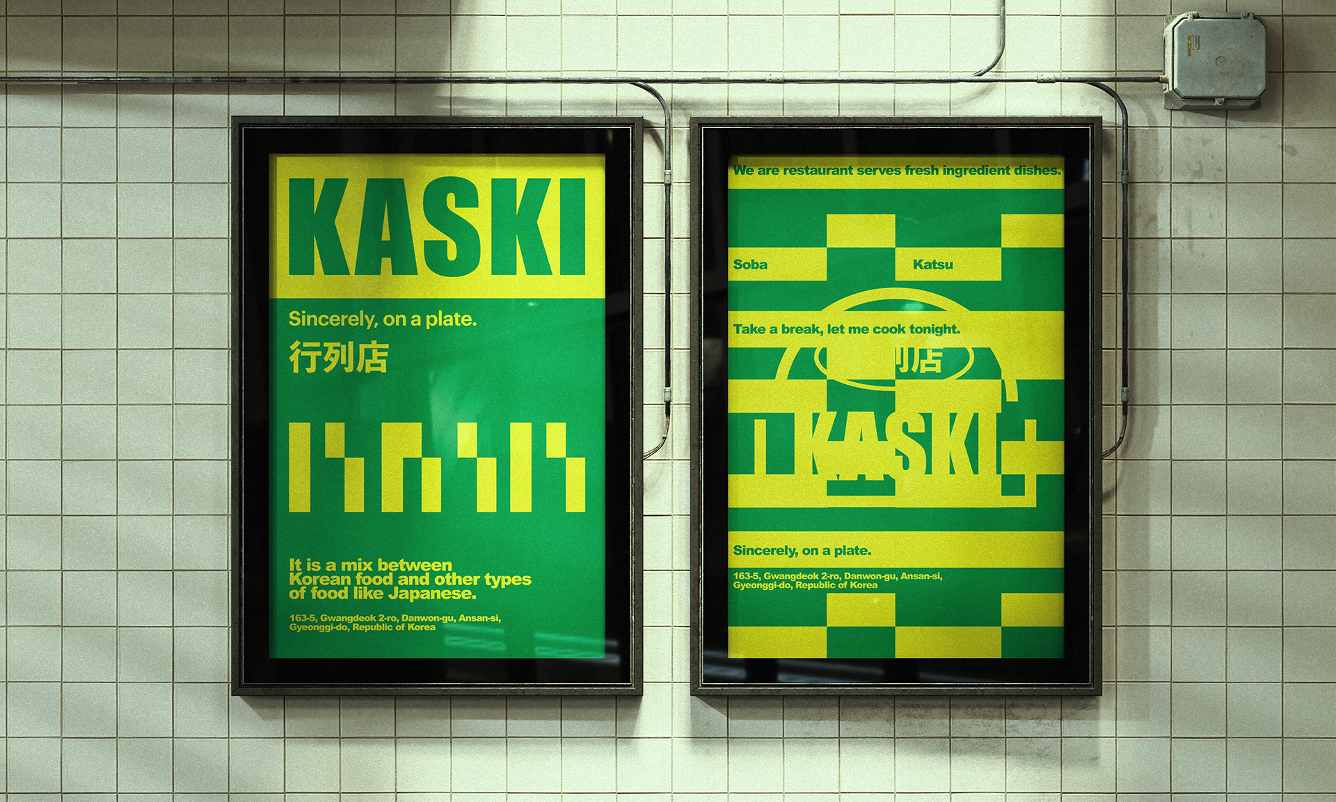
Spatial planning and brand direction setting. Logo design and key visuals inspired by cinematic emotion. Typography and color system developed in harmony with the interior mood. Development of an English wordmark and symbolic identity aligned with the brand concept. Proposal of signature compositions that leave an emotional impression.