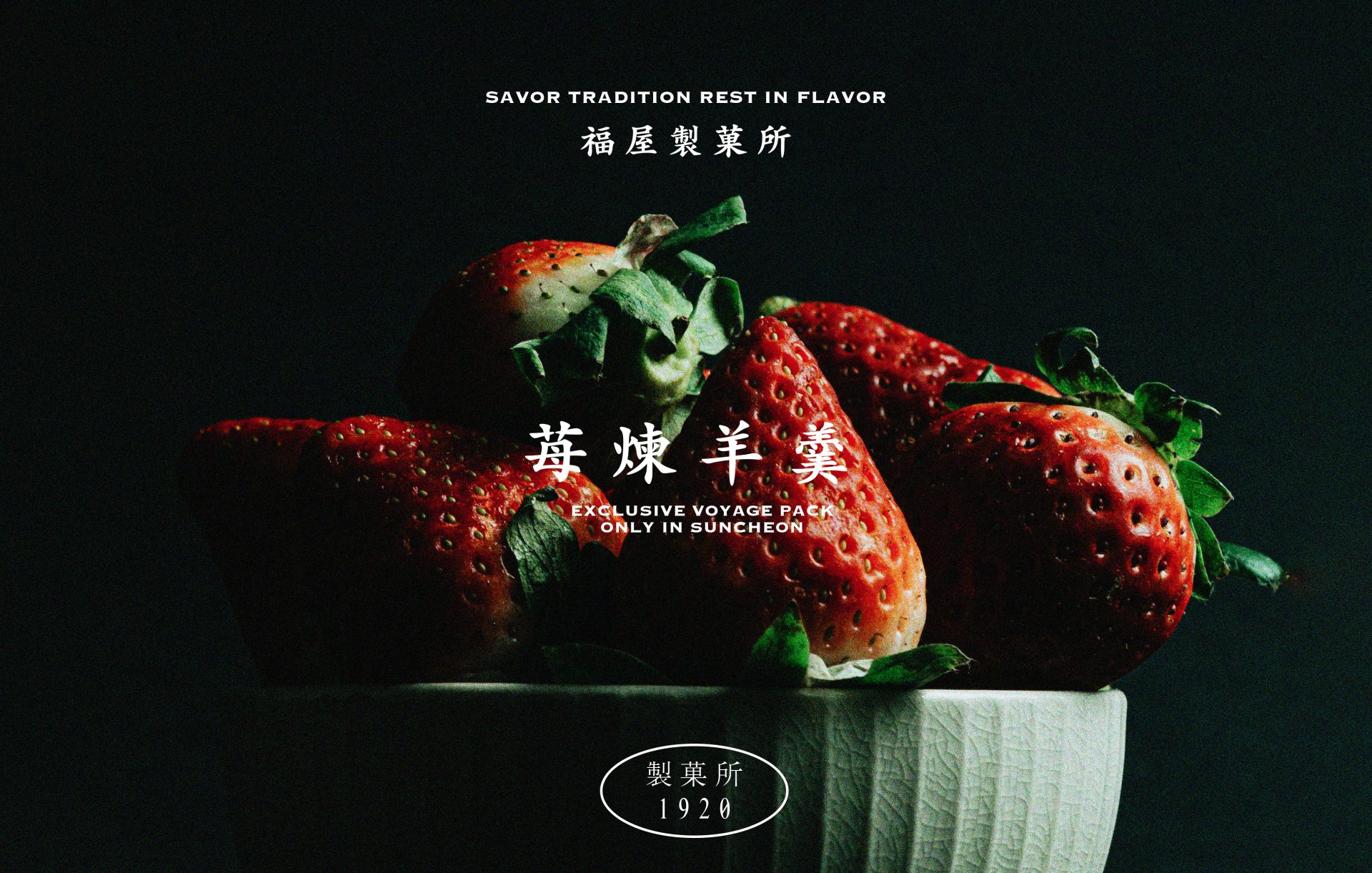
Savor Tradition Rest in Flavor

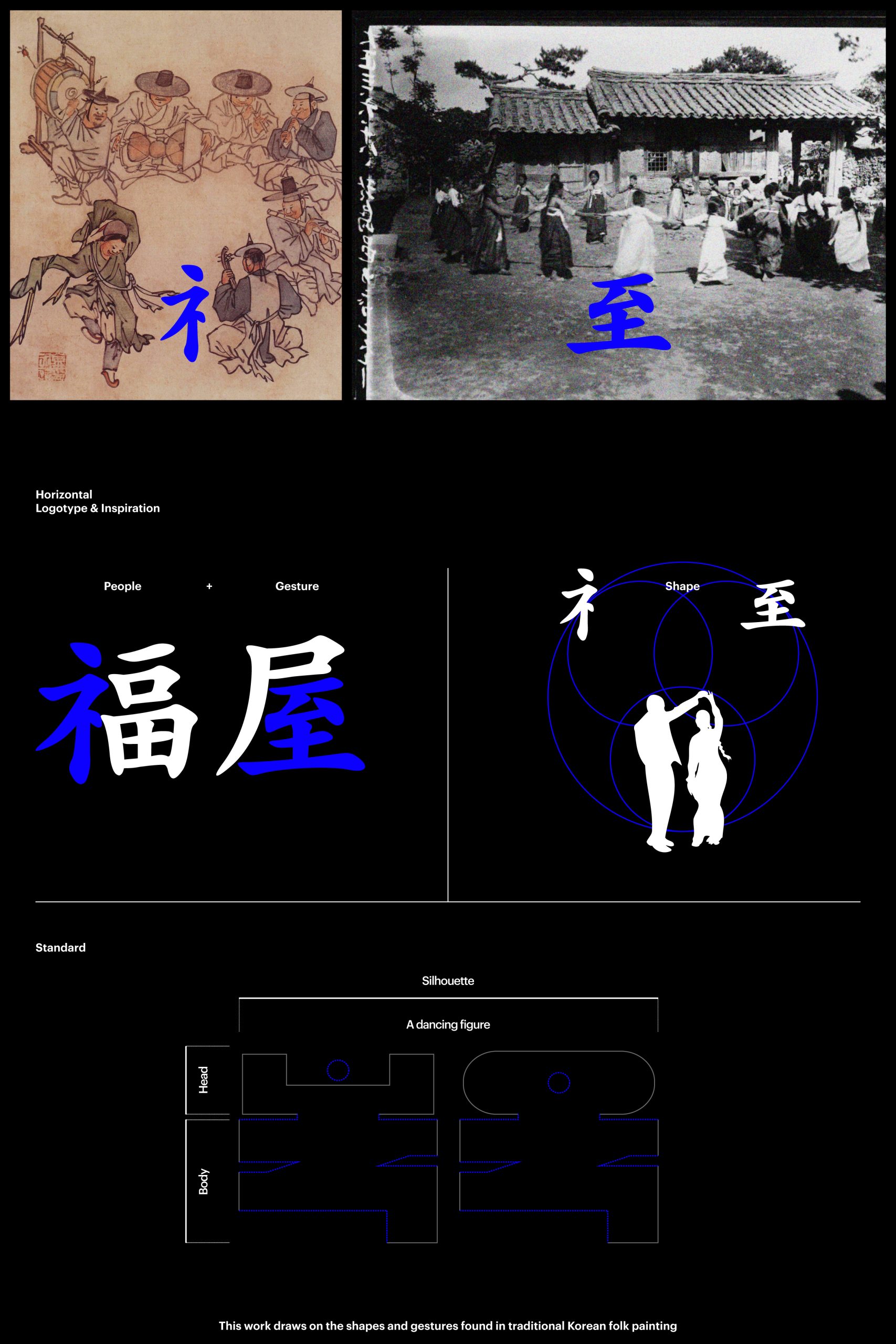
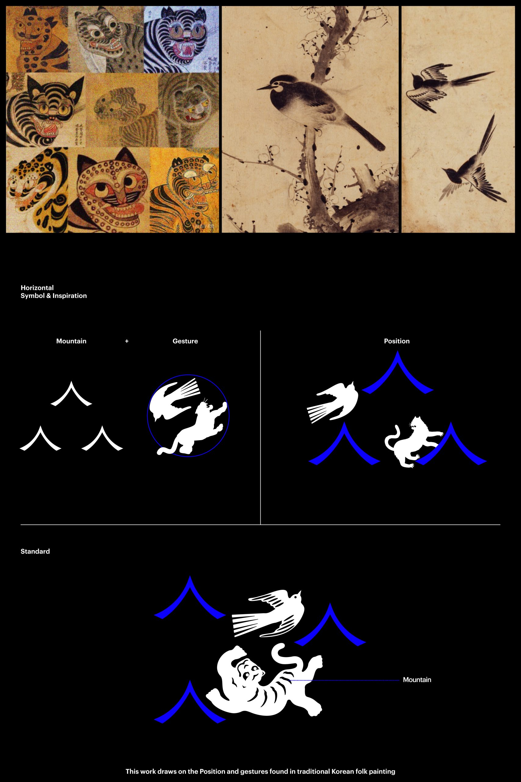
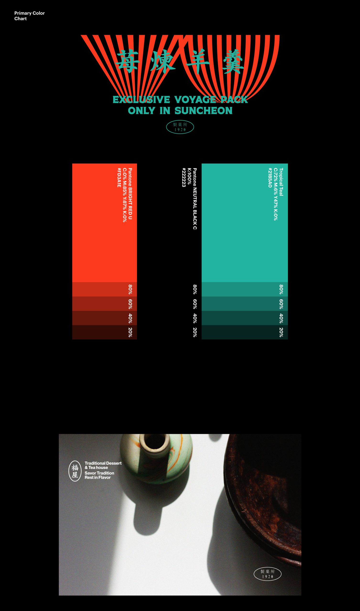
A playful yet nostalgic brand identity system for a dessert café inspired by Korean retro-modern aesthetics. From custom typography to symbolic illustrations, Bokok’s design reflects joy, tradition, and storytelling.

Task

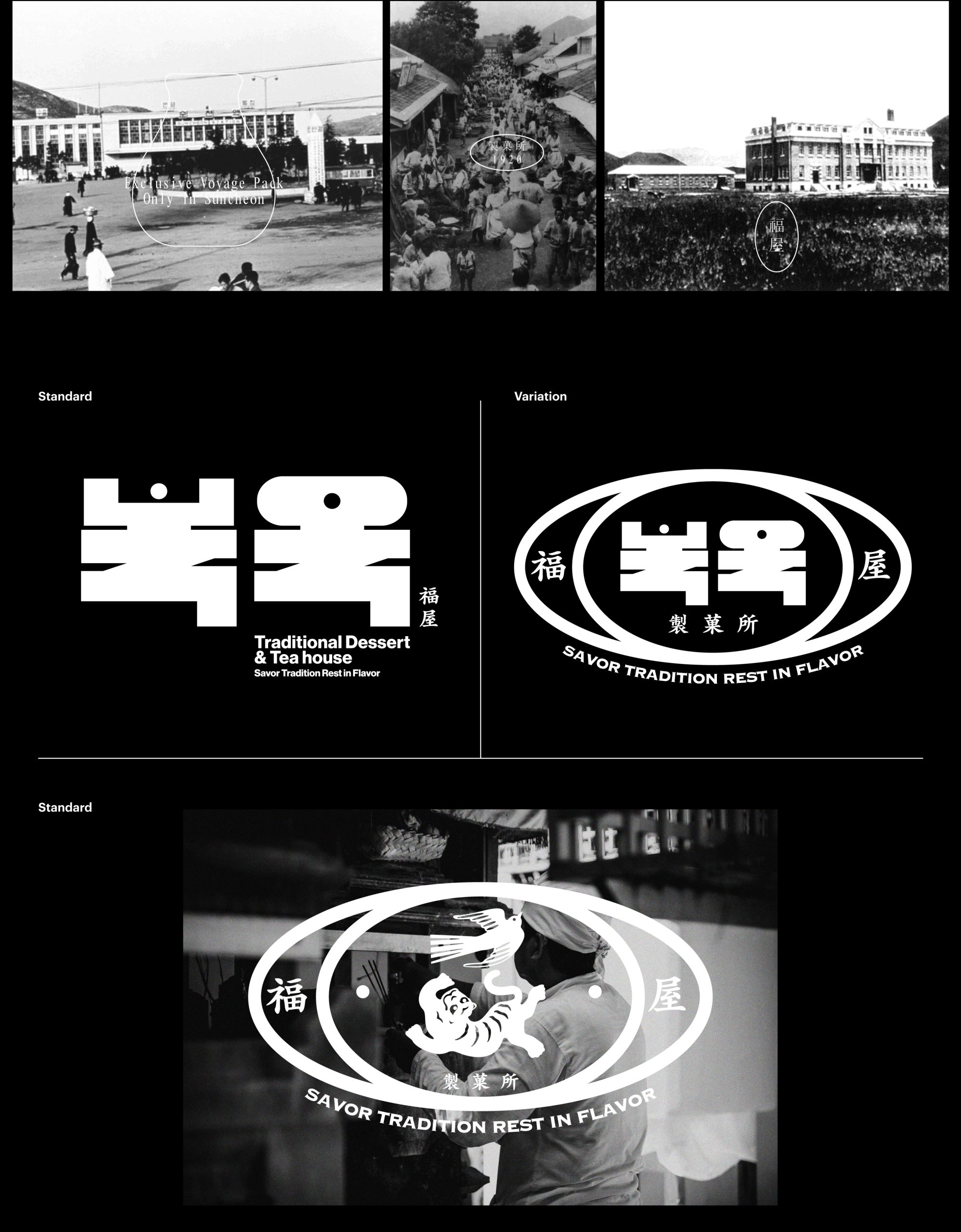
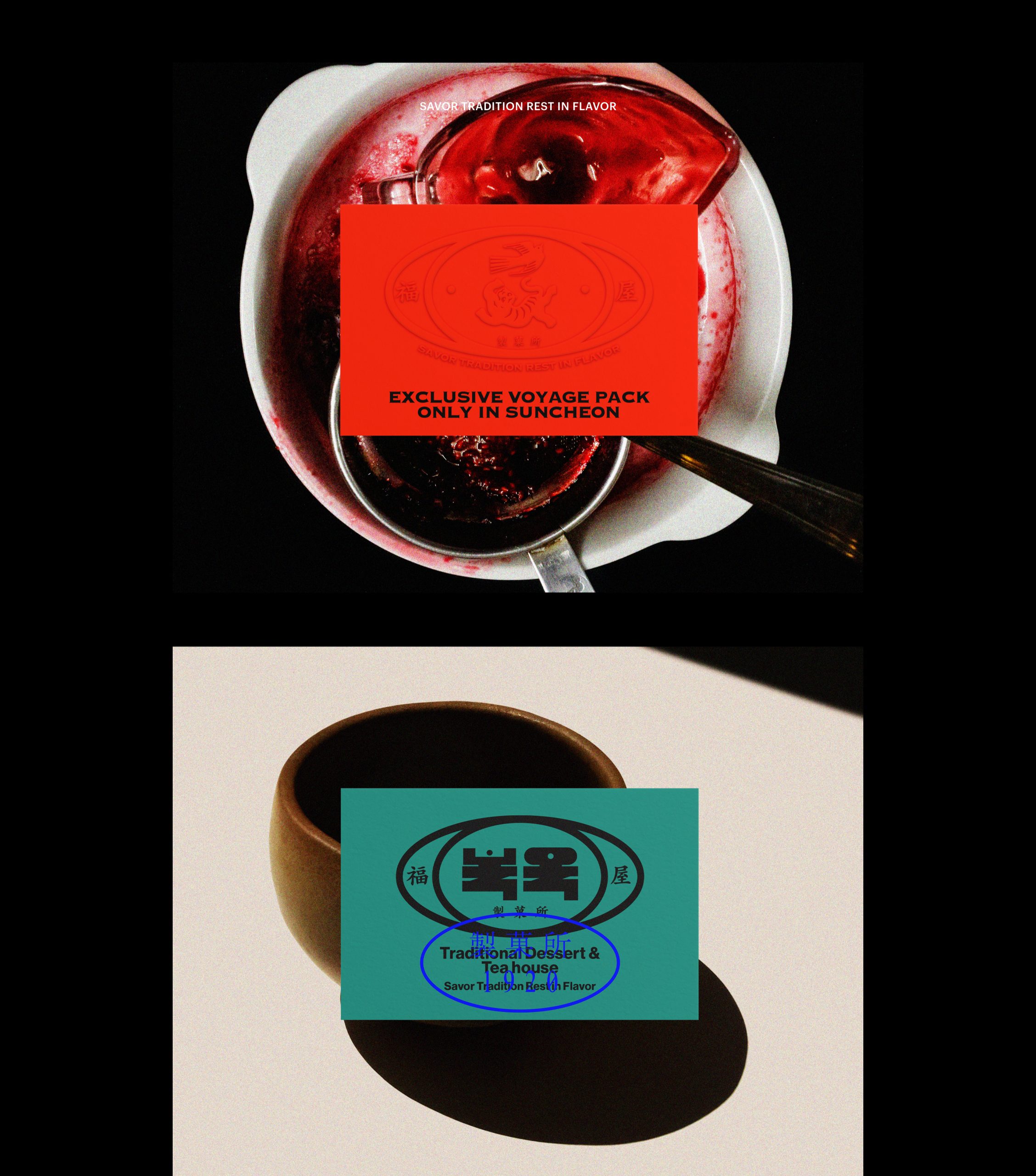
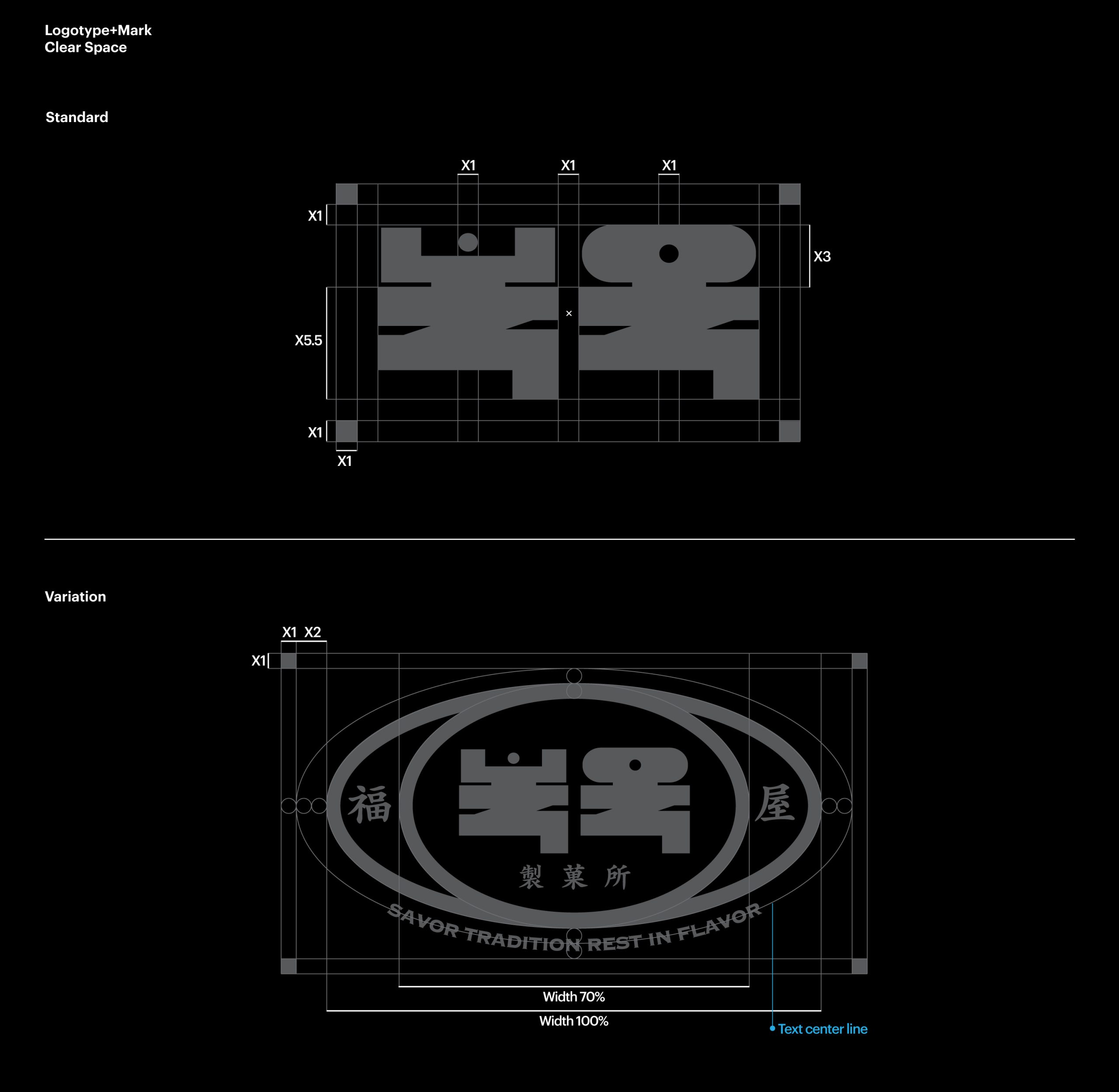
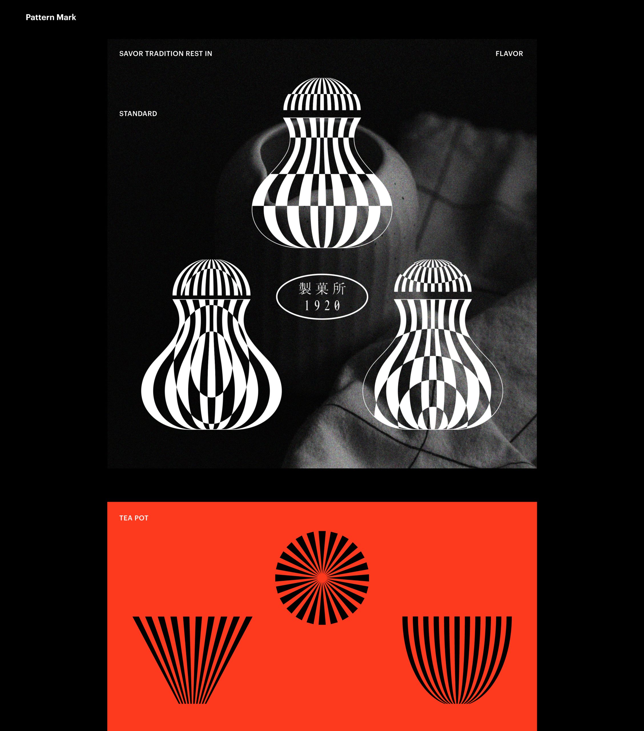
Developed a comprehensive brand identity system for Bokok, a dessert café in Suncheon. The work includes logo design, custom type, character development, and pattern graphics rooted in retro-modern Korean aesthetics.

  • Design

    Brand Identity

  • Client

    BOKOK

01.Project Info-Concept

Located in Suncheon’s old Geumseongdang area, Bokok is a dessert café whose name means “a house that brings blessings.” The project required a brand identity that could reflect traditional values through a casual and witty visual language. With a core offering of sweet red bean jelly and teas, Bokok carries a retro mood that recalls Korea’s early modern era.The visual identity centers on a geometric logotype system referencing proportions often seen in traditional signage. The Korean word Bokok and the Chinese character for “yanggaeng” share similar silhouettes. By merging these forms, we created a distinctive and humorous symbol that blends tradition with a playful tone.

순천 중앙동의 옛 금성당 자리에 들어선 디저트 카페 ‘복옥’은 이름 그대로 ‘복을 주는 집’이라는 의미를 기반으로, 전통을 캐주얼하게 재해석한 브랜드 아이덴티티 디자인을 필요로 했다. 복옥은 양갱과 차를 주요 메뉴로 구성하고 있으며, 근대화 시대의 레트로한 감성을 공간 전반에 담아내고 있다.그래픽 아이덴티티는 그에 걸맞게 도형 기반의 구조를 활용해 전통적 비례감과 시각적 위트를 결합하였다. ‘복옥’이라는 한글과 양갱의 한자 형태가 시각적으로 유사하다는 점에 착안하여, 이 둘의 형태를 조형적으로 결합한 로고를 개발하였다. 타이포 중심의 로고는 고풍스러움을 유지하면서도 캐쥬얼하고 경쾌한 인상을 줄 수 있도록 설계되었다.

02.Project Info-B.I

Character illustrations of a swallow and a tiger represent folklore figures that bring fortune and joy. These mascots metaphorically “distribute blessings” by carrying symbols of luck and prosperity into the space, reinforcing a warm and festive narrative.

캐릭터 모티프인 까치와 호랑이는 한국 민화의 ‘길상’ 상징을 차용하여, ‘복과 옥을 나눠주는 존재’로 설정되었으며, 이들이 사람들에게 복을 전하며 공간에 머무는 이들에게 화색과 즐거움을 전달한다는 스토리를 담았다.

The brand identity system comprises a custom typeface, modular logomark, folklore-inspired characters and symbolic patterns. Together, they establish a bold yet adaptable visual structure rooted in Korean heritage while allowing dynamic application across media.

전용 서체, 로고 시스템, 캐릭터 및 패턴 요소를 포함한 복옥의 브랜딩 시스템은 전통과 재치를 결합한 조형 언어로 브랜드의 정체성을 단단하게 구축하며, 다양한 응용 전개가 가능한 유연한 비주얼 플랫폼이 되었다.

A gourd-shaped graphic element, inspired by traditional “horibyeong” flasks, was transformed into a core pattern. This motif depicts fortune spilling outward and evolving into a repeating visual theme across packaging, labels and printed materials.

호리병을 본뜬 그래픽 패턴은 내부에 담긴 ‘복’이 점차 퍼져나간다는 내러티브를 형상화한 것으로, 브랜드 시그니처 패턴으로 활용되었다. 이 패턴은 포장 패키지뿐 아니라 테이블웨어, 제품 라벨 등에 반복적으로 적용되며 브랜드의 일관성과 확장성을 함께 구축하였다.

Let's get in touch,
we respond fast.

Ready to work together?
Back