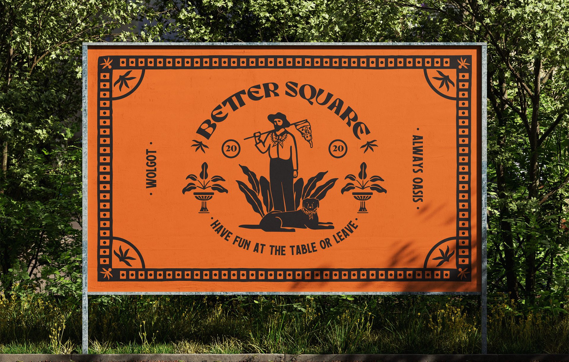
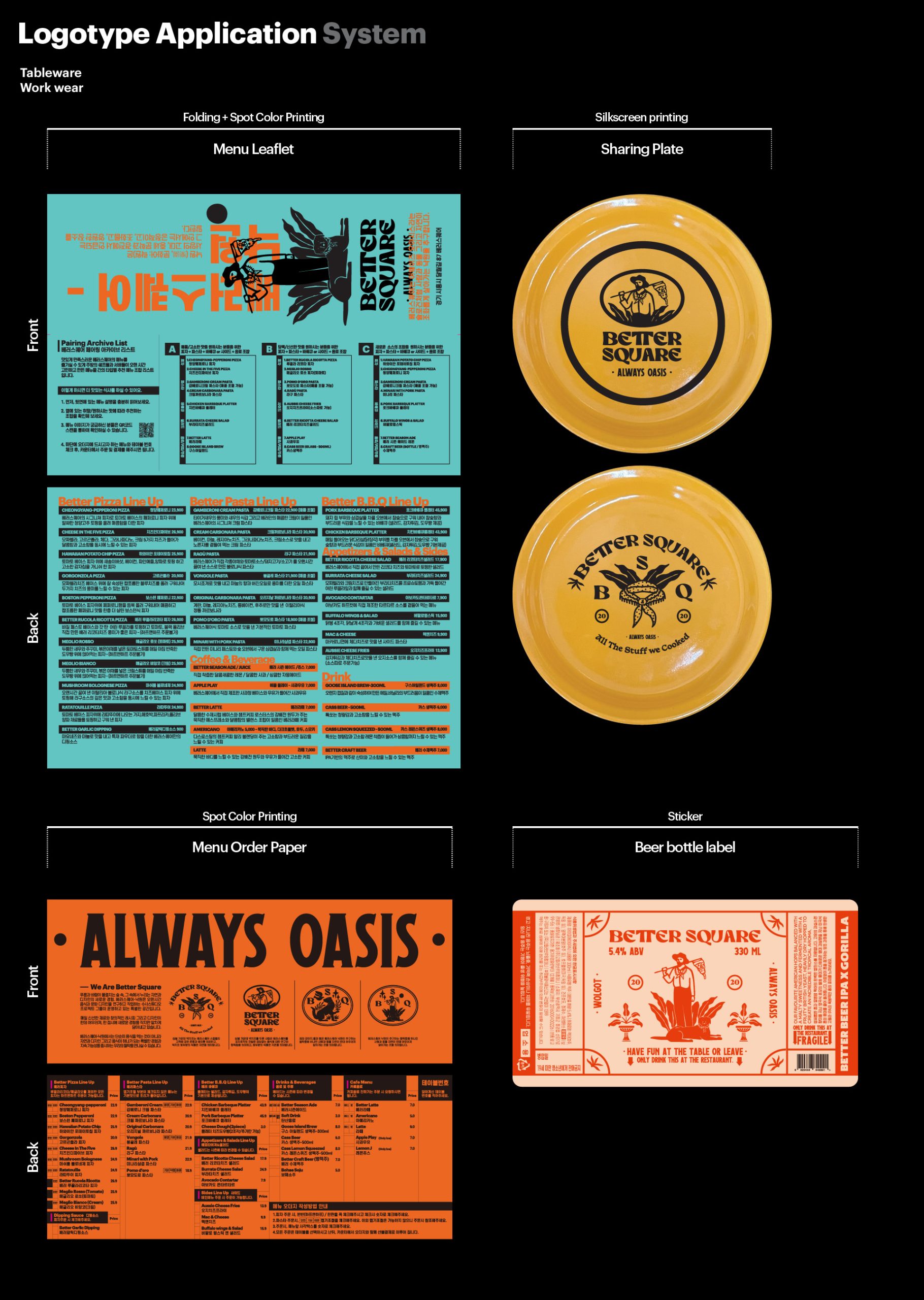
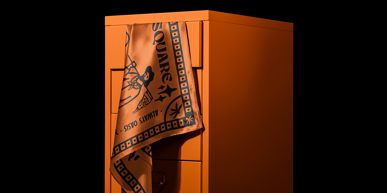
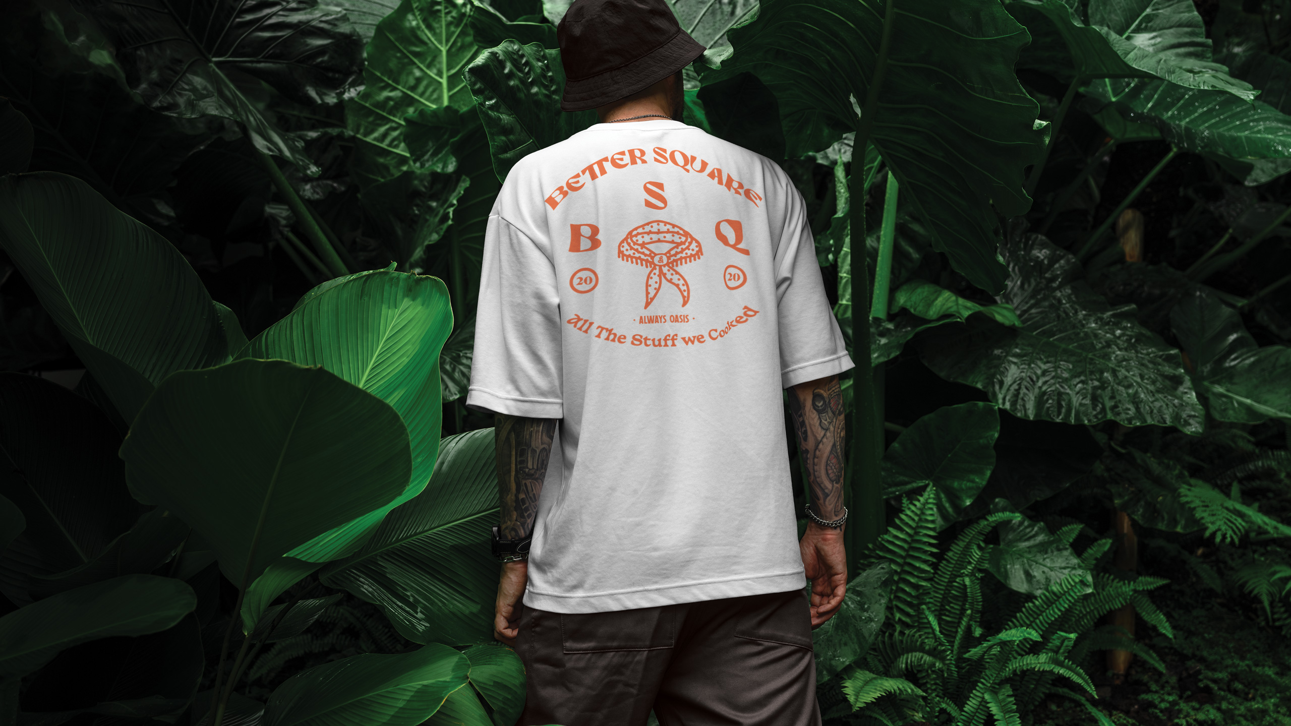
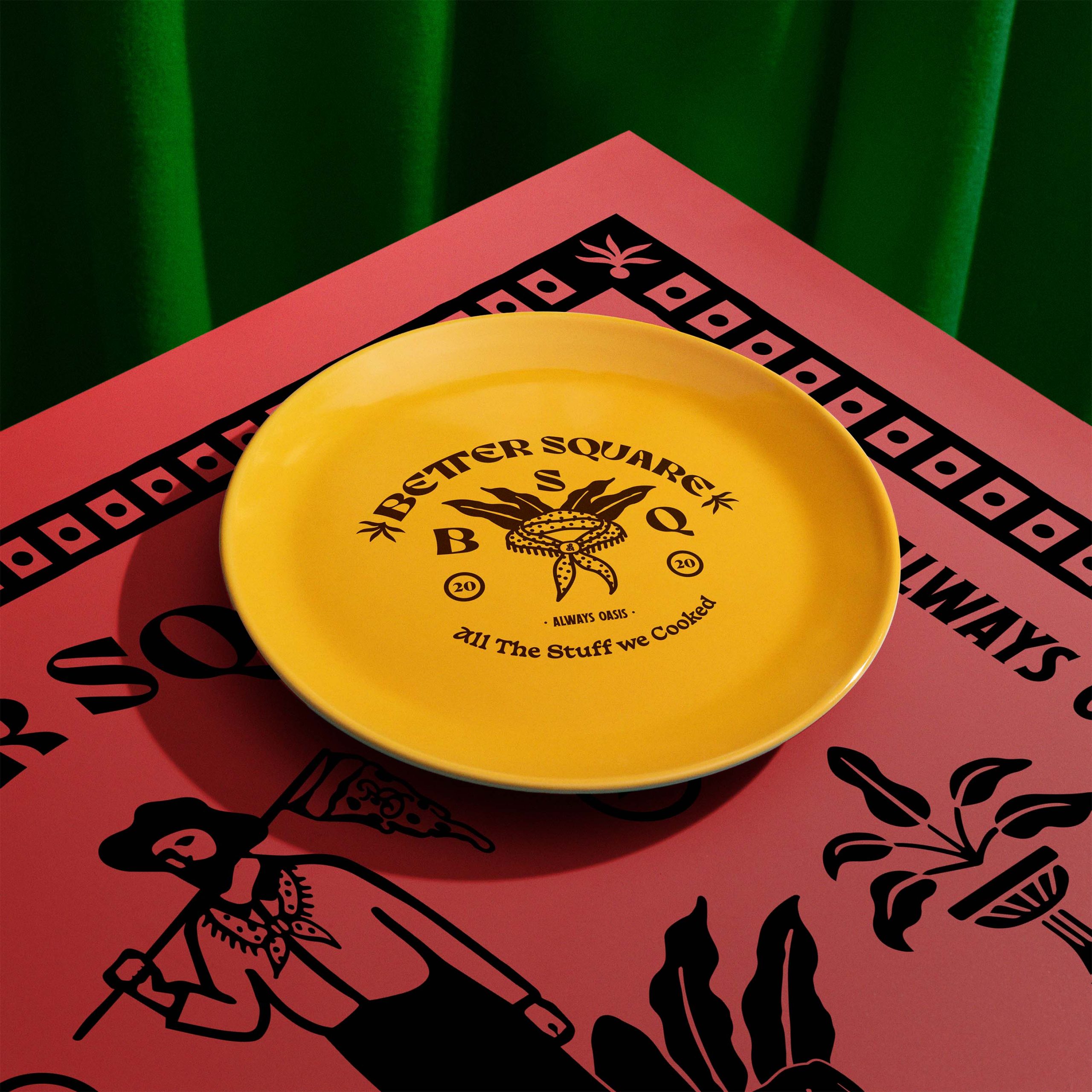
Oasis Within the Woods

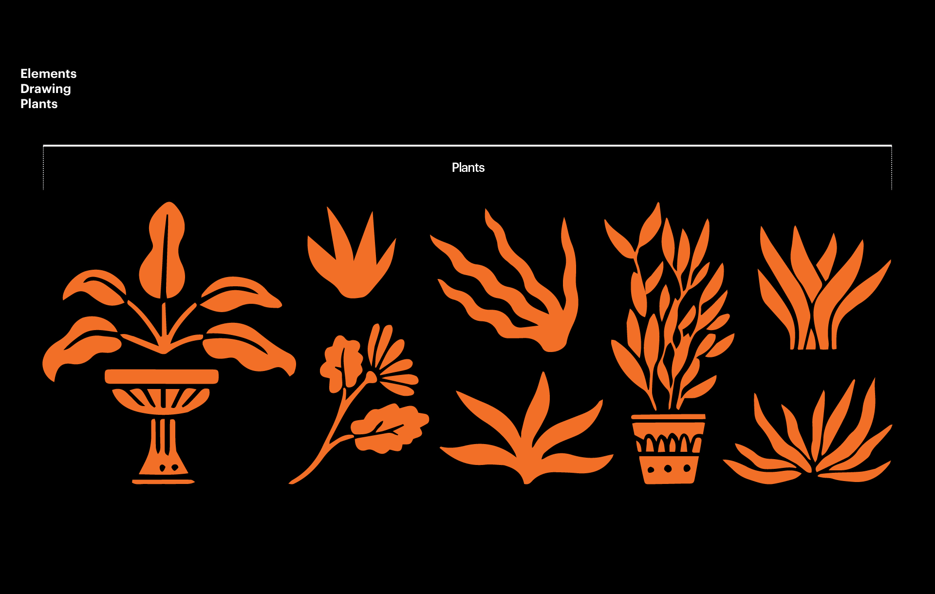
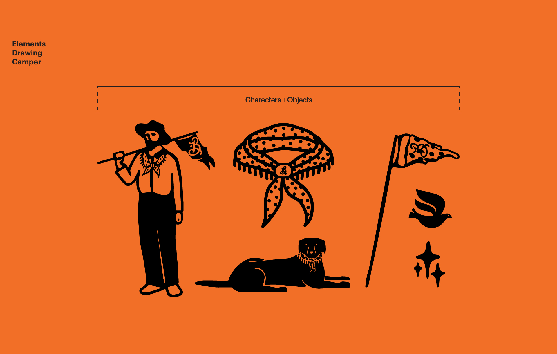
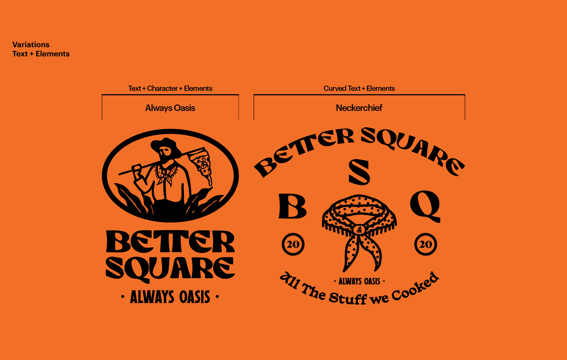
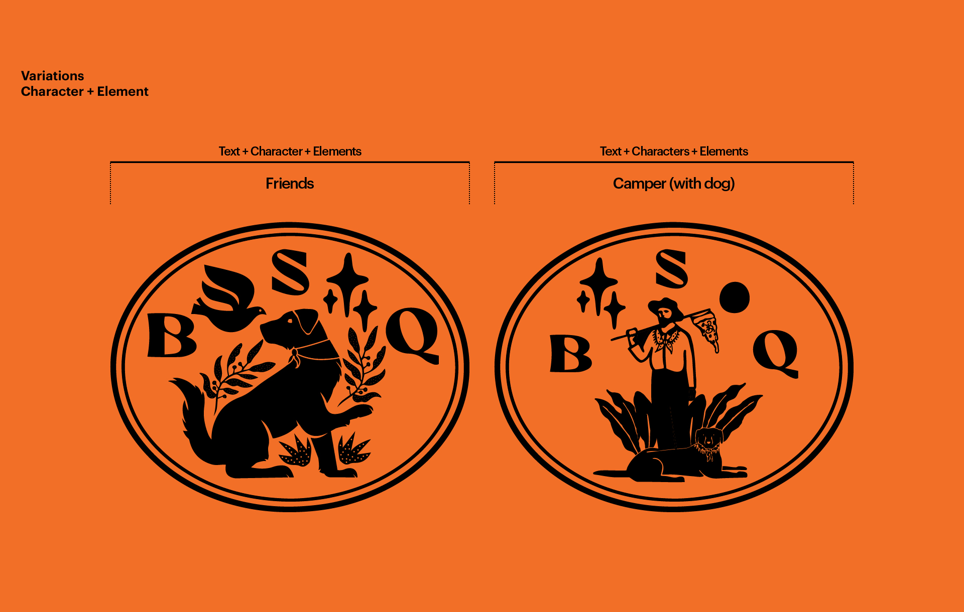
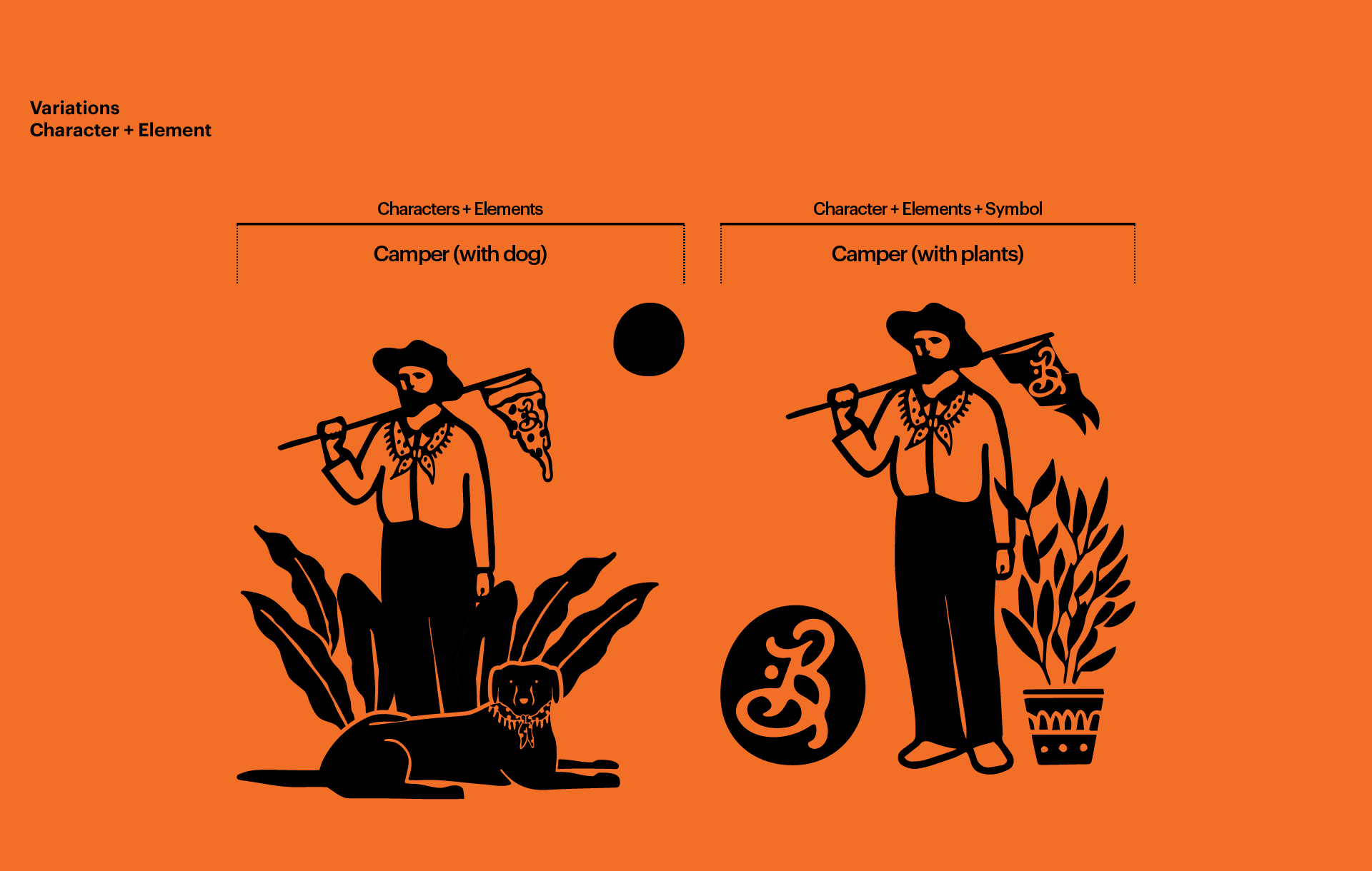
This is the Season 2 BI renewal for BETTER SQUARE, themed around an oasis where nature and people coexist. The visual system combines a hand-drawn logotype with elements such as plants, neckchief, and character icons.

Task

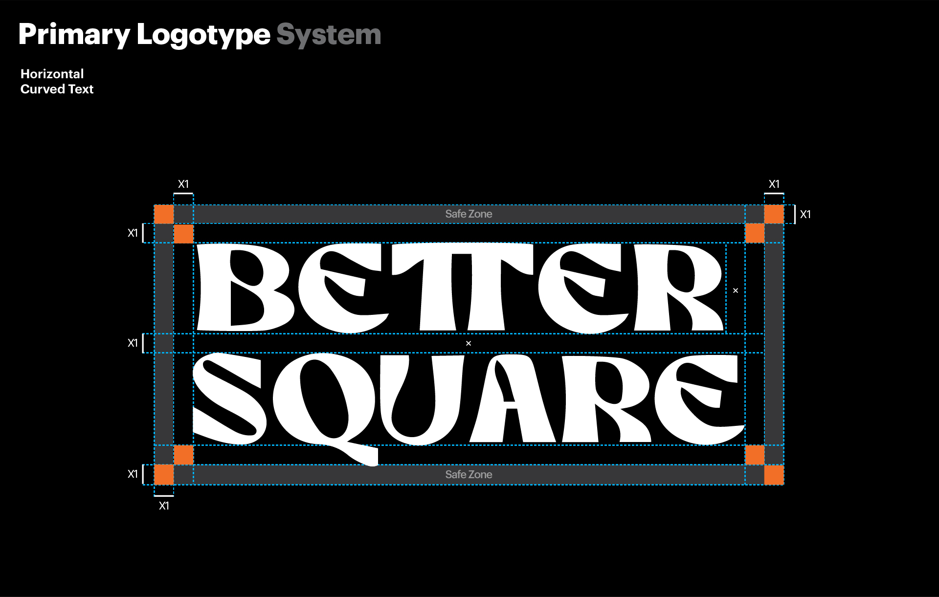
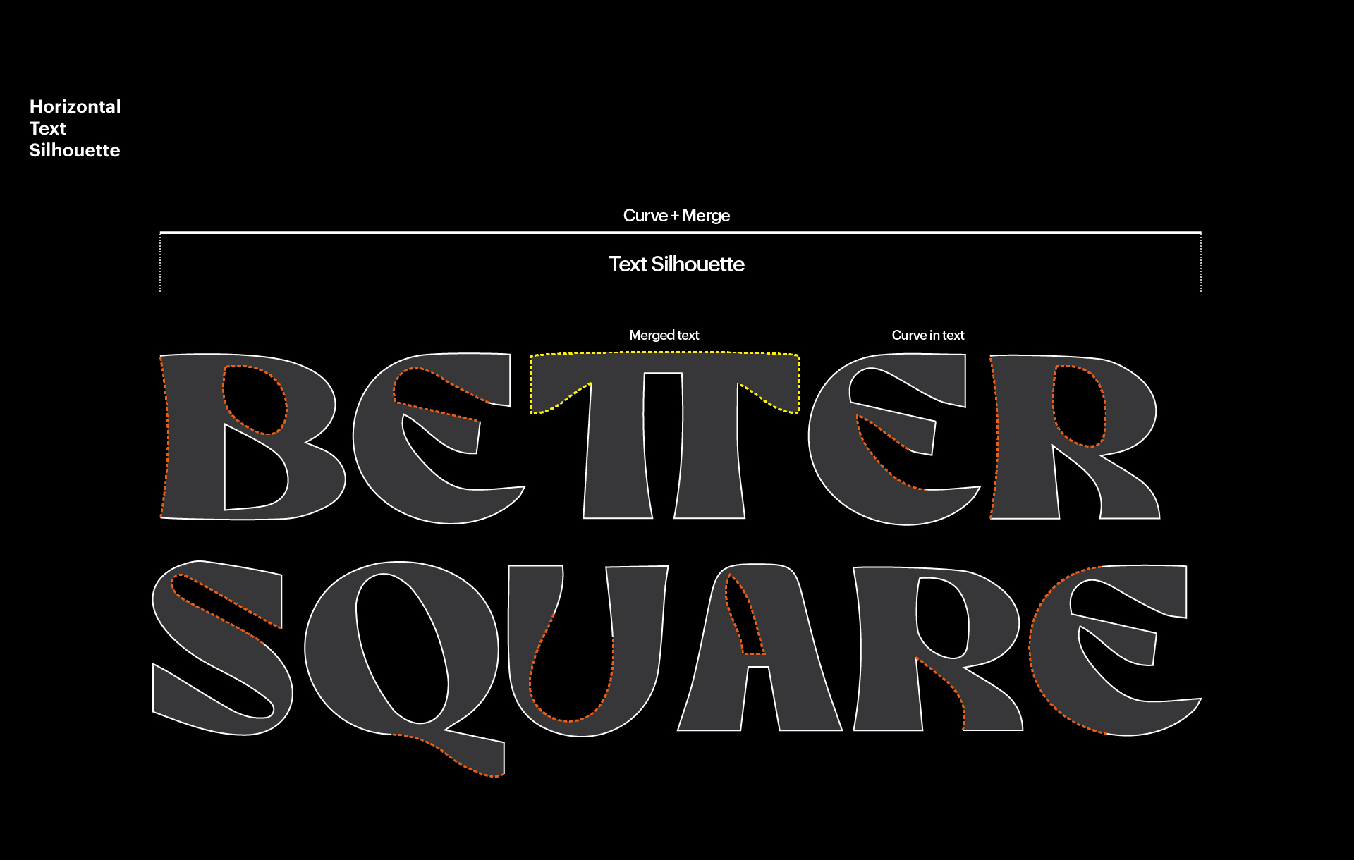
Planned and redefined the brand philosophy through Season 2 BI renewal. Developed key visual elements (neckchief, plants, character) and built an illustration system. Designed a custom-drawn typeface and structured a distinctive logotype. Created a modular symbol system and established visual combination rules. Directed the color and shape system that communicates brand identity and harmony.

01. Bettersquare season 2

BETTER SQUARE is an independent space run by CSUCSA Studio that blends culinary art and design. Surrounded by greenery and breeze, this project offers a unique experience where fresh ingredients, creative recipes, and graphic identity come together in small but meaningful servings.


Season 2’s BI renewal embraces the idea of “Paradise” as described in ancient and medieval Western literature a space of harmony, permanence, and natural beauty. Maintaining the organic visual direction from Season 1, this update reinforces a softer, more nature inspired sensibility.

푸르름과 바람이 흐르는 숲속, 베러스퀘어-낙원은 수사스튜디오가 운영하는 음식과 디자인이 융합된 독립 프로젝트 공간이다. 신선한 식재료와 창의적인 레시피, 그리고 디자인을 하나의 접시에 담아 매일 새로운 경험을 선사하는 이 공간은 ‘자연’과 ‘사람’이 조화를 이루는 ‘오아시스’를 지향하며, 일상 속 작고 지속 가능한 기쁨을 전하고자 한다.


이번 시즌 2 BI 리뉴얼은 서양의 문학과 경전에서 언급되는 ‘낙원’이라는 개념을 시각적으로 해석한 결과물이다. 비정형적 구조와 자유로운 감성을 담고자 했던 시즌 1 BI의 방향성을 유지하면서도, 보다 유기적이고 소프트한 무드를 강화하였다.

The logotype evolves from the previous sans-serif structure into a hand-drawn type with smooth curves and merged silhouettes, representing both character and craft. A symbolic shift was also made by featuring the neckchief a key visual cue replacing the more conventional apron imagery in the culinary field as a central icon of the brand.


This flexible BI system is designed with modularity in mind, allowing typographic, illustrative, botanical, and character elements to be rearranged fluidly across future visual applications.

로고 타입은 기존 산세리프 기반에서 출발하되, 손 드로잉의 유연한 곡선과 통합된 실루엣을 통해 감각적 개성을 부여했다. 또한, 브랜드의 상징적 이미지 중 하나로 ‘넥치프’를 중심에 두어, 요식업이 가진 전형적인 앞치마 이미지에서 벗어난 베러스퀘어만의 조형 언어를 형성하였다.


로고는 직선적 구성 외에도 타이포그래피, 일러스트레이션, 식물 모티프, 캐릭터 드로잉 등 다양한 요소와 조합 가능한 모듈형 시스템으로 설계되어 향후 비주얼 브랜딩 확장에 유연하게 대응할 수 있도록 하였다.

Let's get in touch,
we respond fast.

Ready to work together?
Back