Garment for the City in Motion

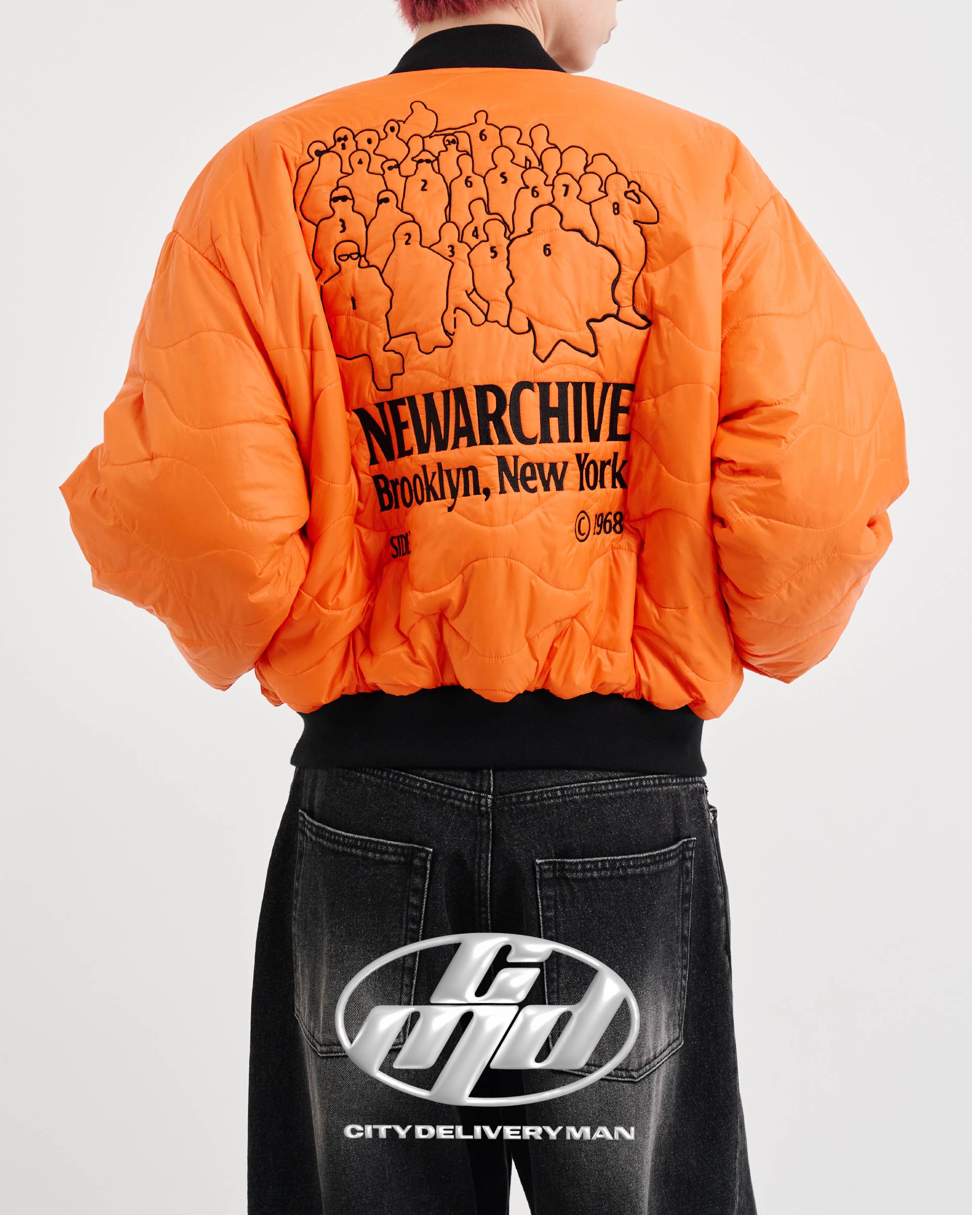
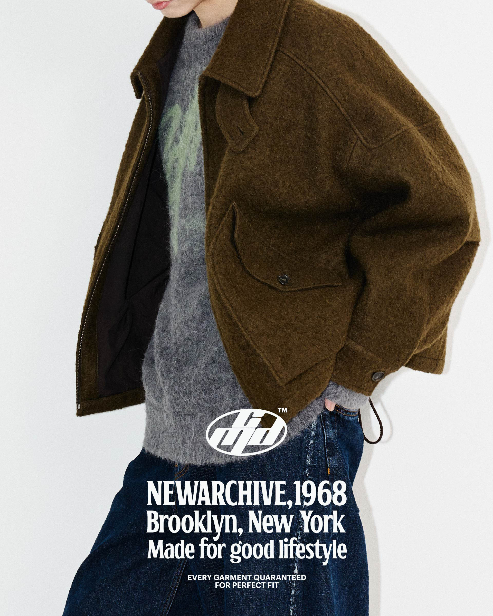
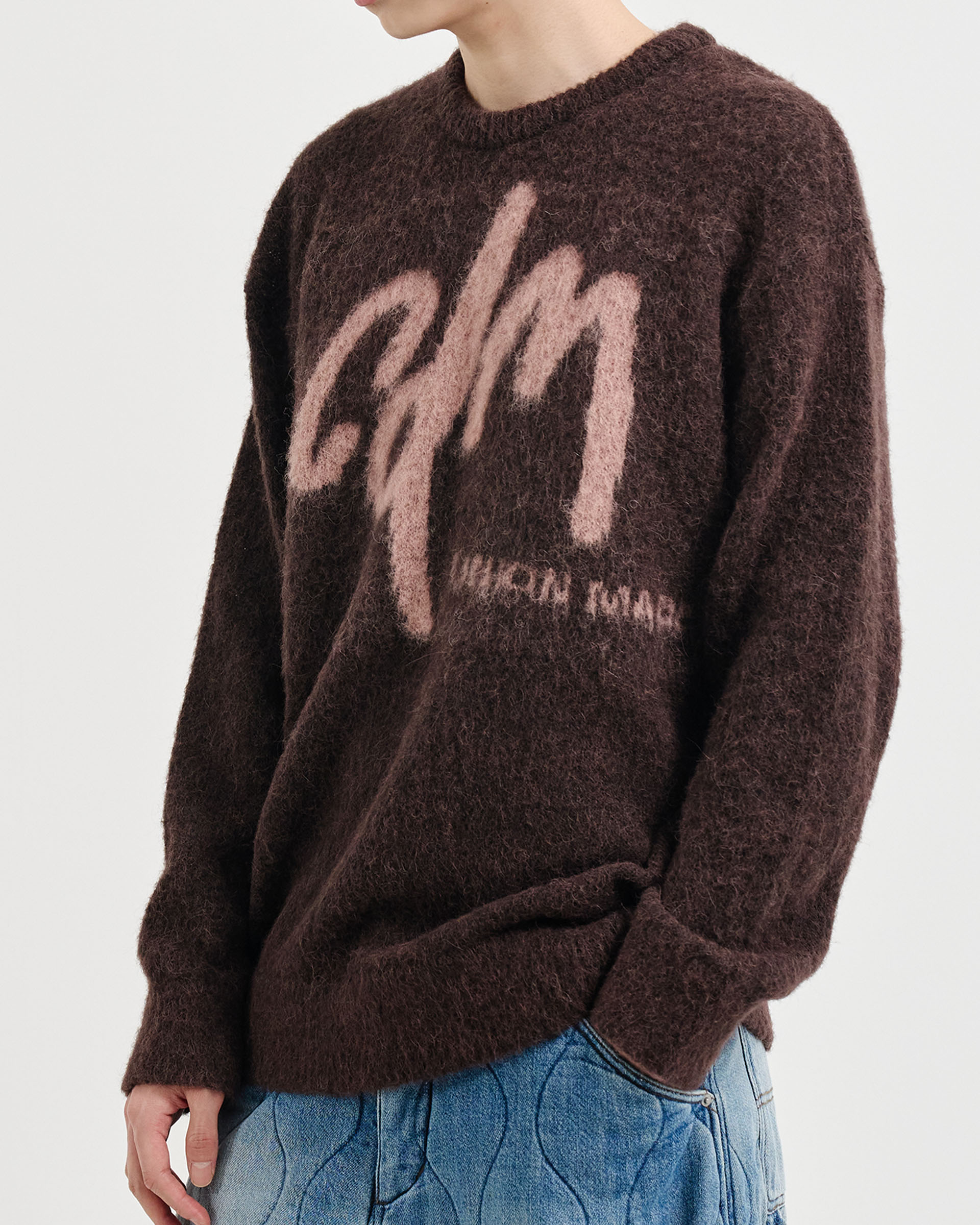
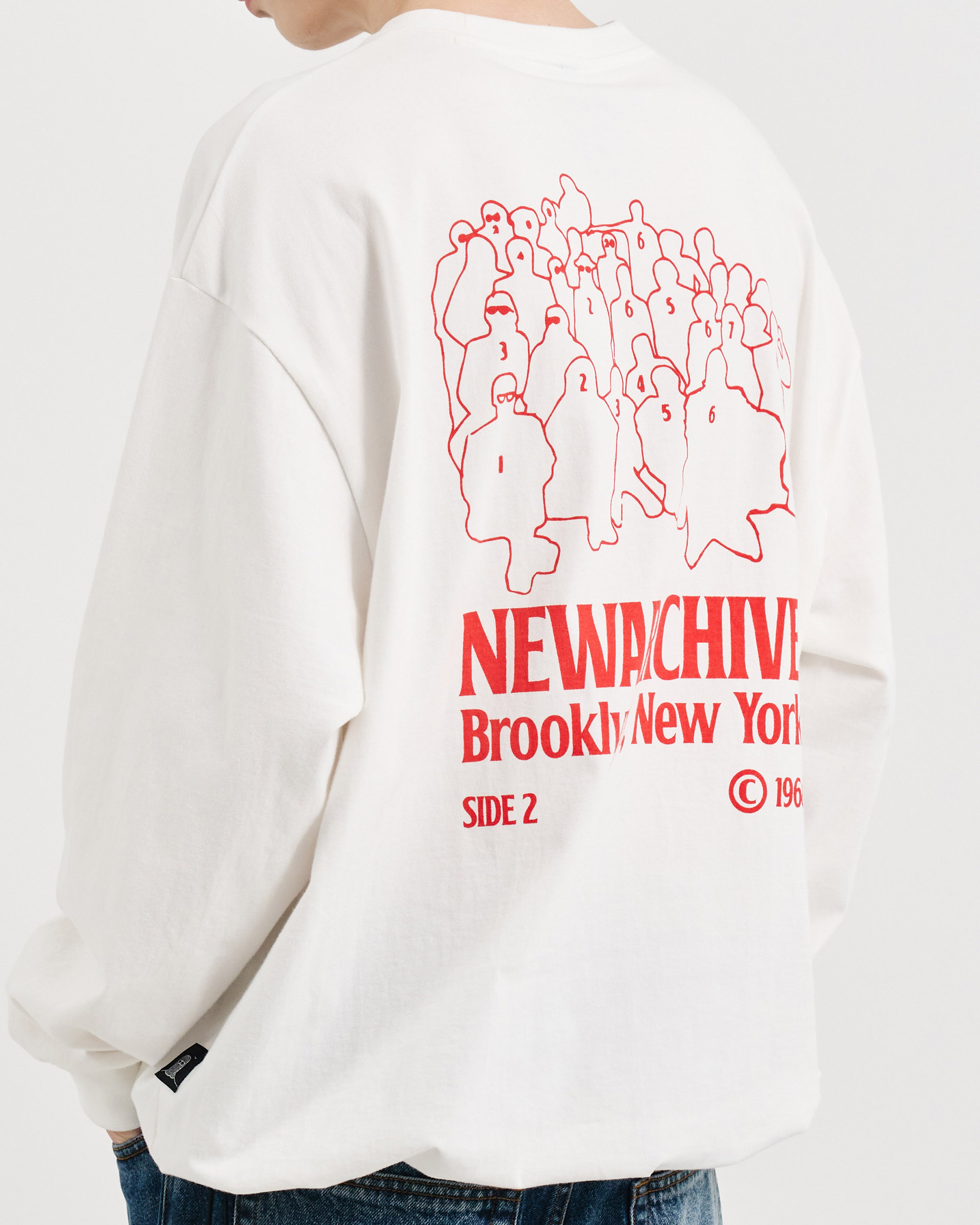
A system forged in utility, shaped by the city. CDM blends discipline and street energy into a functional identity, where every detail serves a purpose. Inspired by the rhythms of urban life, its design language reflects resilience, precision, and the raw pulse of the streets. The result is a brand that seamlessly connects form and function, creating pieces that move with the city, built to endure its pace.

Task

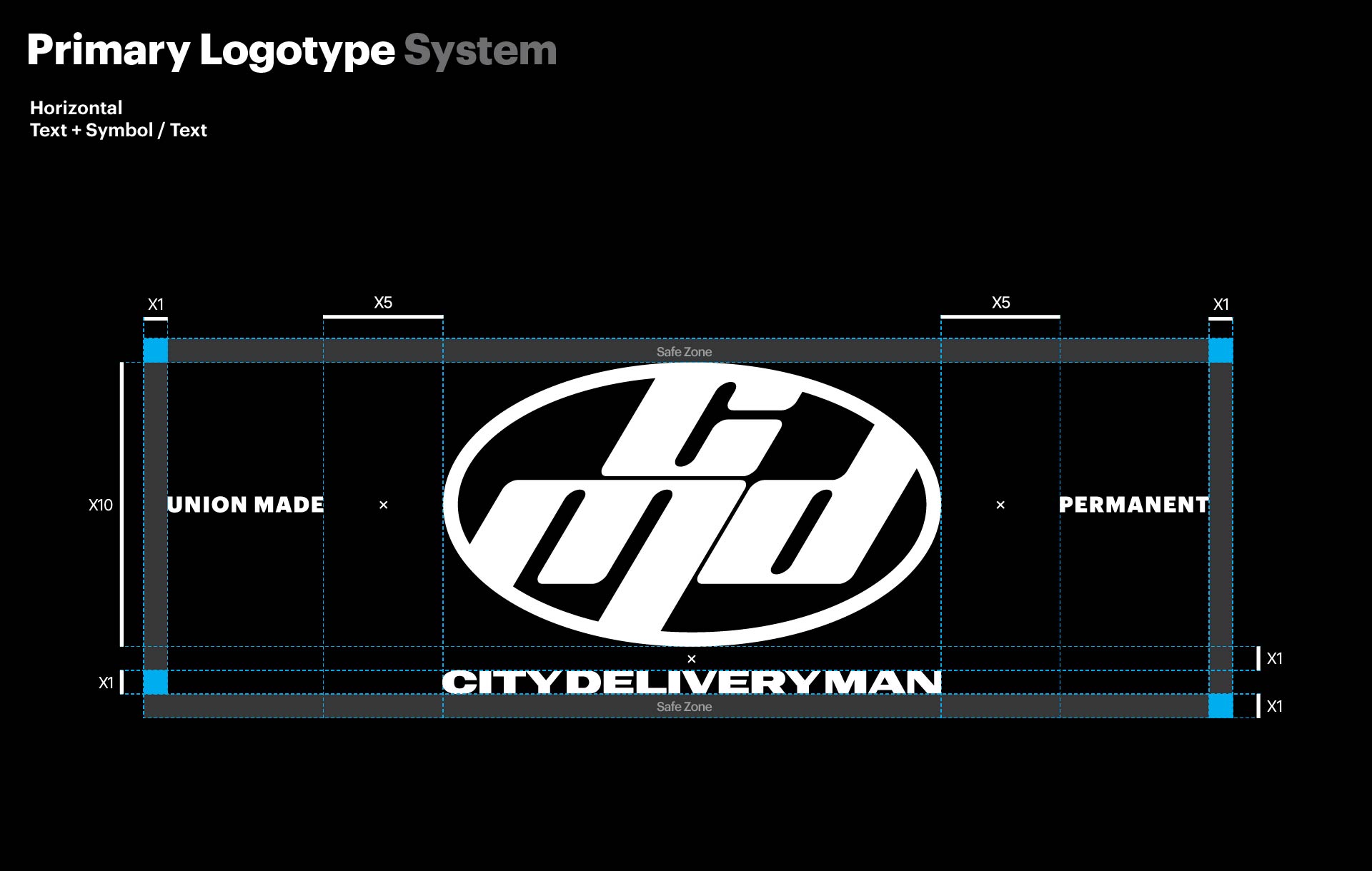
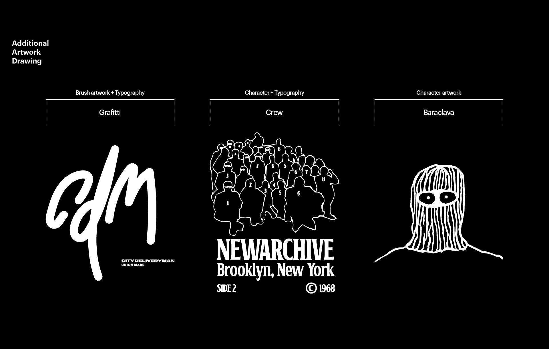
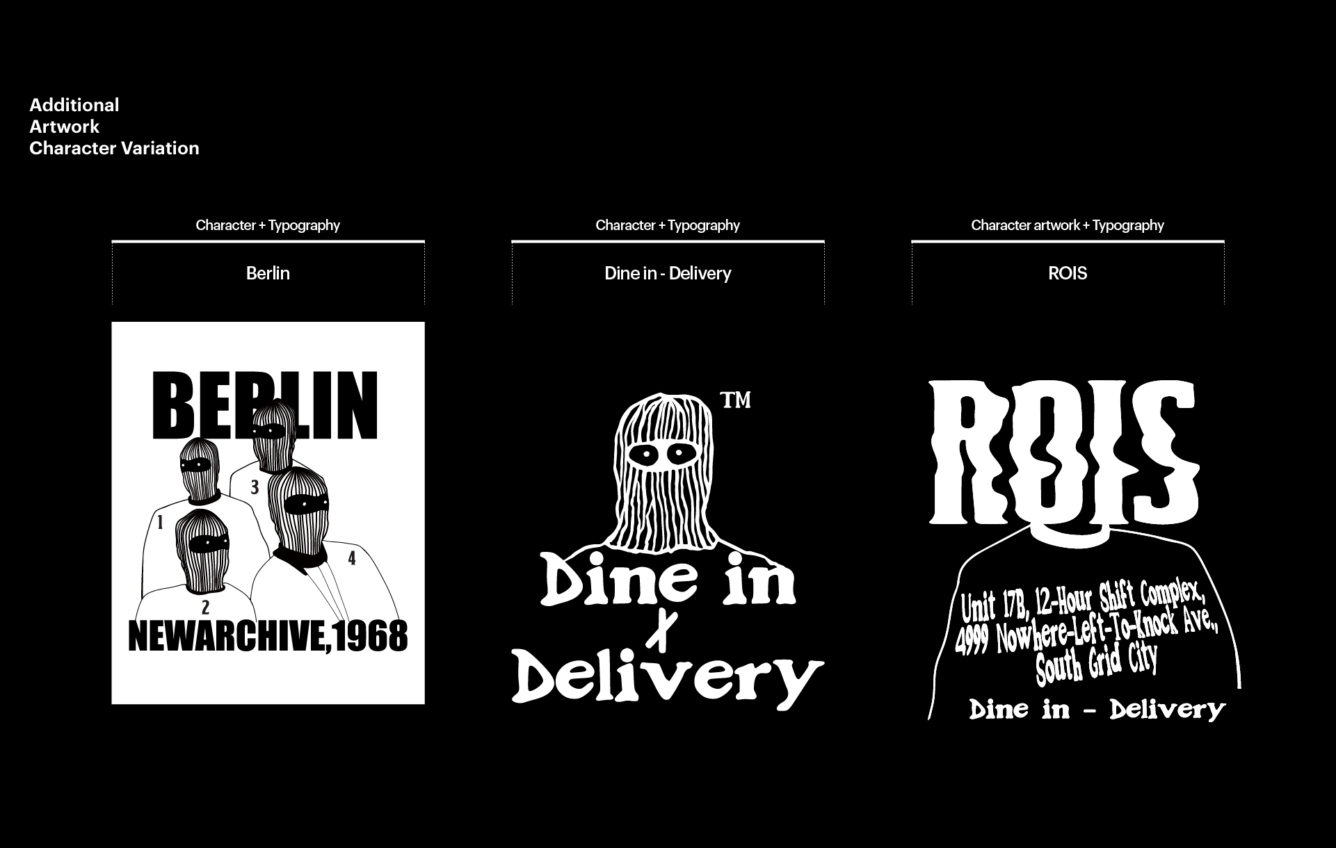
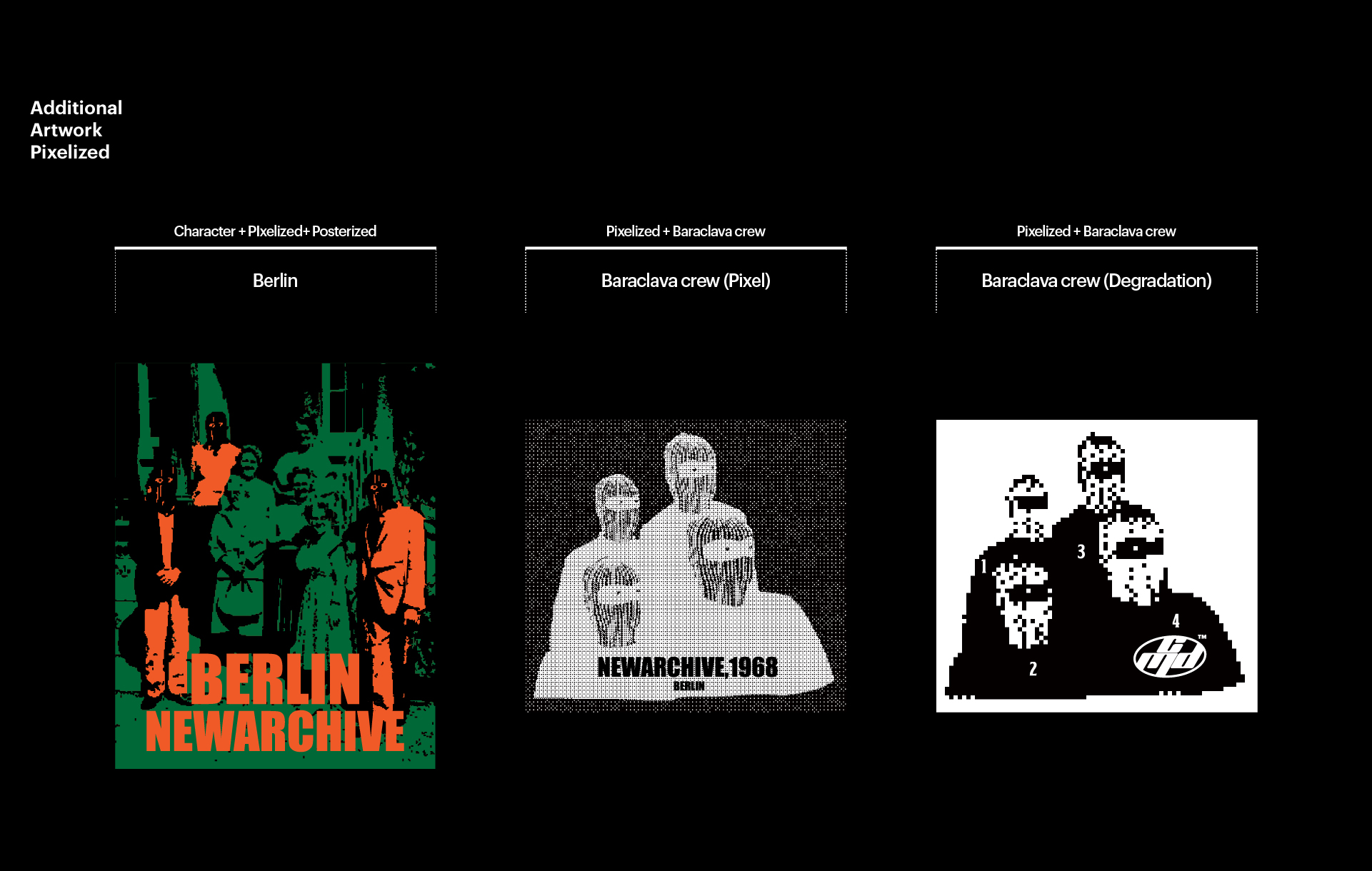
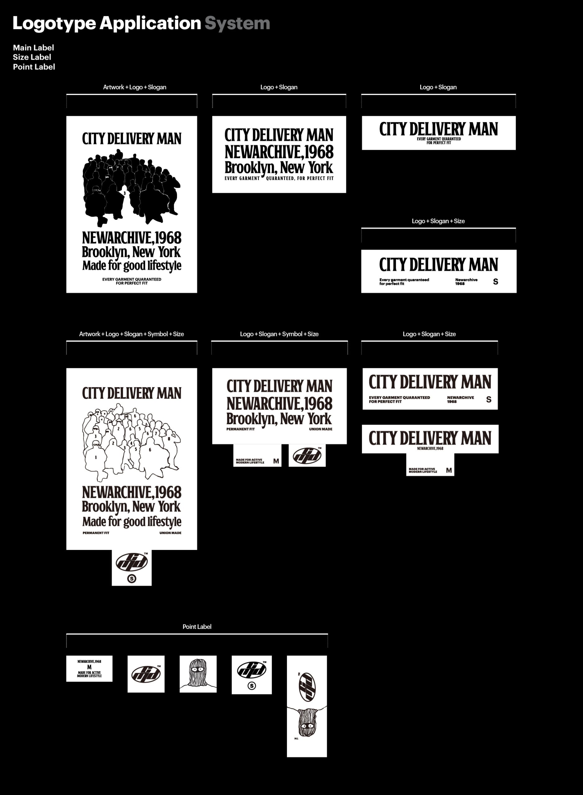
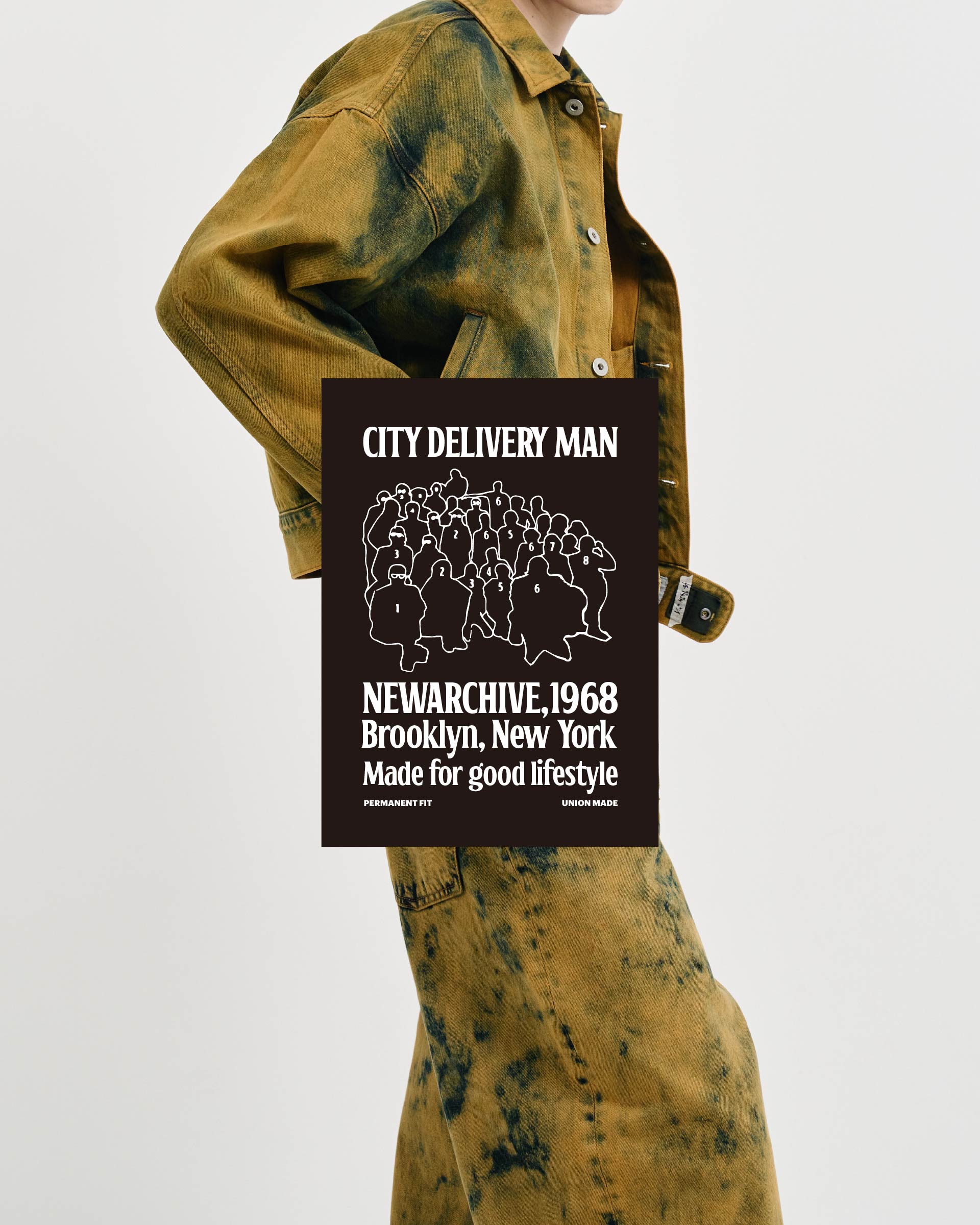
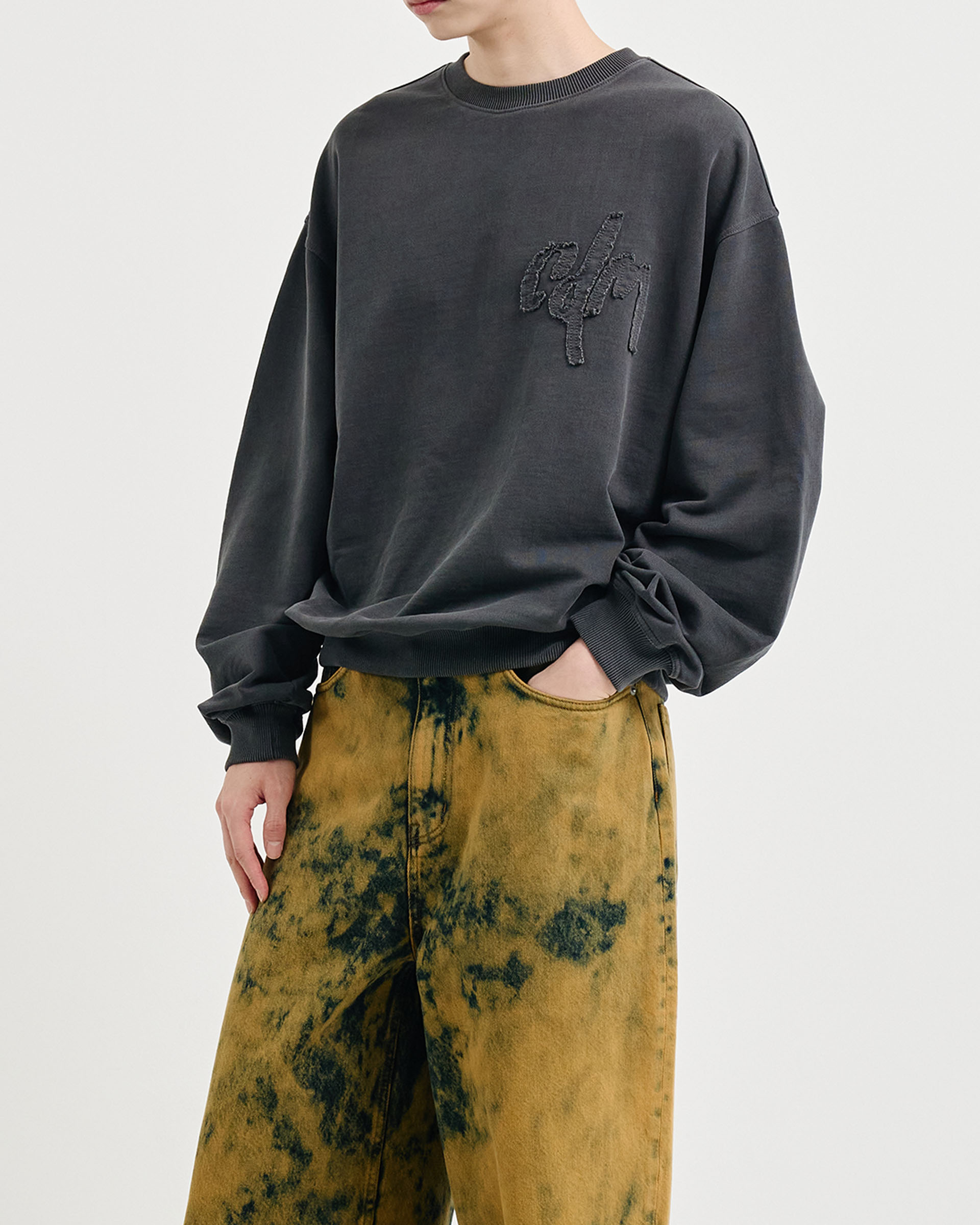
We developed a logo and visual system for CDM that merge utilitarian function with cultural expression. Drawing inspiration from military uniforms and urban architecture, the brand identity emphasizes clarity, modularity, and movement. From the tilted oval emblem to graffiti-inspired elements, the design reflects both structure and street energy balancing visual discipline with storytelling.

01. Information - B.I

CDM’s Brand Identity design is deeply rooted in practicality. Inspired by the functionality of military uniforms and the silhouette of timeless garments,
the visual identity embraces utilitarian clarity while avoiding short-lived trends. Each component of the system from typography to spacing emphasizes clarity, durability, and technical accuracy. 


The logo structure is based on strong geometric symmetry, with a unique 60° tilt and rounded edges that embody movement and cohesion. This shape language is not arbitrary it reflects the order and grid-like logic of the city itself.


At the center of CDM’s Brand Identity design lies a robust logo built from stylized “cdm” initials, locked into a dynamic oval container. 
This emblem isn’t merely aesthetic; it speaks to the enclosed, defined flow of city blocks and the deliberate energy of those navigating within them. 


The supporting wordmarks “UNION MADE” and “PERMANENT” emphasize the brand’s durability and value. These are not fleeting trends but long-lasting beliefs.
The safe zones and scalable system ensure that the identity maintains integrity across any medium garment labels, digital presence, or packaging.

CDM의 브랜드 아이덴티티는 실용성을 핵심으로 두고 설계되었습니다. 군용 유니폼의 기능성과 시대를 초월한 의복의 실루엣에서 영감을 받아, 유행에 휘둘리지 않는 명확하고 실용적인 조형 언어를 추구한다.


타이포그래피부터 여백까지, 시스템을 구성하는 모든 요소는 명료함, 내구성, 기술적 정밀함을 기반으로 설계되어 있다. 로고는 60도 기울기의 기하학적 대칭 구조와 부드러운 곡선을 바탕으로 움직임과 결속력을 시각화한 형태로 구축했다. 이러한 형태는 단순한 조형적 선택이 아닌, 도시의 질서와 격자형 구조에서 착안한 논리적 표현이 된다.


BI의 중심에는 ‘cdm’ 이니셜을 조형화해 역동적인 타원형 프레임에 담아낸 견고한 로고가 자리하고, 이 심벌은 단순한 장식 요소를 넘어, 도시 블록의 흐름과 그 안을 걷는 사람들의 에너지를 상징한다. 서브 워드마크인 “UNION MADE”와 “PERMANENT”는 브랜드의 지속성과 가치관을 강조하며, 일시적인 유행어가 아닌, 브랜드의 철학을 드러내는 지속 가능한 신념을 표현한다.


정교하게 설정된 마진 규칙과 확장 가능한 시스템은, 의류 라벨에서부터 디지털, 패키지에 이르기까지 어떤 매체에서도 브랜드의 정체성이 흐트러짐 없이 유지되도록 설계되어 있다.

CDM’s Brand Identity design balances expressive depth and visual discipline. Graffiti-inspired typography, brushstroke lettering, and character illustrations such as the baraclava figure and crowd silhouettes introduce cultural nuance and urban storytelling.


These elements enhance the brand’s emotional tone while a modular, rule based application system ensures consistency across all media. The identity flexes to fit diverse formats without losing cohesion, allowing CDM to remain both dynamic and structured in its visual language.

CDM의 브랜드 아이덴티티는 표현의 깊이시각적 질서 사이의 균형 위에 서 있고, 그래피티에서 영감을 받은 타이포그래피, 거친 붓질의 레터링, 바라클라바 캐릭터나 군중 실루엣과 같은 일러스트 요소들은 브랜드에 도시적 서사와 문화적 뉘앙스를 더해준다.


이러한 감정적 텍스처는 브랜드의 정서적 밀도를 높이는 동시에, 모듈형이자 규칙 기반의 응용 시스템은 매체 전반에 걸친 일관되게 표현한다결과적으로 CDM의 아이덴티티는 다양한 포맷에 유연하게 적용되면서도 브랜드 고유의 구조적 통일성을 유지하여, 역동성과 질서가 공존하는 시각 언어를 완성하게 된다.

02.Infomation - Application

CDM’s label system reflects the brand’s commitment to clarity, consistency, and cultural storytelling. Each label format, from main labels to size and point labels, is designed within a modular structure. This approach ensures flexibility while maintaining strict visual discipline.


The main labels combine artwork, logotype, slogans, and symbols to express both function and narrative. Graffiti-style illustrations and urban motifs highlight CDM’s cultural nuance, while the grid-based layout reinforces technical accuracy.


Point labels feature expressive icons and characters inspired by the brand’s identity elements. These components enhance recognition and establish a strong connection with the streetwear context. Altogether, the label system functions as a practical tool and a visual extension of the brand’s philosophy.

CDM의 라벨 시스템은 브랜드가 지향하는 명료성, 일관성, 도시적 스토리텔링을 시각적으로 구현한다. 메인 라벨부터 사이즈 라벨, 포인트 라벨에 이르기까지 모듈화된 구조를 바탕으로 설계되어, 엄격한 시각적 규율 속에서도 유연한 응용이 가능하도록 구성되었다.


메인 라벨은 일러스트, 로고타입, 슬로건, 심벌을 조합하여 기능성과 내러티브를 동시에 담아내고 있다. 그래피티 스타일의 그래픽과 도시적 모티프는 브랜드의 문화적 뉘앙스를 전달하고, 격자 기반의 정렬 시스템은 기술적 완성도를 강조한다.


포인트 라벨은 브랜드 아이덴티티에서 파생된 캐릭터와 심벌 아이콘을 중심으로 구성되어, 감성적 연결과 기억 요소를 강화하고, CDM의 라벨 시스템은 단순한 정보 전달을 넘어, 브랜드 정체성을 직관적으로 경험하게 만드는 시각적 장치로 작동하게 된다.

03.Infomation - Product

Let's get in touch,
we respond fast.

Ready to work together?
Back