The Essence of Nothing

NAHTHING PROJECT captures the essence of purity through structural design. Nothing unnecessary, everything intentional.

Task

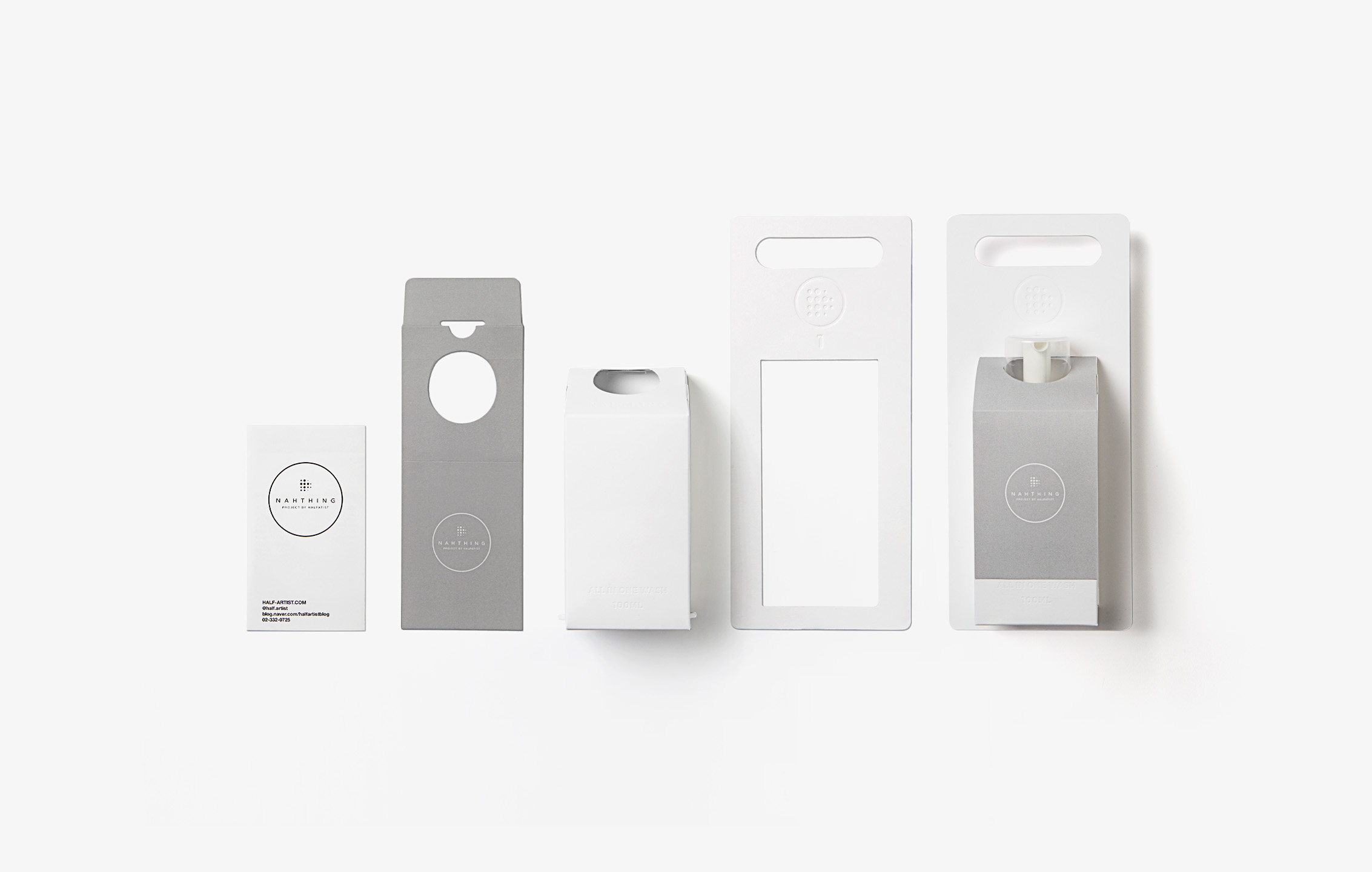
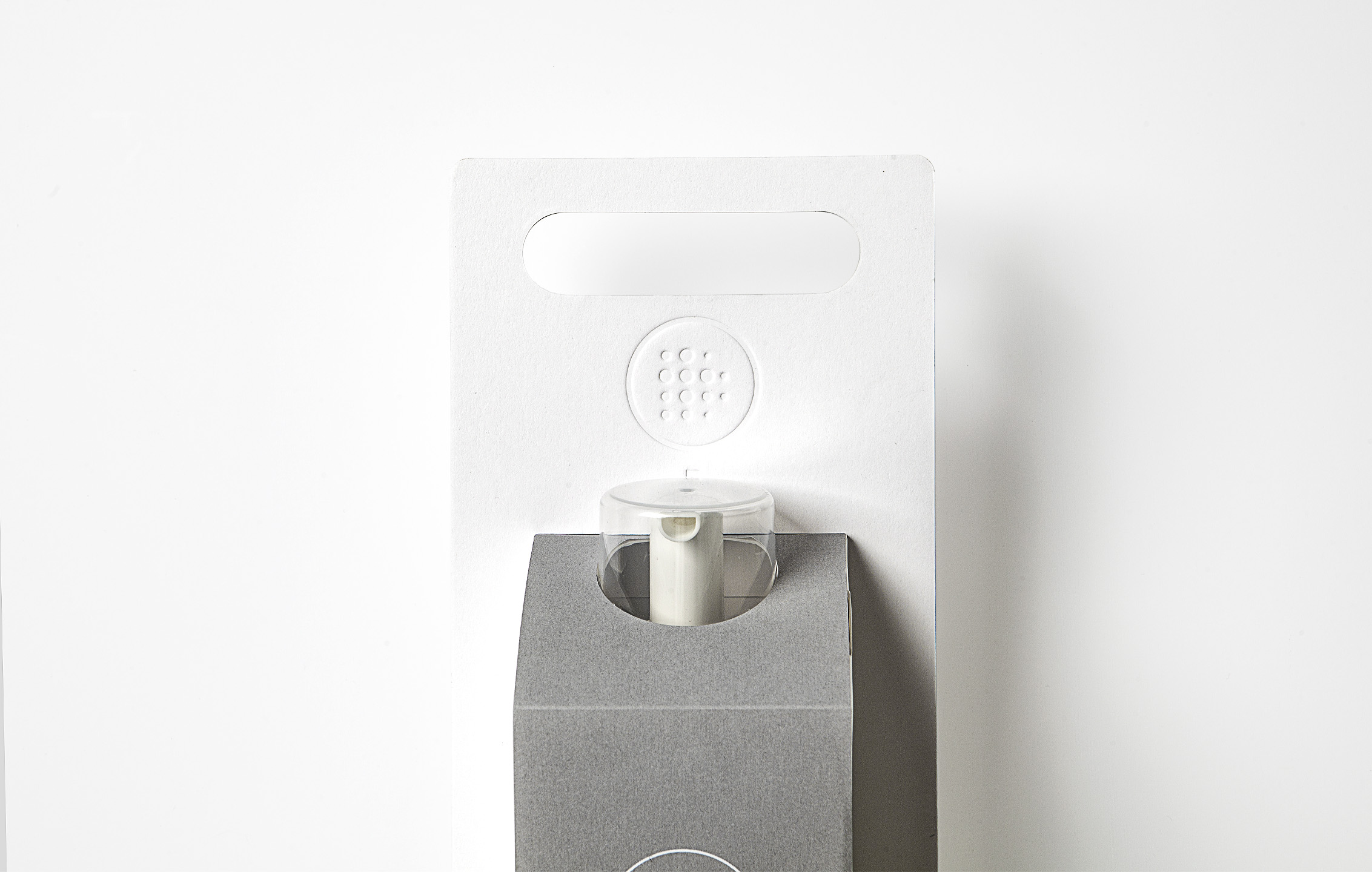
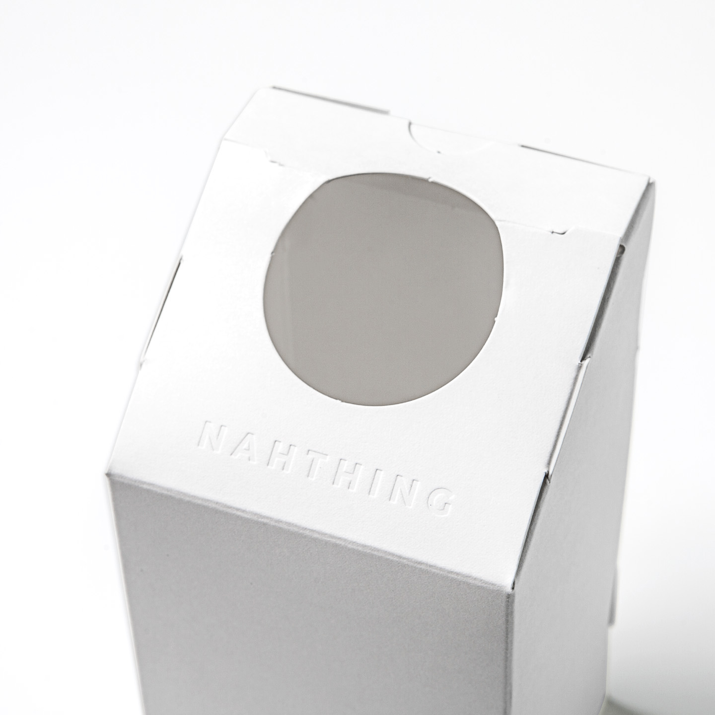
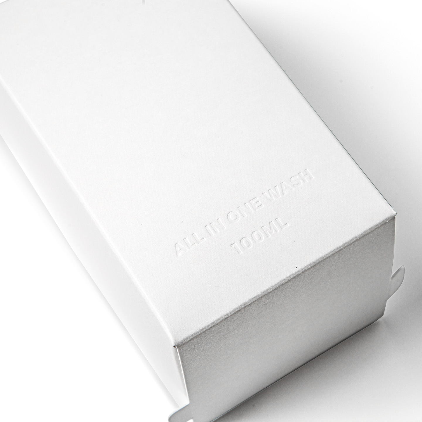
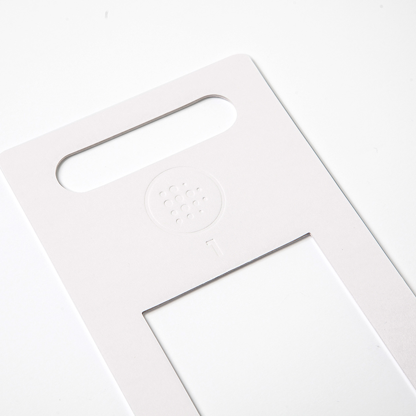
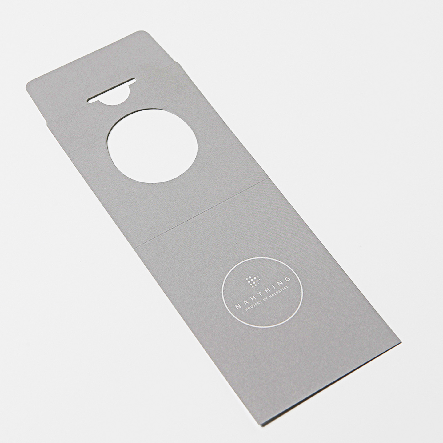
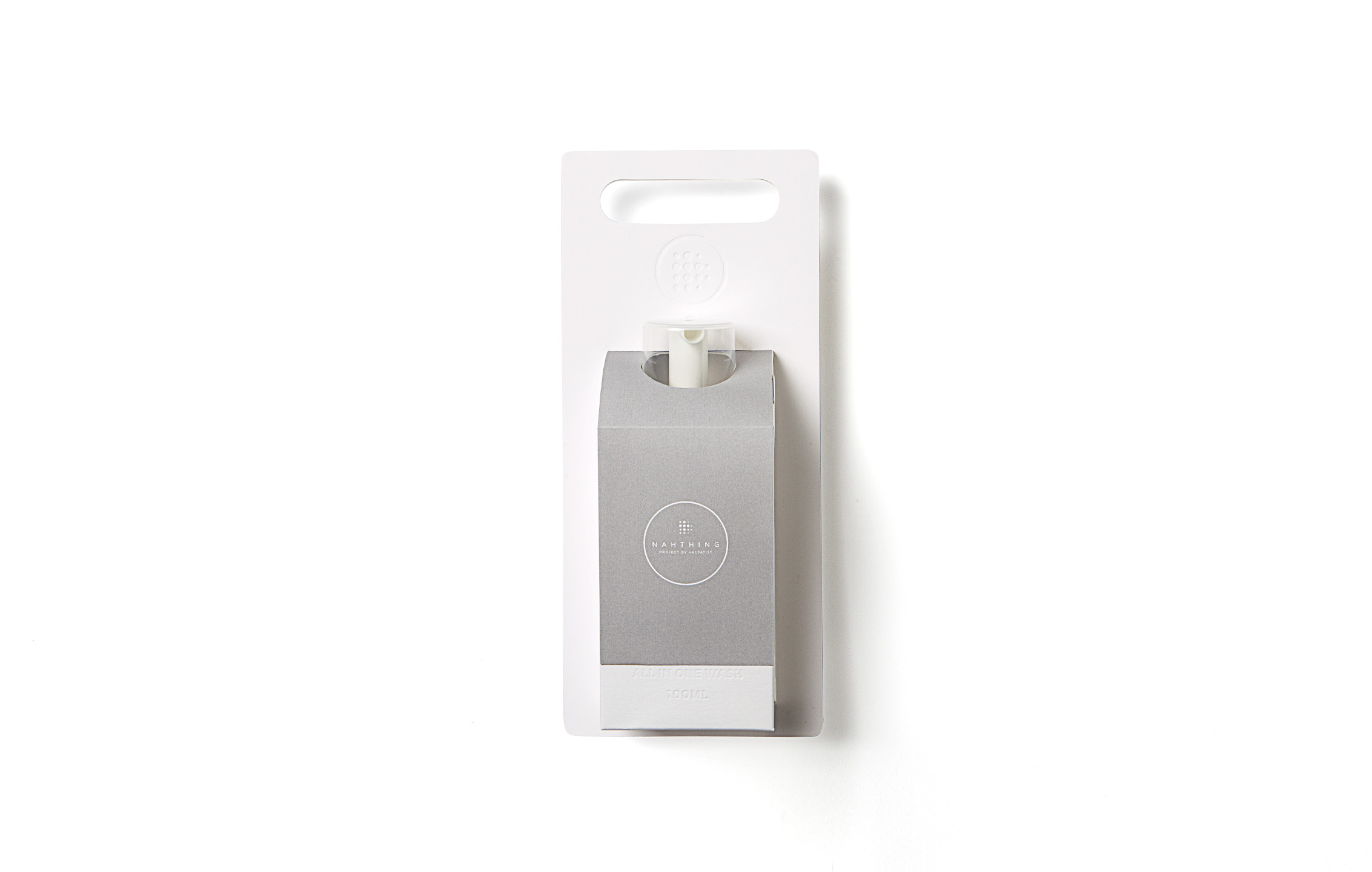
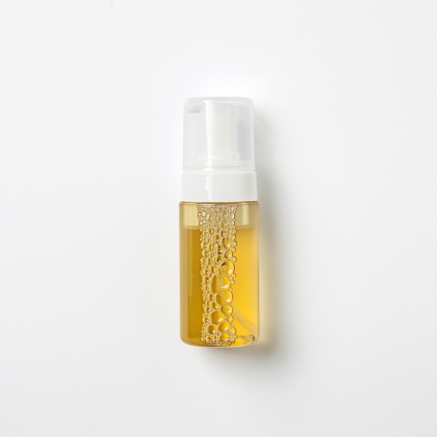
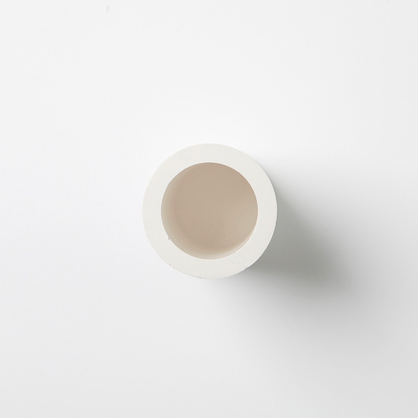
We developed the branding and packaging system for NAHTHING PROJECT, a baby-care line under Half Artist, in celebration of a special pop-up at Banyan Tree Club & Spa. The design reflects the brand’s core philosophy of leaving nothing behind no harmful substances, no unnecessary waste. We created a glue-free, embossing-only structural package with no ink printing to highlight sustainability. The cleansing product featured a label-free bottle and a circular gypsum container to express purity and transparency. All elements, including the box, leaflet, stand, and case, were integrated into a unified packaging system. The entire collection was presented in absolute white, visually reinforcing the brand’s values of minimalism, cleanliness, and care.

  • Design

    Package Design

  • Client

    Half Artist

01. Information - Project Concept

This project focused on the branding and packaging design for NAHTHING PROJECT, a baby-care line under the bath lifestyle brand Half Artist.

It was developed in connection with a special pop-up event held on May 5th, Children’s Day, at Banyan Tree Club & Spa, with the goal of visualizing the brand’s core philosophy leaving nothing behindNAHTHING PROJECT goes beyond simply offering products free of harmful ingredients. It seeks to embody the purest form of care by eliminating even the environmental trace left behind. We translated this philosophy into every aspect of the design from structure and material to color and information hierarchy.

이번 프로젝트는 욕실 라이프스타일 브랜드 Half Artist 산하 베이비케어 라인인 NAHTHING PROJECT의 브랜딩 및 패키지 디자인을 중심으로 진행되었다.


이 프로젝트는 5월 5일 어린이날, 반얀트리 클럽 & 스파에서 열린 팝업 행사에 맞춰 기획되었으며, 브랜드가 지향하는 “남김 없는” 철학을 시각적으로 구현하는 데 중점을 두었다. NAHTHING PROJECT는 단순히 유해 성분이 없는 제품을 넘어, 환경에 불필요한 흔적을 남기지 않는 순수함의 본질을 지향한다. 우리는 이 브랜드 철학을 패키지 구조, 소재, 색채, 정보 설계 전반에 걸쳐 구체화하였다.

02. Information - Package design

1. Packaging Concept – A Design That Leaves Nothing Behind 

The packaging system was built on the brand’s commitment to sustainability and minimalism. We developed a glue-free, self-assembled structure that eliminated the use of adhesives and reduced production waste. Rather than printing, we used embossing only, allowing the material’s raw texture to become the main visual carrier. This ink-free and label-free approach enhanced the eco-conscious messaging of the brand.


2. Product Design – Minimal Information, Maximum Transparency 

To emphasize purity and honesty, the cleansing bottle was designed without any printed label, allowing full visibility of the product inside. The cleansing solution was housed in a circular container made from natural gypsum powder, a form that subtly echoed the product’s cleansing function. This sculptural approach highlighted the tactile and material integrity of the product.


3. All-in-One Packaging – A Unified Form 

All components of the set including the product, leaflet, box, display stand, and carry case were designed as a single, unified structure. There was no secondary wrapping or extra packaging, reinforcing the “All in One” concept central to the brand identity. This approach ensured both visual coherence and practical usability.


4. The Absolute White Palette 

The entire packaging system was finished in pure white, a deliberate choice that visually reflected the product’s commitment to purity and non-toxicity. This monochrome palette unified the structural and visual language across every component, while reinforcing the brand’s values of clarity, sustainability, and restraint.

1. 패키지 콘셉트 – 남김 없는 구조

패키지는 무접착 조립식 구조로 제작되어, 별도의 접착제를 사용하지 않고도 완성 가능한 형태로 설계되었다. 잉크를 전혀 사용하지 않고, 오직 엠보싱만으로 브랜딩 요소를 표현함으로써 시각적 절제와 친환경 메시지를 동시에 전달했다.


2. 제품 디자인 – 최소한의 정보, 최대한의 투명성

클렌징 제품은 라벨이 없는 바틀을 통해 내용물의 순도를 직관적으로 드러냈다. 또한, 해당 용액을 담는 원형의 석고 용기는 제품의 ‘클렌징’ 기능을 형태로 상징화했다.


3. 올인원 패키징 – 하나의 구조로 통합된 시스템

리플렛, 제품 박스, 스탠드, 캐리 케이스까지 모든 구성 요소를 하나의 구조로 통합하여, 브랜드가 추구하는 “All in One” 개념을 물리적으로 표현했다. 개별 포장이 아닌 단일화된 구조는 사용성과 미니멀리즘을 동시에 충족시켰다.


4. 절대 백색의 팔레트

전체 패키지는 절대적인 화이트 컬러로 통일되었다. 이 선택은 제품에 유해 성분이 없다는 점을 시각적으로 강조함과 동시에, 브랜드가 추구하는 순수성, 지속 가능성, 투명성이라는 핵심 가치를 명확히 전달한다.

Let's get in touch,
we respond fast.

Ready to work together?
Back