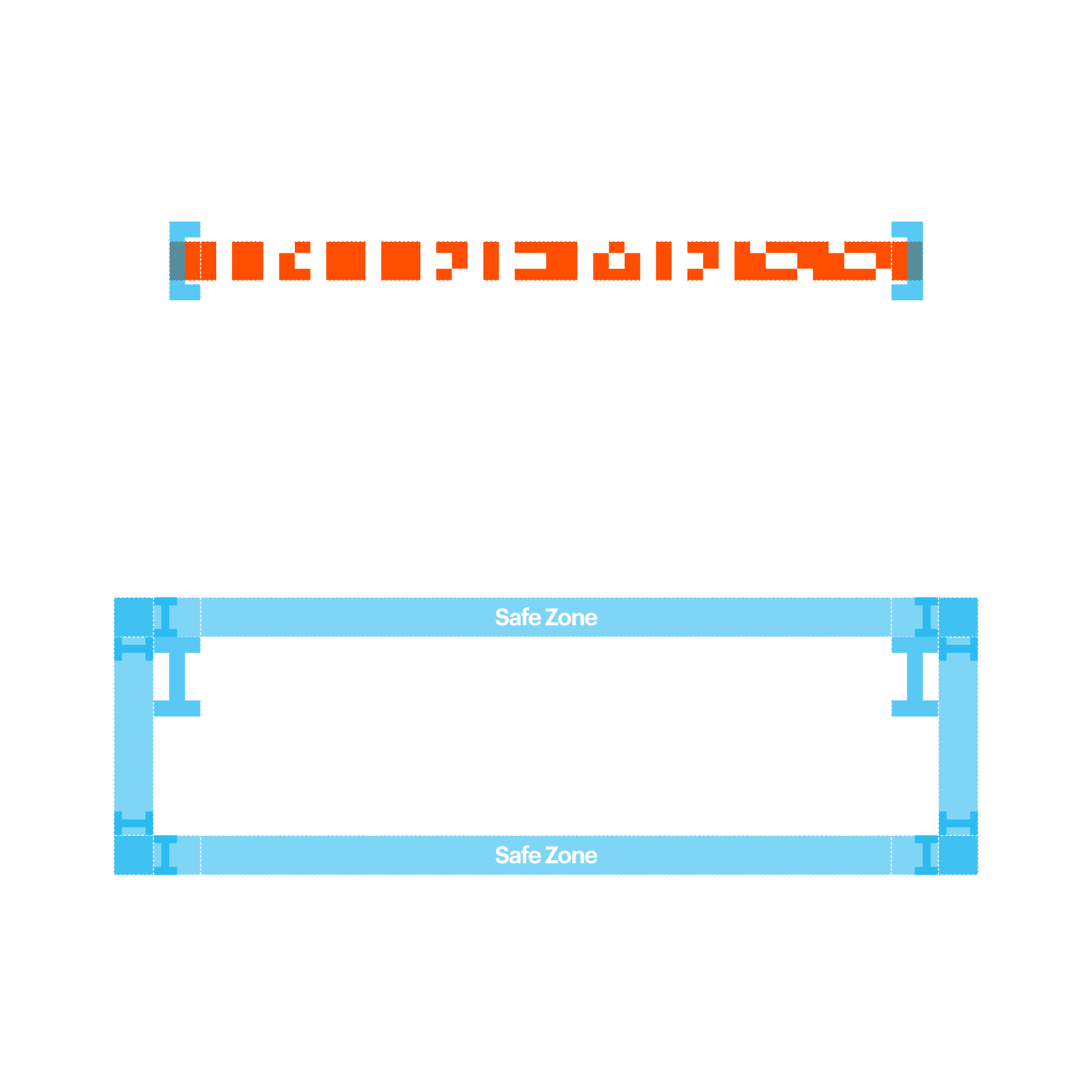
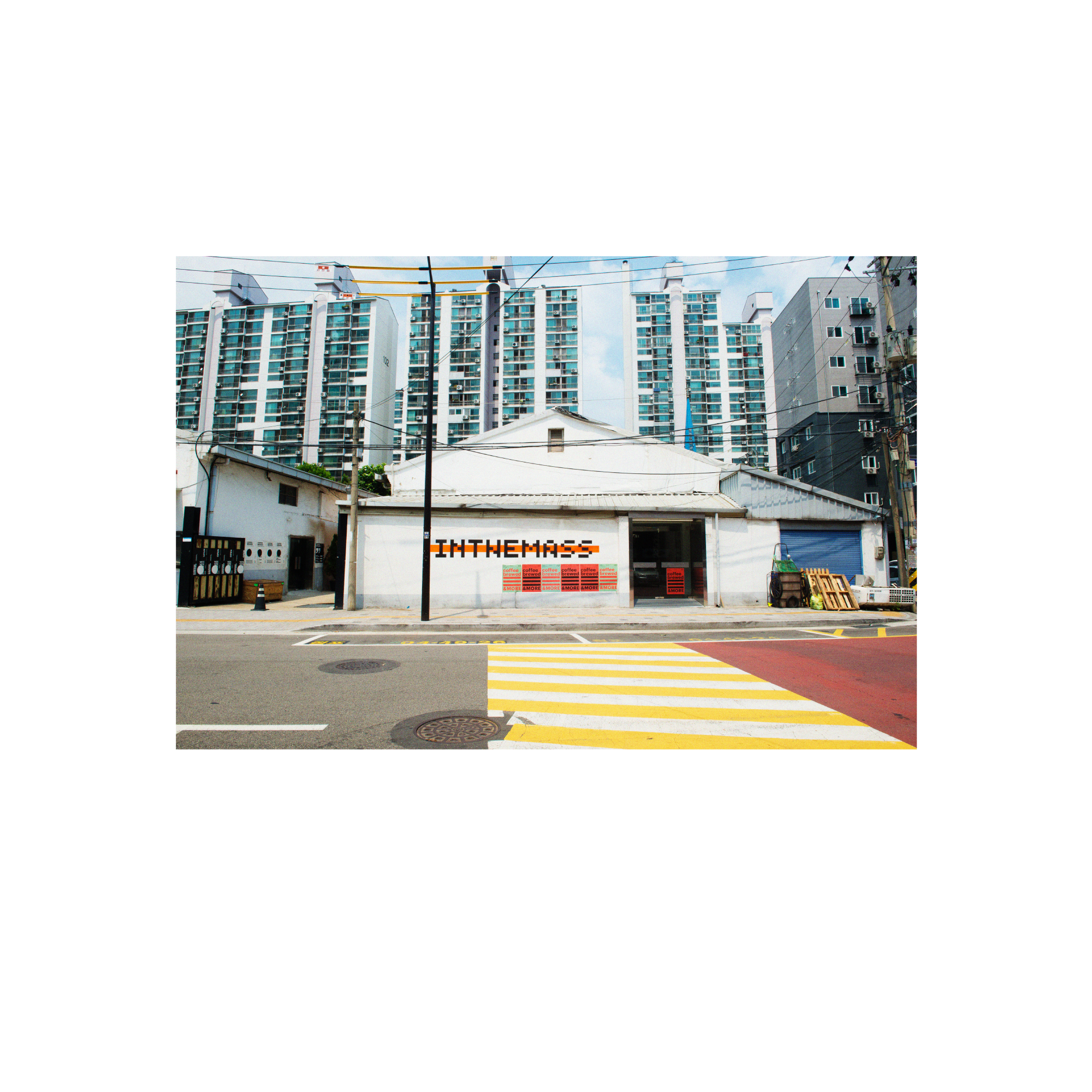
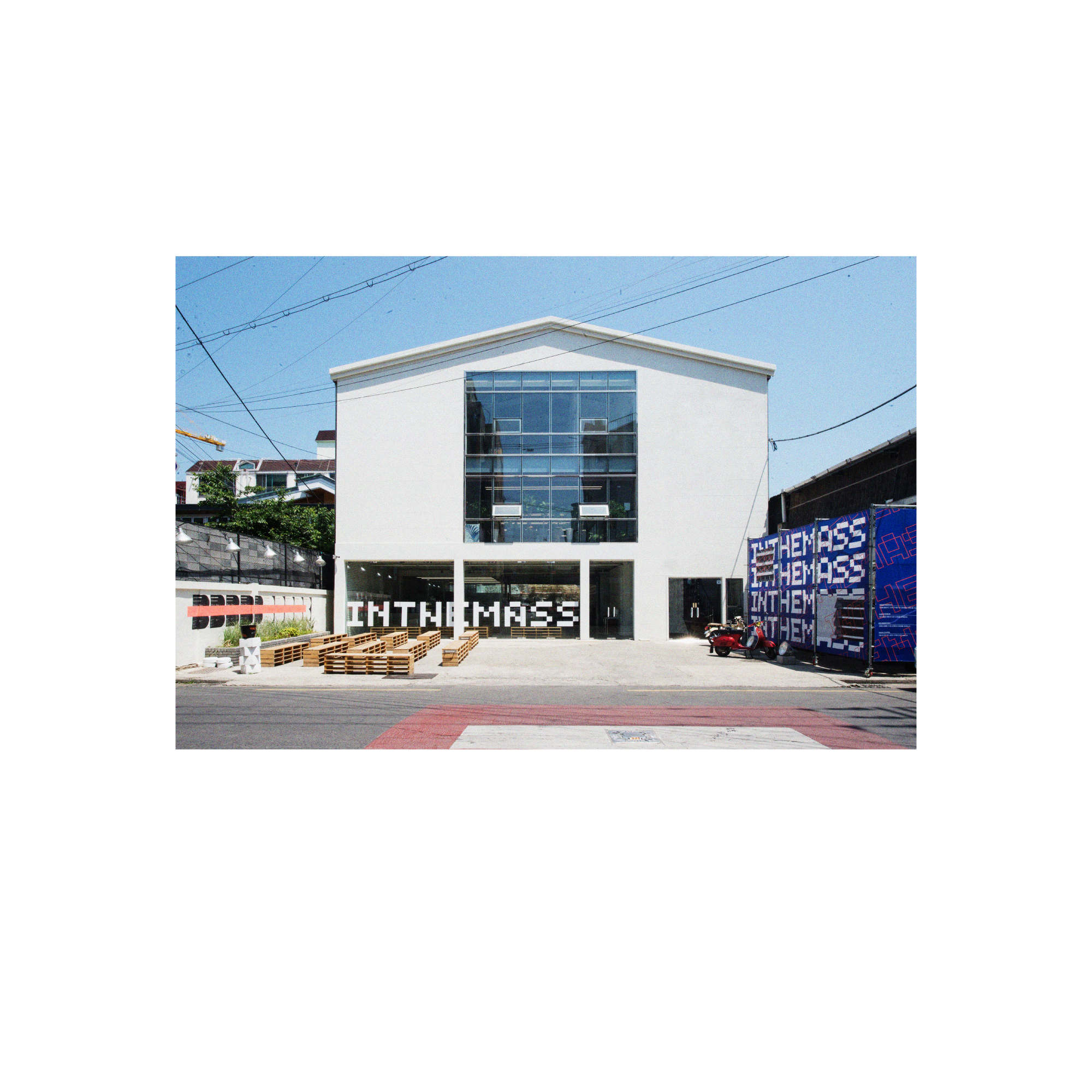
Defining a New Identity for Inthemass

A new high-end identity shaped from the foundation of MASS.
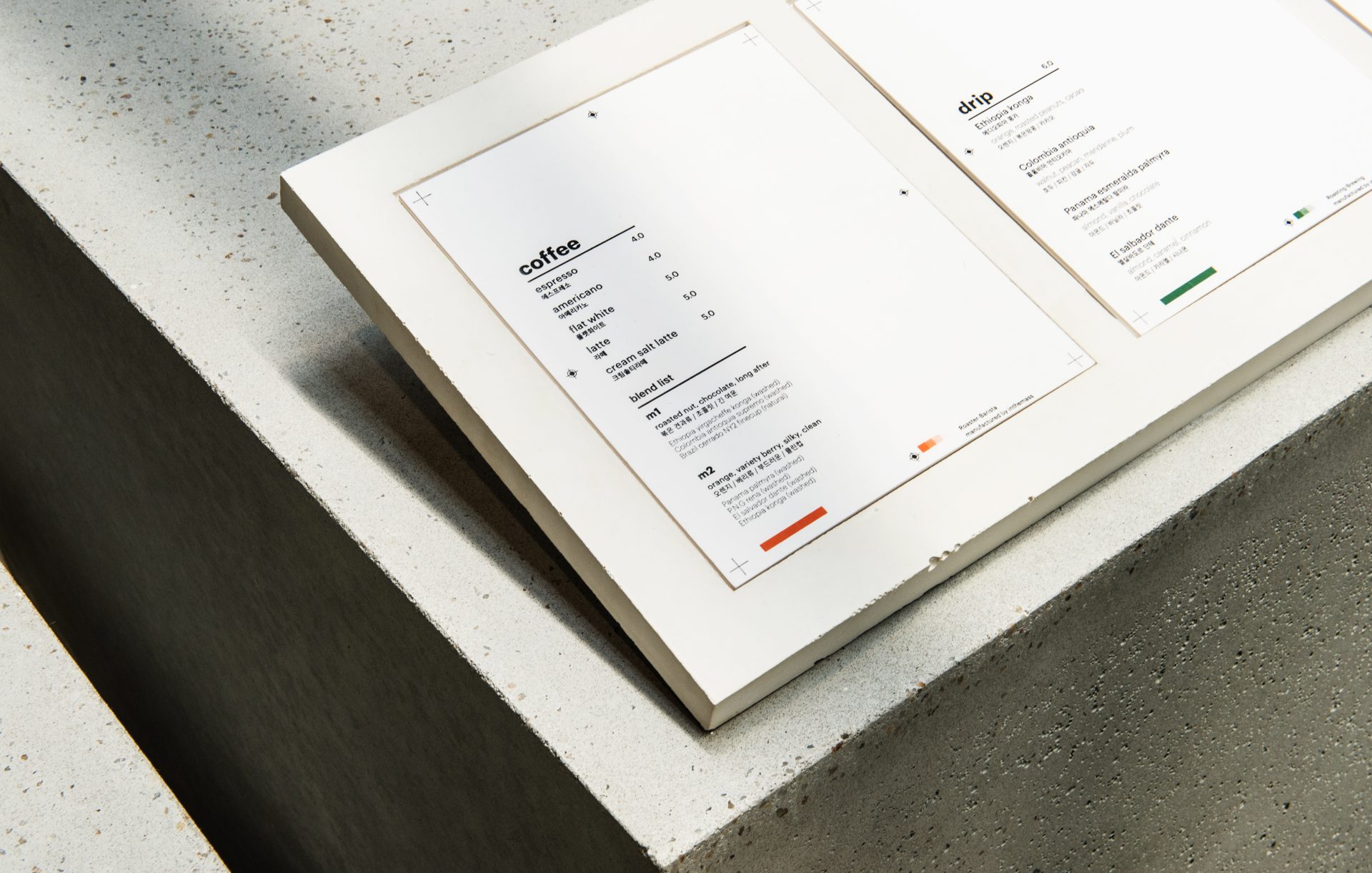
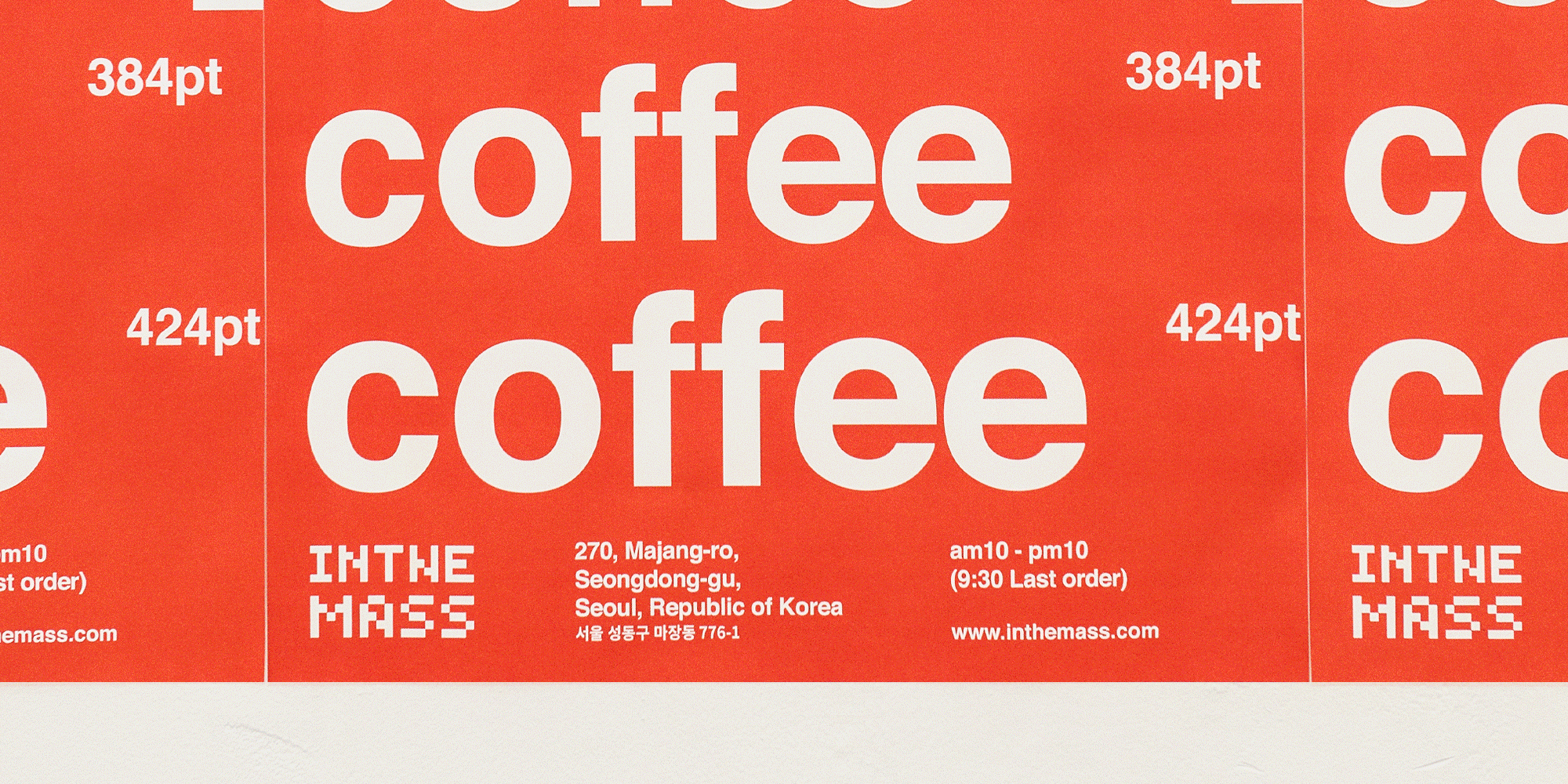
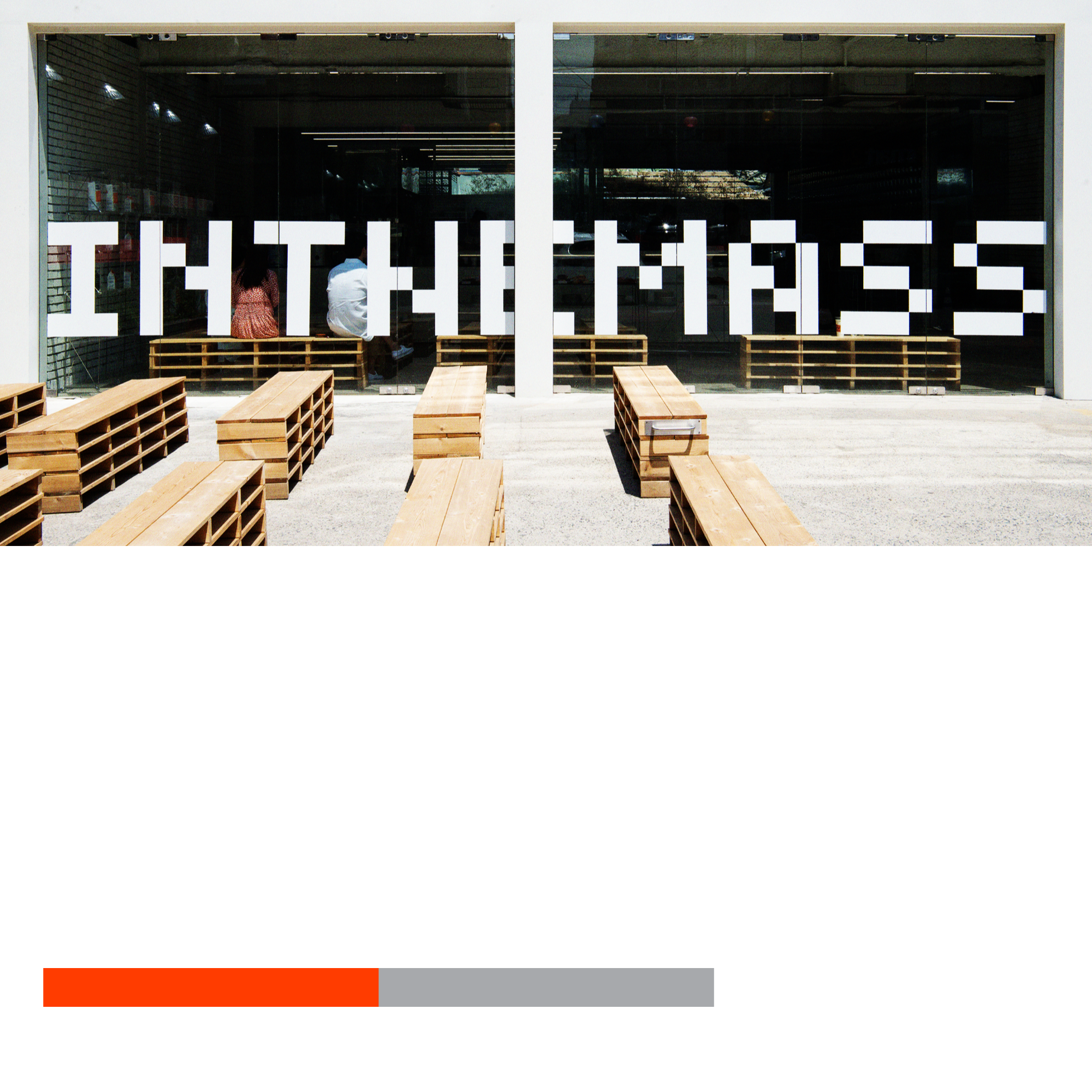
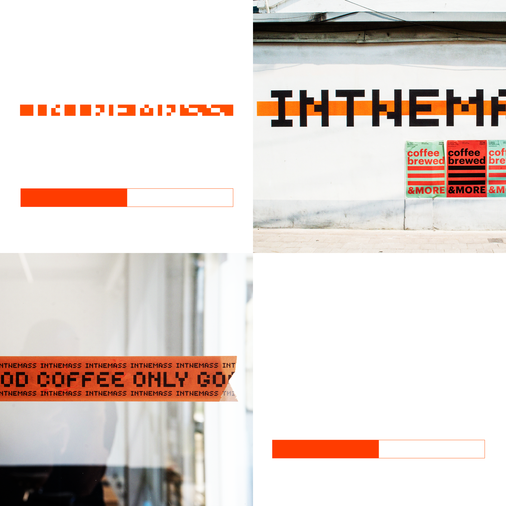
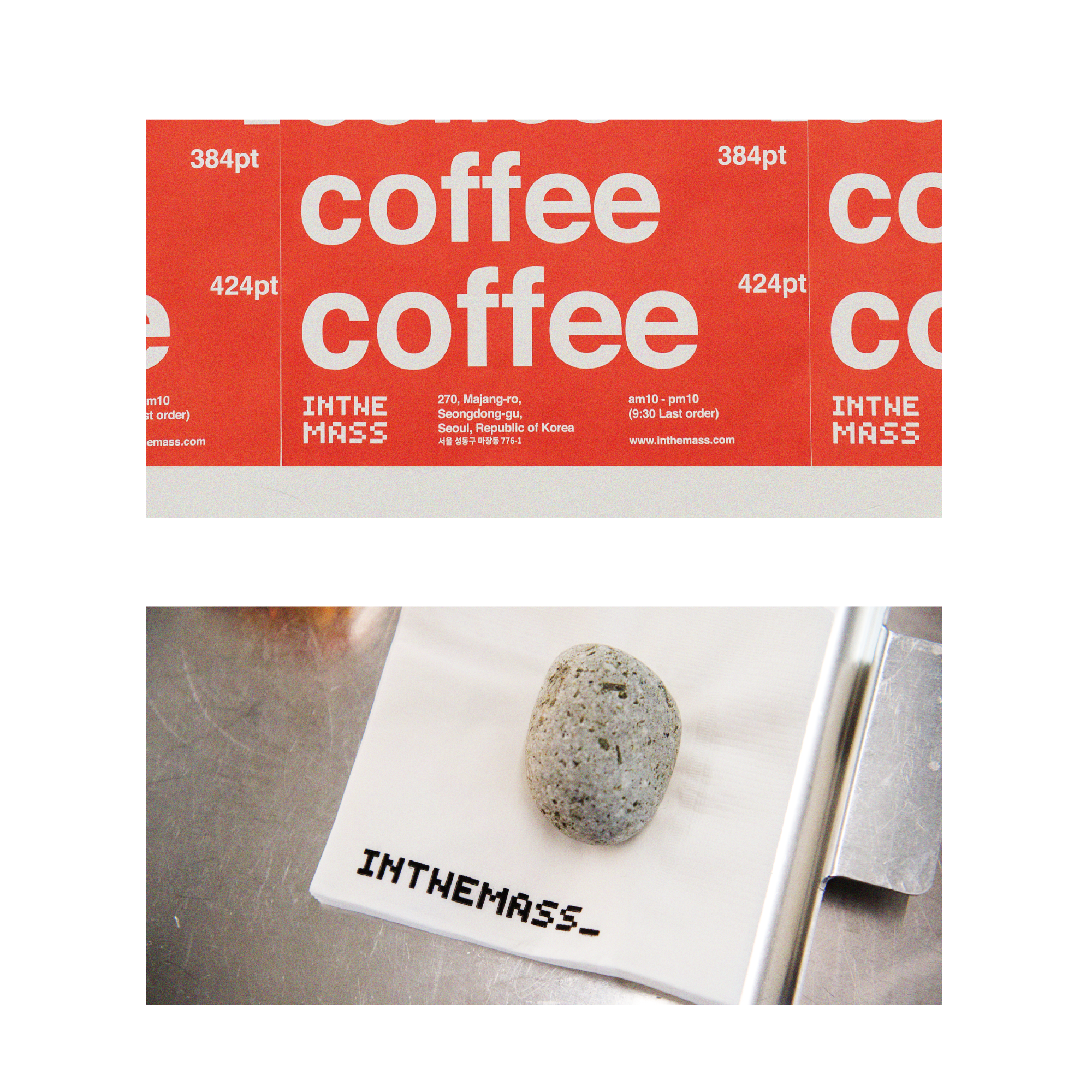
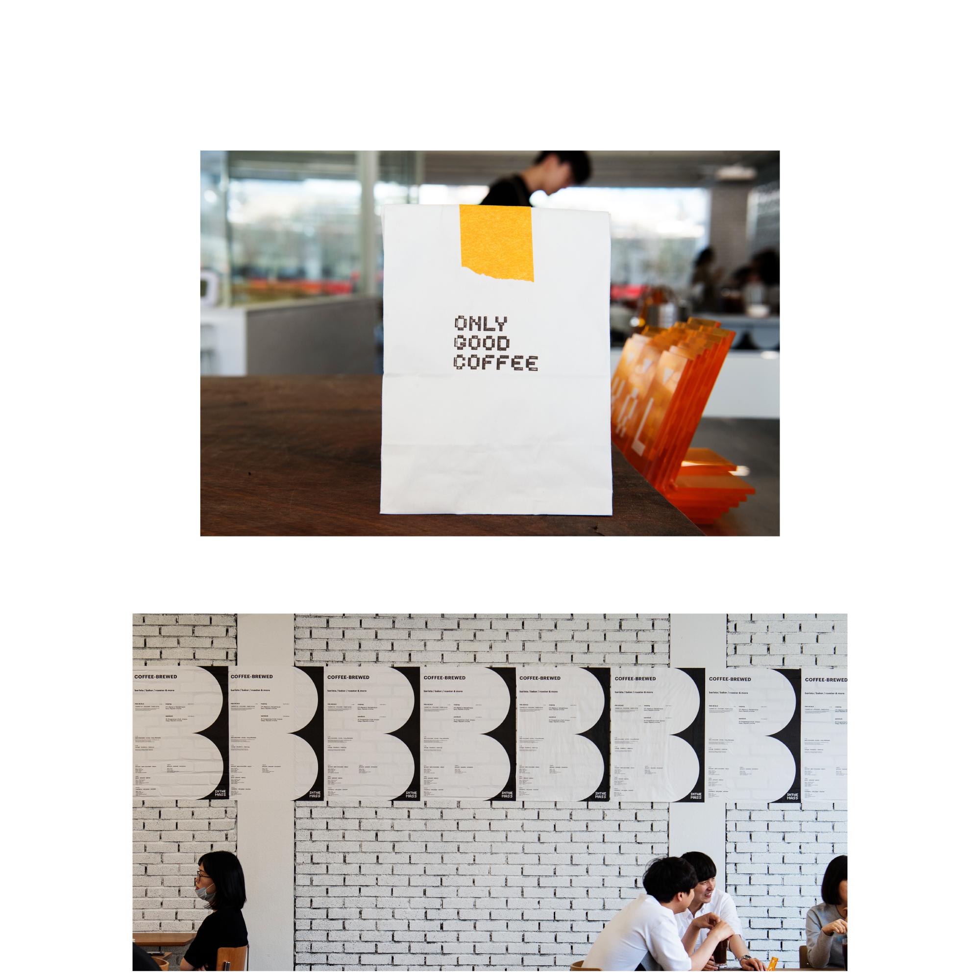
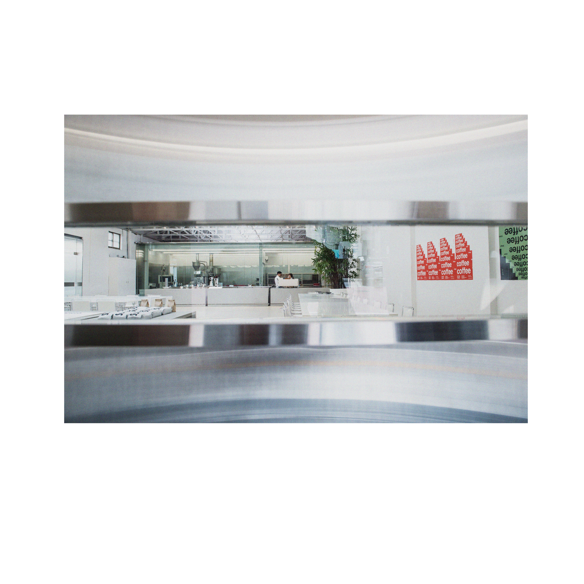
Its visual language is structured and deliberate,
dense with meaning and driven by a spirit of experimentation.

Task

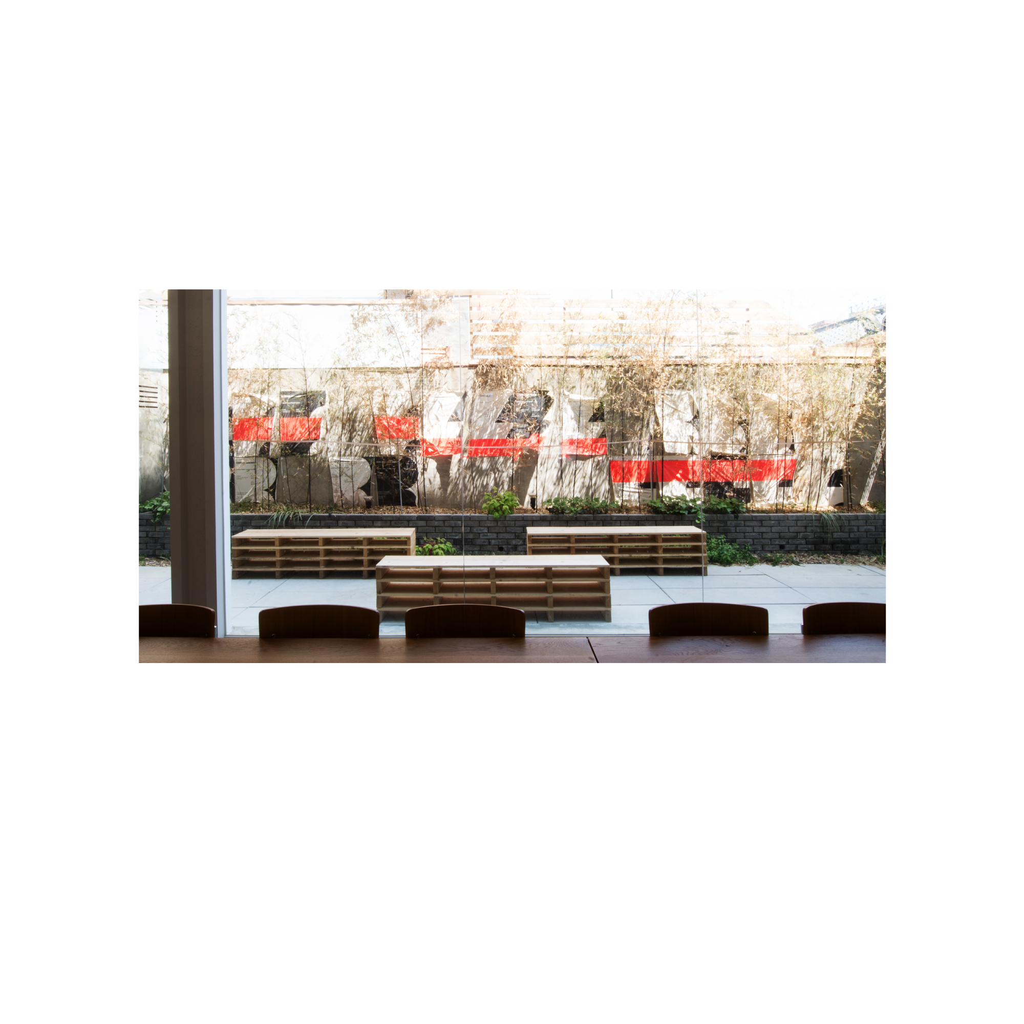
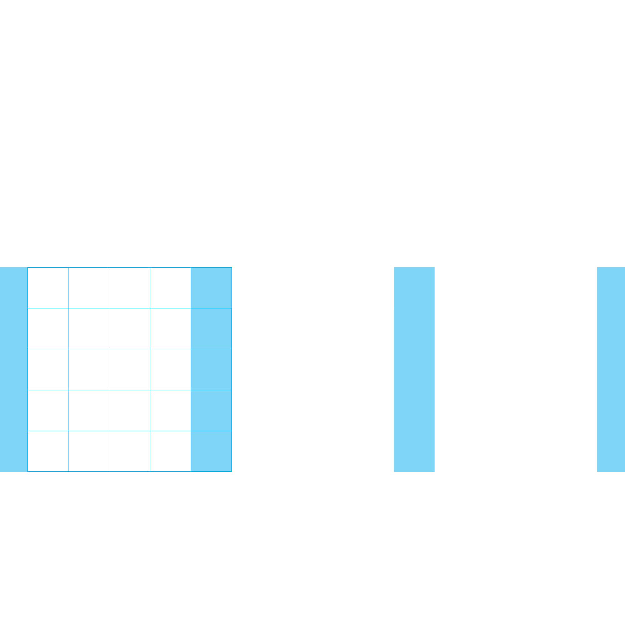
We developed a complete visual identity system including brand strategy, naming, symbol and logotype design, typography and grid system, application mockups, and final guideline production.

  • Design

    Branding

  • Client

    Inthemass

01.Project intro

Inthemass is a new high-end brand developed from the philosophy and design legacy of the Mass.
Built upon its conceptual depth and spatial sensibility, the visual identity was created to reflect the brand’s experimental ethos with clarity and structure.Rather than a decorative surface, the identity becomes a framework for how the brand communicates its thought and presence—measured, intentional, and open to experimentation.

Inthemass는 기존 ‘MASS’ 브랜드의 철학과 조형 언어를 바탕으로 새롭게 개발된 하이엔드 브랜드이다.
브랜드의 실험정신과 공간적 감각을 시각적으로 전달할 수 있도록, 핵심 키워드를 바탕으로 시선과 무게 중심이 명확한 비주얼 시스템을 설계하였다.이번 아이덴티티 개발은 로고 디자인에서, 브랜드가 가진 실험인 부분을 구조화하고 고도화하는 과정이었다.

02.Project Info - B.I

The identity of Inthemass is a visual structure that captures hidden potential and rhythm within form.
Tension between geometry and balance, space and density, reveals the brand’s unique sense and direction.
Through repetition and expansion of a single form, the identity connects how the brand exists and how it behaves.

인더매스의 아이덴티티는 덩어리 내부에 숨겨진 가능성과 리듬을 시각적으로 구조화한 결과물이다.
기하와 균형, 여백과 밀도 사이의 긴장 속에서 브랜드가 가진 감도와 방향성을 선명하게 드러낸다.
하나의 형태가 반복되고 확장되며, 브랜드의 존재 방식과 태도를 유기적으로 연결짓는다.


03.Project Info - Typography System

The identity centers around a bold symbol a reinterpretation of spatial density and internal rhythm.
Through a custom typographic system and a meticulously structured grid, we enabled consistency across all brand expressions without losing the layered depth that defines IN THE MASS.

우리는 브랜드의 심볼을 중심으로 조형적인 반복과 구조를 규정하였고, 그동안의 운영 속에서 발생한 무수한 실험들을 담아낼 수 있는 그리드와 타이포그래피 시스템을 구축하였다.
심볼은 덩어리 내부의 밀도와 균형을 상징하는 도형으로 재해석하였고, 무게감 있는 구조 안에서 리듬을 만들 수 있도록 여백과 정렬의 규칙을 설정하였다.

Let's get in touch,
we respond fast.

Ready to work together?
Back