Seasonal Limited Edition Dessert Branding
Mont Saint Clair
Brand Design
Package Design
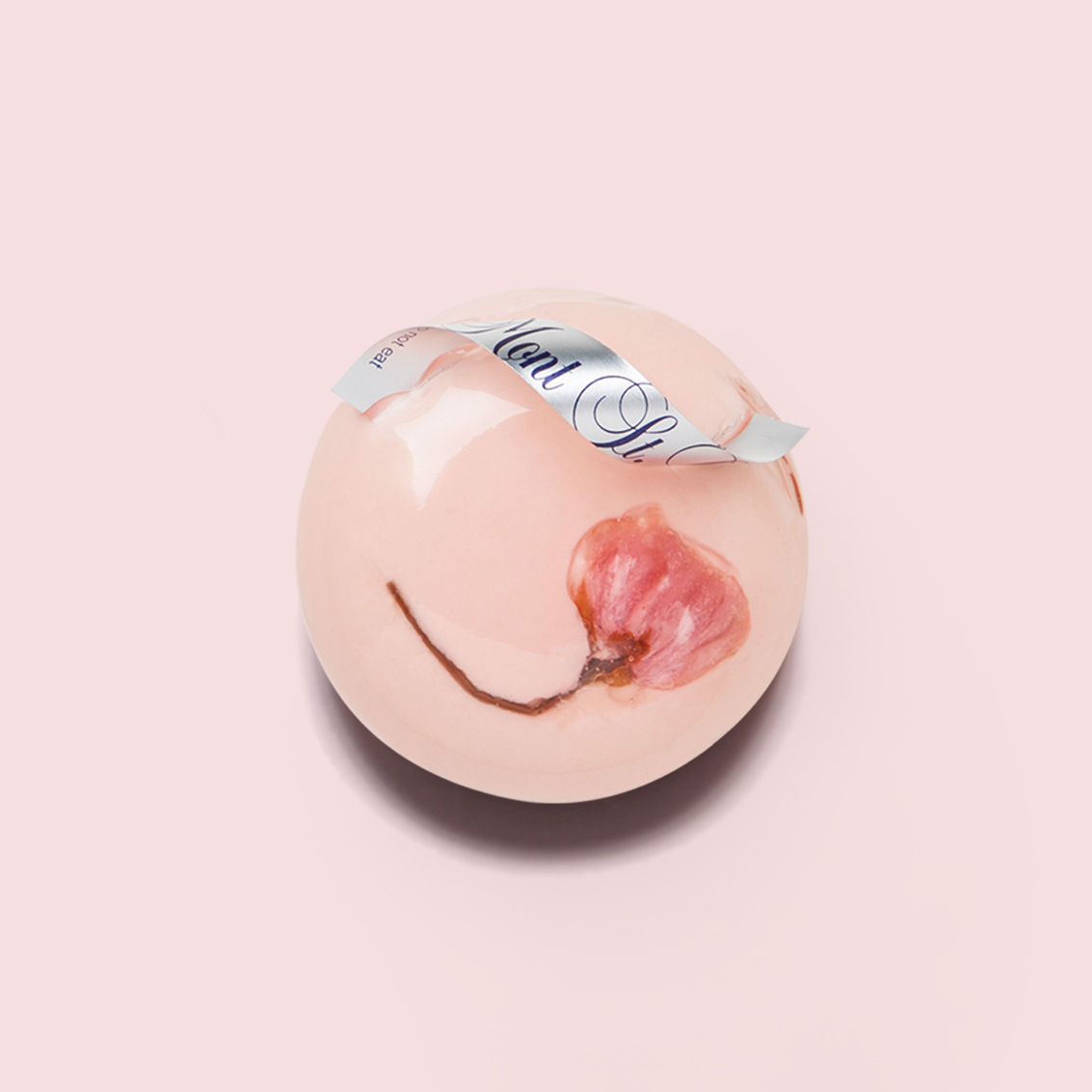
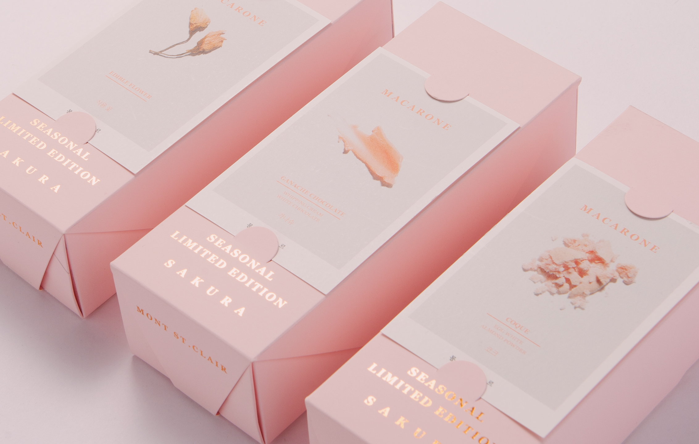
Every spring, Mont St. Clair unveils its Sakura Limited Edition desserts, a delicate tribute to the season. This year, our goal was to honor the brand’s established tradition while introducing a fresh perspective on the experience. Our design process began with an exploration of spring itself— what defines its atmosphere, and which elements most strongly evoke the essence of Japan? Ultimately, we stayed true to Mont St. Clair’s annual Sakura theme while deepening its visual and emotional impact.

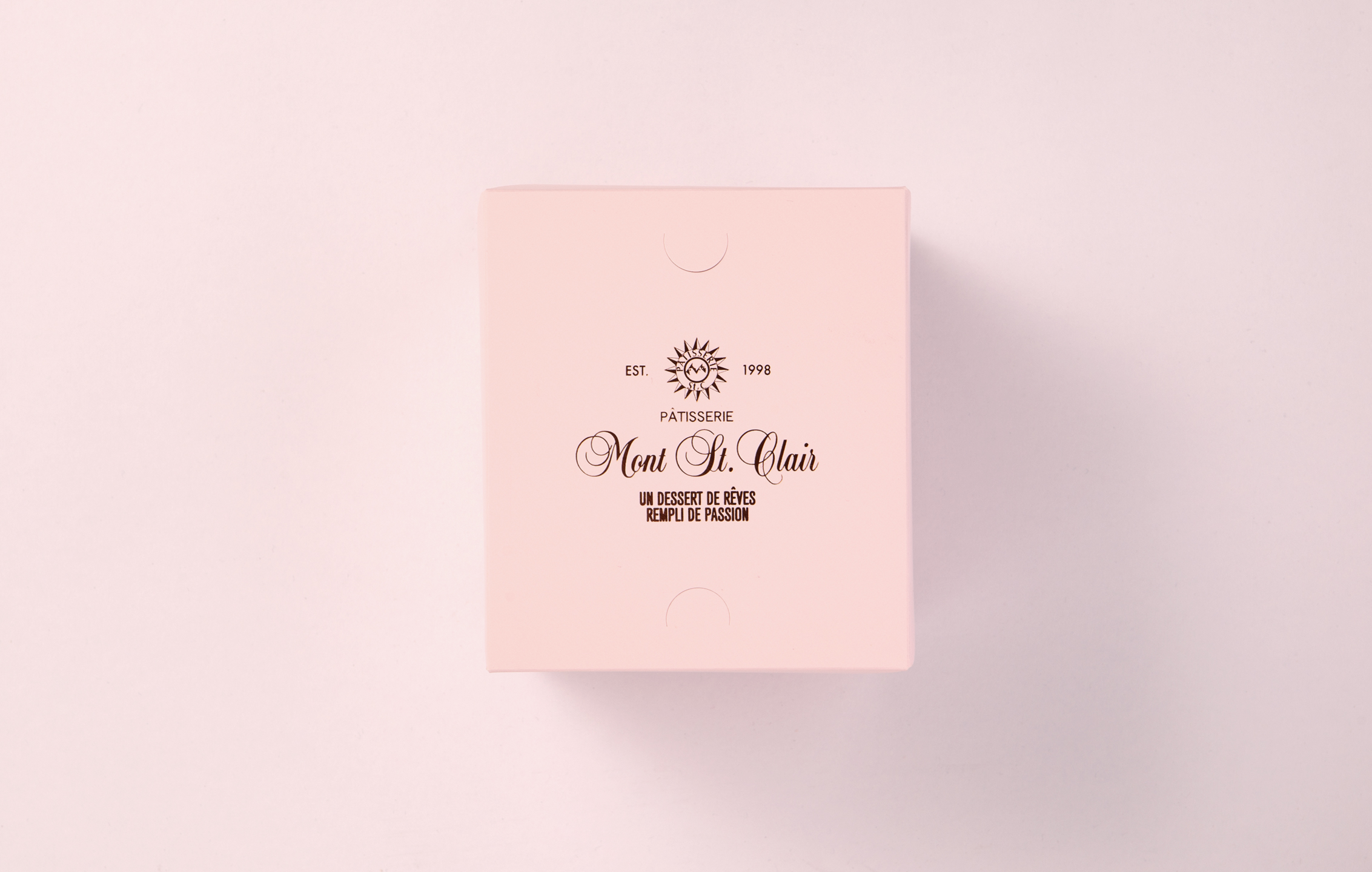
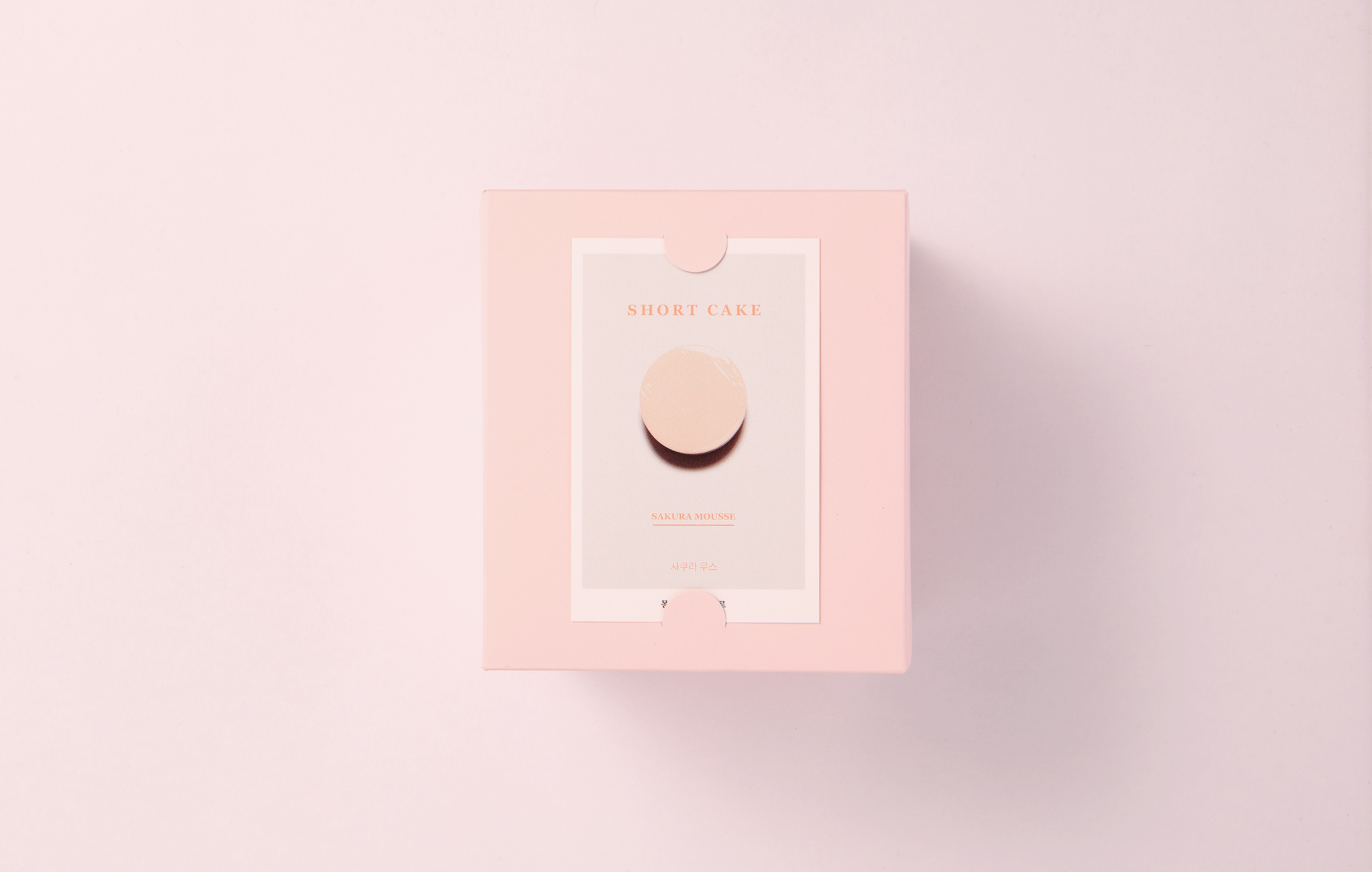
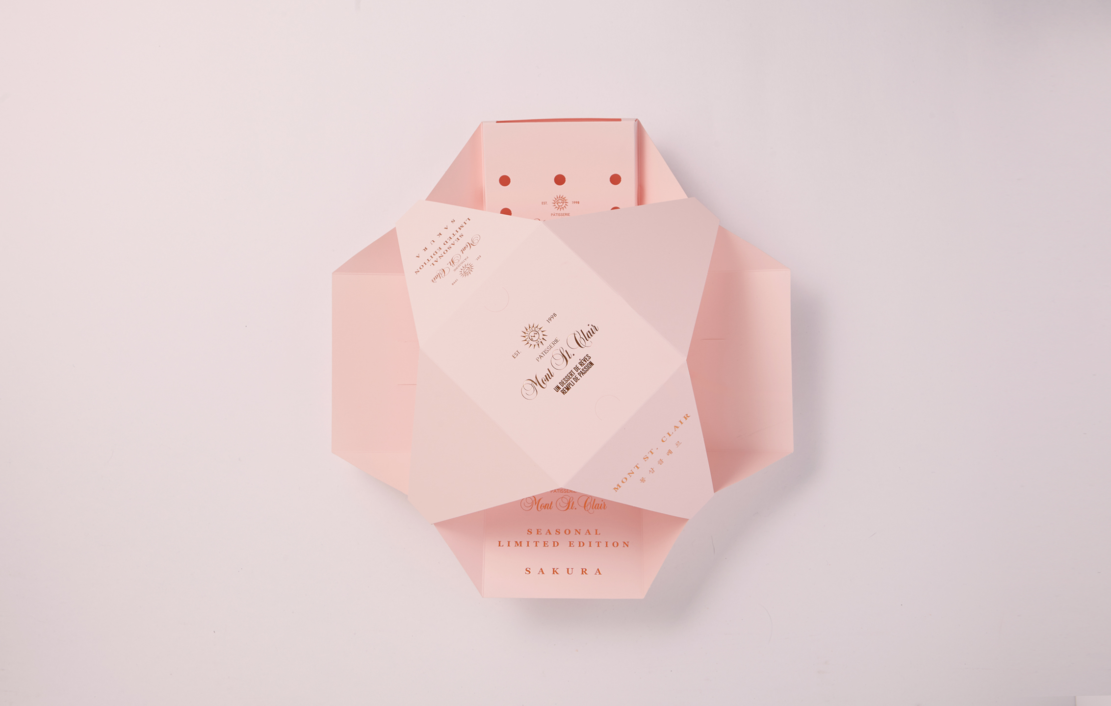
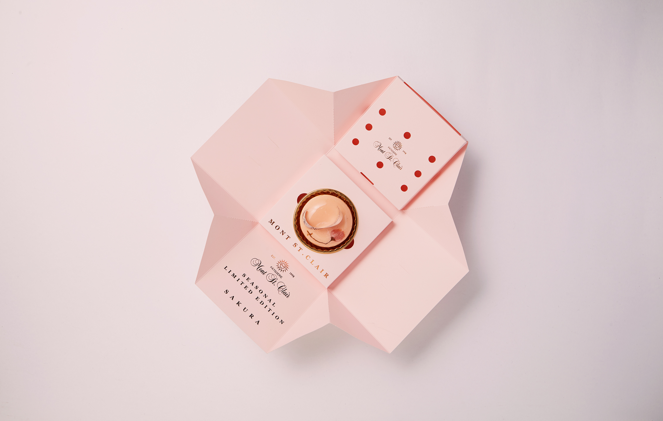
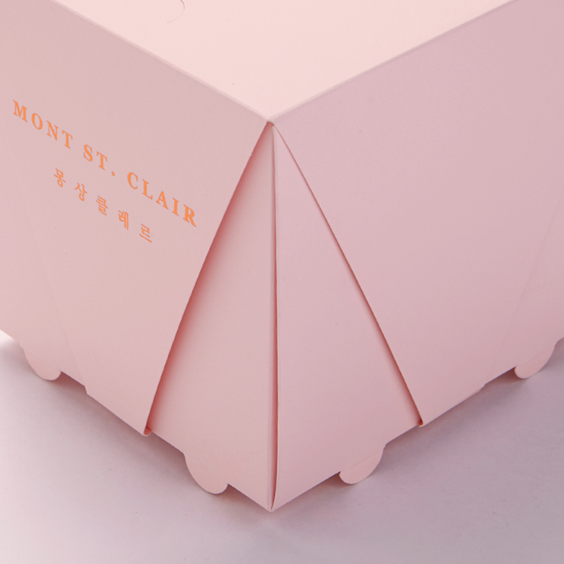
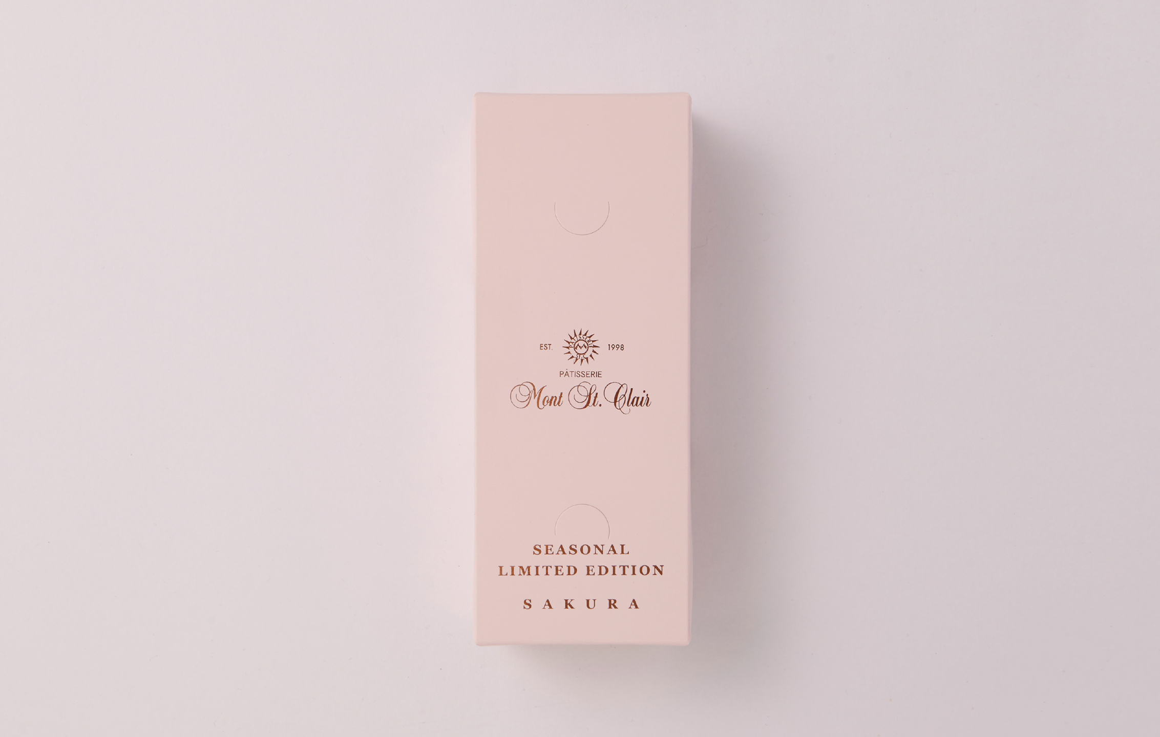
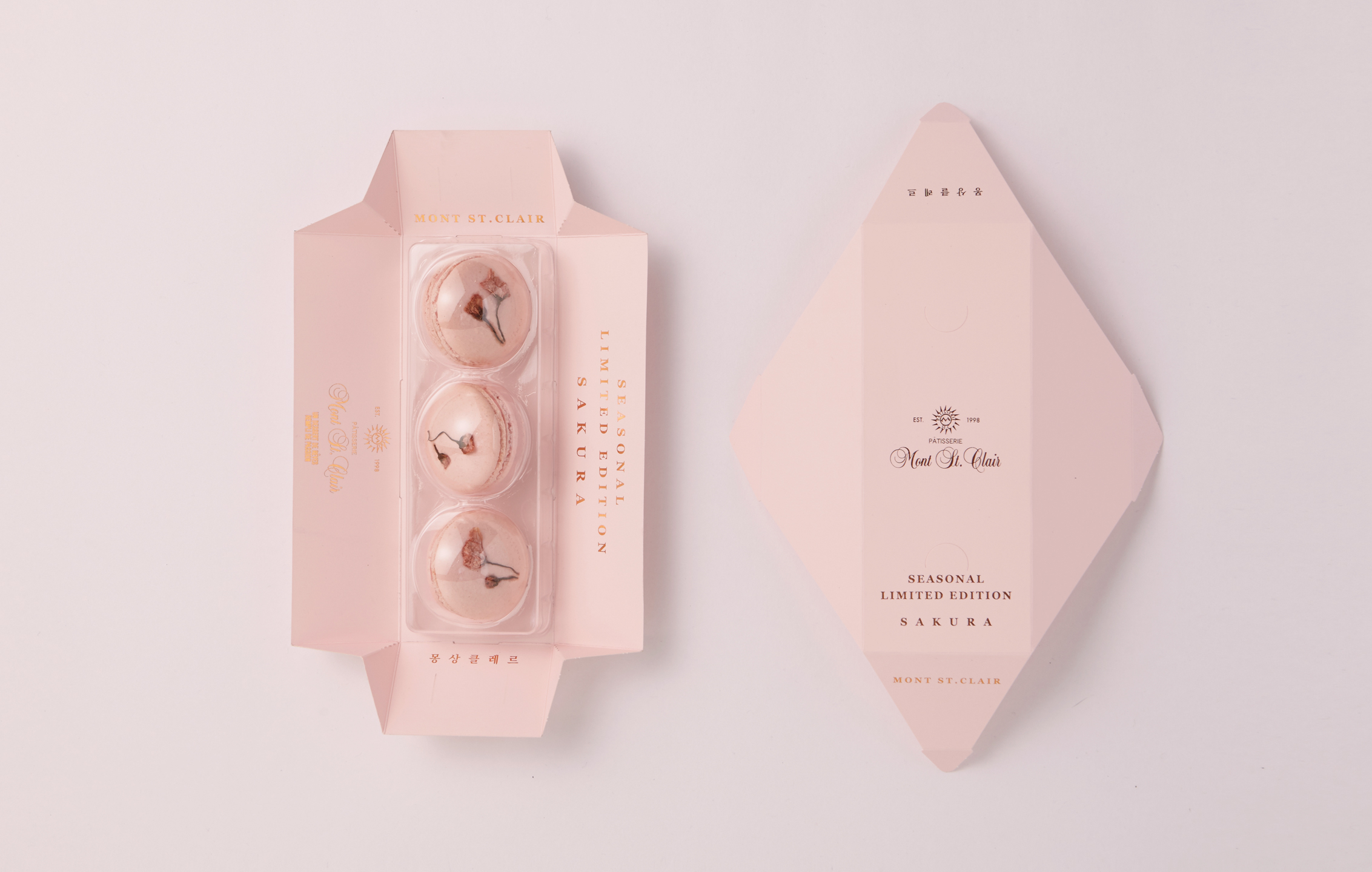
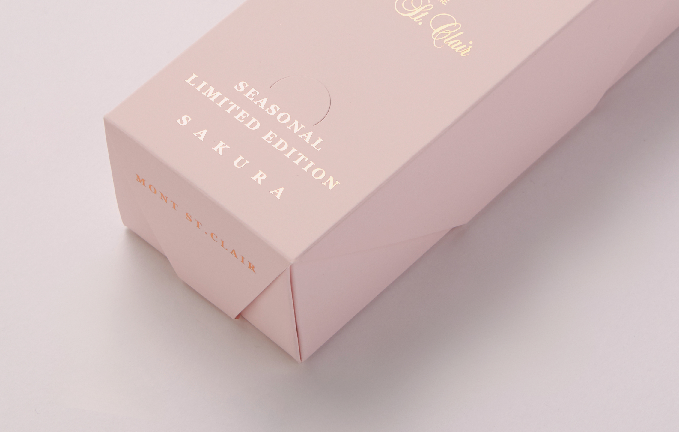
Packaging isn’t just a protective layer. it’s an integral part of a brand’s narrative. For years, we have refined our non-glue packaging system, and this project was no exception. By incorporating an origami-style fold, we ensured that the package remained structurally sound while eliminating the need for adhesives. This design choice was both an environmental statement and an aesthetic one, allowing the natural texture of the paper to become a defining element. To capture the fleeting beauty of cherry blossoms, we selected a palette of soft pink and white, balanced with subtle branch tones. Structurally, the packaging mimics the moment a petal drifts and settles onto the ground through its delicate folds. Gold foil detailing was used to enhance the organic silhouette of branches holding their final petals, creating a layered interplay of light and shadow.
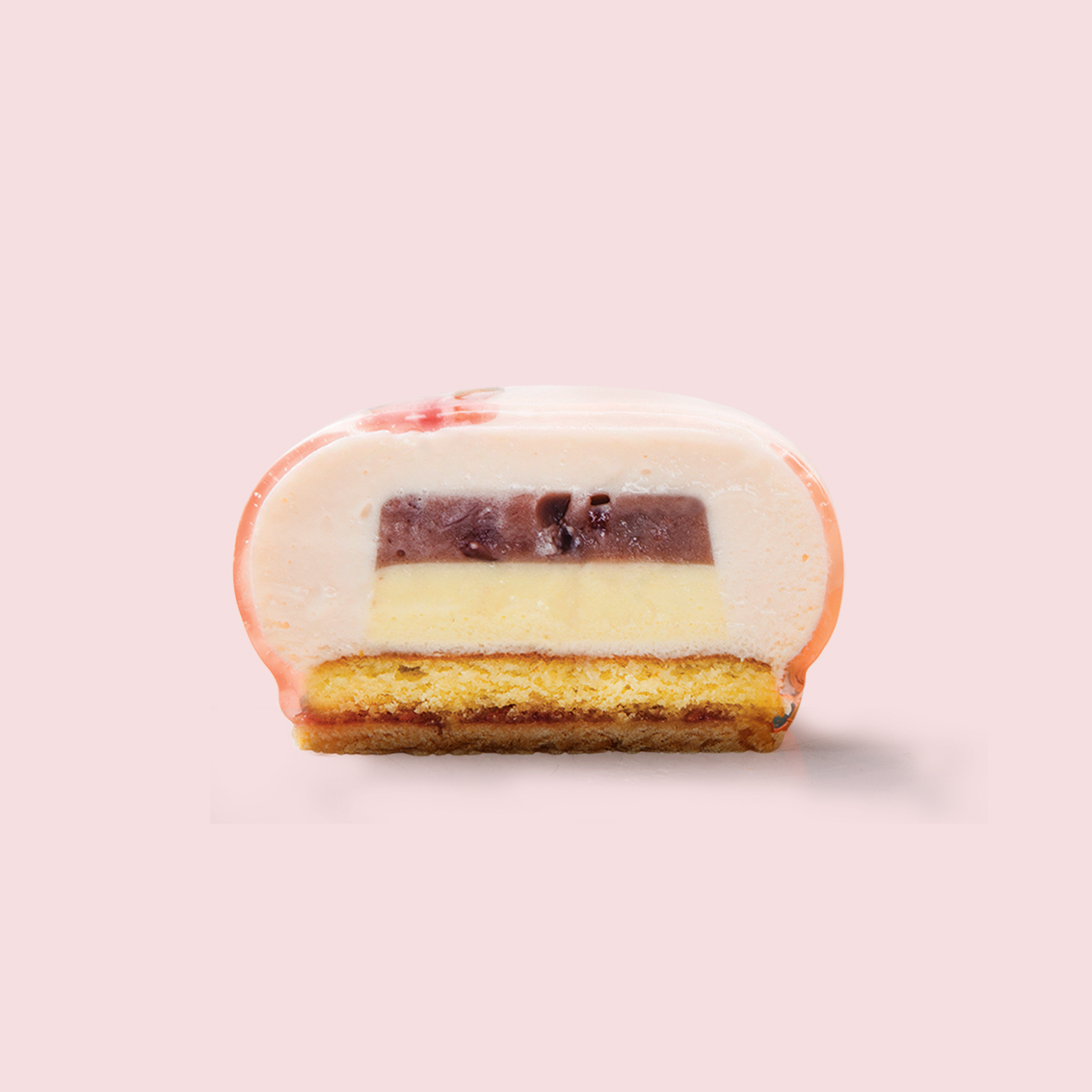
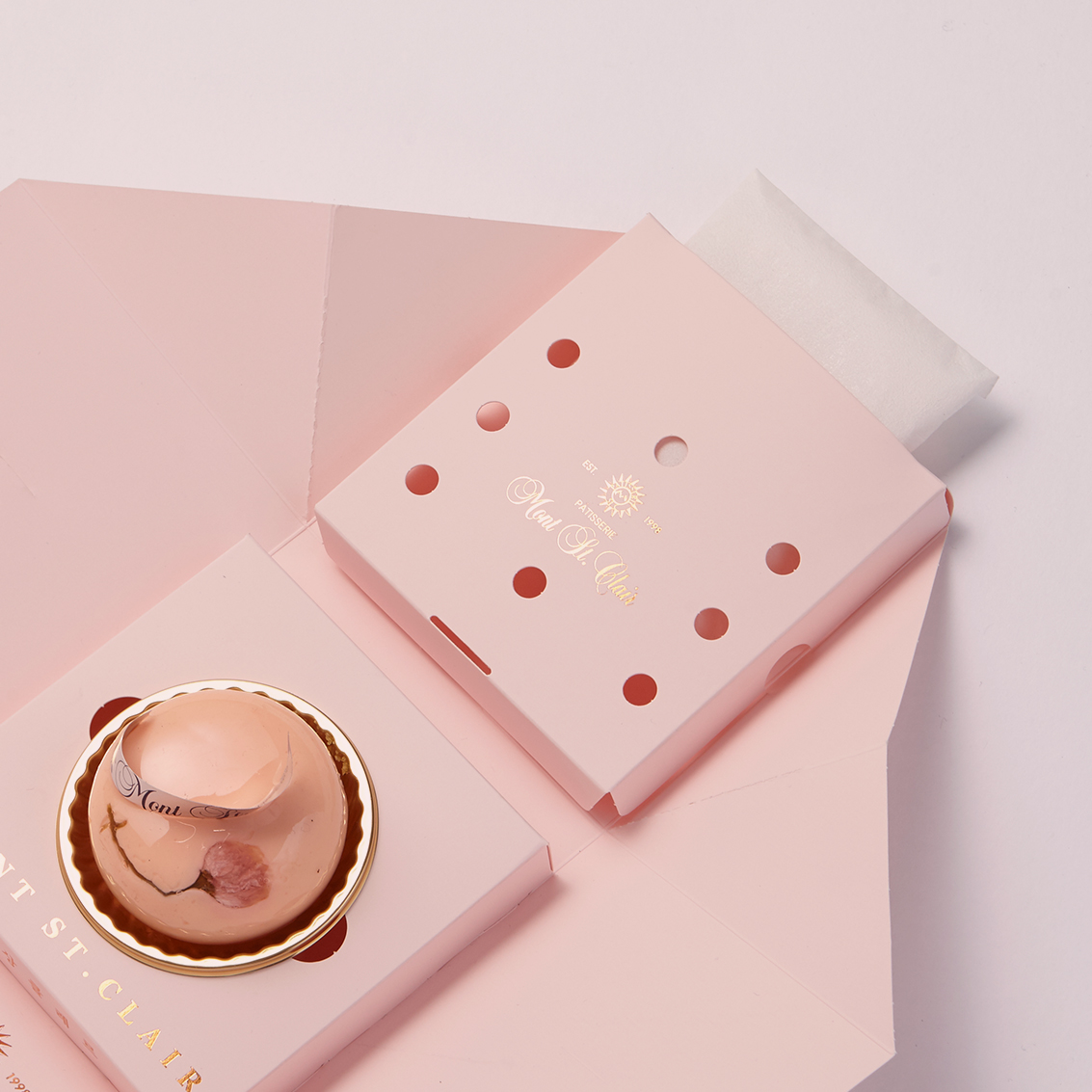
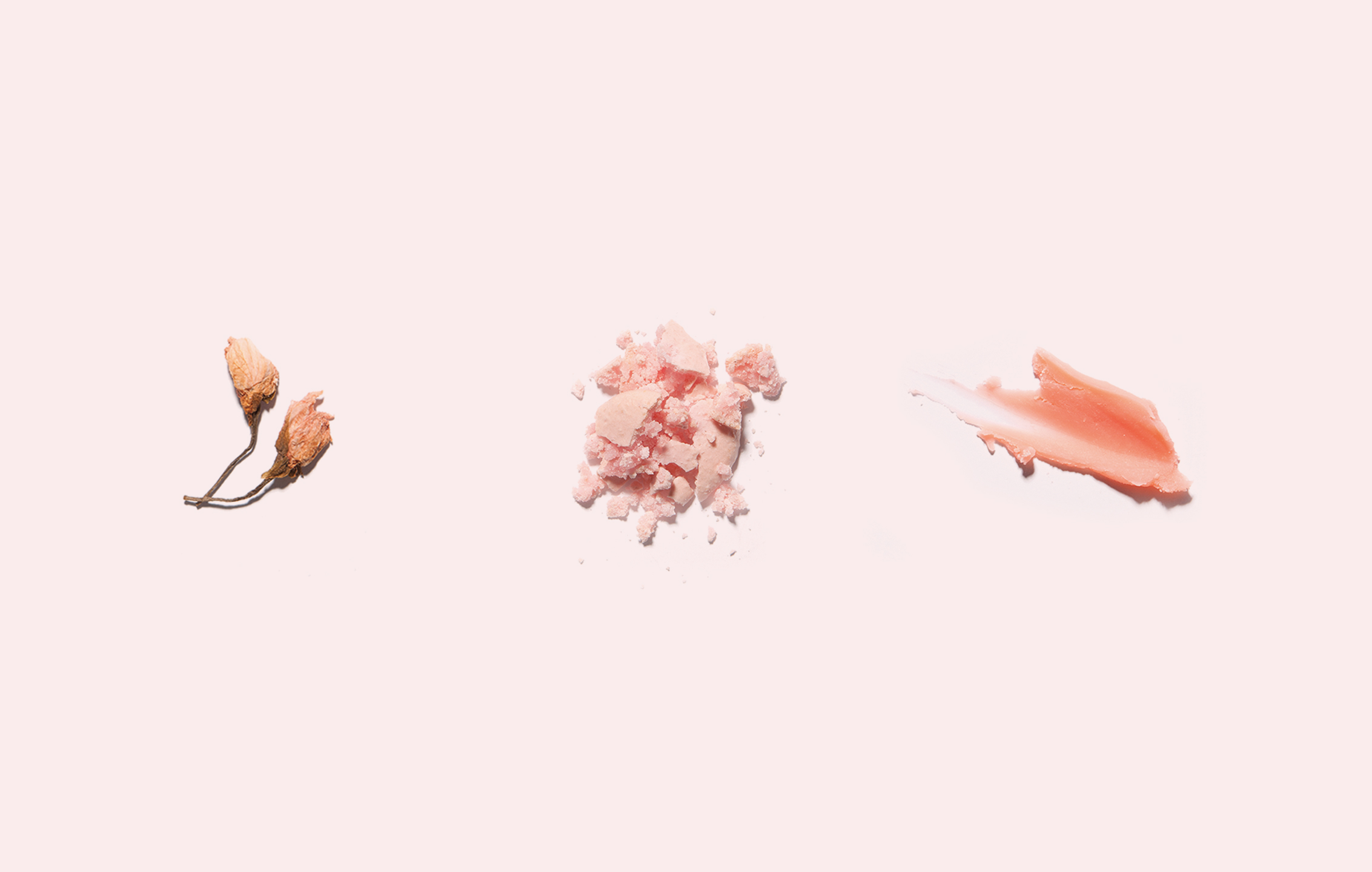
Beyond its visual appeal, the unboxing experience was central to our approach. We designed the structure so that the cake would appear luminous upon opening, heightening the anticipation of the moment. A key part of this redesign was also a functional improvement— previously, cakes and ice packs were packaged separately for freshness. We re-engineered the structure so that both could now be housed in the same compartment, resulting in a more cohesive and practical solution. The poster design extended the philosophy of this project— it wasn’t just about presenting the dessert, but deconstructing its craft. By visually breaking down the shortcake and macaron into their essential components, we highlighted the meticulous artistry behind each creation. This project was more than a seasonal branding exercise. It was about capturing the innate sense of anticipation and joy that comes with a dessert. We wanted the moment of holding the package to feel as poetic as cherry blossoms drifting through the air— a cinematic frame frozen in time.

